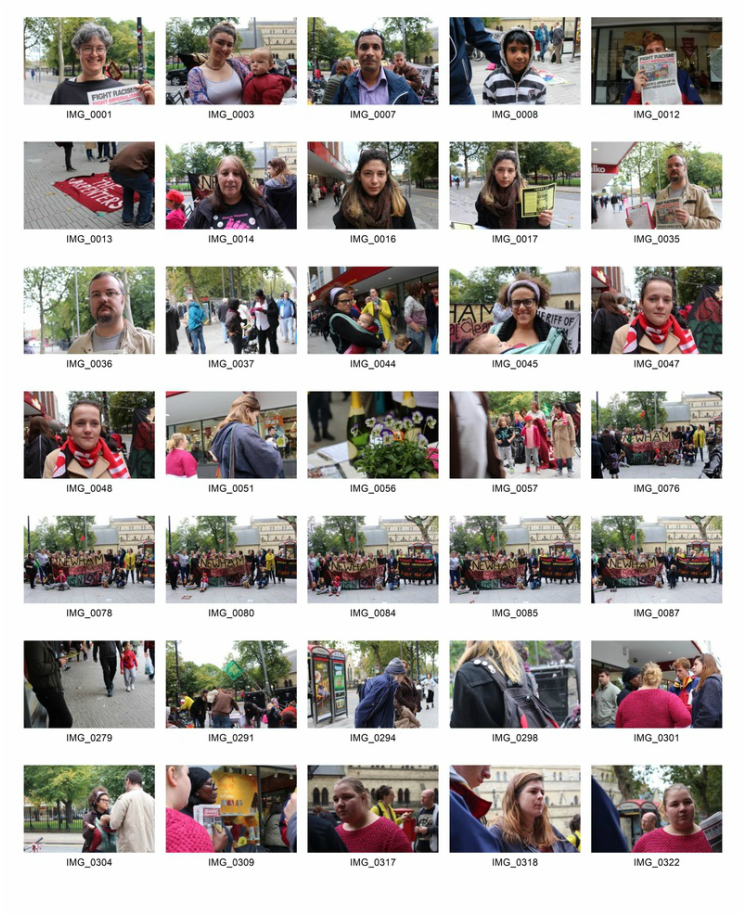
The Brief
Create a series of images that are representative of the on-going socio-economic changes in London.
The History of Britain's social-housing
"It shall be the duty of every local authority to consider the needs of their area with respect to the provision of houses for the working classes"
During the Victorian poverty was considered to be a problem for the poor to deal with. After World War I a social revolution came about with the aim of creating a better life and future for people in the London. The idea of sending Britain’s war heroes back to slums seemed like a preposterous idea, so the idea of council housing was formed. The purpose of council housing was to rehouse people in post-industrial areas that were displaced by slum clearance. The slum clearance came about as way to reduce overpopulation and improve the health standards of London’s slum dwellers. The Addison Act was established in 1919, stating that "It shall be the duty of every local authority to consider the needs of their area with respect to the provision of houses for the working classes" [1]
The initial housing scheme moved thousands of families into better accommodations. However, after the Second World War council housing was view more as a right rather than a privilege. Through no fault of their own many people returned home from the war to see that their homes had been completely destroyed, leaving families homeless. As a result, the government started to provide houses that would be permanent homes. Council Estates provided a vision for the development of the future.
As the construction of council housing developed the blueprint for large high-rise estates evolved. The tower blocks created ‘streets in the sky’. These self-contained communities were equipped with facilities such as pubs and parks. The country’s largest housing estate, Beacontree, in Essex, filled 27,000 homes with the urban working class from London’s overcrowded slums. In an interview a resident described the estate as “heaven with the gates off.”[2]
Social-housing in the country was becoming more prevalent, at its peak in 1970 one third of the British population lived in council housing. The future of social-housing seemed bright, however in ... the ‘working class’ clause was removed from the Housing, Town Planning act of 1919. The working class people who had been the original reason for the development of council housing had become less of a priority. The creation of new towns, such as Stevenage in 1946, saw areas where council housing was more for the affluent working class rather than slum dweller. This was where the government became fixated on consumerism rather than creating social utopias. And so the problems began.
Councils placed less effort into the social needs of communities and invested very little into the maintenance of the housing estates. The perception of housing estates warped from being heavenly to being cheap, they were now known for being the breeding ground for anti-social behaviour, crime and dysfunctional families. “The homes that were built to replace the slums were becoming slums themselves.”[3] In an effort to improve the opinions of theses area council began to regenerate areas, bringing in outside investment (often from transnational corporations). Whilst large estates such as Southwark’s Heygate Estate were demolished to make way for shiny luxury apartments low-income families and small businesses were displaced. Generations of communities who had grown up together were now forced to move to the suburbs, away from their jobs, family and friends. In some cases families were pushed out completely of their home cities.
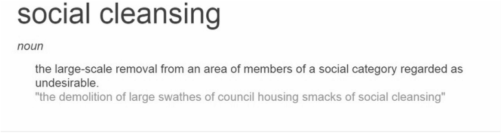
Gentrification - the renovation/renewal of an area in deterioration increasing the value of the area, often displacing low-income families and small businesses
It is not just about issue that concerns housing, but it is the social cleansing of an entire city. Gentrification and social cleansing is now occurring in all corners of the capital, changing the face of London as we know it.
[1] http://legislation.gov.uk/
[2] Find were interview came from
[3] Fine name of narrator & video
[1] http://legislation.gov.uk/
[2] Find were interview came from
[3] Fine name of narrator & video
Introducation
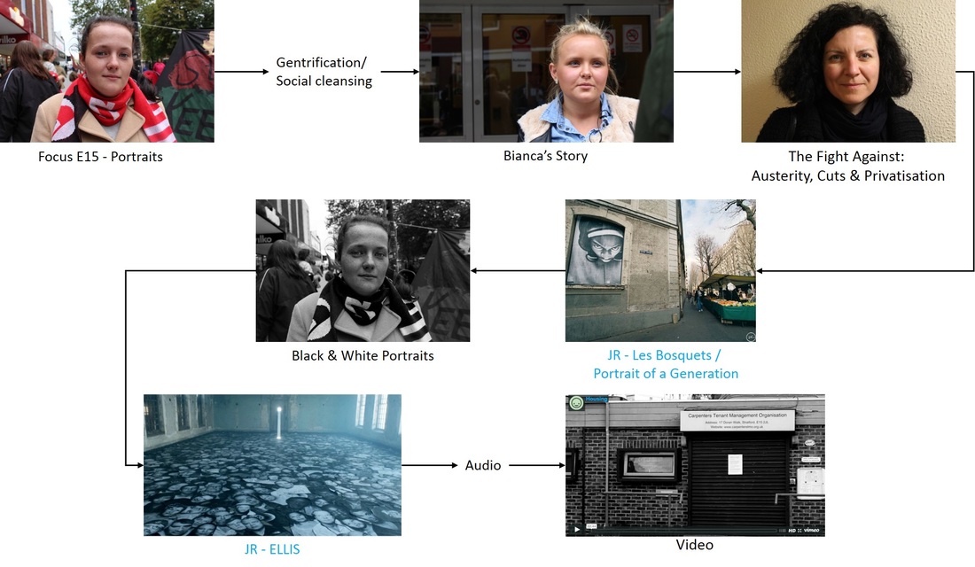
In this project I plan to explore the changing face of the capital, London, through documenting the city’s on-going social cleansing. After being inspired by photographers I researched in my curatorship project, the aim of my project is to educate the audience, by increase the awareness of some issue facing many people in Britain today.
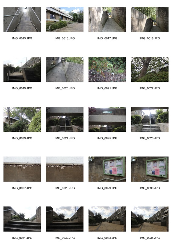
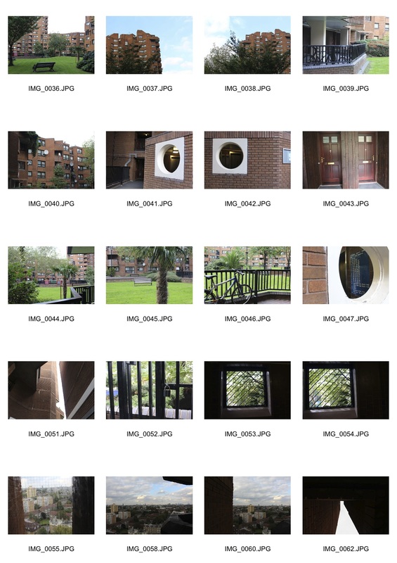
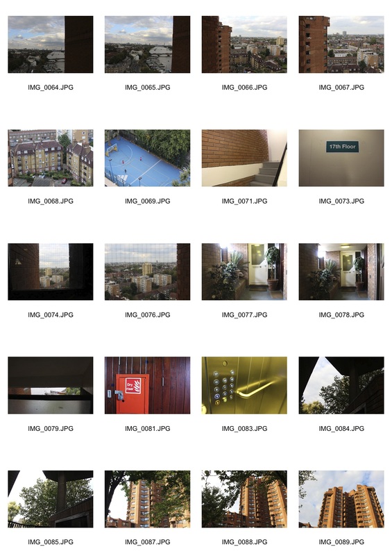
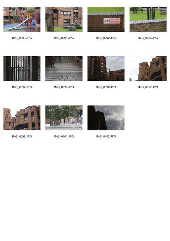
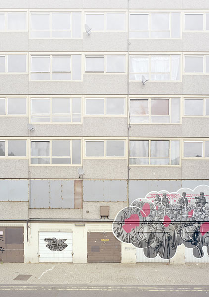
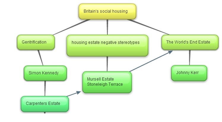
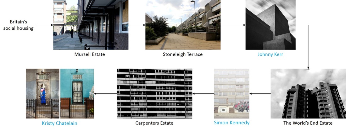
DEVELOPMENT 1: Mursell Estate, SW8
In my first shoot I decided to visit Mursell Estate to see if the stereotypes put on council estates were true. To my surprise I found that there was nothing to be feared at all, the estate was surprisingly peaceful. Photographing the architectural features of the estate I saw the ... of the features of the building the architects created. To develop my idea on the next shoot I will take more images of the architecture, to highlight the building’s aesthetics.
DEVELOPMENT 2: Stoneleigh Terrace, N19
Developing from my first response I visited another housing estate. In comparison, to Mursell Estate the Whittington Estates looked a lot less like the conventional council estate. I thought it would be interesting to visit a place that on the surface would not typically be considered to be a council estate. The estate had been designed by Peter Tabori, a Hungarian architect who had studied with studied with Ern Goldfinger and worked with Denys Lasdun. Lulot Gardens in the Whittington Estate had be built during the ‘golden era’ of Camden’s social-housing development in 1979. As part of Camden’s ethos the 273 homes delivered “high quality architecture, underpinned economically and politically by the democratic structures in place within the Council.” [1] Unlike a lot of London’s other housing estates Highgate Newtown, as it was dubbed, provided modernist maisonettes that were working for the good of the people.
I used perspective to try to show the magnitude and complexity of the geometric pattern created by the stepped profile. The strong vertical lines in the building are softened by the surrounding vegetation, whilst also creating a refreshing contrasting with the grey brutalist architecture. The appealing aesthetics comes across strongly in the images, however this was the downfall for its initial purpose of social-housing. All of the flats have now been privatised under the Right to buy scheme. To improve the shoot I think I could have experimented with the formal elements more to emphasis the architecture.
[1] http://camden50.co.uk/
Johnny Kerr
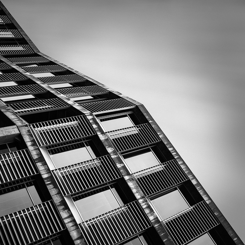
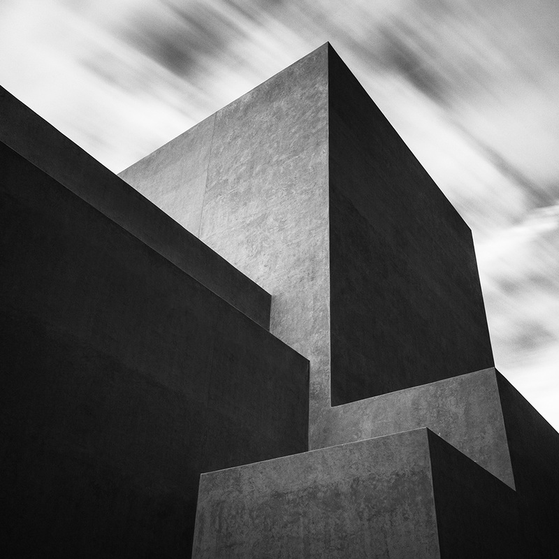
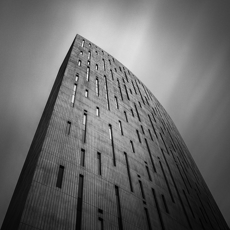
Johnny Kerr is an architectural photographer who was born and raised in Phoenix, Arizona. As a self-taught photographer Kerr’s appreciation for minimalist is often prevalent. In 2015, Kerr was awarded the 7th Best Architectural Photographer in the World, by the Interactive Design Institute. This is a large achievement as Kerr only started pursuing photography in 2011. He currently works as both a photography teacher and a freelance graphic designer.
In 2015 Kerr also published his book, Abstractions, which included long exposure abstract architectural images. The images had also been featured in Phoenix's Bokeh Gallery. The long exposure used exemplifies the sharp vertexes of the buildings as they cut through the soft background and attract attention. The simplicity of the black and white images is created through the artist’s use of negative space. In addition, the use of black and white images rather than colour enables the architectural features of the structures to stand out. The minimalist images of architectural designs provide an emphasis for Kerr’s passion for graphic design as well as photography and architecture.
In the image Circumspect Kerr’s use of symmetry emphasises the pattern in the architecture of the building. Moreover, shooting from an interesting perspective enables an audience to appreciate the entirety of the building, as they are able to see the abstract shapes.
DEVELOPMENT 3: Worlds End Estate, SW10
Click to see full contact sheets
Developing from visiting both the Mursell and Whittington Estates I decided to take advantage of Open House London 2015 and visit the World’s End Estate to continue with the theme of architectural photography. As the largest monolithic housing estate the World’s End Estate is an architectural … whilst still providing ampules of council housing. Even though the estate is situated in the Royal Borough if Kensington and Chelsea the area in which the estate is located is often considered as the less desirable part of the borough, despite its close proximity to the expensive Kings Road. Commissioned in 1963 by the government, the purpose of the estate was to replace the 11 acres Victorian terrace houses that stood there and provide more housing to combat overcrowding.
When I entered the estate it was a Utopia, where the hustle and bustle of the outside was completely gone. According to the estate’s local policeman the was very little crime, with the issue of litter (which there was a lack of) being in the top ten. Unlike many housing estates in London the World’s End is listed due to its striking architecture, even with the possibly of Crossrail 2 being built nearby there is very little chance of the estate being demolished. As a result, the issue of gentrification isn’t that much of an issue to residents, however it could affect the people in the less attractive neighbouring estate. Instead, since the time of construction residents had seen an increase in the ethnical diversity of families. Although originally the estate had been built with the purpose of housing young families the population of the estate had aged. Numerous residents had not moved out since they first moved in 1975, subsequently units had be taking out of council housing for decades, fueling London’s Housing crisis. Currently approximately 163 units are owned by lease holders.
Continuing with the architectural images I took inspiration from an image I saw in an article about estate and the work of Johnny Kerr. I edited my images making them black and white. The contrast created enabled the building’s architectural details to be appreciated. The image where the tower block shoots up from the ground into the sky it looks futuristic, embodying the idea of providing people with a better future. The negative space surrounding the image makes a viewer’s eye drawn into the image. I think the images could have be improved further if I had used long exposure to make the build be more prominent, reducing distractions.
To develop my idea further I plan on visiting an estate that is relevant to the issue of social cleansing.
At the time of construction the World's End Estate monolithic housing estates was the largest of its kind. The name of the estate was taken form the name of the pub that is located near the site. The estate is situated in the Royal Borough if Kensington and Chelsea, adjacent to Chelsea Embankment. The area is often considered as the less desirable part of the borough, despite its close proximity to the expensive Kings Road. Commissioned in 1963 by the government, the purpose of the estate was to replace the Victorian terrace houses that stood there and provide more housing. The estate was designed by Eric Lyon, however when built it exceeded the LCC's housing density.
Although today the 11 acre site appears to look like the typical council housing estate from the outside, looks are very deceiving, thwarts the negative stereotypes. The estate was quite and peaceful and provided a feeling of safety, due to the electronic security gates that guided every door. According to the local police officer litter was one of the top ten issues the estate faced.
Although today the 11 acre site appears to look like the typical council housing estate from the outside, looks are very deceiving, thwarts the negative stereotypes. The estate was quite and peaceful and provided a feeling of safety, due to the electronic security gates that guided every door. According to the local police officer litter was one of the top ten issues the estate faced.
|
|
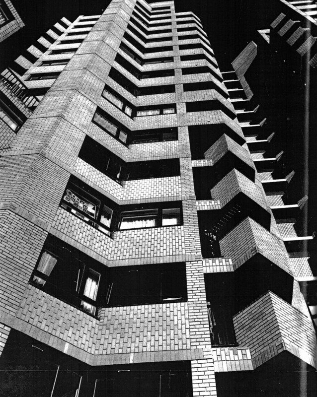
Image taken from the World's End tenant's website
|
Simon Kennedy
"The idea that photography can make a proposal as well as capture a moment or scene."
Before working a professional photographer Simon Kennedy trained as an architect. Today Kennedy specialises in architecture and interior spaces in his photography, using photography as an extension of his architectural. Kennedy states he is “compelled to photograph both out of a desire for creative satisfaction and by an intellectual curiosity toward modes of representation.”
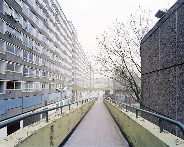
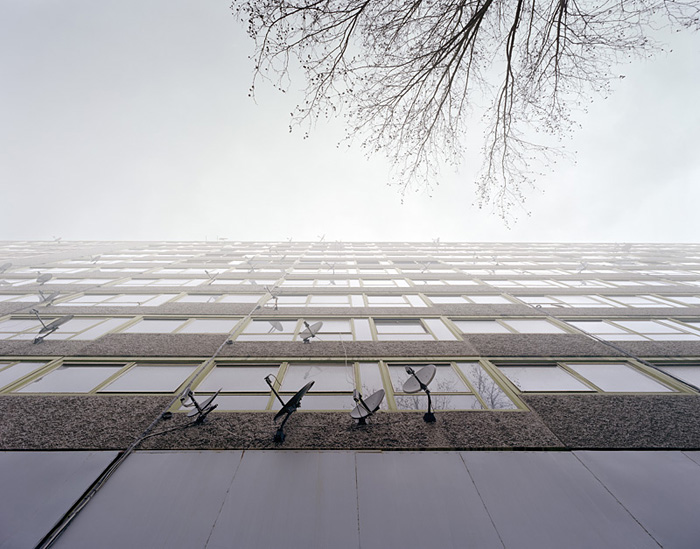
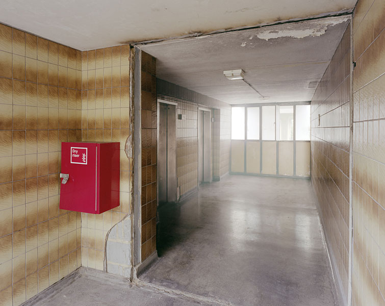
In his project Heygate Abstracted Kennedy photographs the Heygate Estate in South London. The Heygate was Europe’s largest estate and at after being completed in 1974 the estate had utopian aspirations. At the time of Kennedy’s project the estate had been cleared out and was scheduled for demolition. Focusing on the exterior and public spaces of the estate purpose of Kennedy’s images were to get the audience to think about modernism as a whole rather than its failure. Ben Campkin, an architectural historian, commented on the projects stating that “even in their ruinous condition, they can still offer a sense of possibility which decades of being told that ‘There is No Alternative’ has almost beaten out of us.” The series of images act as a visual representation of both the political and architectural debate encircling the estate. As the tower blocks are planned to be brought to the ground and many of the families who had once live there are relocated to the periphery of London the images emphasises the consequences of London’s regeneration. Each image puts forward the question, ‘was Southwark’s the decision to demolish the tower blocks valid?’
Kennedy analysed and augmented the images to display the striking vacancy of the derelict estate. Kenney use of perspective to draw viewers into the images is effective at making a person feel is if they are standing on the walkway. The eerie mist in the images produces a haunting atmosphere where the only presence of life left are the trees. The new tenant, with their exposed bark and scrawny twigs creep into the shots. Although the Southwark council may have emptied all the human life nature still prevails. I especially like the image in which the tower block disappeared into the sky, illustrating the magnitude of has many people would have had to relocate.
Kristy Chatelain
Kirsty Chatelain is a Brooklyn based photographer who originated from New Orleans, Louisiana. From a young age Chatelain has been fascinated with surrounding architecture and its effect on her. In 2004-05 Chatelain worked as a Fulbright young journalist grantee. Three years later, in 2008, she graduated from the School of Visual Arts in New York with a master’s in digital photography. In her thesis project Chatelain chronicled the rapid changes in her local neighbourhood of Greenpoint along with near by Williamsburg, using her camera as a tool.
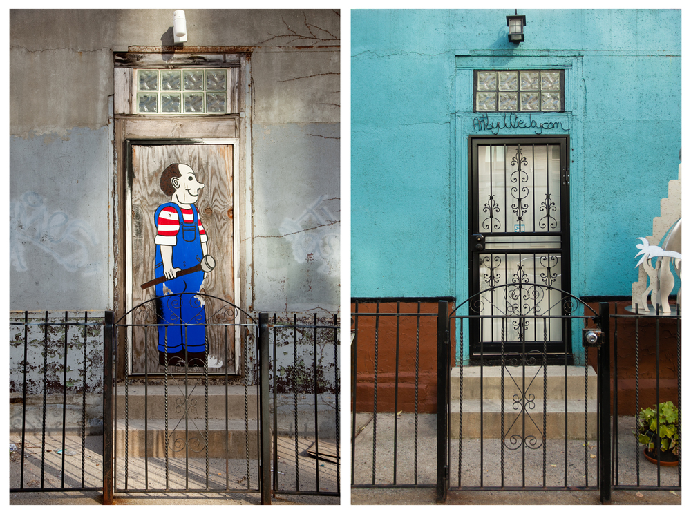
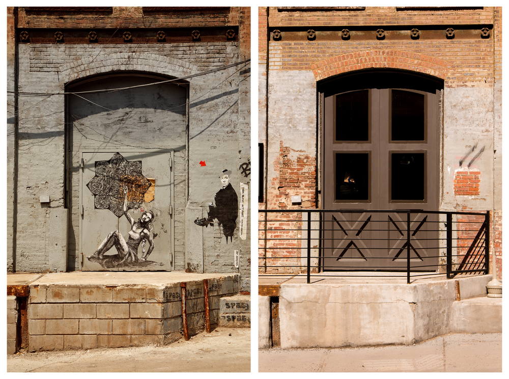
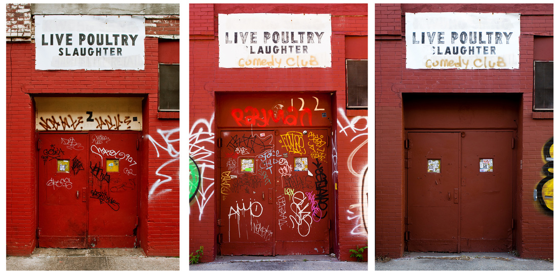
Brooklyn Changing is Chatelain’s an ongoing photographic project that documents the constant shift in New York’s urban landscape. The project compares images dating back to 2007 with present day images. When she began the project in 2007 Chatelain did not initially conceive it as a before-and-after project. The project began at the height of the gentrification conversation. Brooklyn can be argued to be one of the places where the recent conversation on gentrification began. Her intentions were to capture the Brooklyn that she had come to love before it was changed beyond recognition. Chatelain told the Architectural Digest her “photography evolved as the neighborhood did.”
Brooklyn’s industrial and postindustrial architectural background provided a good backdrop for Chatelain’s project. The side-by-side comparisons enable viewers to instantly recognise the that the locations are the same, however the differences with the images highlight the contrast between the the two. For instance, the image of the of the doors shows how the process of gentrification can often remove the character from a building or an area. The street art seen in the older images have a much lighter tone with their humorous colourful caricatures.
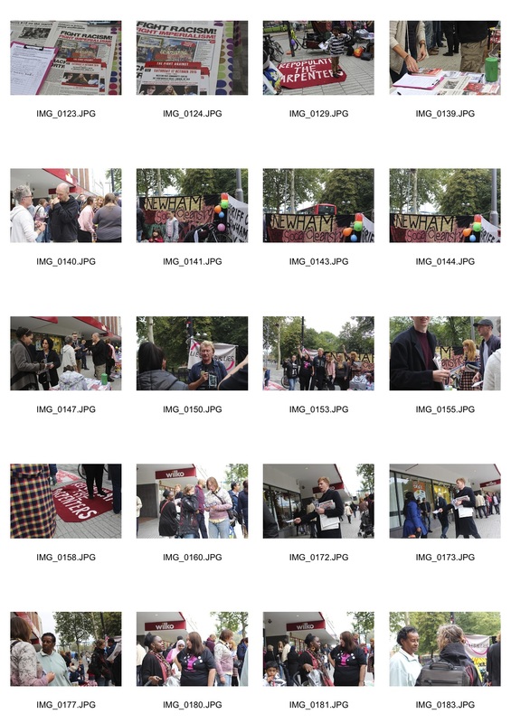
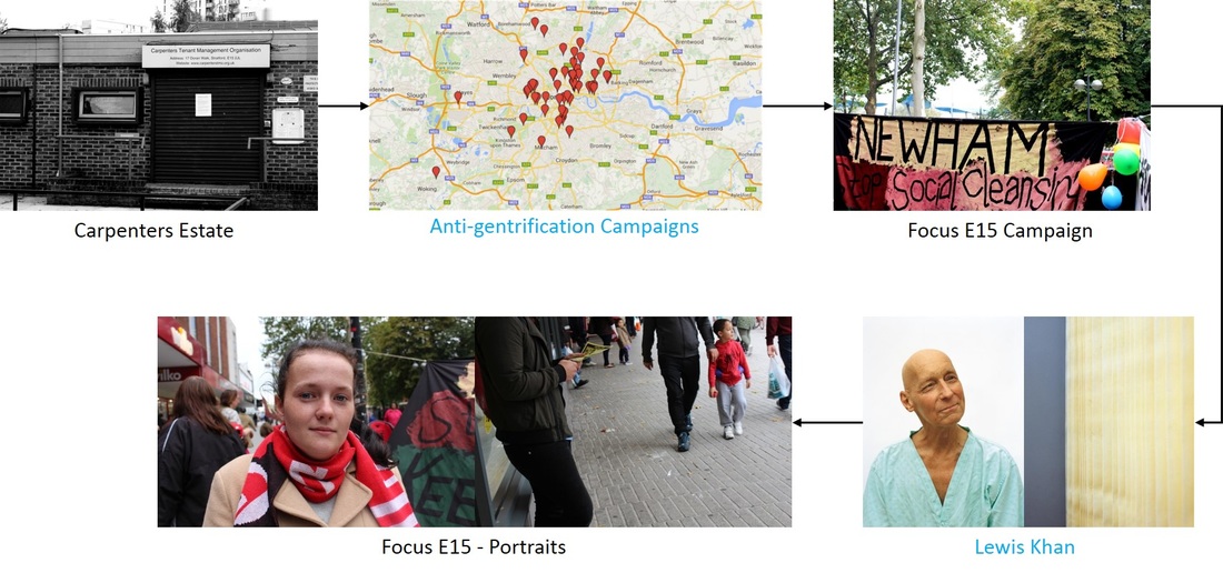
DEVELOPMENT 4: Carpenters Estate, E15
Click to see full contact sheets
Developing from my previous response I visited a site that was relevant to gentrification and was due to be renovated. I discovered the Carpenters Estate after reading an article [1] about a group of mothers who occupied a house in the estate after being evicted from their nearby hostel. With the arrival of the Olympics in 2012 the estate, like Heygate, had been cleared to make plans for development. Hundreds of flats laid empty whilst many people in the borough of Newham were struggling to find accommodation. The origins of the estate had an emphasis on community spirit, with a social club and a school formed on the estate to cater for the community. Yet, when I visited the estate there was an unnerving emptiness creating an eerie atmosphere.
Taking inspiration from Simon Kennedy’s work I tried to also show the consequences of social cleansing. The compulsory purchase of properties by the council evicted ... with no obligations to rehouse tenants in future developments. A lack of funds for maintenance purposes had seen the physical deterioration of the estate. In the image of the tower block multiple flats can be seen to be uninhabited, with some boarded up. This sends a powerful message to the audience. Following on from my development of the World’s End Estate I experimented with contrast in black and white as well as in colour. I am especially proud of the image of the beer barrels outside the Carpenters social club as it makes reference to the thriving community that once filled the estate. Making the images black and white and increasing the contrast enabled the texture of the rust on the barrels to complement the pattern of the brick wall.
For my next development I plan on moving my focus to the social impact of social cleansing by getting in contact with the Focus E15 campaigners. Including interviews with people will make my photographs better connected with the political side of London’s social cleansing.
[1] http://www.theguardian.com/commentisfree/2014/dec/31/focus-e15-mothers-newham-council
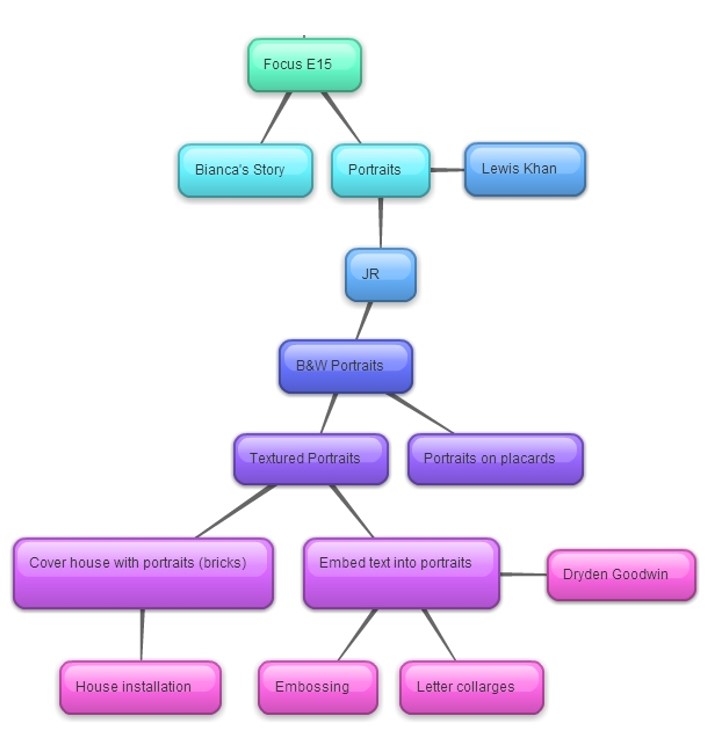
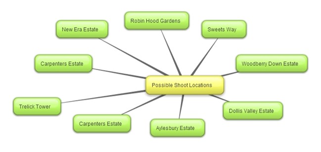
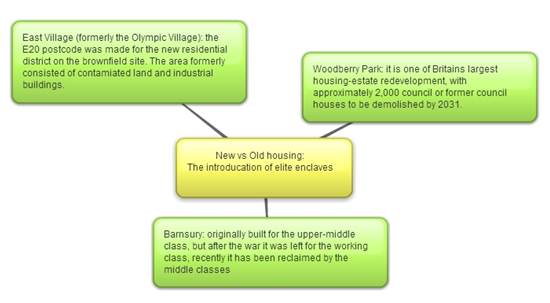
DEVELOPMENT MIND MAP
Anti-gentrification Campaigns
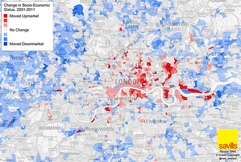
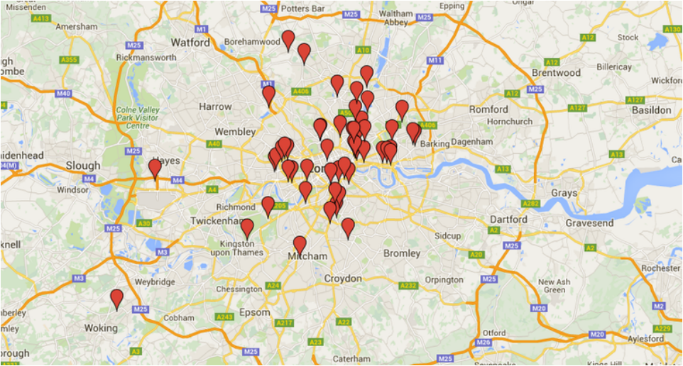
The map shown illustrates the socio-economic changes in London from 2001 to 2011. The map shows that majority of the places that have seen a change upmarket are the areas flanking the city of London borough, in areas such as east London. These area are highly attractive for investors and developers due to their close proximity to central London. Consequently, the rapid development of these areas have caused the original inhabitants to be moved out. On the other hand, the map also highlights some of the areas where people are being moved to. Areas such as Ealing and Ilford have moved downmarket as inner city councils move low-income families out of their boroughs. In recent years London has seen a rise in the number of anti-gentrification campaigns. The second map shows the distribution of anti-gentrification and social cleansing campaign. The distribution of the current campaigns correlates with socio-economic move upmarket. In Strafford the area has seen a £118,463 increase in the value of houses in the past 5 years (Zoopla), making the area unaffordable for the current residents. In 2014 a group of mothers formed the Focus E15 campaign to protest Newham’s social cleansing. The campaign title, Focus E15 along with the maps inspired me to added the postal codes to the end of my responses to show the wide spread nature of London’s socio-economic changes.
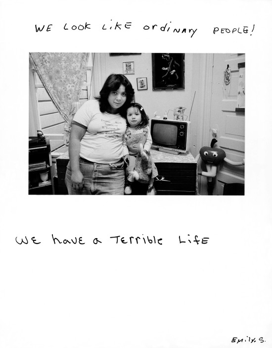
DEVELOPMENT 5: Focus E15
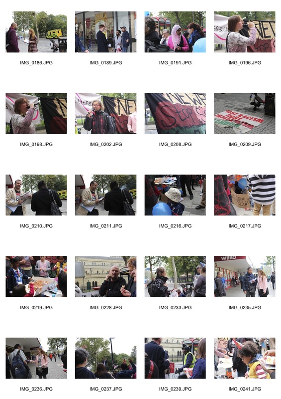
Click to see full contact sheets
After looking at the map that showed the distribution of the anti-gentrification campaigns in London I discovered that there was a weekly Focus E15 stall. Developing my idea I moved from landscape portraiture into portraiture to concentrate more on the socio-political side of London’s housing crisis. After visiting the Carpenters Estate I was pleased to see that other people were taking action. I decided to take atmospheric and action shoots to try to convey the passion that the campaigners had to protest against Newham’s social cleansing. I also used high contrasting images to symbolise that their passion. An image that I think embodies the campaign efforts to increase public awareness through interaction is the image where a man is signing up to the campaign. The fact that the identity of the subject is unknown signifies the fact that everyone can join the campaign, it is not limited to your gender, age or background. The small stall had a community spirit around it, intriguing passers-by.
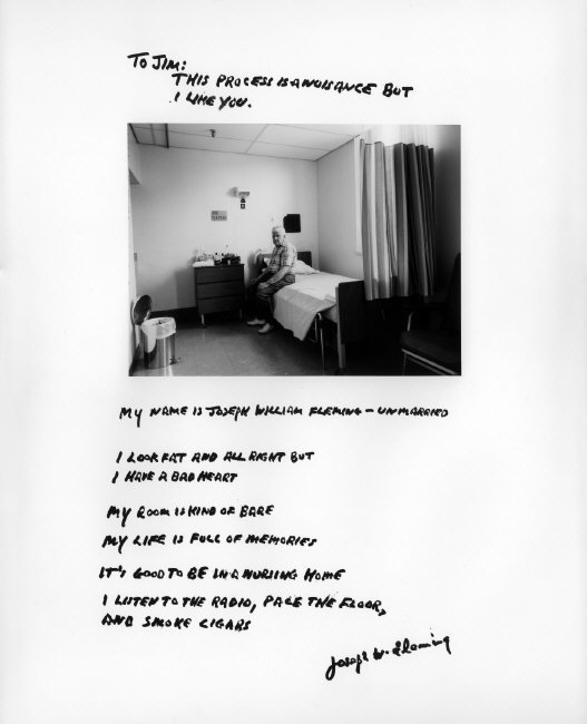
Lewis Khan
|
In 2013 Lewis Khan read Photography at UWE Bristol, where he received a first class honours. Khan won 1st prize in the 'Shuffle Film Festival - The City', in 2014 and he was then short listed for the Shortlist 'Magnum Graduate Photographer Award 2015'.
In one of his current projects as a freelance photographer Khan is partaking in a residency in Chelsea and Westminster Hospital. The project, Our NHS, features a series of portraits from the hospital. The purpose of the project was to celebrate the legacy of England’s National Health Service. The images also highlight the importance of the service, especially in a time where the health service is under increasing privatisation. |
|
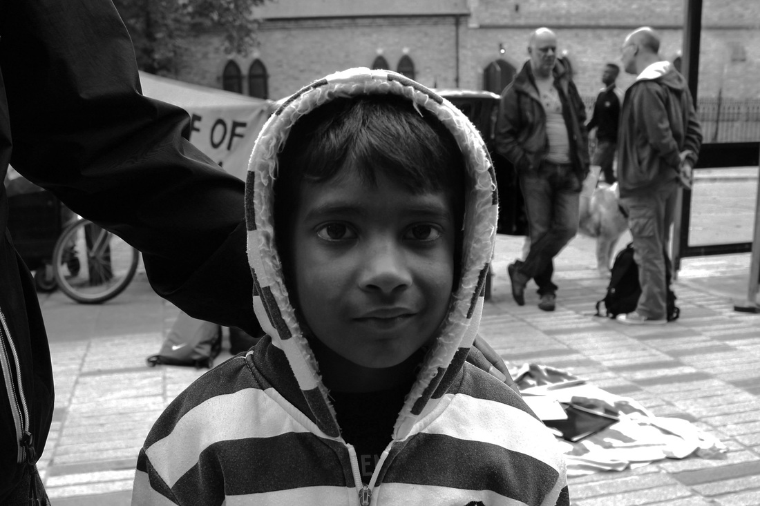
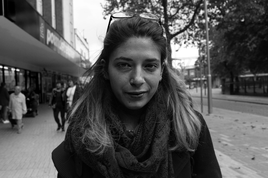
DEVELOPMENT 6: Focus E15 - Portraits
To develop my idea I returned to the Focus E15 stall at Stratford Broadway, this time I took some face on portraits to try to make the focus of my portrait to be on the people rather than the campaign. However, also taking inspiration from the atmospheric shots I took in my previous response as well as Lewis Khan’s NHS series I presented each portrait with an atmospheric shot of the stall to create a visual link between the portraits and the location in which they were photographed.
In the portrait I used a short depth of field to place more emphasis on the subjects. The eye contact the subjects hold with the camera allows a viewer to make an emotional connection with the subject. In some of the portraits the subjects pose with leaflets or newspapers and make a statement to publicise the cause they stand for. However, I think the leaflets created a distraction that pulled away from the attention on the subject. To develop my idea I will create portraits that have less distractions. I think that increasing the contrast of the portraits would also improve the aesthetic appeal of the portraits.
In the portrait I used a short depth of field to place more emphasis on the subjects. The eye contact the subjects hold with the camera allows a viewer to make an emotional connection with the subject. In some of the portraits the subjects pose with leaflets or newspapers and make a statement to publicise the cause they stand for. However, I think the leaflets created a distraction that pulled away from the attention on the subject. To develop my idea I will create portraits that have less distractions. I think that increasing the contrast of the portraits would also improve the aesthetic appeal of the portraits.
Development Mindmap
Google Trends: Gentrification
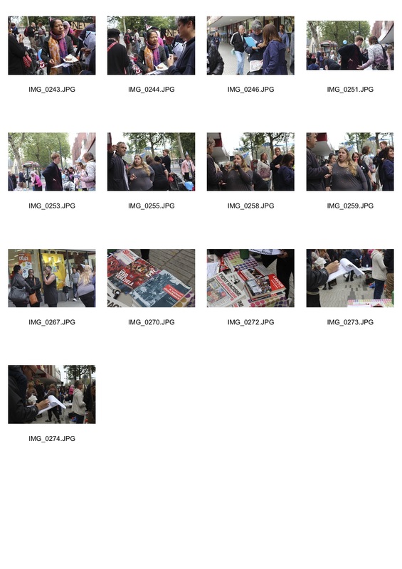
After visiting the Focus E15 stall I followed the group to a protest in Redbridge, a neighbouring borough to Newham. I developed my idea by moving my focus from the stall to the story of a specific individual. The purpose of the protest was to object the eviction of a mother, Bianca, and her two young children from the borough. The council were threatening to move Bianca out of the borough completely with accommodation as far as Ealing and Birmingham in the line-up. Moving Bianca out of the borough would have meant that she would have been far from her children’s schools and her family network. Although the campaign was small, with only a hand full of people turning up, the presences of people to stand in solidarity with Bianca did have an impact. Even though it was not the best of outcomes Bianca was given temporary accommodation in a one bedroom hostel in Newham.
In the response I experimented with a variety of mediums including photography, video and voice recordings. The purpose of using different mediums was try to recreate the atmosphere on the day. I was inspired by Lewis Khan’s Georgetown to explore using still and moving images as well as interviews to convey a deeper message to the audience.
In the response I experimented with a variety of mediums including photography, video and voice recordings. The purpose of using different mediums was try to recreate the atmosphere on the day. I was inspired by Lewis Khan’s Georgetown to explore using still and moving images as well as interviews to convey a deeper message to the audience.
|
|
|
DEVELOPMENT 7: Focus E15 - Bianca's Story
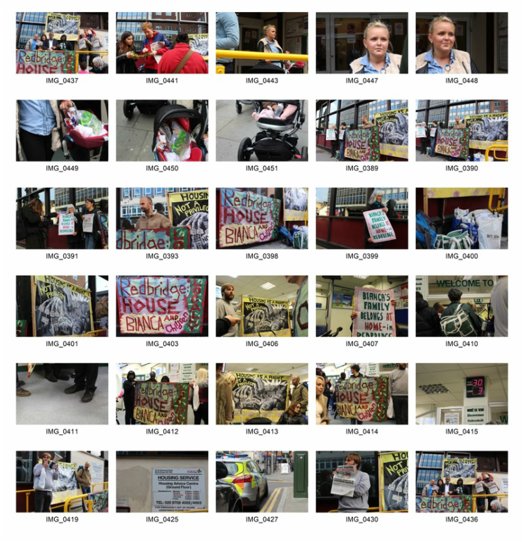
After visiting the Focus E15 stall I followed the group to a protest in Redbridge, a neighbouring borough to Newham. I developed my idea by moving my focus from the stall to the story of a specific individual. The purpose of the protest was to object the eviction of a mother, Bianca, and her two young children from the borough. The council were threatening to move Bianca out of the borough completely with accommodation as far as Ealing and Birmingham in the line-up. Moving Bianca out of the borough would have meant that she would have been far from her children’s schools and her family network. Although the campaign was small, with only a hand full of people turning up, the presences of people to stand in solidarity with Bianca did have an impact. Even though it was not the best of outcomes Bianca was given temporary accommodation in a one bedroom hostel in Newham.
In the response I experimented with a variety of mediums including photography, video and voice recordings. The purpose of using different mediums was try to recreate the atmosphere on the day. I was inspired by Lewis Khan’s Georgetown to explore using still and moving images as well as interviews to convey a deeper message to the audience.
In the response I experimented with a variety of mediums including photography, video and voice recordings. The purpose of using different mediums was try to recreate the atmosphere on the day. I was inspired by Lewis Khan’s Georgetown to explore using still and moving images as well as interviews to convey a deeper message to the audience.
DEVELOPMENT 8: The Fight Against: Austerity, Cuts & Privatisation, N1
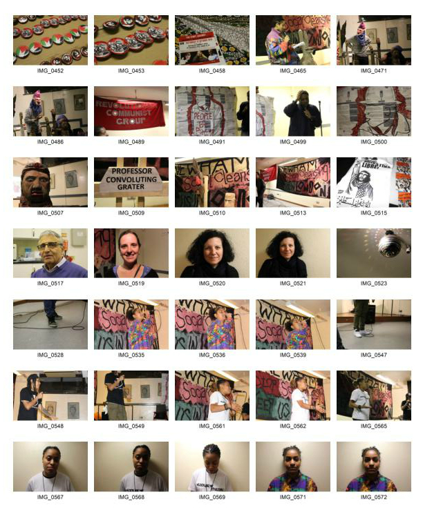
Following on from my response on Bianca’s story I continued working with the Focus E15 campaigners and went to the Fight Against: Austerity, Cuts and Privatisation event. After doing my Focus E15 portrait response I developed my response by photographing subjects with a white backdrop to create no distraction. I think that the white backdrops made the subjects the sole receiver of a viewer’s attention. However, I think that the lighting in which the portraits were photographed created angular shadows that cut across the face. I think the use of natural light rather than artificial light refine the portraits.
To caption the images I used the subject’s professions to illustrate that people from different walk of life have all come together to support the same cause. To improve this response I think more of the focus should have been on the portraits.
To caption the images I used the subject’s professions to illustrate that people from different walk of life have all come together to support the same cause. To improve this response I think more of the focus should have been on the portraits.
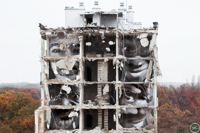
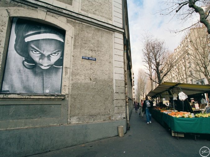
JR
JR is an anonymous French urban activist, though many see JR as “neither a street artist nor a photographer” but instead describes himself as a photograffeur. For 14 years JR has been flyposting his images in public spaces. JR’s large scale black-and-white portraits are provocative, causing people to stop and think in the middle of the street. The streets are “the largest art gallery in the world” according to JR.
Les Bosquets
|
Portrait of a Generation,
|
The rough surfaces, such as brick walls and wooden planks that JR presents his portraits on create texture that is visible when viewing the image. The wood mounted image on was especially breath-taking as the grain texture of the image bridged the gap between the two-dimensional scene of the image and the audiences reality. In collaboration with the New York ballet company JR again brings his work into the audience’s reality through the ballet Les Bosquets. Inspired by JR’s first project Portrait of a Generation, about the French riots of 2005 in the area of les Bosquets.
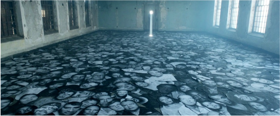
As part of Crossing the series Unframed Ellis Island was also exhibited. The series commemorated the stories of the millions of immigrants who entered the United States via Ellis Island. The Island served as a gateway into the land of opportunity, whilst the statue of liberty stood as a beacon of hope for the refugees. In the 14 minute film of the photo installation viewers are taken inside the neglected Ellis Island hospital. Hundreds of portraits of many of those who were not fortunate enough to reach the shores of the mainland lines to dilapidated corridors. In the film and the installation JR pays respect to those ill-fated migrants. JR highlights subjects that are often missing in today’s media coverage.
In October 2010 JR won the TED Prize for 2011. With the prize money he started the Inside Out Project, a global participatory art project with the aim of changing the world by turning it ‘inside out.’ In the project JR creates pieces of work out of messages of personal identity, however he places an emphasis on the people and the stories behind their cause rather than the portraits themselves. In 2013 Times Square also became part of the initiative in an effort to engage New Yorkers after Hurricane Sandy. By June 2015 the project had over 1,200 group actions
"I would like to bring art to improbable places, create projects so huge with the community that they are forced to ask themselves questions. I want to try to create images of hot spots such as the Middle East or Brazil that offer different points of view from the ones we see in the worldwide media which are often caricatures."
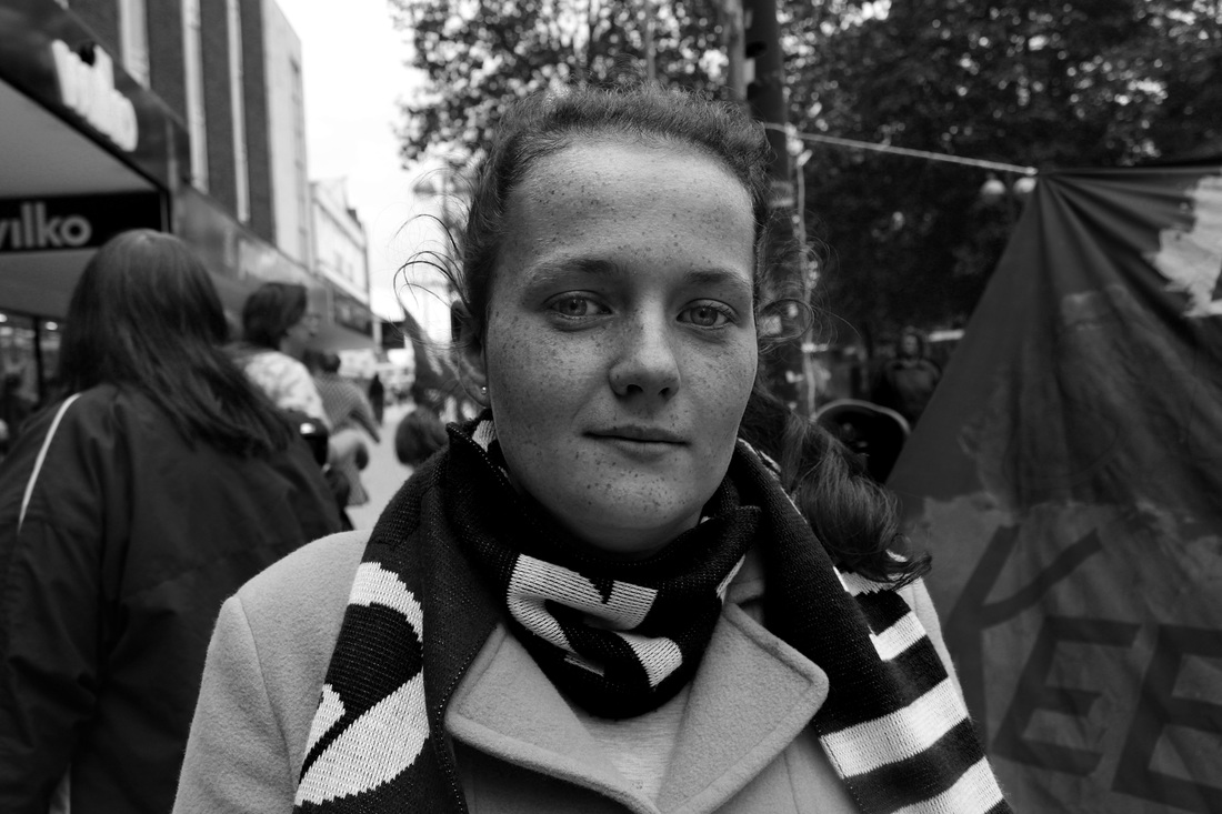
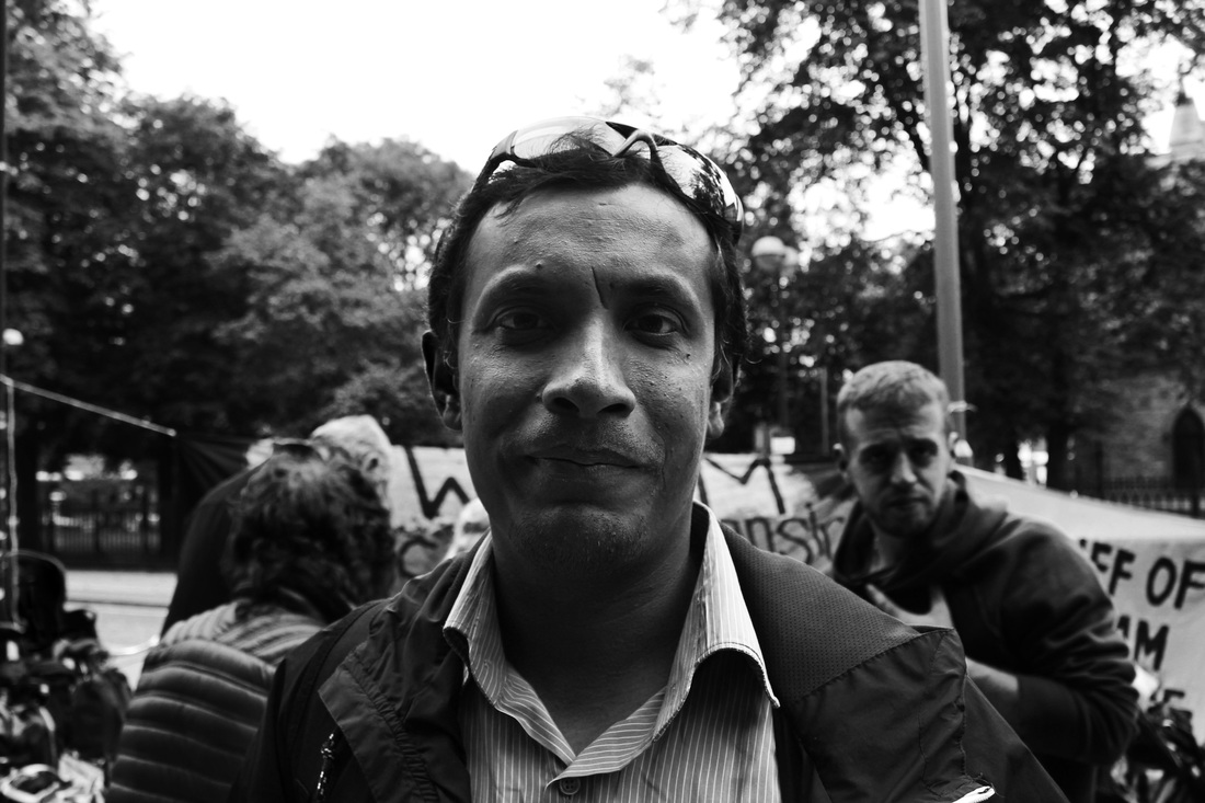
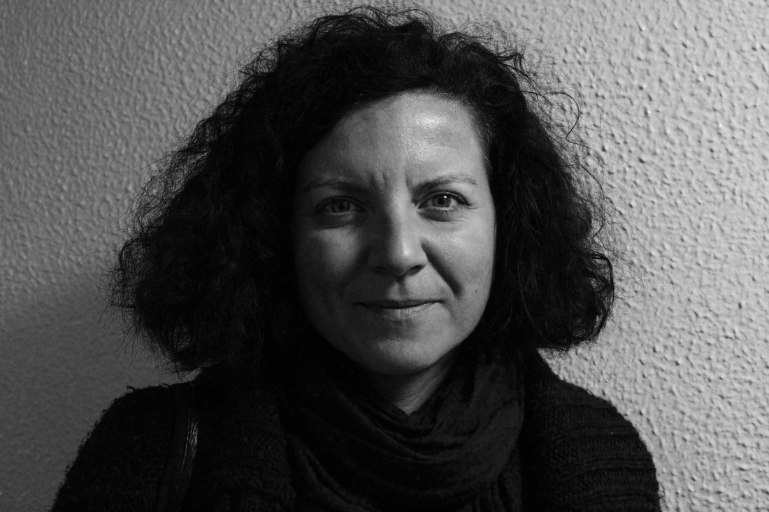
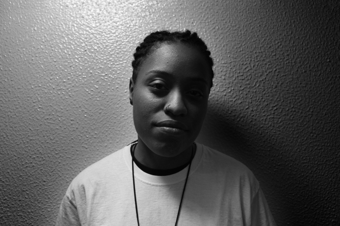
DEVELOPMENT 9: Black & White Portraits
After looking at JR’s portraits I was inspired to develop the project by making the portraits black and white. The lack of colour results in more emotive images that displays the deeper emotions of the subject. Additionally, I think that the black and white portraits create a sense of cohesion between the portraits. The portraits were create an intimate moment between the subject and the photographer. The way the in which each subject stares directly down the lens. As I had to have previously established a relationship with the subject in order to make them feel comfortable enough to take the portrait. This bond was created over a number of days or visiting the campaign stall as well as just talking to the subjects.
I think the portraits that were taken in natural light were more successful as the features of the face were more prominent. However, I thought that the portraits taken inside with the overhead lighting created shadows across the face that formed abstract shapes. To improve my images I shall increase the contrast of the image to make the facial feature more noticeable.
I think the portraits that were taken in natural light were more successful as the features of the face were more prominent. However, I thought that the portraits taken inside with the overhead lighting created shadows across the face that formed abstract shapes. To improve my images I shall increase the contrast of the image to make the facial feature more noticeable.
DEVELOPMENT 10: Audio
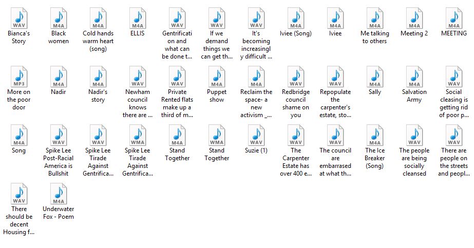
Inspired by Robert De Niro’s narration in JR’s ELLIS short film I decided to compile the audio I had recorded from my interviews with some of the E15 Campaigners. The addition of audio to my work allows the audience to have a further understanding behind the context of the series, as well as enabling them to connect with the subjects.
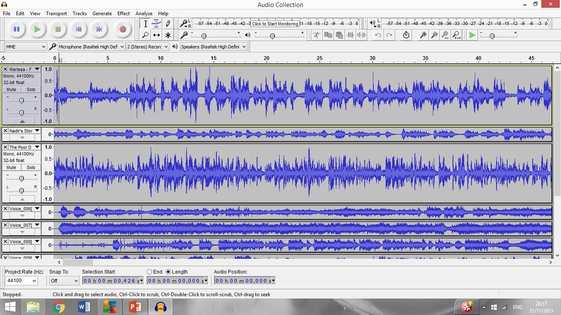
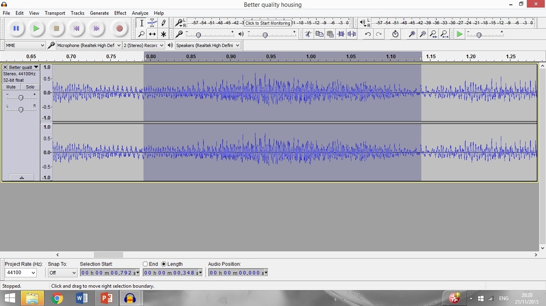
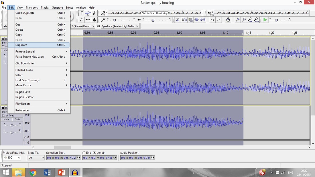
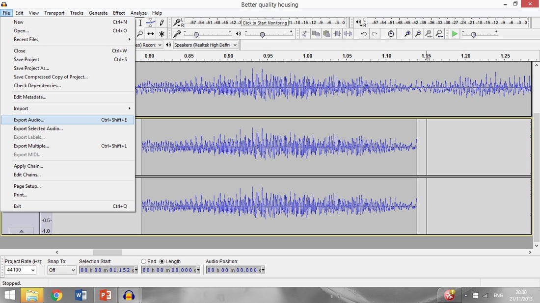
I used the Audacity software to cut and edit the audio, as to highlight key point in each interview. When editing the audio I also decrease the background sound in the interviews to refine the audio. If I were to further improve the audio I collected I would have used a better quality mic along with mic sponge cover to reduce the wind sounds. I addition I could have also interviewed passers-by who are not actively involved with the campaign to see opinions of the British housing crisis.
As well as recording the interviews I also recorded atmospheric sounds from the stall. This was because I thought that the audio could accompany the portraits, thus enabling the audience to experience the same sounds of foot traffic and chants I heard as I photographed my subjects.
To develop further I think it would be good if I combined some of the images, audio and moving images I have recorded so far in the project, as a way of presenting the progression of my journey with the campaign and understanding the British housing crisis.
DEVELOPMENT 11: Video
Again inspired by JR’s film ELLIS and continuing on from my previous response I decided to create my own short film. Returning to the Carpenters Estate, where I began the main body of my project, I recorded some moving images of the landscape. Using the Adobe Premiere Pro program I created the short film by combining both moving and still images. I chose to present all of the footage as black and white images, so that the tie in with the portraits I had previously photographed. Moreover, I think the use of black and white is symbolic of the bleak reality a lot of people face when they are forced to come to terms with their housing situation.
|
The film editing process:
|
|
The film acts as an amalgamation of what I have seen and learnt over the course of the project. The film begins with shots of the Carpenters Estate to set the scene and the progresses onto images of the Focus E15 stall along with shot of a protest I visited. To conclude the audience are shown images of some of the people I met throughout the projects, who had a large impact on its final outcome. The burst of images at the end of the video again draw the audience’s attention to the personal side of the purpose of the project, reminding them the real people are affected by the housing crisis.
The addition of audio, collected from my own interviews as well as external sources, along with fact and quotes added context to the video. To create a sense of continuity in the video I chose to add background music to the video. I used Newton Faulkner’s cover of Get Free by Major Lazer, as I felt that the lyrics of the song had significance to the content of the video.
When creating the short film I paid a lot attention to detail, especially when ensuring the the changes in the music matched the visual changes as well. If I were to improve the video I think the use a narrator, like the one used in JR’s ELLIS, would have been beneficial. I also think the the video would perhaps be improved if I followed a single individual's story rather focusing on the campaign on a more general basis.
Development Mindmap
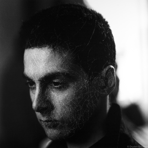
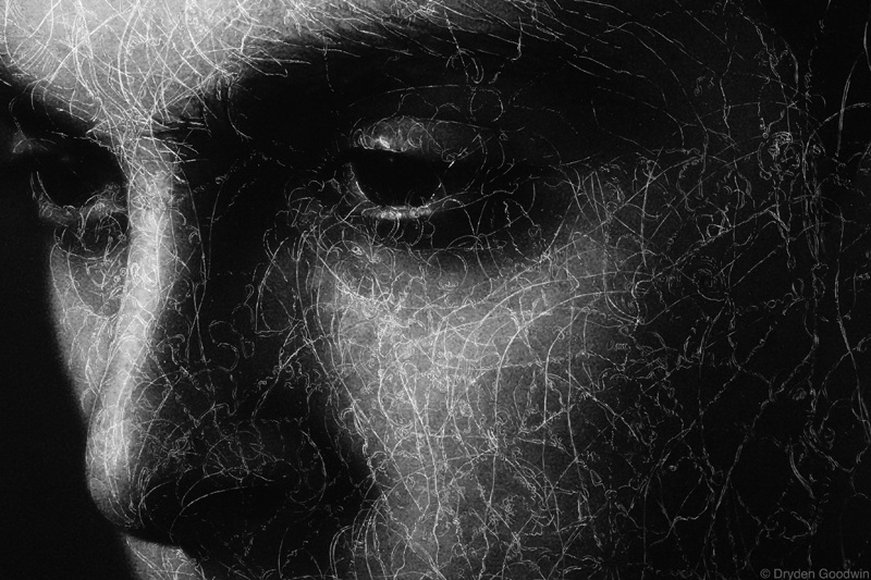
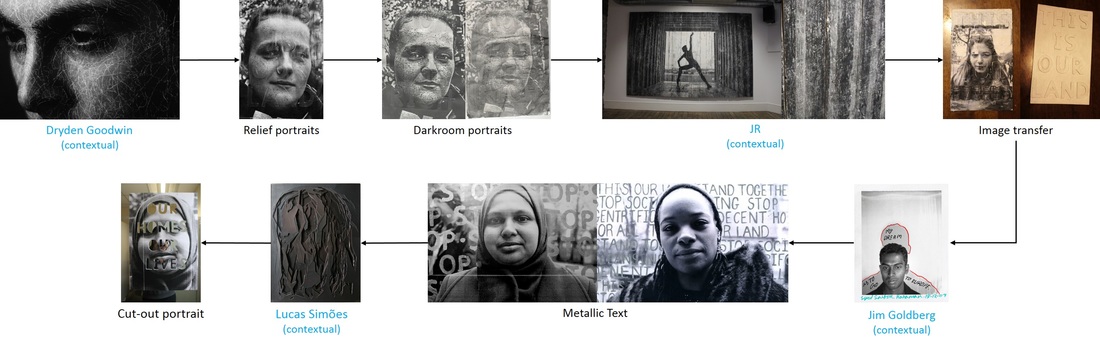
Dryden Goodwin
Dryden Goodwin is a British artist from Bournemouth. Drawing in often an integral part of Goodwin’s work, however Goodwin often combines the process with other mediums such as photography. Contemporary themes such as the city and ideas of public and private life are also heavily featured in his work. As much of the world undergoes rapid urbanisation the people who live in the city with use begin to feel more and more distant.
Though combining the modern of digital photography and the traditional process of drawing Dryden Goodwin conveys the complexities of the human mind. In his series Cradle Goodwin uses a compass to etch the spiraling lines into the surface of the images. Carved spirals are encased within the subject's cranium. Through drawing on the portraits Goodwin tries to understand the strangers in front of his lens by making the unseen visible. The style of the etching vary for each of Goodwin's subjects. The patterns are representative of the spiritual rather than scientific way in which people process their thoughts. The intricate patterns elevate the individuals above their mundane urban setting whilst also creating texture. Goodwin, also presents his work in large life-size screen based installations, thus allowing audience to analyse the finer details of the portraits. When presenting his work Goodwin also accompanies his work with soundtracks to enhance the viewing experience by engaging more than one of the sense.
Though combining the modern of digital photography and the traditional process of drawing Dryden Goodwin conveys the complexities of the human mind. In his series Cradle Goodwin uses a compass to etch the spiraling lines into the surface of the images. Carved spirals are encased within the subject's cranium. Through drawing on the portraits Goodwin tries to understand the strangers in front of his lens by making the unseen visible. The style of the etching vary for each of Goodwin's subjects. The patterns are representative of the spiritual rather than scientific way in which people process their thoughts. The intricate patterns elevate the individuals above their mundane urban setting whilst also creating texture. Goodwin, also presents his work in large life-size screen based installations, thus allowing audience to analyse the finer details of the portraits. When presenting his work Goodwin also accompanies his work with soundtracks to enhance the viewing experience by engaging more than one of the sense.
|
|
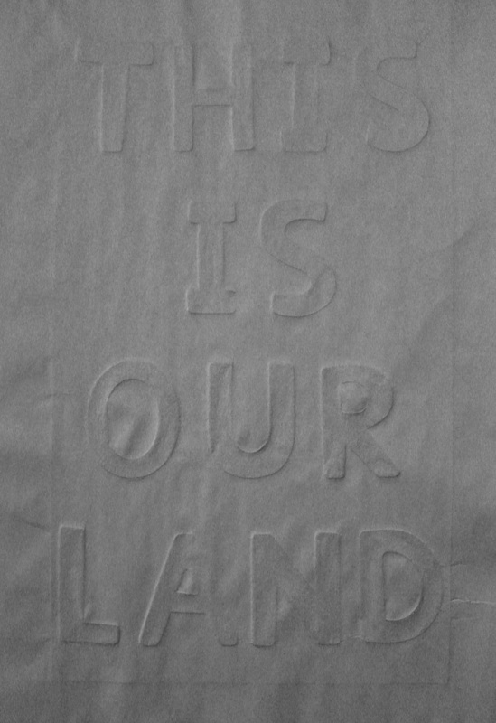
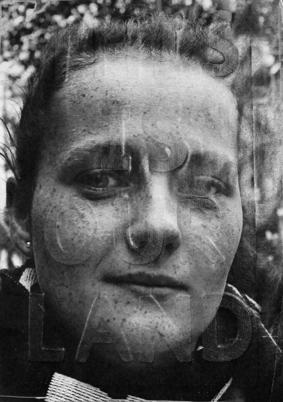
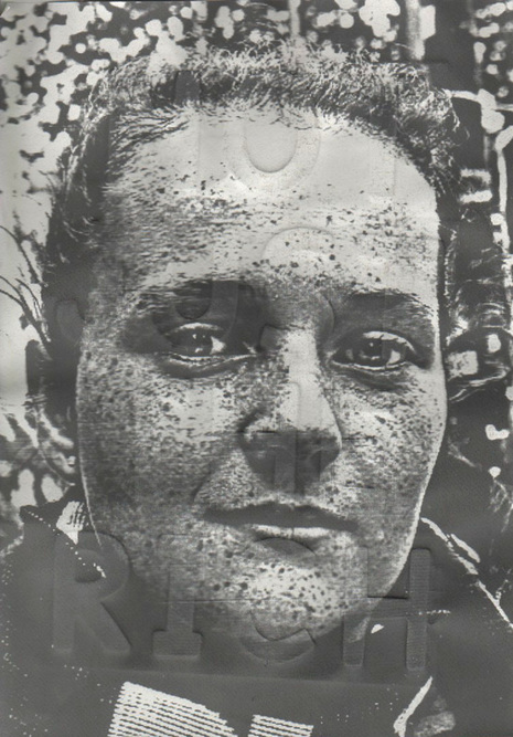
DEVELOPMENT 12: Relief Portraits
Developing from my previous response I decided to find a way to incorporate the words from the interviews and text from my research in my images. I was influenced by Jim Goldberg’s work. The text enables the audience to understand the wider context and the stories behind the series of images. The etched makes in Dryden Goodwin’s work also inspired me to add dimension to the images. Using the collograph blind printing technique to emboss the images.
To emboss the image I first started by creating the embossing plate. The wooden letters were arranged on a piece of card. Then a thin layer of PVA glue was applied to the back of the letter and placed on the card. After being left to dry the plate was left varnished, in order to seal it. A printed image of the portrait was then submerged in water until the paper was limber. The plate was then placed in the printing press with the damp image over the top. Pressure was then applied by rolling the press to emboss the image.
|
|
A problem I first encountered when embossing the image was that the image often got stuck to the plate, ripping it. In order to solve this issue a sheet of tracing paper was place between the image and the plate before putting it through the printing press.
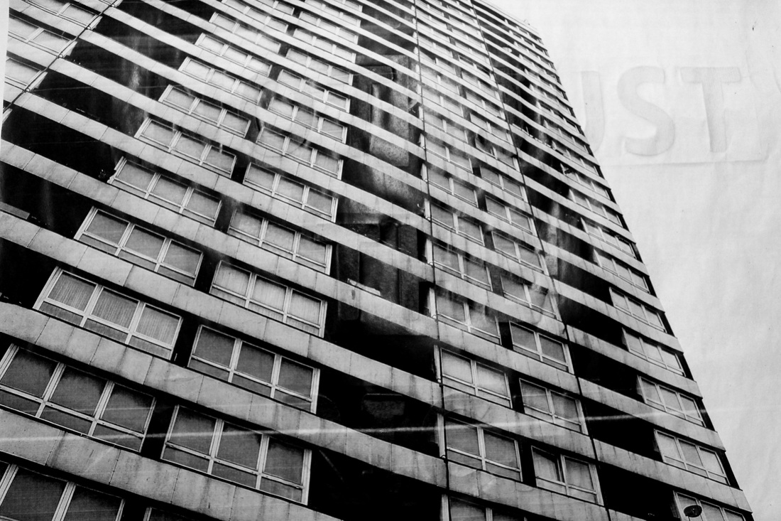
In this response I discovered that the embossed text was more prominent on the white parts of the image. In the landscape image, of the block of flats, it was difficult to see the full message. I retried the embossing process with a portrait. This time I applied more pressure when the image was in the printing press in order to make the impression deeper.
For my next response I shall continue to experiment with the idea of incorporating text into the portraits.
For my next response I shall continue to experiment with the idea of incorporating text into the portraits.
DEVELOPMENT 13: Liquid Light
Developing from my previous Relief Portrait response I continued with using the roller press to emboss my portraits. In this response I embossed the paper before printing the image onto it, I then experimented with two technique to see which one produced the highest quality image.
In both portraits I think the embossing was much more noticeable than that of the previous response. The outcome would have been improved if the embossing was reversed, allowing the words to be raised from the image rather than indented.
In both portraits I think the embossing was much more noticeable than that of the previous response. The outcome would have been improved if the embossing was reversed, allowing the words to be raised from the image rather than indented.
|
For the first method a layer on liquid light was washed onto the paper. I noticed that in the final print the application of the liquid light was uneven. This meant that when I was using a test strip it was difficult to find a suitable exposure time, resulting in inconsistencies in the exposure of the portrait. Overall I think this response was not a as successful as the second portrait.
|
For the second experimental method I used a thicker paper, which better absorbed to water prior to embossing and as a result it was more successful at holding the embossing pattern. Additionally, the greater contrast of the portrait created more of an impact, however I think the contrast was not as high as that of the laser printed images. In conclusion I think using the laser inkjet print produces high quality images.
|
DEVELOPMENT 14: Image Transfer
After my previous embossing response I continued with experimenting with methods that incorporate both text and texture into the portraits. I realised that using a roller printing press to emboss the image did not make the text prominent enough. Inspired by the texture created by pasting portraits on the wall of buildings in JR’s street art I decided to use the Image Maker paste to create a relief of the wooden letters. This method exaggerated the relief of the letters making them more visible.
The Process:
In the process of creating the relief portrait I found it difficult to create an even layer for the paste as a result of the paste getting stuck in between the letters. I think that using a thinner layer of paste would have combated the issue. In addition, I think this would have reduced the wrinkling as there would have been less excess paste.
- Use the embossing plate created from the Relief Portrait in a previous response.
- Prepare the embossing plate, clean the surface of the plate and paint it white.
- Select and print an image - if the image contains text it should be printed in reverse.
- Apply a thick layer of image maker onto the correct side of the image.
- Place the wet print paste side down onto the plate.
- Press the paper down using both hands and a rolling-pin to try to eliminate wrinkles.
- Lay a soaking wet sponge on top of the image.
- Allow the image to completely absorb the water until saturated, then leave for a few minutes.
- Rub the wet paper off of the plate with fingertips.
- Using a damp cloth to remove the fuzz.
In the process of creating the relief portrait I found it difficult to create an even layer for the paste as a result of the paste getting stuck in between the letters. I think that using a thinner layer of paste would have combated the issue. In addition, I think this would have reduced the wrinkling as there would have been less excess paste.
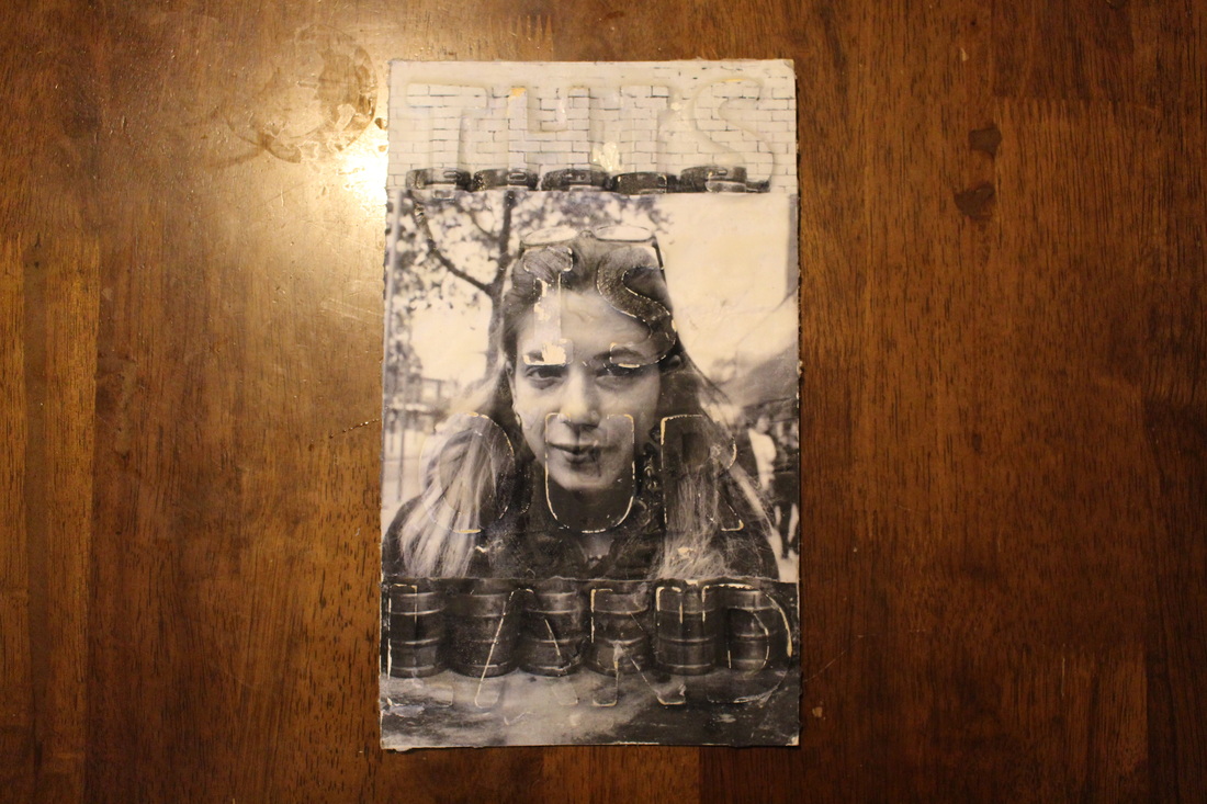
For this response I used a black and white portrait taken of a campaigner at the stall along with a landscape image taken of the estate. I created a collage using the two images. Combining both portraiture and landscape photography along with the text enables viewers to have some context about the project. Another issue I encountered was that the wooden letters did not hold the paste, consequently the print rubbed off exposing the wood underneath. However, I think that this effect was reminiscent of the texture of the brick or wood coming through in some JR’s work.
For my next response I think that I shall continue using text in my work, but perhaps not in this style as I found that placing the wooden letters directly beneath the portraits detracted attention from the subjects. Using a larger scale for my next response would improve the outcome of the response.
For my next response I think that I shall continue using text in my work, but perhaps not in this style as I found that placing the wooden letters directly beneath the portraits detracted attention from the subjects. Using a larger scale for my next response would improve the outcome of the response.
Jim Goldberg
In his Polaroid portraits of displaced or forgotten people, living on the fringes of society, Goldberg encourages his subjects to participate in the photograph making process by letting them divulge something personal. Using the cinéma vérité approach, which uses the camera to reveal topics hidden by reality, as part of the social aims movement. Goldberg’s work testifies the power of photography when it is used to address broad and cultural issues.
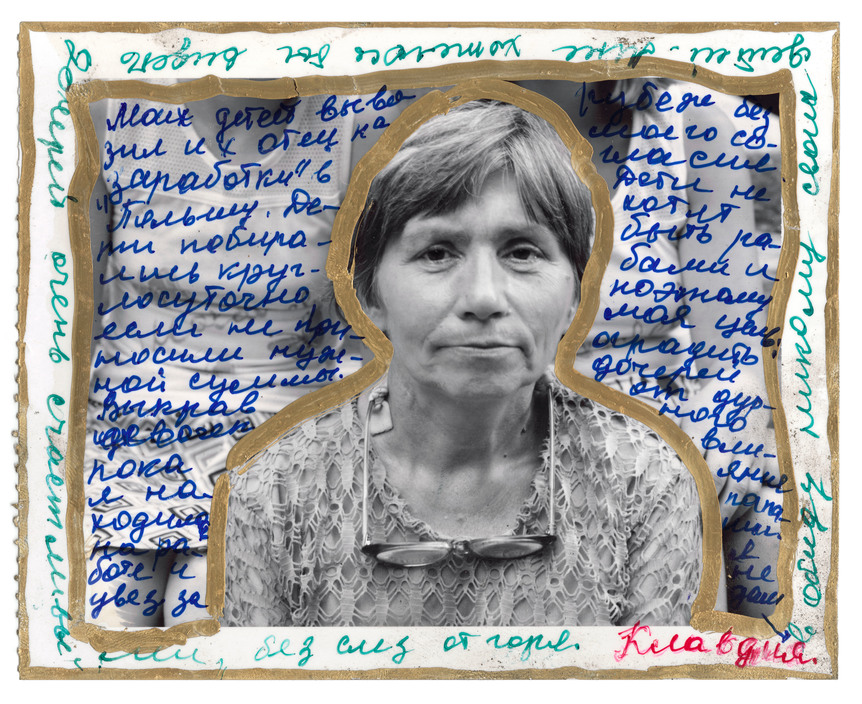
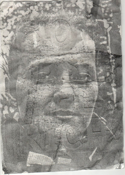
DEVELOPMENT 15: Metallic Writting
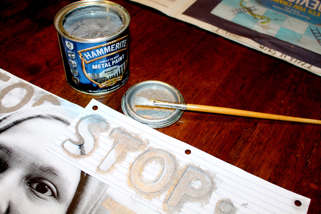
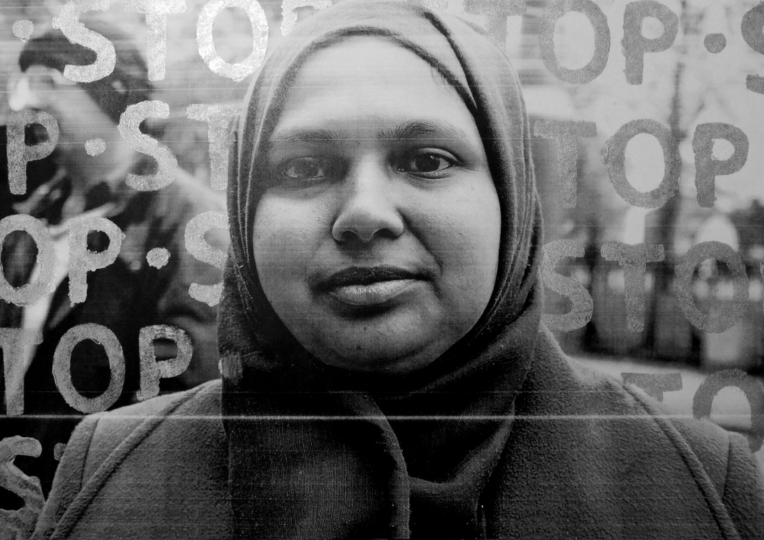
After the relief portraits response I decided to use the same letters I had used to make the plates, however, this time I used the letters to make stencils. Metallic paint was then applied and left to dry. The paint was applied in a way so that the subject still stood out amongst the text.
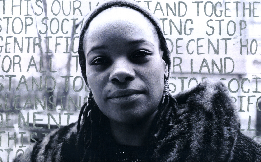
I also tried another method where I dipped a pencil into the metallic paint, then the phrases we applied directly onto the portraits. However, this process was much more time consuming. In addition, the results of the process were less consistent. I found that this process enabled me to fit more information onto each portrait.
I found that scanning the final images in comparison to re-photographing them meant the quality was better. However, I found that once they were scanned the portraits lost their reflective quality. Like Goodwin’s work from Cradle the metallic paint added another dimension to the portraits. Looking at the painted images from different angles is interesting as it allows the words to glimmer as the paint catches the light, making the text stand out whist still drawing most of the audience’s attention to the subject.
I found that scanning the final images in comparison to re-photographing them meant the quality was better. However, I found that once they were scanned the portraits lost their reflective quality. Like Goodwin’s work from Cradle the metallic paint added another dimension to the portraits. Looking at the painted images from different angles is interesting as it allows the words to glimmer as the paint catches the light, making the text stand out whist still drawing most of the audience’s attention to the subject.
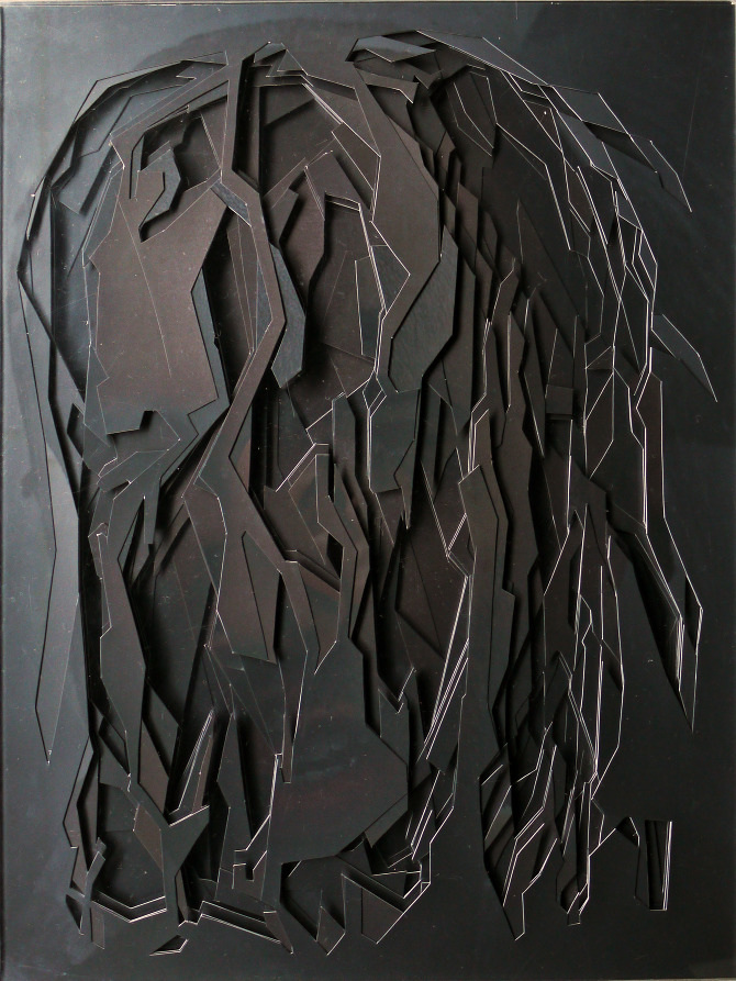
Lucas Simões
Lucas Simões is an independent Brazilian artist, based in São Paulo. Simões background in architecture redefined his perceptions of art, influencing his approach to sculpting and collaging. In his work he uses a variety of materials including maps, book and photographs. Simões de-constructs his work, putting it through process of cuts and fold to produce fragmented portraits. The intention behind the work is to change the original meanings of the portraits by presenting them in a new way. The work juxtaposes different themes, such as strangeness and beauty. On his website Simões stated that “strangeness is something that fascinates me, and to make it beautiful is even better.”
In Simões’ series Desretratos (unportraits) he invites ten of his close friends to tell him a secret as he photographed them. In addition, he also asked them to choose a song for him to listen to. The tone of the song along with the colour his subjects had said their secrets were influenced how Simões cut the portrait. Simões then used the song lyrics to caption his portraits Rather than listening his subjects secrets Simões focused on capturing their expressions. Again like Jim Goldberg Simões allows his subjects to have some sort of input into their portraits.
In Simões’ series Desretratos (unportraits) he invites ten of his close friends to tell him a secret as he photographed them. In addition, he also asked them to choose a song for him to listen to. The tone of the song along with the colour his subjects had said their secrets were influenced how Simões cut the portrait. Simões then used the song lyrics to caption his portraits Rather than listening his subjects secrets Simões focused on capturing their expressions. Again like Jim Goldberg Simões allows his subjects to have some sort of input into their portraits.
|
The song that dies in the air
"Die in the air A song of rest A rest so serene So quiet passion Plays in the air A stick with goodbye My eyes are your eyes To get us ... " |
After changing the colour of the portraits, using the colours given to him by his subjects and then deconstructing the portraits by cutting them. The different layers were then individually sandwiched between layers of transparent acrylic sheets, to create multidimensional portraits. Simões’ work is not confined to a singular dimension. The depth created has a topographic aesthetic. The geometric shapes made by the cut-outs abstracted the subject’s identities. It is interesting that even where the portraits are destroyed there are still elements of familiarity.
In the portrait captioned “the song that dies in the air” the shape of the cuts along with grey tone of the image creates a somber atmosphere. The lyrics of the song add to the melancholy nature of the image.
In the portrait captioned “the song that dies in the air” the shape of the cuts along with grey tone of the image creates a somber atmosphere. The lyrics of the song add to the melancholy nature of the image.
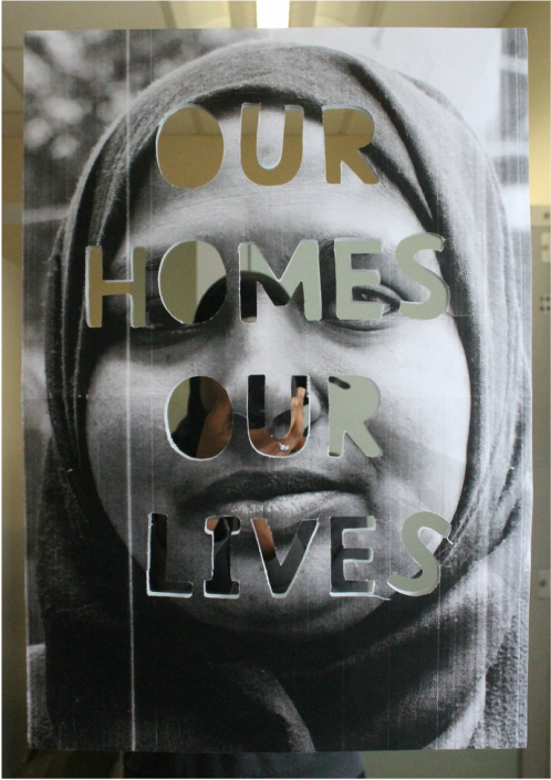
DEVELOPMENT 16: Cut-out portrait
|
Developing from my previous response and after looking at Lucas Simões’ Desretratos I created a cut-out text into a portrait, experimenting with using cut-outs rather than paint to combine text and image. To create the cut-outs I began by using the wooden letters to as stencils to create outlines of the words on the portrait. I then used a scalpel, with a cutting mat, to cut out the letters. To present the portrait I attached the image to a mirror. The effect created by this enables viewers to see their reflection within the work itself. The fact that a viewer can see themselves in the words in the portrait state ‘Our homes, our lives’ creates a connection between the subject and the viewer, as well as involving them in the cause behind as the are able to put themselves in the subject’s perspective. A downside of the portrait I created was that the cut-outs covered the subject’s eyes, resulting in a lack of eye contact. In addition, to improve the quality of the portrait a laser cutter could have been used, this would have also reduced the risk of the portrait. |
|
Development Mindmap: Portraits
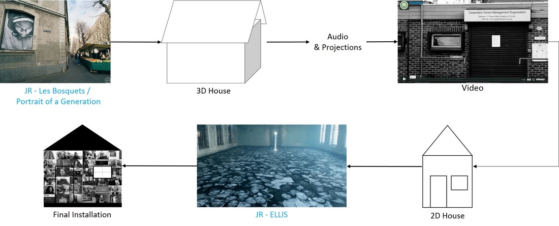
DEVELOPMENT 17: MDF house
Laser-cut Stencils
Developing from a previous response where I suggested that using a laser cutter to create stencils would improve the quality of the print, I used a laser cutter to cut-out the silhouettes of phrase that I had both heard and seen in the time I spent following the campaign.
To create the stencils I began by importing the phrases into 2D Design Tool, where I then exploded to letters to create their silhouettes. Using the laser cutter I cut the outline of letters out on a sheet of card.
To create the stencils I began by importing the phrases into 2D Design Tool, where I then exploded to letters to create their silhouettes. Using the laser cutter I cut the outline of letters out on a sheet of card.
2D House Structure
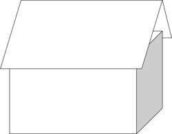
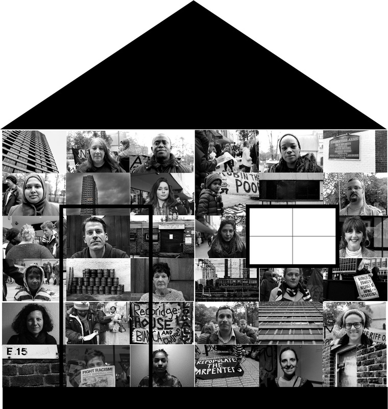
After looking at JR's use of fly-posting his portraits I was inspired to present my portraits in a way that encompassed the idea of London's housing crisis. This brought me to the idea of bring silhouette of a clip art house into the exhibition space, without minimising the scale. Like in JR's Les Bosquests the portraits were l be pasted onto the surface of the house.
The silhouette is symbolic of the British housing crisis, it represents those who have lost are being threatened of losing their home. The idea of using the silhouette was to illustrate the number of vacant house that are more suitable for accommodation in comparison to some temporary accommodation some people are forced to live in.
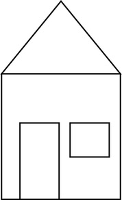
Initially I had the idea of building a three-dimensional MDF structure that resembles a house with an iconic pitched-roof, as shown in the adjacent diagram, measuring at approximately 8ft x 8ft x 8ft. The aim of the structure was to allow an audience to see the numerous portraits on the shell of the house but then also be able to become a part of the installation by being able to walk into the house. Inside the house the audience will be told personal stories stories in an intimate setting. A video will then be projected on the interior wall of the house, like Dryden Goodwin's 14x Woman, the work will stimulate audience's senses. However, due to time constraints and limitations in the availability of material. As a result I was forced to downsize my final piece, creating a two-dimensional rather than a three-dimensional structure.
The silhouette is symbolic of the British housing crisis, it represents those who have lost are being threatened of losing their home. The idea of using the silhouette was to illustrate the number of vacant house that are more suitable for accommodation in comparison to some temporary accommodation some people are forced to live in.
Initially I had the idea of building a three-dimensional MDF structure that resembles a house with an iconic pitched-roof, as shown in the adjacent diagram, measuring at approximately 8ft x 8ft x 8ft. The aim of the structure was to allow an audience to see the numerous portraits on the shell of the house but then also be able to become a part of the installation by being able to walk into the house. Inside the house the audience will be told personal stories stories in an intimate setting. A video will then be projected on the interior wall of the house, like Dryden Goodwin's 14x Woman, the work will stimulate audience's senses. However, due to time constraints and limitations in the availability of material. As a result I was forced to downsize my final piece, creating a two-dimensional rather than a three-dimensional structure.
For the shape of the two-dimensional house I drew inspiration from a concert stage prop, to keep the impact of the piece I kept the large-scale nature that I had seen in JR’s portraits. Initially I had the idea of using scrap material collected from demolition and construction sites to play of the fact that houses are being torn down and new luxury houses built yet there are still many without a home. In the end I resulted in using two 8ft x 4ft MDF panels to construct the structure. The final structure measures at 8ft x 8ft.
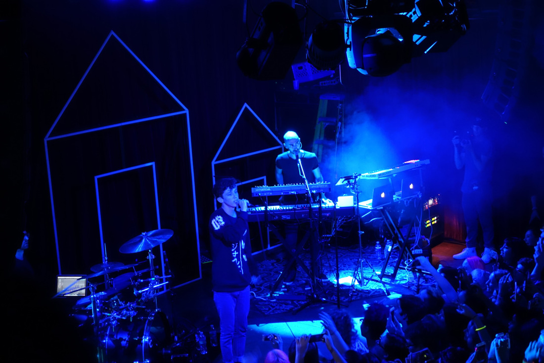
Troye Sivan Blue Neighbourhood Concert
|
|
To incorporate the video I had created in a previous response, using a jig saw a window was cut out of one of the panels. The monitor screen was then placed inside the window, as the video provide context for the structure. I decided that projecting the video on to the house, which was an idea that I had previous considered, would not be feasible as the room would need to be dark and the audience would consequently be unable to see the portraits. The moving stills along with sounds enable the audience to join me on my journey as I followed the campaigners.
To integrate both the wooden letters and the stencilling I had used in previous response I filled the the black spaces of the house with repetitive metallic stencilling. I felt the metallic paint used complemented the grey-scale images presented in the main body of the structure. For the words I used in the stencilling I took phrases and statements I had seen on some of the campaign banners as well as things I had heard when interviewing subjects.
To add texture to the otherwise flat surface I glued the wooden letters to the roof of the house before painting them black, to camouflage them with the background. Overlaying the silver paint over the wooden letters made the letter beneath it prominent.
To add texture to the otherwise flat surface I glued the wooden letters to the roof of the house before painting them black, to camouflage them with the background. Overlaying the silver paint over the wooden letters made the letter beneath it prominent.
Development Mindmap: Presentation