Relationships
|
To start off my Relationships project I used a short film, created by the film-maker Daniel Mercadante, which consisted of a series of images that displayed the images between two objects. In the film Mercadante presents to thing side by side, enabling the audience to see the relationships between these two everyday occurrences. The objects show relationships between things that are opposites, for instance day and night or life and death, whilst other pairs show the relationship between objects that are similar like peanut butter and jam, which are both spreads. Other relationships that where also shown were accompanying objects, for example popcorn and the cinema or a padlock and a key. These relationships are more about the activities particular objects are associated. Some relationships on the other hand are abstract and can be harder to see. For instance, a glass filled halfway could be perceived to either half empty or half full. Therefore the nature of a relationship is not necessarily fixed, but is there to be interpreted by a view. There are multitude of relationship, in this project it will be interesting to explore the different types of relationships.
|
Objects shown:
|
Response
In response to Daniel Mercadante's short video I created a collection of images that also illustrated some of the relationships depicted in Mercadante's video.
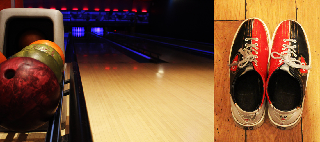
When presenting one of my images I chose to present it in the same format as the images shown in the video. This allowed viewed to clearly see that there was a relationship between the object and the environment depicted on the images. When photographing the bowling alley I chose to shoot it from a low angle in order to try and capture the entire space. Whilst the bowling alley featured as the backdrop the main subject in the image was bowling balls. The image features a large amount of negative space surrounding the bowling balls. Then when photographing the bowling shoes I choose a simple composition, with the shoes filling the majority of the frame. Contrasting the composition of the images and placing them adjacent to one another balanced the two image, making them more aesthetically pleasing. Additionally, I think that using a more square shaped frame for the image of the shoes complemented the larger and wider framed bowling alley.
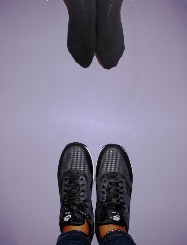
For my second piece I chose to continue to use the theme of shoes. However, instead of photographing a specific type of shoe I chose to look at shoes in a more general sense. Shoes are an item of clothing that protect the feet. The creation of shoes also illustrates the advances an evolution of mankind. When editing the image I used photoshop to combine the two images, by using the auto lend function , to try to create a seamless image that looked as if it had never been two separate images.
To many nowadays shoes are considered to be a necessity there was once a time when they didn't exist. The purpose of presenting feet with trainers along with bare feet is to make a viewer think back to a time when humans didn't wear shoes.
Another idea I tried to conceive through the image was the idea of poverty. The fact that both pairs of feet are shown in the same background together shows that whilst some people possess multiple pairs of shoes there are still people on the same planet that may not even possess a single pair of shoes. Though the use a single image I found it fascinating that I was able to convey such a striking message to a viewer.
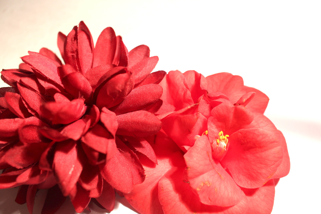
In the third image I created in response to Daniel Mercadante's short video I decided to present the relationship between two opposite in one image. In the image two flowers were shown together. Although, both flowers are similar in appearance one factor that separates the two is that one is fake while the other is real. The grains of the fabric in the fake flower contrasts with the silky textured petals on the real flower. In addition, to comparing the textures of the flowers themselves it was also interesting to look at the relationship between real and fake objects. The idea of immortality is materialised through the use of the fake flower, whilst the real flower starts to brown and it withers away the vibrancy of the fake flower is preserved. Even though the one of the aims of creating the image was attractive photograph I also tried to convey the idea of the unattainable beauty that is created by fakery.
When presenting one of my images I chose to present it in the same format as the images shown in the video. This allowed viewed to clearly see that there was a relationship between the object and the environment depicted on the images. When photographing the bowling alley I chose to shoot it from a low angle in order to try and capture the entire space. Whilst the bowling alley featured as the backdrop the main subject in the image was bowling balls. The image features a large amount of negative space surrounding the bowling balls. Then when photographing the bowling shoes I choose a simple composition, with the shoes filling the majority of the frame. Contrasting the composition of the images and placing them adjacent to one another balanced the two image, making them more aesthetically pleasing. Additionally, I think that using a more square shaped frame for the image of the shoes complemented the larger and wider framed bowling alley.
For my second piece I chose to continue to use the theme of shoes. However, instead of photographing a specific type of shoe I chose to look at shoes in a more general sense. Shoes are an item of clothing that protect the feet. The creation of shoes also illustrates the advances an evolution of mankind. When editing the image I used photoshop to combine the two images, by using the auto lend function , to try to create a seamless image that looked as if it had never been two separate images.
To many nowadays shoes are considered to be a necessity there was once a time when they didn't exist. The purpose of presenting feet with trainers along with bare feet is to make a viewer think back to a time when humans didn't wear shoes.
Another idea I tried to conceive through the image was the idea of poverty. The fact that both pairs of feet are shown in the same background together shows that whilst some people possess multiple pairs of shoes there are still people on the same planet that may not even possess a single pair of shoes. Though the use a single image I found it fascinating that I was able to convey such a striking message to a viewer.
In the third image I created in response to Daniel Mercadante's short video I decided to present the relationship between two opposite in one image. In the image two flowers were shown together. Although, both flowers are similar in appearance one factor that separates the two is that one is fake while the other is real. The grains of the fabric in the fake flower contrasts with the silky textured petals on the real flower. In addition, to comparing the textures of the flowers themselves it was also interesting to look at the relationship between real and fake objects. The idea of immortality is materialised through the use of the fake flower, whilst the real flower starts to brown and it withers away the vibrancy of the fake flower is preserved. Even though the one of the aims of creating the image was attractive photograph I also tried to convey the idea of the unattainable beauty that is created by fakery.
Altering Context
Guy Catling
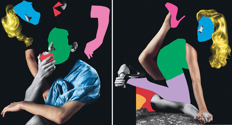
Guy Catling, a graphic designer from Essex, creates work that is heavily focused on collages. Catling use both digital methods, like editing photographs using editing software as well as manual methods, for example create collages by hand using scalpels and paper, to produce his work. Carling's methods to create his work breathes new life into the old photographs, refreshing them.
The use of clashing prints, bright colours and floral prints in his work creates edgy pop-art collages. The addition of small pockets of colour to the black and white images completely changes the dynamic of the image, giving them new meanings. Catling uses layers of floral prints, these feature as a recurring motif in Catling's images, softening up the photographs, and adding a feminine touch. The juxtaposing of the elegant floral patterns in the same frames as war images puts a delicate touch to otherwise strong and masculine photographs. This almost makes the idea of war seem less scary and daunting.
In their original forms the have no connection with viewers as they do not know who the subjects in the images are, or the stories behind the images. In addition, prior to the patterns and colour added the image appear mundane and do not have much aesthetic appeal to them.
The old black and white images are brought up to date by the addition of colour. In the modern world many people are interested in studying old images and bring them to life. The combination of old and new processes, for example black and white photographs with digital editing software, adds a youthful contrast of colour and patterns to the old monochrome photographs. The images are transformed from being serious and bland into becoming striking and pleasant to look at. Catling draws his inspiration for the foundations of his images from his surroundings, friends and vintage war photographs. The images of military men in battlefields wearing floral uniforms and helmets makes an interesting mix for viewers. As well as vintage war photos Catling also uses the vintage portraits of gentlemen and New York businessmen, enhancing the images by draping them in vibrant patterns. In these images the prints creating new sides to the character of the subjects.
One of the images created by Catling that I particularly liked was the image of the coloured faces. Despite the fact that as viewers we are deprived the chance to see the faces of the men we are still able to see their individual characters through their body language. The lack of facial expression forces the audience to look at their body language and their environment. The solid colour used to conceal the subject's faces almost acts as an amplifier to the characters of them men, bring out the fact that although their poses and stances may be similar their personalities are unique. The portrait of the dapper gentleman in the cape was also an image that I found interesting. Draping the subject with a floral motif created a connection that would not have otherwise been there. The complementary colours of the two patterns lightens the tone of the portrait, making the subject seem cheerful, and thus more relatable. Another image that I also enjoyed was Catling's image of the New York skyline. The supplement of the cream and pink floral pattern to the masculine skyline softens up the landscape. The patterns makes what was initially an unattractive urban landscape look more appealing. The two tallest towers in city skyline no longer stand out for just being the tallest are also prominent due to decorative pattern. The flowery pattern that dresses the building also creates a feminine aspect to the somewhat manly corporate world of New York.
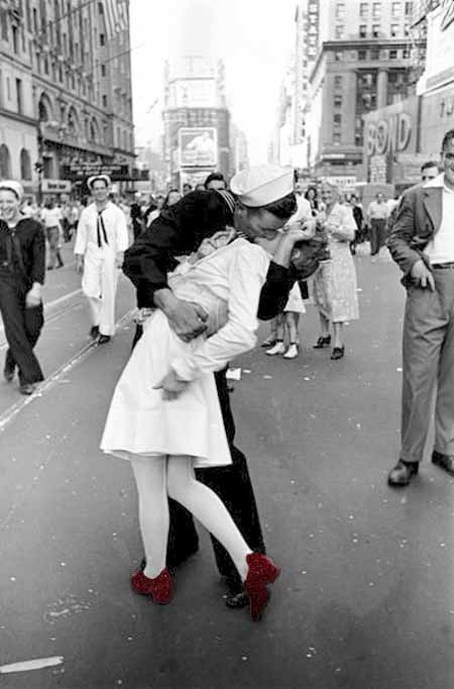
In some piece of his work rather than using a graphic floral designs Catling using the photograph's of floral fabrics. The woven texture of the fabric adds an additional texture, as well as the colour and design, to the images. When viewed in depth and close up the strands of the fabric can be seen, lifting the image into three dimensions and making it more realistic to look at. This influenced me in the process of manipulating Alfred Eisenstaedt's famous V-J image. Rather than using a floral prints I chose to use a red glittery texture, enhancing the photograph.
The use of clashing prints, bright colours and floral prints in his work creates edgy pop-art collages. The addition of small pockets of colour to the black and white images completely changes the dynamic of the image, giving them new meanings. Catling uses layers of floral prints, these feature as a recurring motif in Catling's images, softening up the photographs, and adding a feminine touch. The juxtaposing of the elegant floral patterns in the same frames as war images puts a delicate touch to otherwise strong and masculine photographs. This almost makes the idea of war seem less scary and daunting.
In their original forms the have no connection with viewers as they do not know who the subjects in the images are, or the stories behind the images. In addition, prior to the patterns and colour added the image appear mundane and do not have much aesthetic appeal to them.
The old black and white images are brought up to date by the addition of colour. In the modern world many people are interested in studying old images and bring them to life. The combination of old and new processes, for example black and white photographs with digital editing software, adds a youthful contrast of colour and patterns to the old monochrome photographs. The images are transformed from being serious and bland into becoming striking and pleasant to look at. Catling draws his inspiration for the foundations of his images from his surroundings, friends and vintage war photographs. The images of military men in battlefields wearing floral uniforms and helmets makes an interesting mix for viewers. As well as vintage war photos Catling also uses the vintage portraits of gentlemen and New York businessmen, enhancing the images by draping them in vibrant patterns. In these images the prints creating new sides to the character of the subjects.
One of the images created by Catling that I particularly liked was the image of the coloured faces. Despite the fact that as viewers we are deprived the chance to see the faces of the men we are still able to see their individual characters through their body language. The lack of facial expression forces the audience to look at their body language and their environment. The solid colour used to conceal the subject's faces almost acts as an amplifier to the characters of them men, bring out the fact that although their poses and stances may be similar their personalities are unique. The portrait of the dapper gentleman in the cape was also an image that I found interesting. Draping the subject with a floral motif created a connection that would not have otherwise been there. The complementary colours of the two patterns lightens the tone of the portrait, making the subject seem cheerful, and thus more relatable. Another image that I also enjoyed was Catling's image of the New York skyline. The supplement of the cream and pink floral pattern to the masculine skyline softens up the landscape. The patterns makes what was initially an unattractive urban landscape look more appealing. The two tallest towers in city skyline no longer stand out for just being the tallest are also prominent due to decorative pattern. The flowery pattern that dresses the building also creates a feminine aspect to the somewhat manly corporate world of New York.
In some piece of his work rather than using a graphic floral designs Catling using the photograph's of floral fabrics. The woven texture of the fabric adds an additional texture, as well as the colour and design, to the images. When viewed in depth and close up the strands of the fabric can be seen, lifting the image into three dimensions and making it more realistic to look at. This influenced me in the process of manipulating Alfred Eisenstaedt's famous V-J image. Rather than using a floral prints I chose to use a red glittery texture, enhancing the photograph.
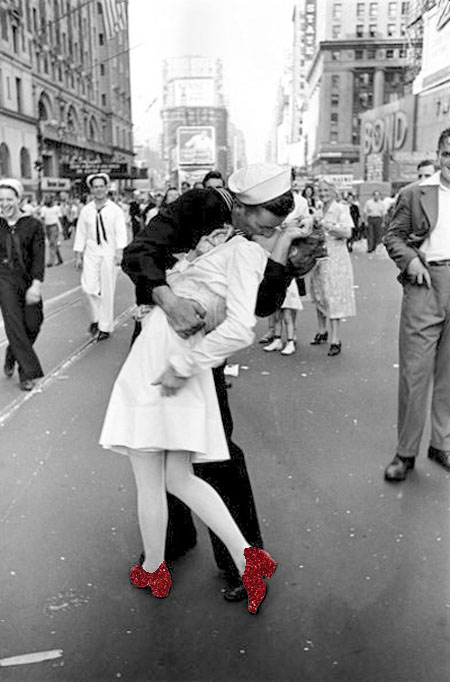
V-J Day - Alfred Eisenstaedt
|
Influenced by Guy Catling's use of old vintage photographs to combine them with patterned prints to produces a digital photographic collages I used Alfred Eisenstaedt's famous V-J day kiss photograph to respond to his work. When editing this image I felt that using colours that were too bold would detract from the beauty within the composition of the image. In the creation of this piece I used the children's story of 'The Wizard of Oz' as inspiration, using the idea and symbolic nature of the ruby slippers. Placing the slippers on the female subject in the photograph refers to the fact that she can now feel at home and relaxed in the arms of her lover. This idea is also connected to the fact that once the war was over everyone was able to be comfortable and at ease.
To create the image I used a background image of red glitter, that I found on the internet, to add humour to the image. Using the magnetic lasso tool I removed the silhouette of the shoes. After that I placed the glitter background on a new layer behind the original image. One problem I noticed after doing this was that the shoes stood out and looked oddly out of place. To resolve this I used the gradient bucket tool, with a transparent foreground and black background, to apply a shadow to both of the shoes. As a result of this the appearance of the shoes looked more realistic and 3D. After that, I used the smudge tool to tidy up the image by removing the halo around the shoe, caused by the magnetic lasso. Overall I think that this enhances Eisenstaedt's original image, whilst adding an additional meaning. |
Through adding the element of red glitter to the monochrome photograph brings the image into the 21st century. Rather than just editing in colour to the famous image I also chose to add texture, after being inspired by the faint woven textures visible in some of Catling's work. However, one issue I found when editing the image was that the image quality of the glitter background decreased as I edited it. The injection of the vibrant red into the image also infuses more passion.

Hayley Warnham
In the series 'Everything is Beautiful' Hayley Warnham transforms old family photographs that were taken by Warnham's Granddad. The grey-scale images features scenes of a traditional British family seaside holiday giving the series a nostalgic feel, the artist's mum even appears in some of the images making the images even more personal. To enhance her photograph's Warnham uses flat coloured shapes to create collages using the bold silhouettes of subjects in the image. Creating the collages enables Warnham to have the ability to build up the collages and strip it down if she wants. The fact that Warnham digitally edits her images allows her to have the freedom of exploring with the composition of the collages. Working digitally also means that the precious photographs that hold sentimental value are not damaged.
Where the vivid colour applied to the images using the digital editing software contrasts with the lower quality of the original photographs. Colouring silhouettes in the vintage photograph's inject a sense of new found life into them, whilst also highlighting particular aspects in each frame. It is interesting to see how filling the silhouettes provide a new perspective on how a spectator may view the series depicting the great British seaside holiday. Bright colours illustrate the difference between the two eras and societies attitudes. Nowadays a lot of people may look down on a British seaside holiday as it is not considered to be exciting or exotic enough. The lack of texture produced by the solid walls of colour also create another interesting aspect as the flat colour act as a good comparison to print of the vintage 1950's photographs.
Where the vivid colour applied to the images using the digital editing software contrasts with the lower quality of the original photographs. Colouring silhouettes in the vintage photograph's inject a sense of new found life into them, whilst also highlighting particular aspects in each frame. It is interesting to see how filling the silhouettes provide a new perspective on how a spectator may view the series depicting the great British seaside holiday. Bright colours illustrate the difference between the two eras and societies attitudes. Nowadays a lot of people may look down on a British seaside holiday as it is not considered to be exciting or exotic enough. The lack of texture produced by the solid walls of colour also create another interesting aspect as the flat colour act as a good comparison to print of the vintage 1950's photographs.
|
From these series of photographs the one I took a liking to the most was the the image of a pair of children sitting on one of the fountains at Trafalgar Square. On aspect that I enjoyed about it the most was that it was reminiscent of my own childhood. Personally, the image took me back to spending days out in the summer with my family. The use of the colour to block out the details of the figures means that as an audience we are able to substitute our selves along with our own memories into the photograph, making it relatable. The overall use of flat colour that is found in the series reminds me of the work of John Baldesarri.
|
John Baldesarri
|
Whilst flat colour was used to conceal the details in the figures in some of the images it was also used to conceal the details in a skyline. The lack of details in the city skyline means that the location is kept unknown, thus making anywhere. Viewers are able to interact with the image through making their own personal connections and deciding where the image was taken. In addition, the vibrant colours used to cover the skyscrapers almost glamorises that landscape, emphasising the appeal of cities. It is intriguing to try and think what are the details behind the mysterious blocks of colour.
Response: The Beatles American Invasion
The inspiration behind the images I created was the work of both John Baldesarri and Hayley Warnham. Both Baldesarri and Warnham used flat colour to highlight aspects of the image, bring new meaning to them. An image that influenced a lot me when editing the photograph was Warnham's image of the boy standing in front of a pool. From looking at the image it made me realise how much an image could be lifted by simply adding a large amount of colour to one section of the image. This was an idea I hoped to use when editing the image I found that showed the invasion of the Beatles in America. Although both photographers use flat colour I decided to use textured background images as I found the added a greater impact, and provided me with the message I wanted to convey.
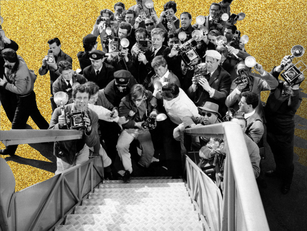
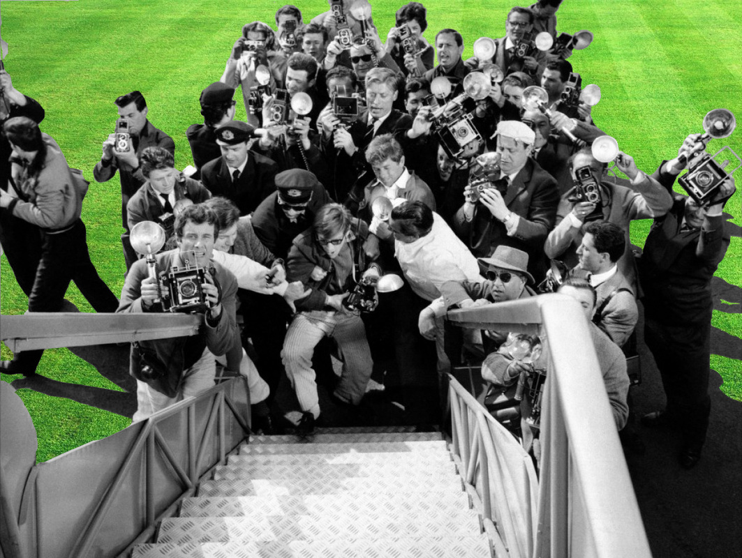
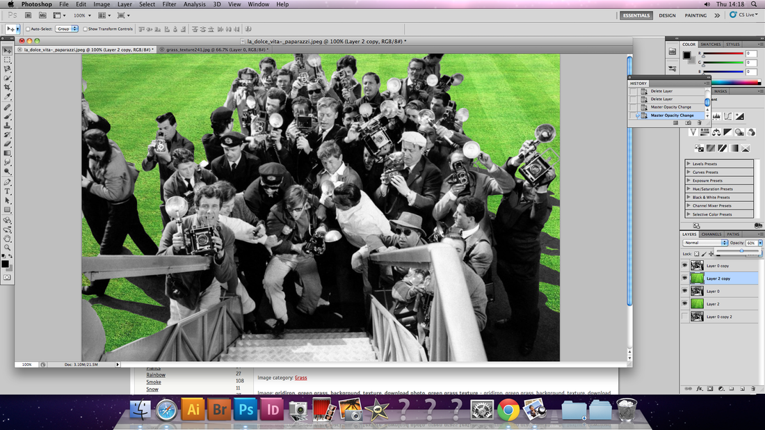
Like Warnham I used a old image, that I did not take myself, to recreate a moment in the past. The image depicts a scene where dozen of paparazzi stand in front of the stairs of a plane as the Beatles descend. The photograph was taken at the peak of Beatlemania in 1964 and illustrates the huge influence the band had on world pop culture. The purpose of editing the image for me was to bring relevance back to image and illustrate for a new generation the profound impact the Beatles had globally. In addition, when creating the image I wanted people in an audience of today to think back to the brighter time in the world's history and an era where experimentation was celebrated by a dynamic subculture, that may not have been illustrate in the original image.
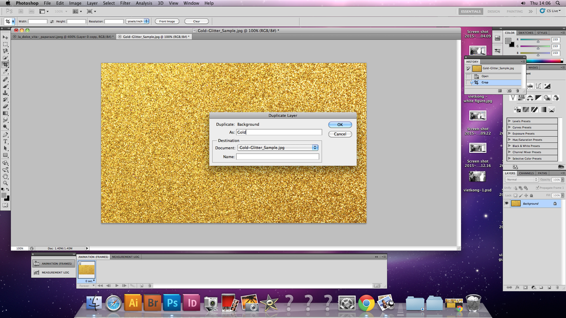
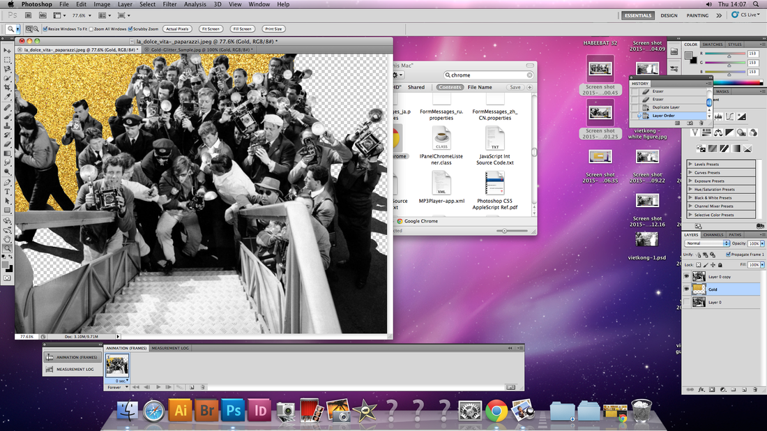
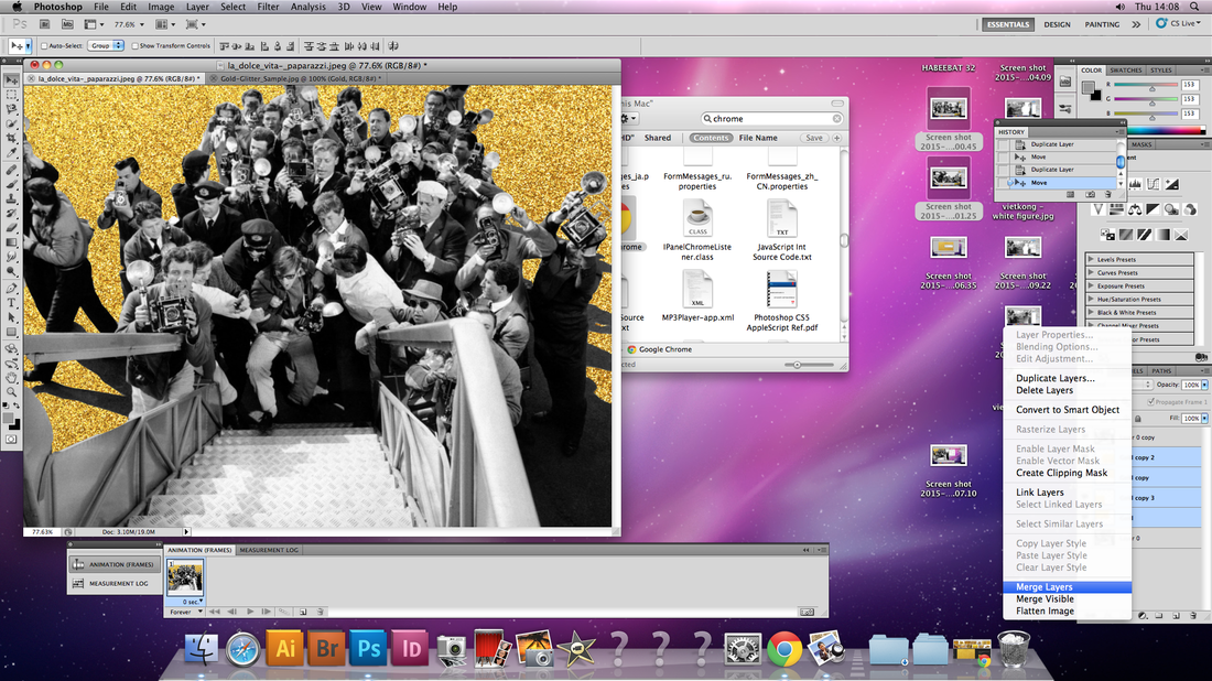
The idea of transforming the once black tarmac into a glittering gold surface was to signify the fact that pinnacle of their fame the ground they walked on was almost like a glamours stage. Every step they took, even before they had even touched the ground was captured, as the media and paparazzi provided coverage of their arrival to America. Whilst the vibrant background takes the image out of the 1960s and brings into the modern era the new and dazzling tone of the image in also befitting of the nature of the Beatles' themselves. This is because I
Using the same image, that captured the 1960s' Beatlemania, I change that tarmac of the runway once again, but this time into a green field. The purpose of this was to try to highlight the significance of the arrival to the Beatles themselves. In comparison to the UK the USA has a much larger population, therefore allowing the music of the band to reach and effect a larger proportion of the world, and perhaps even provide them with more success. The edited image provides a visual representation of the idiom 'the grass is always greener on the other side'. The angle of the grass in the image makes viewers image that the field spans for miles and miles, thus inferring the possibility for the band's success is infinite.
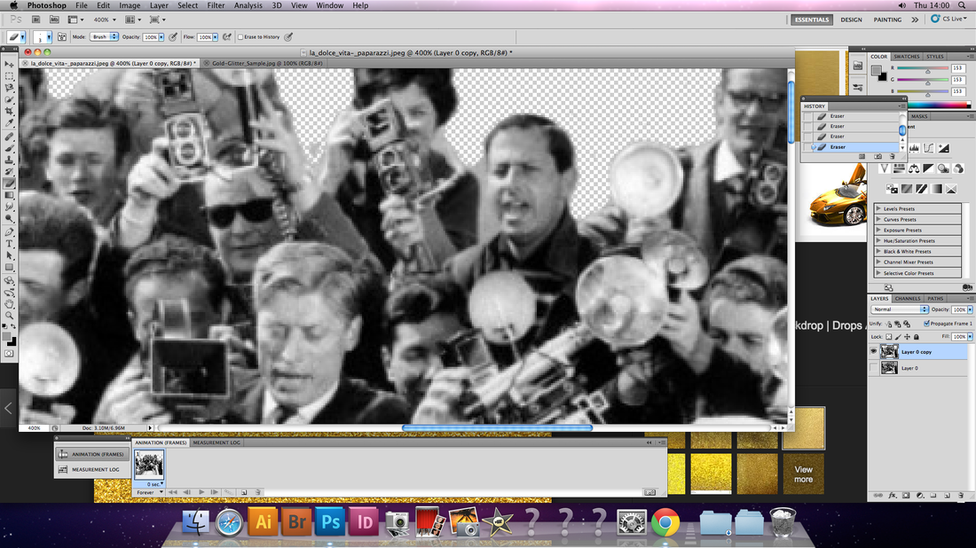
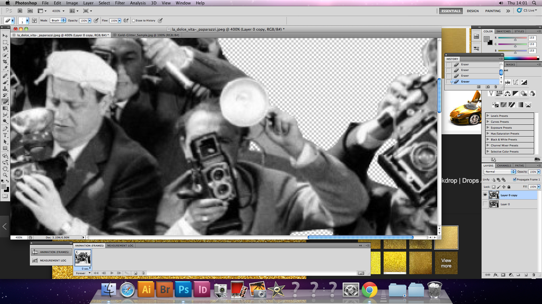
The technical side of editing the image was quite arduous as it involves using the magnetic lasso to trace the entire outline of the airport runway and removing it. For some part of the image where using the magnetic lasso was not sufficient enough too remove the background I used the erase tool to trace it manually. After the tarmac was removed I place the chosen backgrounds, of the green pasture and the gold glitter on a new layer underneath it. However, after this I found that the shadows on the ground looked unrealistic. To combat this I placed the original unedited image on a new top later and reduced the opacity of the layer so that it was barely visible. This enabled the shadows of the figures in the shot to blend in more with the background and look more realistic.
Like Warnham I used a old image, that I did not take myself, to recreate a moment in the past. The image depicts a scene where dozen of paparazzi stand in front of the stairs of a plane as the Beatles descend. The photograph was taken at the peak of Beatlemania in 1964 and illustrates the huge influence the band had on world pop culture. The purpose of editing the image for me was to bring relevance back to image and illustrate for a new generation the profound impact the Beatles had globally. In addition, when creating the image I wanted people in an audience of today to think back to the brighter time in the world's history and an era where experimentation was celebrated by a dynamic subculture, that may not have been illustrate in the original image.
The idea of transforming the once black tarmac into a glittering gold surface was to signify the fact that pinnacle of their fame the ground they walked on was almost like a glamours stage. Every step they took, even before they had even touched the ground was captured, as the media and paparazzi provided coverage of their arrival to America. Whilst the vibrant background takes the image out of the 1960s and brings into the modern era the new and dazzling tone of the image in also befitting of the nature of the Beatles' themselves. This is because I
Using the same image, that captured the 1960s' Beatlemania, I change that tarmac of the runway once again, but this time into a green field. The purpose of this was to try to highlight the significance of the arrival to the Beatles themselves. In comparison to the UK the USA has a much larger population, therefore allowing the music of the band to reach and effect a larger proportion of the world, and perhaps even provide them with more success. The edited image provides a visual representation of the idiom 'the grass is always greener on the other side'. The angle of the grass in the image makes viewers image that the field spans for miles and miles, thus inferring the possibility for the band's success is infinite.
The technical side of editing the image was quite arduous as it involves using the magnetic lasso to trace the entire outline of the airport runway and removing it. For some part of the image where using the magnetic lasso was not sufficient enough too remove the background I used the erase tool to trace it manually. After the tarmac was removed I place the chosen backgrounds, of the green pasture and the gold glitter on a new layer underneath it. However, after this I found that the shadows on the ground looked unrealistic. To combat this I placed the original unedited image on a new top later and reduced the opacity of the layer so that it was barely visible. This enabled the shadows of the figures in the shot to blend in more with the background and look more realistic.
|
|
Amirali Ghasemi
In a project by Amirali Ghasemi, entitled 'The Party Scenes Series - Tehran Remixed', that was started in 2005 Ghasemi uses a collection bright colourful images, short clips and music to create a real-life depiction of Tehran's party culture at the time through capturing scenes of young urban Iranians socialising. The series title is a literal representation of the scenes depicted. In creating the series Ghasemi had the intention of capturing the friendly and humble nature of Iranian youth, through photographing aspects their social and private lives. Having grown up in a middle class family in Tehran, Ghasemi is able to provide us with behind-the-scene access to Tehran’s mysterious youth culture. The images of the intimate and unsanctioned private parties provide viewers with a look into aspects of Iranian life that are rarely televised, enabling us to visualise the other side of Tehran. The scene of Tehran captured by Ghasemi ten years ago contrast to prejudicial images that are provided to us by the media. It is strange to think that the images were taken at a time were Iranian citizens were put under constraints as the photographs show party scenes that could be in any city in the world.
To protect the identities of his subjects Ghasemi conceals their face and exposed flesh that is visible through digital manipulation. Overexposed the faces and bodies of the subjects almost asks as a pre-emptive censor, due to the circumstances in Iran. The images almost act as a form a photojournalism as the show ordinary activities, however altering the spontaneous shots and creating anonymity adds an extra element of interest to the images. Even though the identities of the subjects remain anonymous throughout the series as viewers we are still able to create a connection between ourselves and the subjects via the everyday task that are shown. The series of images act as a way of portraying similar scenes of life occurring elsewhere in the world, as some of Iran's young population enjoy their youth, like many others around the world. Moreover, the concealment of the subjects’ identities enables viewers to truly connect with the circumstances in which the images were taken rather than just the individuals in the photographs.
From the collection of images in Ghasemi's 'The Party Scenes Series' the image that I found particularly interesting was the image that captured two women dancing. The fact that the scene was photographed from an elevated angle means as viewers we are able to be right in the middle of the intimate dance circle. Even without facial expression we are still able to visualise the care-free nature and the euphoria within their action. Another aspect of the image I also appreciated was the attention to detail that was used in editing the images. When concealing the identities of his subject Ghasemi still took care to allow elements of the body that do not reveal their identities to still show, such as painted nails, hair and jewellery.
Response: The Vietnam War - Eddie Adams
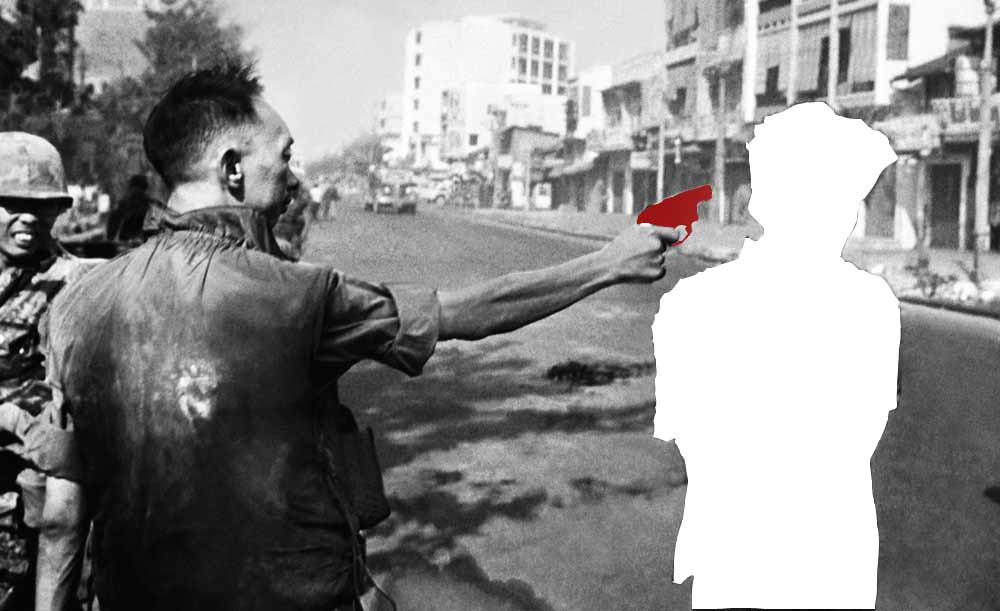
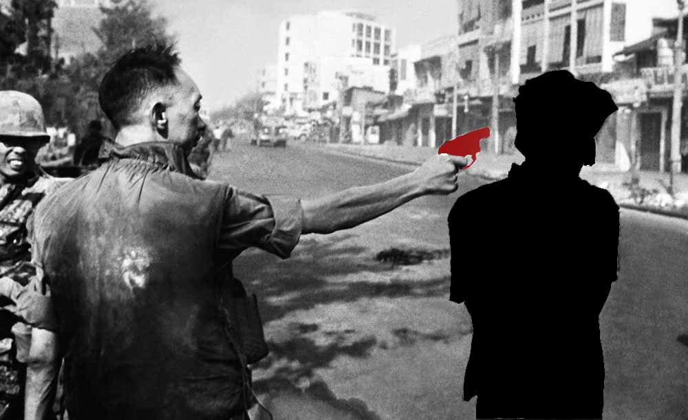
To create this image I used a well-known image of the Vietnamese war captured by Eddie Adams. Without any editing the image already has a strong moving nature, as it embodies some of the horrendous acts that were committed in the war. Whilst the image does not provide the entire truth behind the circumstances it still allows anyone in the world to be moved by the sheer emotional power the image possesses.
When choosing the parts of the image to isolate and change I considered what effect this would have on the meaning of the image. The colour palette I used was limited and consisted of red, black and white. I chose this trio as they symbolise the significant amount of life that was lost in the war.
When filling the gun in solid red the lack of shadows flattens the image, it is almost hard to recognise the weapon as a gun. This is important as it delivers the message of the fact that it is not only weapon like gun that can cause pain and anguish to a person. Whilst the blood red colour used infers the blood shed that occurred during the war. The vivid red stands-out against the grey scale image.
The white silhouette of the man was created to signify the fact that it is unimportant who the subject actually is, but that we can sympathise with the loss of any life. The silhouette also enables a viewer to empathise with subject, as they wonder about who the subject was and what he was like as a person.
If I were to develop the image further I would colour block the entire image, reducing it of all of its details and allow the message of the image to be emphasised. This would involved blacking out the silhouette of the gun man and making the background grey. This would also transform the work to conform with the form of a graphic piece of art rather than a photograph.
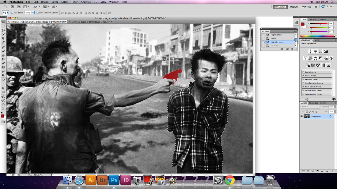
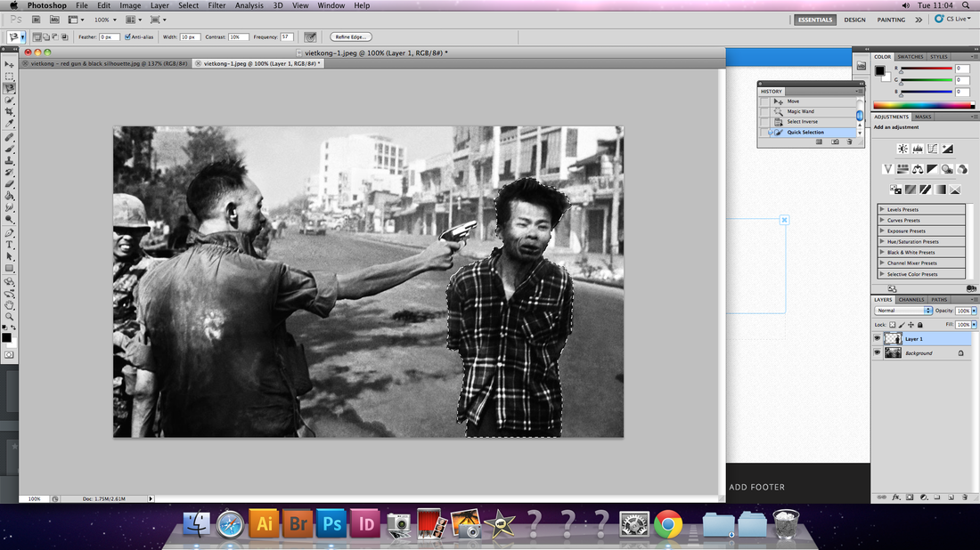
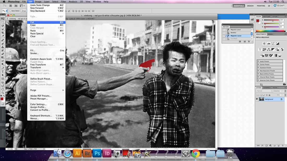
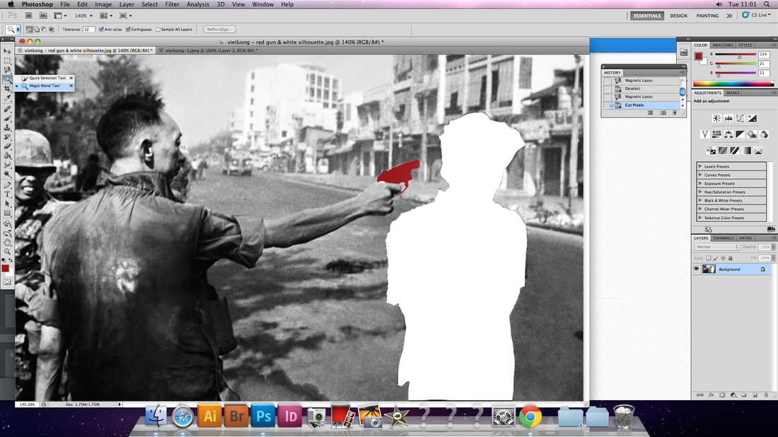
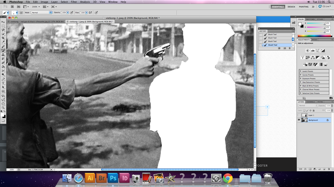
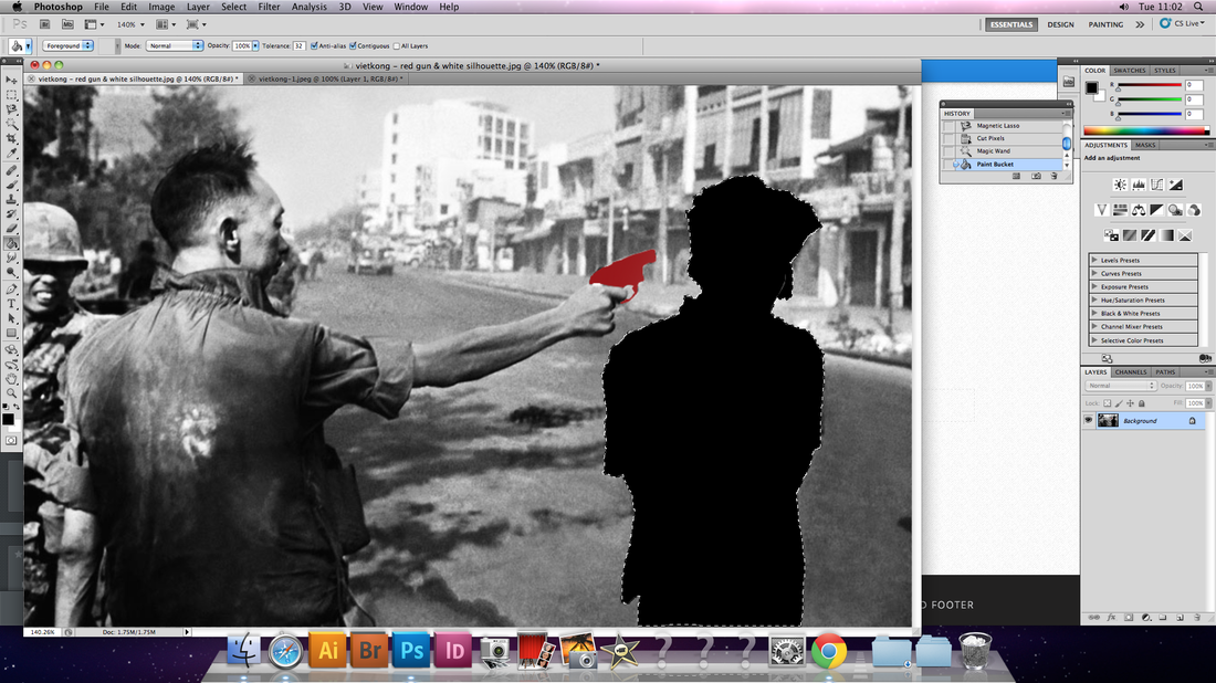
When creating the silhouettes of both the gun and the person in the image I started by using the magnetic lasso to select the object. After that, I cut out the selected part of the image, leaving the silhouette to remain. Using the eraser I then touched up the silhouette to make the lines smoother, so that none of the figure was left. This then allowed me to experiment with using different colours to add meaning to the image.
In creating my images I used the works of artists like Hayley Warnham and Amir Ali Ghassemi to influence my work. In this project I used Photoshop to alienated and eliminate elements of photographs, filling them in with blocks of solid colour and patterns. Doing this creates new context for the images, making them more interesting.
Response: Black hole
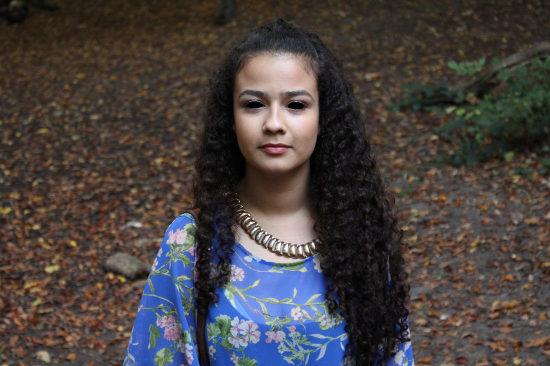
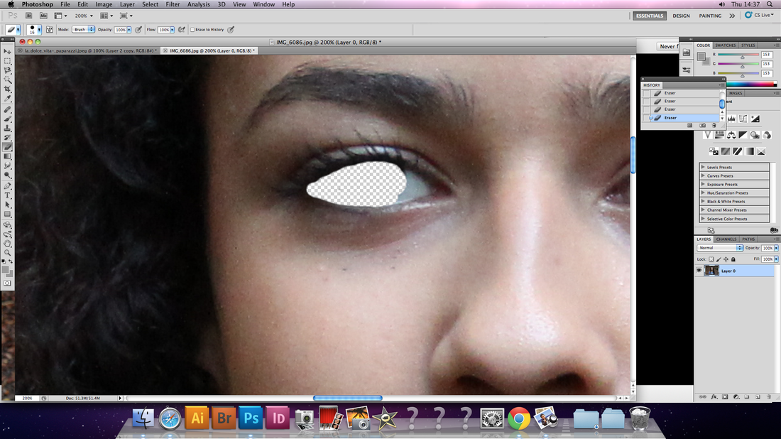
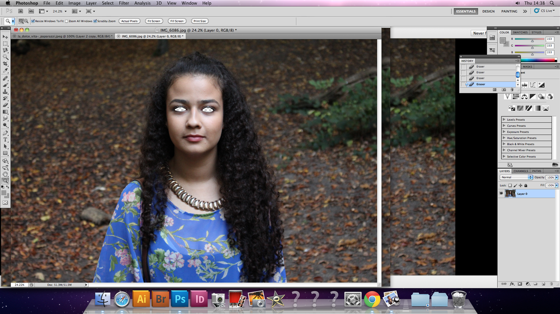
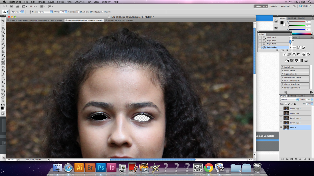
Inspired by all of the artist I had looked at for the Altering Context strand I chose to edit a simplistic portrait that that I had taken prior to the start of this project for my last response. Originally, the portrait was was plain, with the subject positioned in the centre of the frame with a lack of expression. When editing the image my main was to bring a new life to the image without drastically transforming it.
As the eyes are commonly referred to as the gateway to the soul, blacking out the eyes makes the subject seem soulless. Removing the details of the eyes also meant that an audience were now reliant on looking at the rest of the features of the model's face in order to interpret her expressions. In the image it looks at if the subject is giving the viewer a mischievous smirk.
By removing the eyes of the subject and filling it with a solid black background it made a subtle difference to the aesthetics of the portrait, whilst also making a large impact on the meaning behind the image. At first to a viewer may think that the image was completely normal. I would only be under careful inspection would they realise that there was something strange.
|
Dina Lynnyk
Another artist who I was also inspired by used the idea of changing the context on images was conceptual artist, Dina Lynnyk, from Kiev, Ukraine. Although majority of Lynnyk's work is in the fashion industry she created an interesting window installation for Bershka. Looking at the window installations themselves as the once 2D images are animated. Rather than viewing the collage as a flat piece having it in 3D allows for the collages to be brought into reality. In addition, the fact that the images are viewed from behind shop windows means that the surrounding environment is also reflected on to the collage. As a result of this the pieces of work are then then made unique in a way to the point where a viewer looks at it from. |
|
Like Amirali Ghasemi Lynnyk removed the faces of her models. However, rather than to make the subjcets in the images anonymous the purpose of removing the models faces was to big an emphasis to the clothes on display. This also allows passers-by to envisage themselves in the outfit on display, letting the identify themselves with the models Like the other artists removing the face of subject make an image more relatable and personal as the view is able to put themselves into the image.
Lynnyk's collages bring to mind the Henri Matisse's collages. The collages a homage to different people's personalities. Through the placement of other objects and shapes Lynnyk creates representations of different types lifestyles
Lynnyk's collages bring to mind the Henri Matisse's collages. The collages a homage to different people's personalities. Through the placement of other objects and shapes Lynnyk creates representations of different types lifestyles
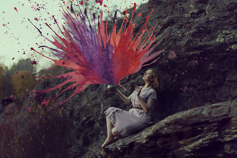
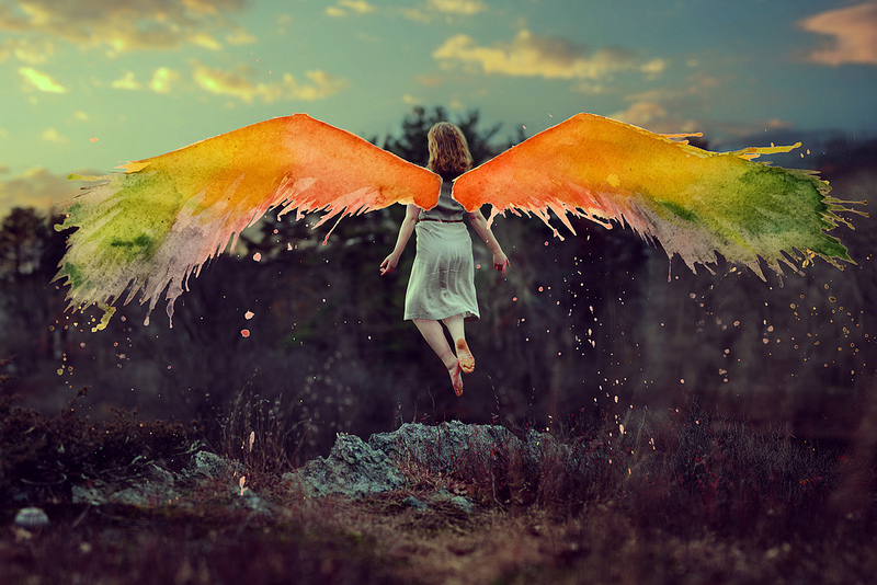
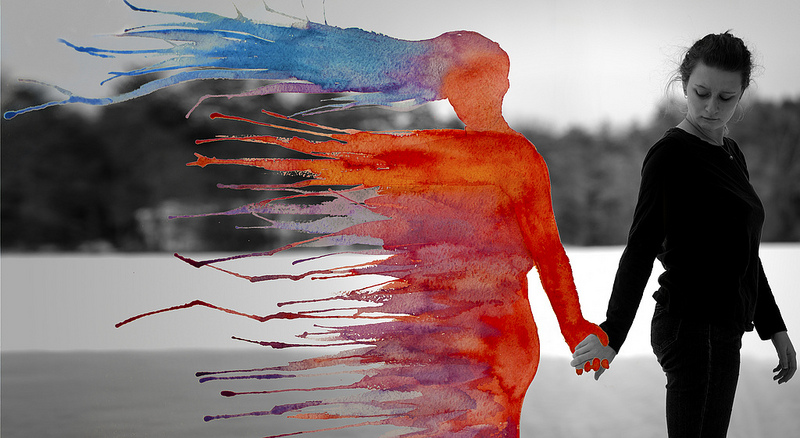
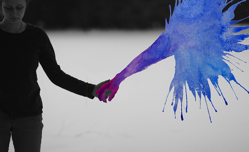
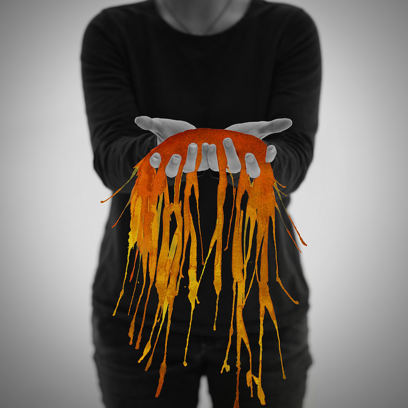
Aliza Razell
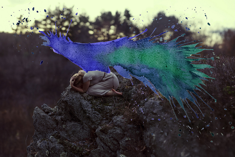
As an artist and photographer Aliza Razell combines self-portraits with vibrant watercolour brush strokes to tell the audience a story. In both series the artist combines the two distinct medium into one piece of work. The motion of the watercolour paint along with its colour embodies the rare emotion that sits behind the photograph. This emphasises the message that is trying to be discloses, whilst enhancing the image as well. As a whole Razell's work is whimsical and almost surreal.
In one her series 'Anesidora', Razell explore the well known story of Pandora's box. The images build up in anticipation as the content of the box escapes. The almost violent outburst of the watercolour from the pot adds context to the image. This allows a person who many not necessarily know the story of Pandora's box to try understand, or allow them to create a story of their own.
In another series called 'Ikävä' (Finnish for 'yearning') we see Razell interacting with a figure that is not actually there. The processes of adding the person to image after it was taken almost suggest that the person is missing and Razell herself is yearning their presence, in reference to the series title. In 'Ikävä' the emotion of feeling lost and nostalgia are conveyed in the image as the subject is left alone, with only an imaginary figure for comfort. The use of watercolour to complement the photograph also act as a link, reconnecting memories. Old memories are joined it the present as the unseen is made visible again.
Childhood Memories
Jan Von Holleben
|
German photographer, Jan Von Holleben, started his 'Dreams of flying' series in 2002, where the images act as a visual representation of childhood in a general sense. The title of the series is an homage to the aspirations of having the ability to fly that many dreamed of as a child. Using the children from his local neighbourhood as his models, Von Holleben created set up that made nostalgic childhood memories come true in the form of overhead photographs. The wistful childhood memories captured creates connections with the inner child of each viewer, allowing them to remember personal memories.
Looking at the series a smile is brought to my face. Majority of the images shows genetic dreams, in some instances the refer to films connected to a lot of people's childhoods, such as Aladdin. To create the series of images it required a lot of imagination and photographic skills on Von Holleben's part. The images also illustrate a playful, fun and inventive nature. It is interesting to look at images that were photographed from directly above the studio set-up. Von Holleben uses a ladder to elevate himself when photographing. Looking at the set up it is intriguing to think that such imaginative and innovative could be created using household objects. This encourages viewers to try to create scenes of their own and to finally to life their own personal childhood dreams. |
In the creation of his series Von Holleben was influenced not only by his own personal experiences and the dreams he had as a child but also by his parents, a cinematographer and a child therapist. Another aspect of Von Holleben's life was also the concepts of child-history and playing that was learn through teacher training course. All of this had a influence on the 'Dreams of flying' series.
In the series there were a few images that stood out to me, so I decided that the I would use them to inspire me to create my response. The first image that I found the most inspiring was 'The Jumper', where two small boys are seen jumping across a gap hand-in-hand. The simplistic nature of the image where only two props were used is inspiring to think that a powerful dream, like having the ability to fly, could by created so easily. The image also bring across the message that anything is possible.
The second image I was particularly drawn to to was 'Aladdin', in the scene Von Holleben uses his style of photography to re-create a scene from the film Aladdin, where he flies over the desert on a carpet. Once again Von Holleben explores the idea of flying. Through using a scene from the famous film allows some of the thousands who have watch the film to rekindle memories their childhood.
Response
The inspiration behind this piece of work was to explore the connections between my present self and my former self. Using memories and aspirations that I once had I tried to capture them through my camera lens. Personal experience from a person's past long with memories they once had shape their present as well as their future. In my collection of images I tried to connect older models, in comparison to the models used in Von Holleben's series, to childhood memories. In the two images I tried to not only convey childhood dreams but also some emotions that was felt not necessarily as a child but in the processes of transitioning from being a child into adulthood.
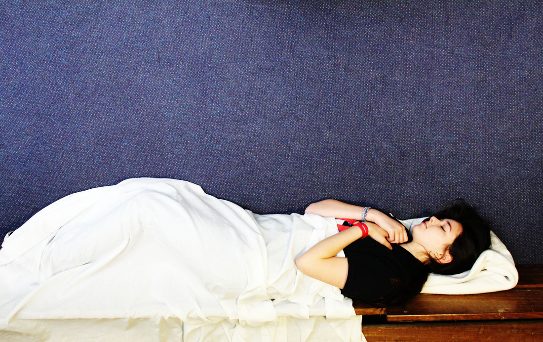
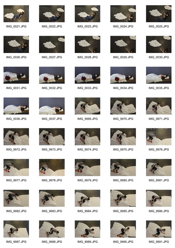
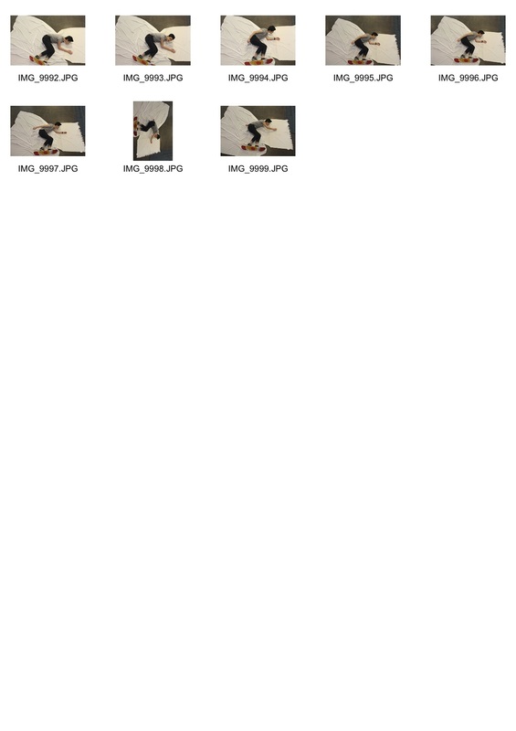
When creating the images the idea behind the snowboarding images was inspired by Von Holleben's image of the two bikers. The idea behind the image was to bring to life that you do not have to be on the slopes or even know how to snowboard to imagine yourself as a professional snowboarder. The image that children possess is still there in us all, it allows us to dream of the impossible and have aspirations to do something we thought we could have never done.
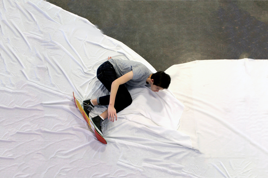
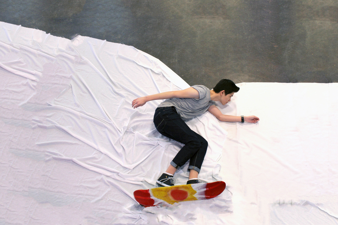
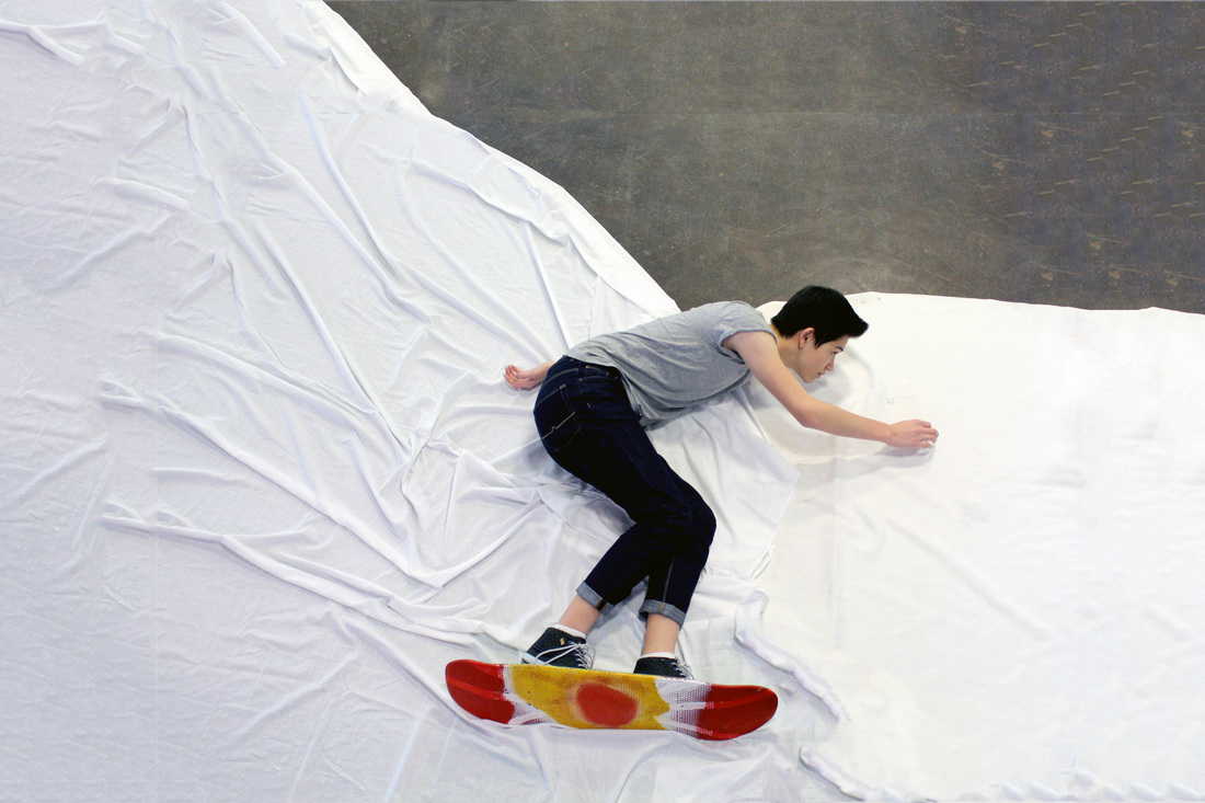
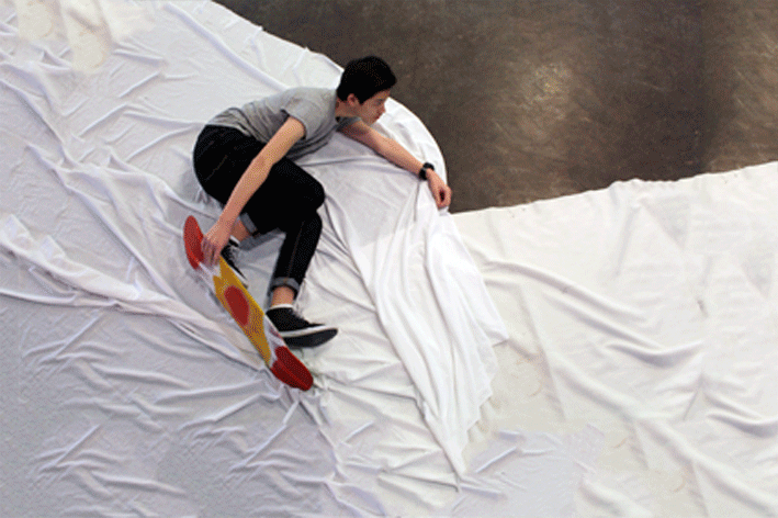
In the second piece that depicts a girl falling was influenced by the music video to Oren Lavie's Her Morning Elegance. In the video gave me the idea of creating a GIF, developing the idea of taking aerial shots by adding motion to it. The purpose of this piece was to try and create a visual representation of the mixture of a person may feel as they transition into adulthood. The fact that the girl is shown to be continuously falling suggest that a person may feel as if the world around them is constantly changing, as expectations that were previously not there are put on a person. The GIF embodies the feeling of being lost, this is relatable to a viewer because at one point or another everyone has felt somewhat distant, not necessarily in a negative way. The tone of the image is there to be interpreted by the audience.
The process of photographing the image consisted of using ladders and worktops to elevate myself, this allowed my to capture aerial shots of the scenes below. Through the positioning of the model and the props made it look like the images were captured as if they were taken at ground level from the side. If I were to improve the series in the future I would have used a clamp along with a remote to prevent the camera from changing positions. In the GIF especially the change in the camera position resulted in the framing being different, consequently the GIF was not as fluid as I hoped it would have been. I would have also made sure that the props were not moving during shooting.
The inspiration behind this piece of work was to explore the connections between my present self and my former self. Using memories and aspirations that I once had I tried to capture them through my camera lens. Personal experience from a person's past long with memories they once had shape their present as well as their future. In my collection of images I tried to connect older models, in comparison to the models used in Von Holleben's series, to childhood memories. In the two images I tried to not only convey childhood dreams but also some emotions that was felt not necessarily as a child but in the processes of transitioning from being a child into adulthood.
When creating the images the idea behind the snowboarding images was inspired by Von Holleben's image of the two bikers. The idea behind the image was to bring to life that you do not have to be on the slopes or even know how to snowboard to imagine yourself as a professional snowboarder. The image that children possess is still there in us all, it allows us to dream of the impossible and have aspirations to do something we thought we could have never done.
In the second piece that depicts a girl falling was influenced by the music video to Oren Lavie's Her Morning Elegance. In the video gave me the idea of creating a GIF, developing the idea of taking aerial shots by adding motion to it. The purpose of this piece was to try and create a visual representation of the mixture of a person may feel as they transition into adulthood. The fact that the girl is shown to be continuously falling suggest that a person may feel as if the world around them is constantly changing, as expectations that were previously not there are put on a person. The GIF embodies the feeling of being lost, this is relatable to a viewer because at one point or another everyone has felt somewhat distant, not necessarily in a negative way. The tone of the image is there to be interpreted by the audience.
The process of photographing the image consisted of using ladders and worktops to elevate myself, this allowed my to capture aerial shots of the scenes below. Through the positioning of the model and the props made it look like the images were captured as if they were taken at ground level from the side. If I were to improve the series in the future I would have used a clamp along with a remote to prevent the camera from changing positions. In the GIF especially the change in the camera position resulted in the framing being different, consequently the GIF was not as fluid as I hoped it would have been. I would have also made sure that the props were not moving during shooting.
|
|
|
Childhood Memories
David Levinthal
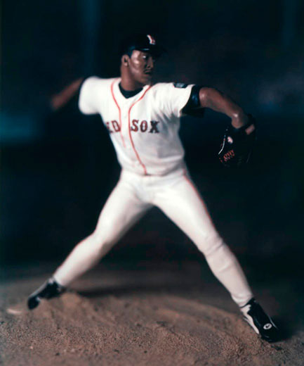
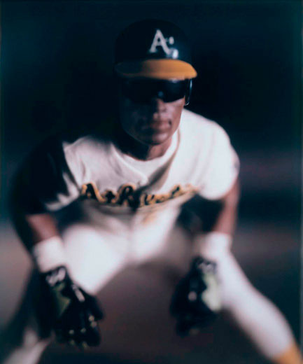
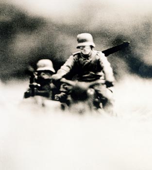
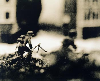
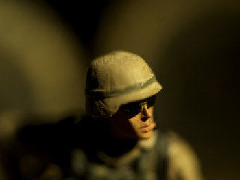
In his photographs of miniature figures and toys David Levinthal uses his photographs as a form of iconography, to examine America popular culture. For example in his series Baseball (2003-4) Levinthal celebrates one of America's beloved sports, in an image in the series Levinthal recreates Don Larsen's perfect game in 1956, a legendary moment in both American and baseball history. The toys used reflect aspects of American society in point in history and sometimes echo particular events that occurred. Levinthal explores subjects matters, such as scenes of war, that can be seen as hard to try to understand through the you of toys, as the are associated with the innocence of childhood. It is interesting to think that serious matter can be addressed through the use of a play item.
The fact that majority of the toys that Levinthal used belonged to both him and his brother means that the photographs act as self portrait, as it tells history at the time of his childhood through the use of his own personal toys. By using his own childhood memories Levinthal also harnesses the visual memory of the viewer to create a narrative, thus allowing them to interact with their own memories as well as his own and the subject matter. Levinthal also used a mixture of recently manufactured toys along with his antique figurines, making references to both old and new memories. This combination of old and new also shows a viewer how part of history is repeated.
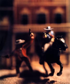
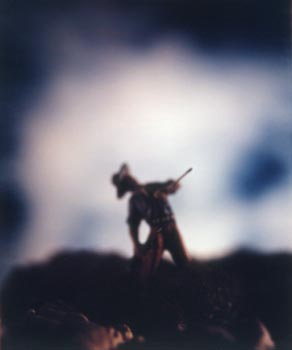
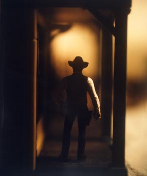
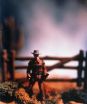
When creating his photographs Levinthal takes his inspiration from both movies and painting as well as people. The series The Wild West, created between 1987 and 1989 emulates scenes from classic western films. It is interesting to see miniatures brought to life in the form of macro shots. The backdrops to the scenes emphasis the stereotypes that exists as part of American heritage, depicting scenes of the American frontier, along with images of the iconic cowboys and Red Indians. The scenes almost act as a physical visualisation of the scenes we picture in our heads as a child as we played.
The fact that majority of the toys that Levinthal used belonged to both him and his brother means that the photographs act as self portrait, as it tells history at the time of his childhood through the use of his own personal toys. By using his own childhood memories Levinthal also harnesses the visual memory of the viewer to create a narrative, thus allowing them to interact with their own memories as well as his own and the subject matter. Levinthal also used a mixture of recently manufactured toys along with his antique figurines, making references to both old and new memories. This combination of old and new also shows a viewer how part of history is repeated.
When creating his photographs Levinthal takes his inspiration from both movies and painting as well as people. The series The Wild West, created between 1987 and 1989 emulates scenes from classic western films. It is interesting to see miniatures brought to life in the form of macro shots. The backdrops to the scenes emphasis the stereotypes that exists as part of American heritage, depicting scenes of the American frontier, along with images of the iconic cowboys and Red Indians. The scenes almost act as a physical visualisation of the scenes we picture in our heads as a child as we played.
Response
|
|
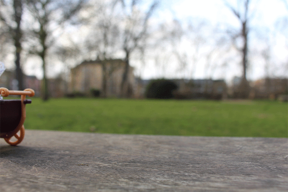
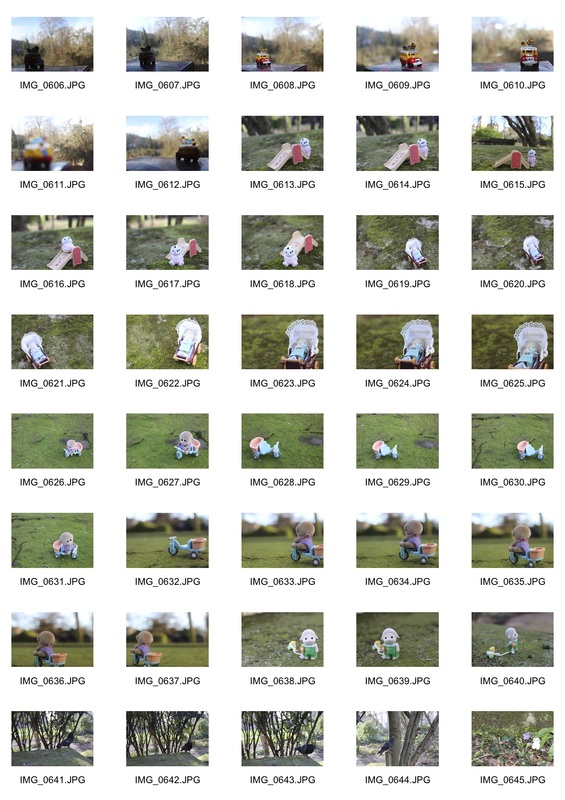
Taking inspiration from David Levinthal I used small to Sylvanian Families figures, toys that were part of my own toy collection, to explore some of my happy past childhood memories. When creating the composition of images I found it fun enjoyable to immerse myself in the world of play once again and develop the idea of play. Using my surrounding environment, a local park, I explored my own memories of playing to create the series of images.
I took close up shots with the small toys as my subjects. I was interesting to revisit a park that I had played in as a child with toys that had never usually ventured outside the confines of my room. The additions of the toys to the environment made a somewhat plain environment into a magical and fantastical world. Using a variety of surfaces I found in the park I replicated simple everyday scenes on a miniature scale. The toys made a space that I walked through everyday magical through adding happy childhood memories in corners of the park.
I took close up shots with the small toys as my subjects. I was interesting to revisit a park that I had played in as a child with toys that had never usually ventured outside the confines of my room. The additions of the toys to the environment made a somewhat plain environment into a magical and fantastical world. Using a variety of surfaces I found in the park I replicated simple everyday scenes on a miniature scale. The toys made a space that I walked through everyday magical through adding happy childhood memories in corners of the park.
Contextual: Bill O'Donnell
Bill O'Donnell
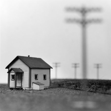

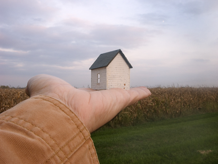
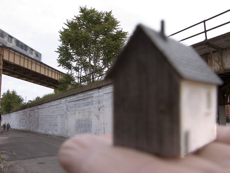
This series of images by Bill O'Donnell also influenced my work. In the collection that features a set off small houses in different environments. The images show that home is not necessarily that place where your house is, but it can in fact be anywhere - from under by the sea to in a field. A person's home is where they feel most comfortable, and does not have to be fixed to a particular place.
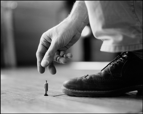
Contextual: Stephen sheffield
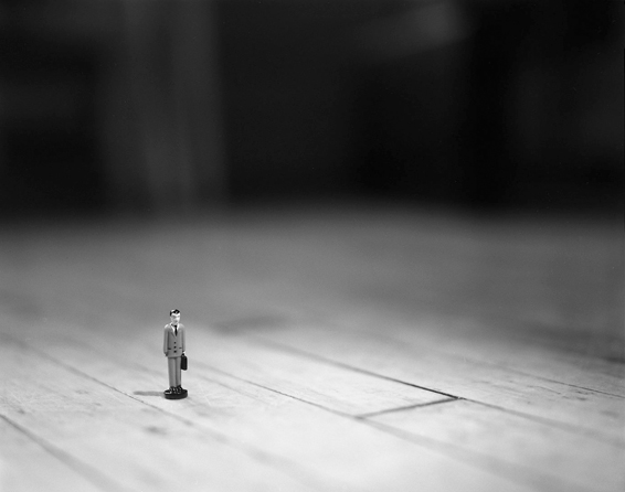
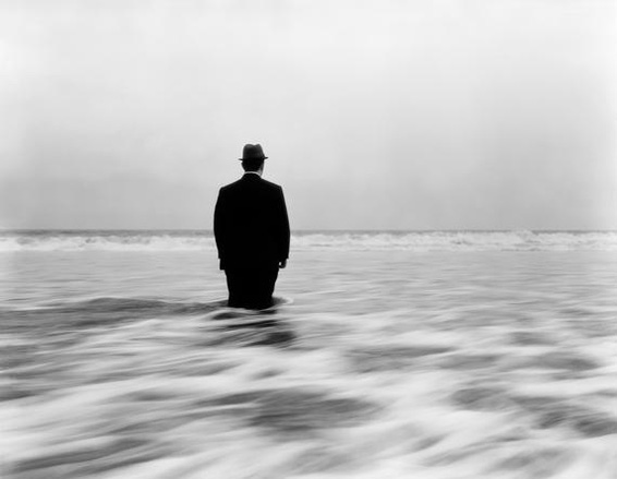
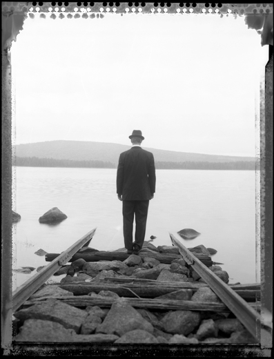
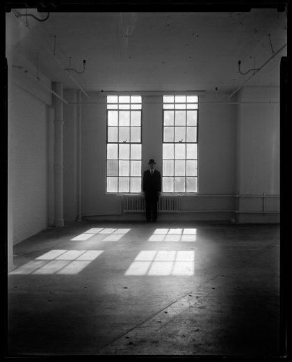
This series of images by Stephen Sheffield was created in response to a project entitled Selfie. Sheffield's images feature a series of self portraits were the photographer is represented in the form of a businessman. It is intriguing to look at the way the Sheffield depicts himself as both a real and a miniature businessman.
The use of the miniature figure illustrates the vastness of the surrounding world. The use of a solitary figure also illustrates the way in which a person can be lost in their thoughts by themselves. In addition, the the small glimpses of limbs in two of the images, for instance a hand and feet, act as a representation of the society around us. I also enjoyed use of black and white as it was refreshing to see how seeing an image in black and white allows an audience to concentrate more on the composition and the meanings behind the images.
The use of the miniature figure illustrates the vastness of the surrounding world. The use of a solitary figure also illustrates the way in which a person can be lost in their thoughts by themselves. In addition, the the small glimpses of limbs in two of the images, for instance a hand and feet, act as a representation of the society around us. I also enjoyed use of black and white as it was refreshing to see how seeing an image in black and white allows an audience to concentrate more on the composition and the meanings behind the images.
Objects
The three following photographers challenge our ideas of what relationships are through the use of photographing everyday objects, combining them and presenting them in unexpected ways. Two of the main approaches that are presented is; balancing objects to create temporary sculptures and combining 2D images with real objects.
Peter Fischli & David Weiß
Peter Fischli and David Weiß are a contemporary artistic duo who collaborated from 1979 until 2012, due to the death of Weiß. Togetherr Fischli and Weiß photographed their tenuously-balanced structures of mostly household objects.
One of the duos most famous pieces of work is The Way Things Go. The structure measures at approximately 80-100 feet long and captures chain reactions, cause by the way things interact with one another. Fischli and Weiß use aspects such as fire fire, water, chemistry and the laws of gravity to depict the way in which objects cause a series of event. As well as showing the relationship between objects the video also shows the relationship between cause and effect. In addition, the chain reactions that occur in the piece show the relationship between the precision of the set up along with the improbable nature of the wanted outcome actually occurring. The precarious nature of the moving sculpture as well as its mechanical nature also acts as a form of art. Overall Fischli and Weiß moving and stationary sculptures transform inanimate everyday objects, making them more interesting.
Response
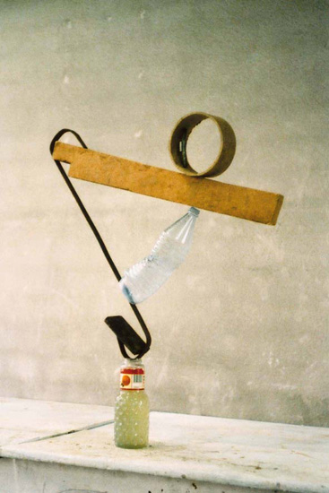
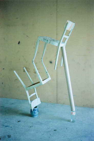
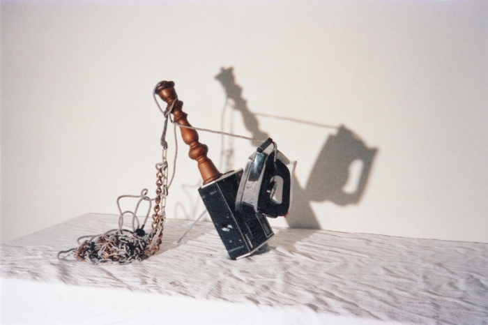
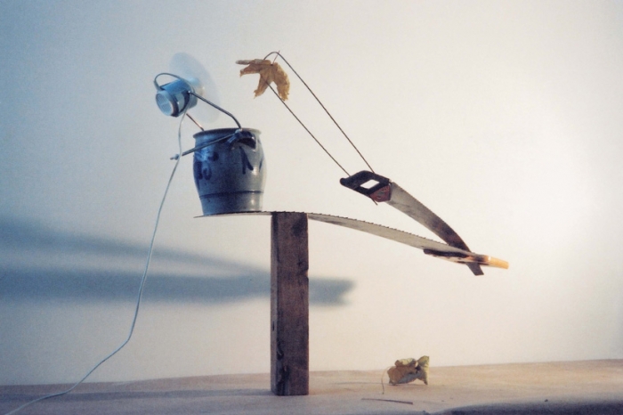
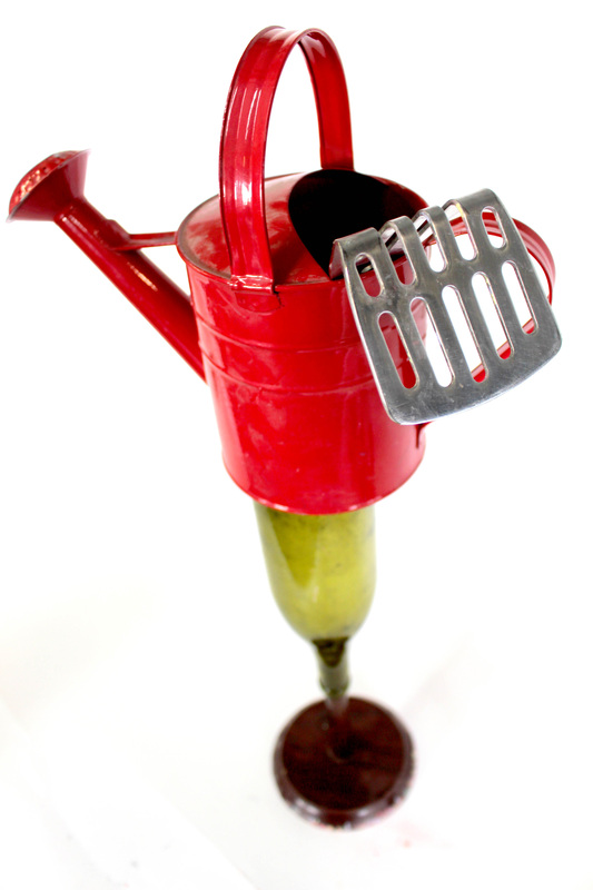
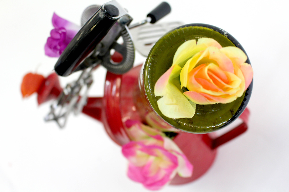
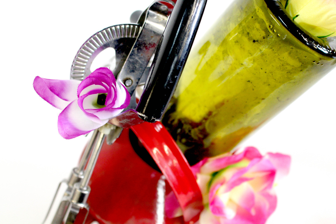
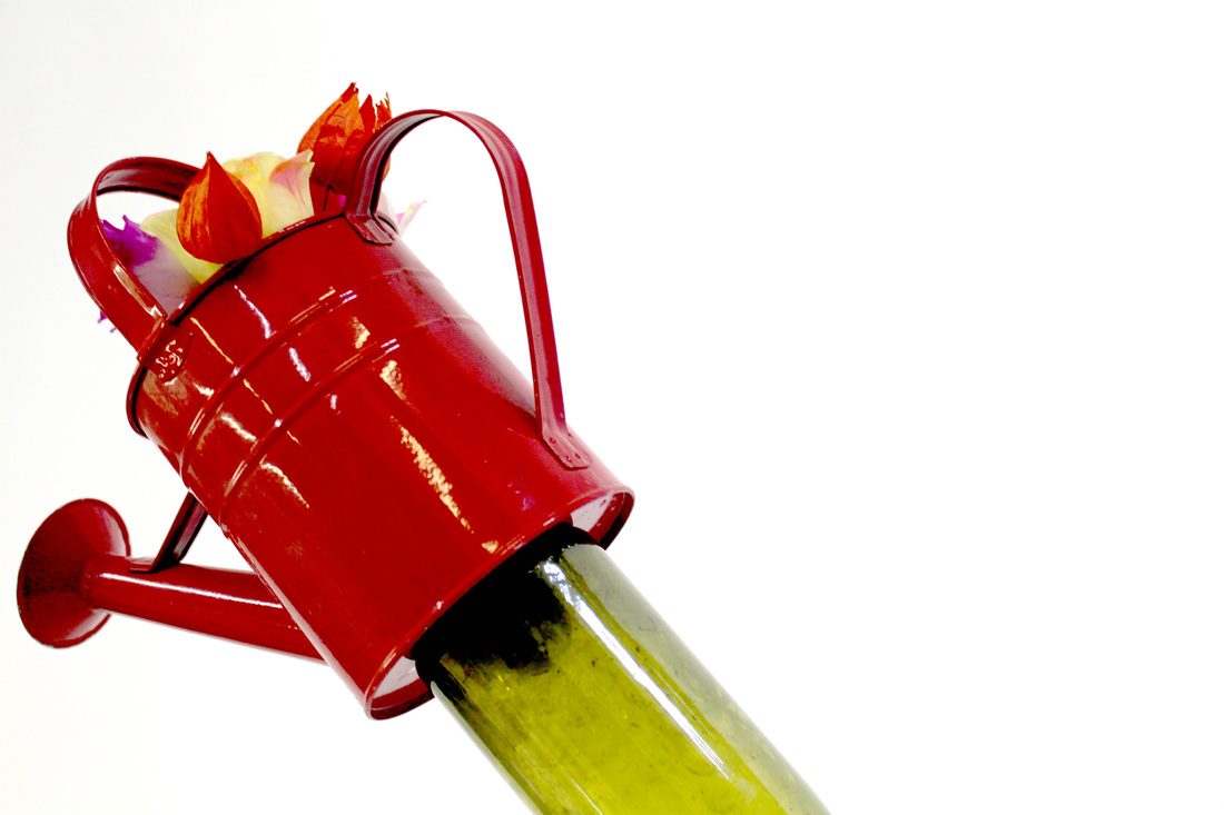
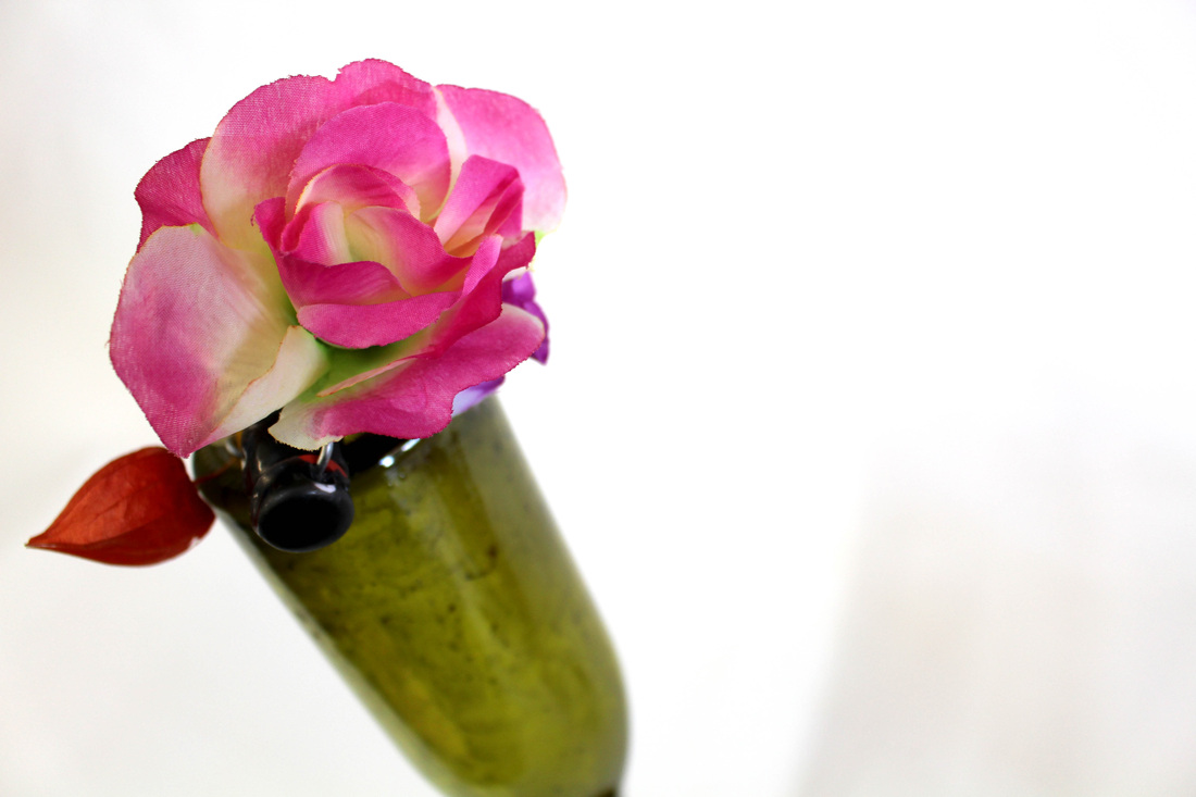
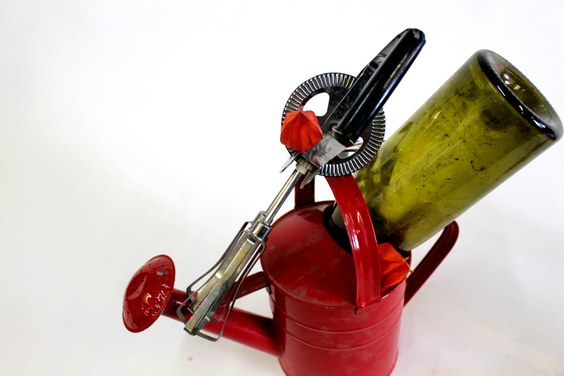
In response to Fischli and Weiß work I also create some temporary sculptures. Using a studio set up along with a few household objects I precariously balanced the objects, trying to make a variety of different arrangements. In order to modernise my own work in comparison to the duo's work I increased the the saturation and the vibrancy of the image by increasing the contrast and adjusting the hues. As a result of this the background was a bright white, making the set up and the objects seem even more artificial even though they were used.
When creating my response to Fischli and Weiß's work I was also inspired by nature. To compliment the precarious nature of the temporary sculpture as well as stacking household objects I also carefully piled up delicate flowers, illustrating the fragility of the structure. In order to add stability when arranging the objects I used an object with a wide base, for example the water can, and then I built up the structure around it. This enabled me to produce structures that were stable, thus enabling me to photograph it from various angles. Capturing the different angles of the structure enables a viewer to explore the objects, with different aspects of the temporary statue highlighted due to the different angles.


Laura Letinsky
Laura Letinsky started to produce her work in the late 1990s and was influenced by 17th century Renaissance paintings. In her photographs Letinsky uses a large format camera in a controlled studio environment to manipulate the photographic space, thus providing an audience with minimalistic compositions and refreshing images.
Through the combination a range paper cut-outs, from lifestyle magazines and art reproductions, with real life objects Letinsky explore realism. By altering a viewer's perspective Letinsky distorts the space within the confines of the frame, as a result of this the viewer's perception of how we see the photograph's is warped. Letinsky's images conflict with an audience's pre-set interpretations of their sense of environment. In the set of surreal images light is used as a key element of maintaining the realistic feel of the images.
The use of soft lighting along with the pastel colour palette gives Letinsky's images a feminine feel. The harsh contrast between the coloured food and flowers is surprisingly not overwhelming but in fact complements the white tones of the backgrounds. The contrast allows the images to subtly stand out against the plain backdrop.
In three of Letinsky's most known series In the Morning, Melancholia and I Did Not Remember I Had Forgotten Letinsky captures scenes that resemble the aftermath of a meal, featuring visible food stains, crumbs and wine spills. Usually audiences are accustomed to seeing images prior to the consumption of a meal, with tantalising dishes plated perfectly. In Letinsky's photographs she takes an unusual approach to food photography, focusing on the idea of the consumption and ingestion of food rather than providing a viewer with yet another image of impeccable meals that society sells us. In her images Letinsky photographs half eaten pieces of fruit and sucked lollies connecting them with the idea of immortality and the perishable nature of things. In the series the relationship between mortality and immortality through exploring ripeness and decay. Somehow even though the has already been picked at it is interesting to see how the images can still provoke desire amongst an audience.
'You could say that my work is in part about the relationship between looking at something and other bodily experiences. Pictures can induce sensations: You can see something in a photograph and it might make your mouth water, or it might stimulate other wants, desires, regrets, or needs.'
An image that I took a like was the image that shows what looks to be the aftermath of a snack. The image shows a partially eaten pomegranate with seed sprawled over the table along with drunken glasses of juice. Looking at the image it is difficult to imagine that one half of the fruit is in fact a 2D cut out. The image makes a viewer captivated by the intermingling of dimensions, exploring the relationship between reality and falseness. The image creates questions in the mind of the audience that complexities of what is real and what is not. Is a photograph of an image of an object make the object fake?
Response

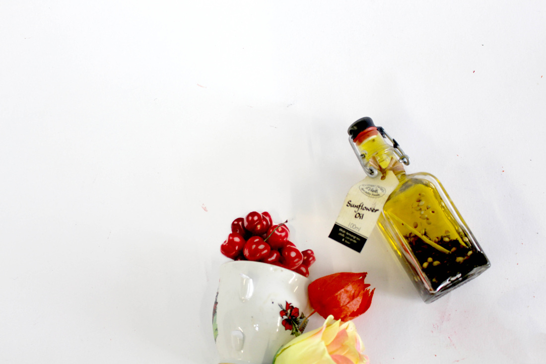
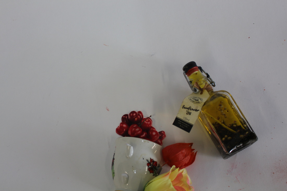
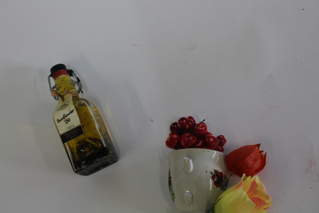
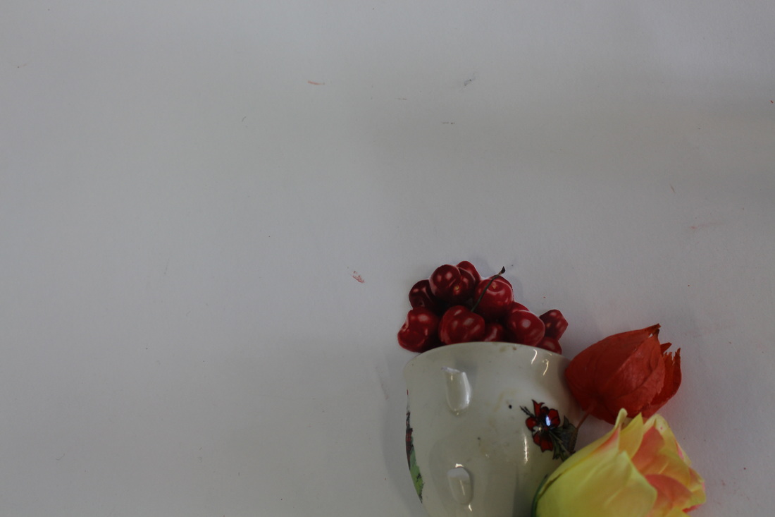
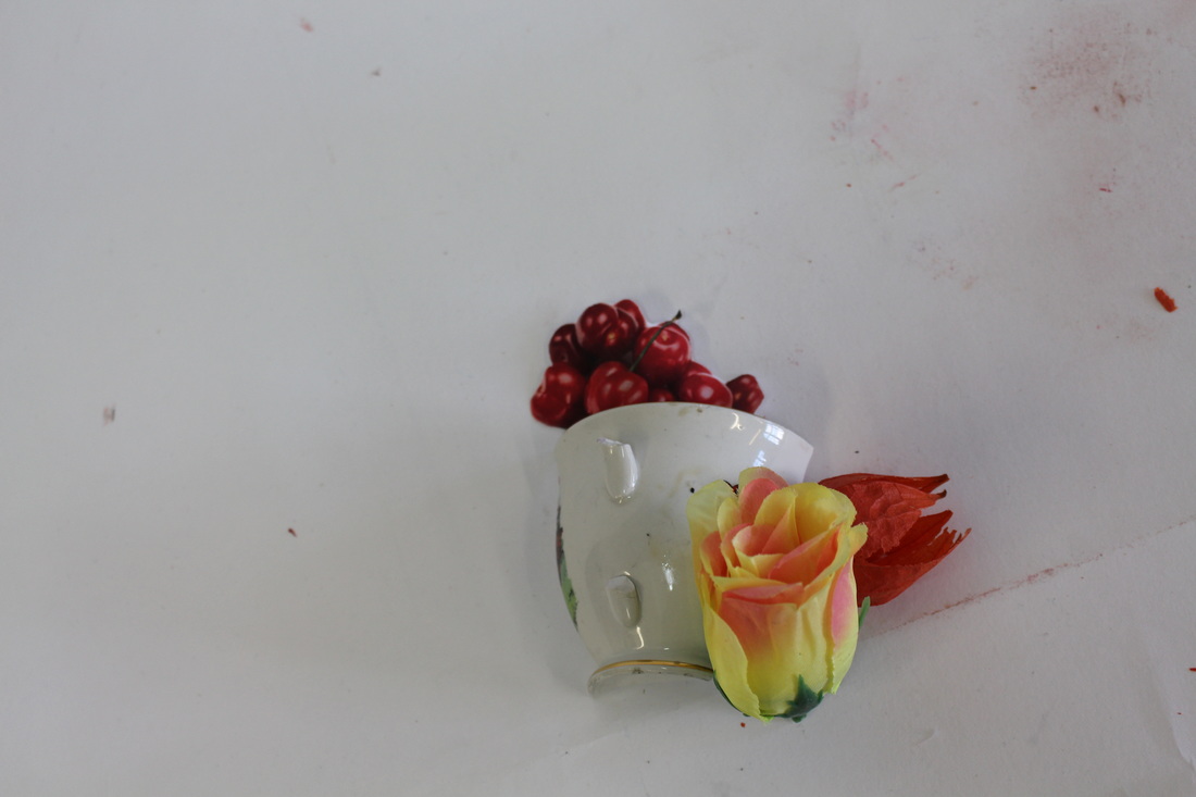
When creating my response to Laura Letinsky's work I found that considering perspective was an important part of trying to achieve a realistic looking image. The objects were photographed from an aerial point of view. As a result of this although the cherries were in fact a printed out 2D image the image looked as if everything there were tangible objects. Letinsky's combination of both 2D and 3D objects inspired me to create my own set of illusions.To add to the fusion of real and fake I also added a fake flower to the arrangement.
In comparison to Letinsky's work, in which she created realistic compositions of half eaten meals I embrace the fact that the objects were photographed in a studio environment by creating arrangement that were unlikely to be seen in everyday life. While Letinsky focused of the concept of consumption I chose to photograph food focusing on the idea of desire. Influenced a little by the story of Alice in Wonderland I incorporated ideas of fantasy into the image, taking a minimalistic approach when it came to the presentation.
In comparison to Letinsky's work, in which she created realistic compositions of half eaten meals I embrace the fact that the objects were photographed in a studio environment by creating arrangement that were unlikely to be seen in everyday life. While Letinsky focused of the concept of consumption I chose to photograph food focusing on the idea of desire. Influenced a little by the story of Alice in Wonderland I incorporated ideas of fantasy into the image, taking a minimalistic approach when it came to the presentation.
Unedited images
Everyday objects
The Everyday - Richard Wentworth & Barry Lewis
The Everyday is a series of images created by Richard Wentworth, a sculptor, and Barry Lewis, a chemistry teacher turned photographer. In the series the pair display images of everyday objects that are often overlooked and go unnoticed. Due to having a heightened awareness of the things around them the artists bring compositions produced from everyday objects into the limelight. In this street photography the artists use urban landscapes to provide ready-made pieces of are that provide an audience with images of everyday occurrences. Although the subjects of the images may not in fact be that attractive it inspires a viewer to not overlook things as much. The series changes the way in which we perceive the world around us.
The Everyday is a series of images created by Richard Wentworth, a sculptor, and Barry Lewis, a chemistry teacher turned photographer. In the series the pair display images of everyday objects that are often overlooked and go unnoticed. Due to having a heightened awareness of the things around them the artists bring compositions produced from everyday objects into the limelight. In this street photography the artists use urban landscapes to provide ready-made pieces of are that provide an audience with images of everyday occurrences. Although the subjects of the images may not in fact be that attractive it inspires a viewer to not overlook things as much. The series changes the way in which we perceive the world around us.
Response
After looking at Wentworth and Lewis' The Everyday I was inspired to photograph objects that I discovered as I walked around my local environment. Walking around an area that was already familiar to me I was surprised to find a large range of strange gems that were hidden in plain sight. In an image where a bottle cap was buried into some soil, with just the top of the lid visible, it was interesting to notice how the lid had become incorporated into its surrounding. Although the rich ruby red of lid pops against the green vegetation it fascinating to think that it goes unnoticed by many.
The purpose of this project was to give the objects their own independents, allowing them to take centre stage. Abandoned object that were left in peculiar places and pops of colour to dreary environments and provide small sources of amusement in mundane everyday life.
The purpose of this project was to give the objects their own independents, allowing them to take centre stage. Abandoned object that were left in peculiar places and pops of colour to dreary environments and provide small sources of amusement in mundane everyday life.
Film Noire
Film Noire is cinematic Hollywood genre that was popular in the 1940 and 1950s. The phrase Film Noire has French origins and translates to 'black film', however its roots are from German Expressionist cinematography. The style mainly consists of black and white images that produce a moody and dramatic atmosphere. The images are commonly used to tell narratives. There are a range of artist interpretations of the genre, in modern photography some photographer even experiment with the use of colour.
The key features of Film Noire is low key lighting along with high contrasts, this produces distinct areas of light and dark within an image. Shadows and silhouettes are often at prominent as the subjects in the images. Some of my favourite Film Noire images feature mist and smoke, adding to theatrical scenes and highlighting the presence of the subject in the shot.
The key features of Film Noire is low key lighting along with high contrasts, this produces distinct areas of light and dark within an image. Shadows and silhouettes are often at prominent as the subjects in the images. Some of my favourite Film Noire images feature mist and smoke, adding to theatrical scenes and highlighting the presence of the subject in the shot.
Response
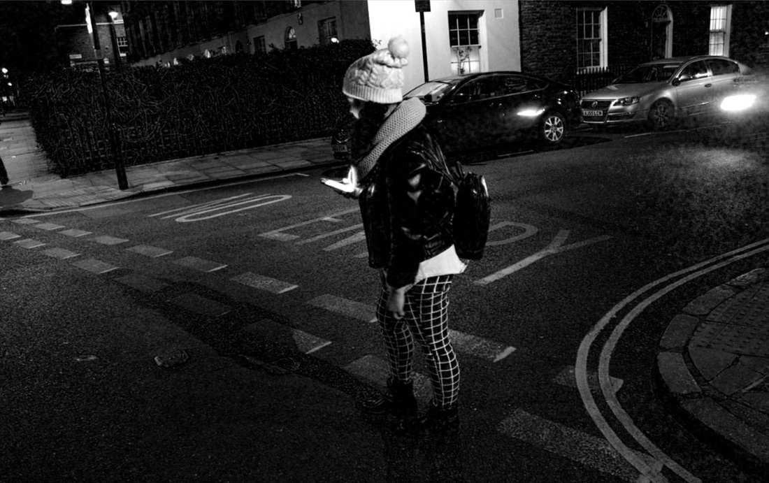
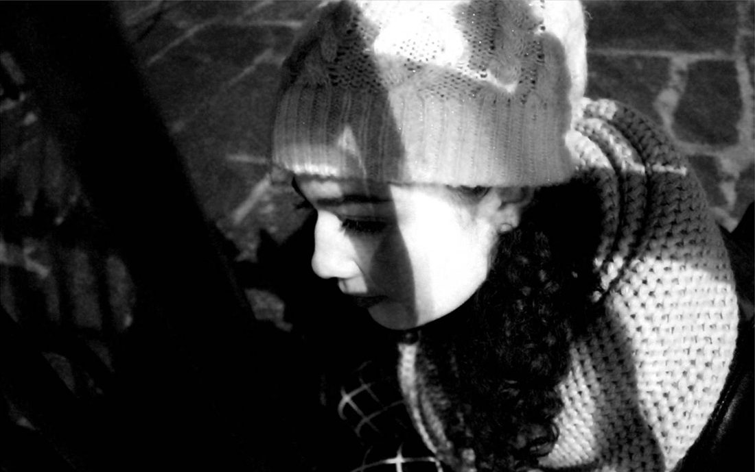
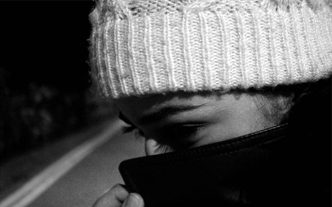

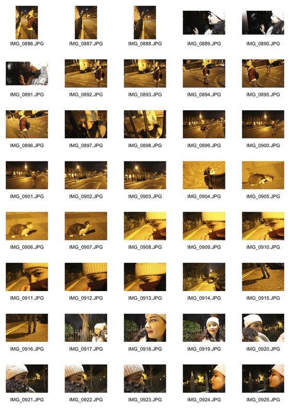
When creating own Film Noire images I used a range of different perspectives and angles when shooting. I also used a number of lighting techniques, from using street to light to the spotlight on my phone, to create a dramatic interpretation of what I saw in front of me. Additionally, I experimented with using pieces of architecture to act as frames, as well as to cast unusual shadows on the model.
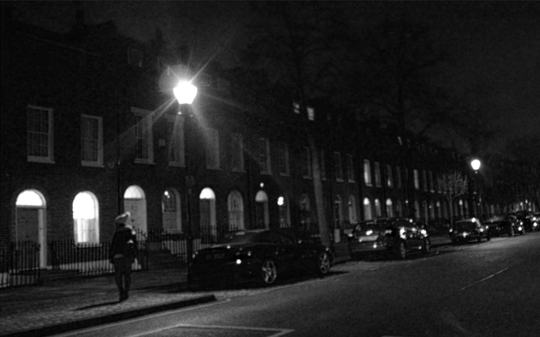
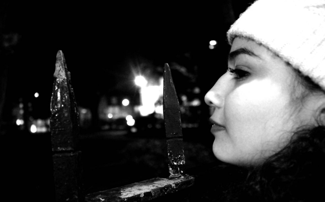
The intentions behind this task was to produce a range of images that illustrated the relationship between the subject and her environment to tell a narrative in the style of Film Noire, each image acts as a snapshot in a story of the viewer's imagination. I think this was archived. An aspect I especially like about the images was the grainy quality that was produced in some images, for example the image with the model walking under a street lamp. I think that gave the image a more old fashioned look that was befitting of the Film Noire theme. I also used Photoshop to experiment with the contrast of the images. This was most successful in the image that shows the subject peering over a gate. The highlighted tones of her skin create a stark contrast to the darker tone of the negative space that surrounds her.
If I were to improve my response to the genre of Film Noire I would explore using more dramatic shadows, like blinds, and the use of smoke of mist to enhance my image. In addition I would also change the depth of field in the images to provide more of a variety.
Strand: Collections
Inheritance Project - Andrea Tese
Andrea Tese's 'Inheritance project' act as a "visual inventory of one man's possessions". In the collection of images we are able to explore the entirety of Tese's deceased grandfather. As a whole each image comes together to form a posthumous portrait. Displaying all the belongings of one person allows the audience to connect to the deceased subject, along with empathising with the grief of the photographer. As viewer we are able to relate to the mourning process the artist goes through, the deeply personal images are moving to look at.
The series addresses people's outlook on life and death, as well as the links inanimate objects can hold with both life and death.The project explores the idea of identity and legacy, and how it defines who we are. An aspect of immortality that is depicted in the collection is through making the possessions embody the memories of the subject, thus bringing the memory of Tese's grandfather's memory back to life bit by bit. In addition, photographing the inanimate objects, which appear to be immortal, make human life seem so ephemeral and disposable.
Although the images focus on basic accessories to daily life, such as; clothes, books, bottles and appliances the significance behind the series is the fact that it depict one man's life. The basic objects are ones we come across daily, the fact that the objects are relatable allows viewers to have a connection them and therefore the deceased and his family. The schematically arrangements of the objects form grids and piles allows the objects to assessed by viewers as a whole or on an individual basis. Placing the objects in the arrangement almost detracts all the emotion from them, stripping that back to what they really are, a collection of objects. The wooden and almost deadpan treatment of the subject matter acts as a reminder, telling us that the objects we class as our today will one day become objects without an owner. At the end of a man's life all of the memories and objects he had amassed would be categorised and packed into boxes.
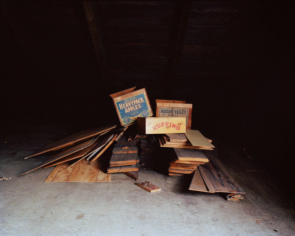
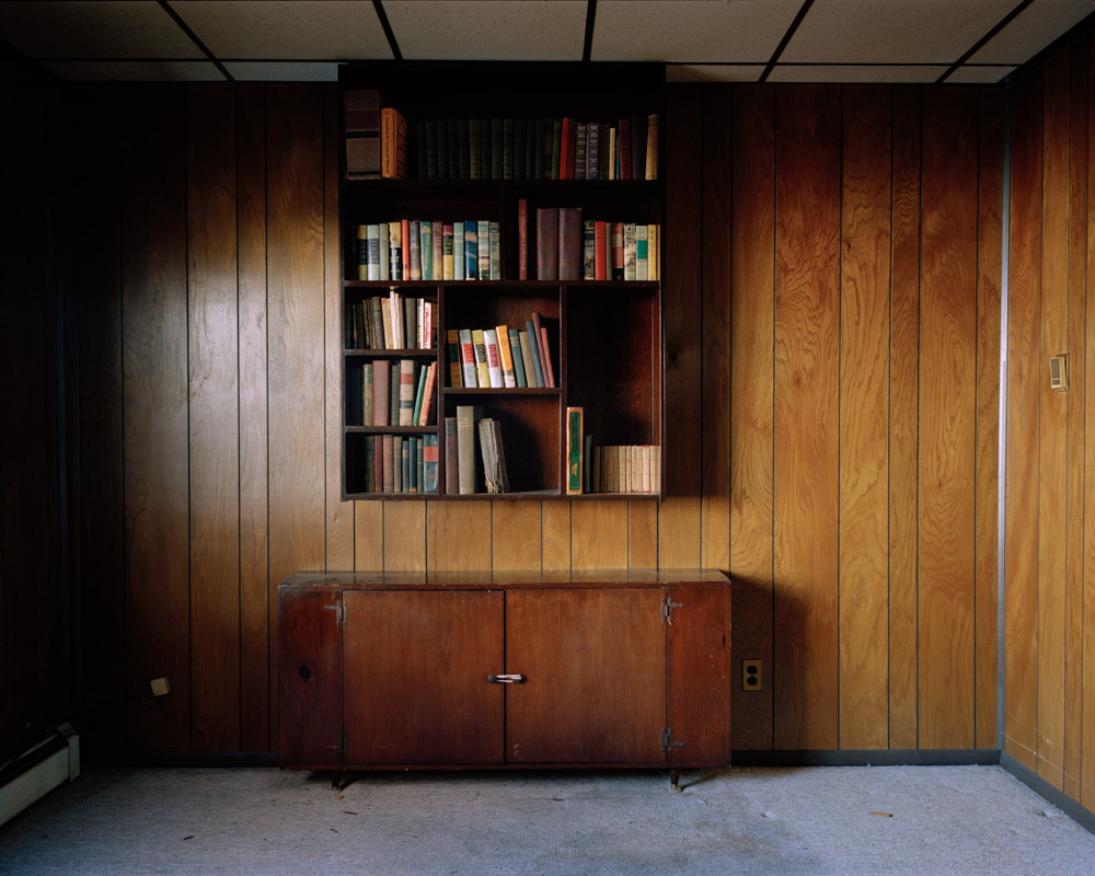
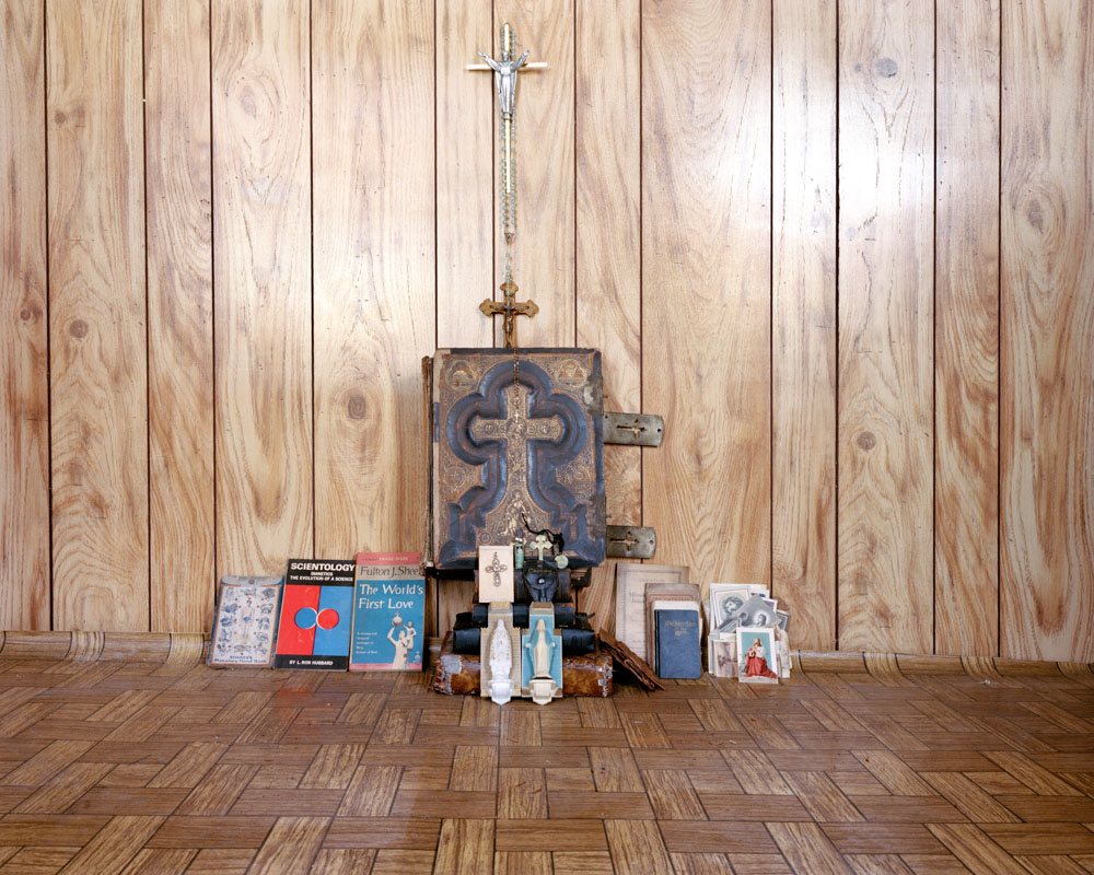
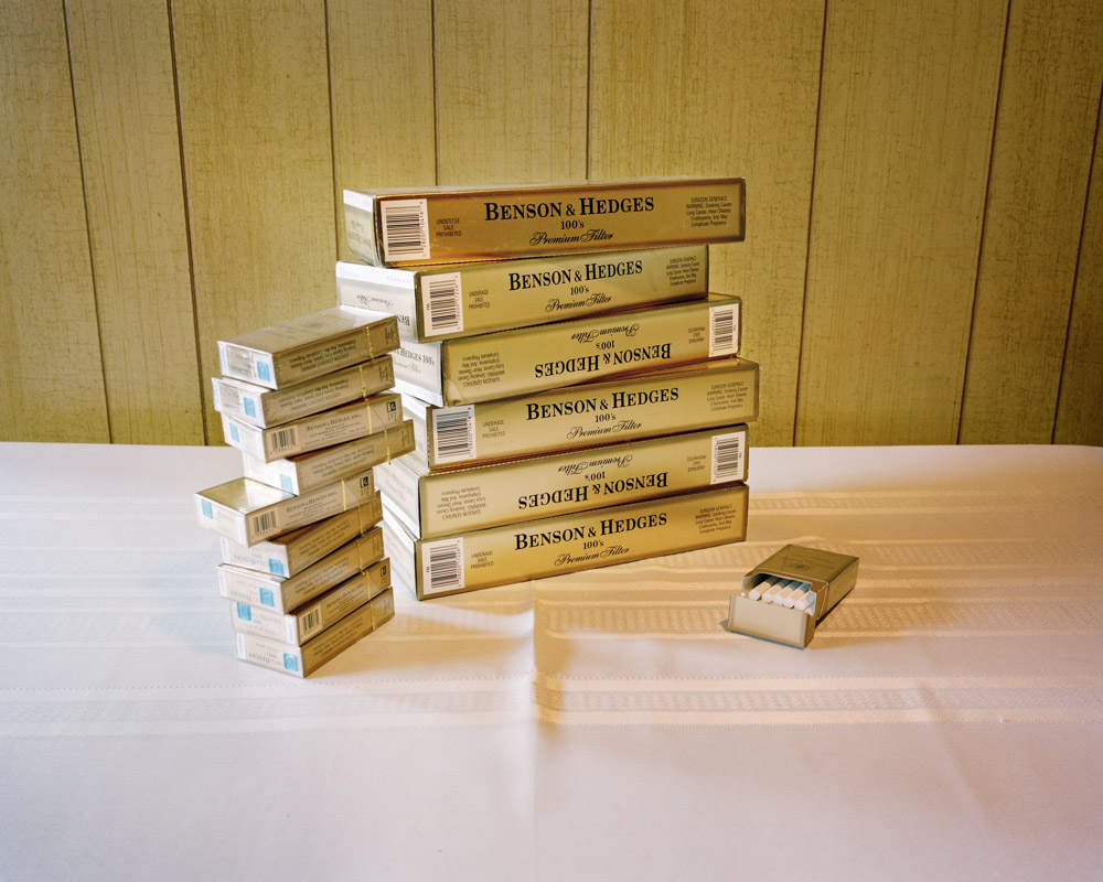
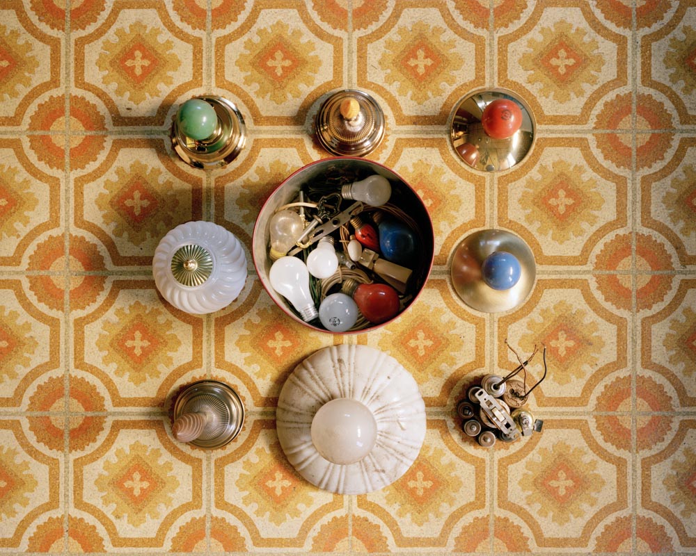
Collections
In this strand of the project I looked at how the presentation of a collection of objects can impact on how they can a viewer feel. At first I was was inspired the idea of photographic typology, especially in how it was presented by the photographer Andrea Tese and a series of Essential images created by the blog Hypebeast. I decided to set up the images by arranging them into regular set ups that consisted of patterns.
In this strand of the project I looked at how the presentation of a collection of objects can impact on how they can a viewer feel. At first I was was inspired the idea of photographic typology, especially in how it was presented by the photographer Andrea Tese and a series of Essential images created by the blog Hypebeast. I decided to set up the images by arranging them into regular set ups that consisted of patterns.
Essentials: Hypebeast

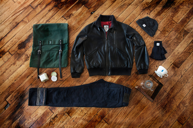
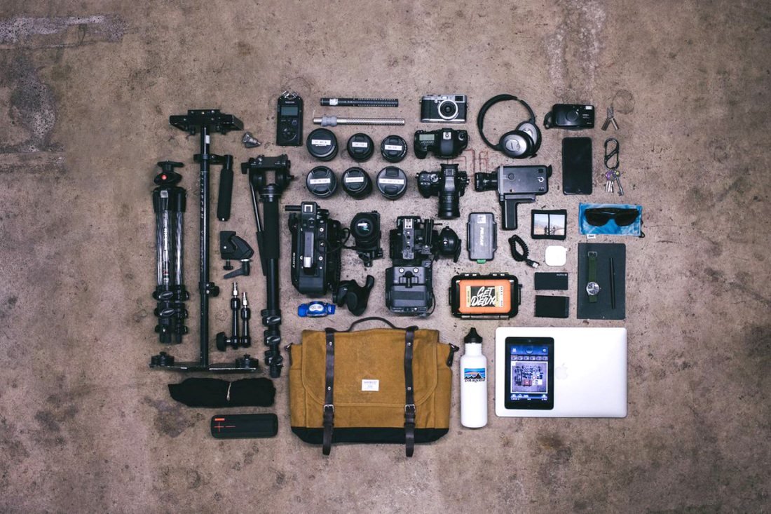
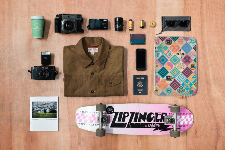
One of the main aspects I enjoyed about photographing this project was that it enabled me to create stories using only everyday objects. Using my camera I put each of the objects into the spotlight, thus allowing an audience look at the object that they may have usually been overlooked have looked at in depth. In the strand my main goal was to only explore the idea of collections, I used different methods to photograph the idea, theses methods can be divided into three distinct sections; negative space, compositions and contrast. I also investigated arranging the object in piles and stylistic set ups.
It was interesting to see how placing multiple objects of the same type into a uniform set up could somehow create a story between the objects and their surrounding. For example, in the image of knives set up in a straight line almost looked as if could have been from a film. The militarian set up also suggested the scene captured a snapshot the environment of a psychotic murderer. The use of a wooden table as the background also adds to the story behind the image as it suggest that the image was captured in person's home rather than a studio. The light that creates harsh shadows behind the knives along with making their metal blades glimmer adds a sinister feel to the image.
In another image where the coins were arranged into a rectangle that filled the screen views are able to reflect on the actually worthless nature of the money we carry in our pockets. Placing the coins from around the world on a blank background shows an audience that it is the society that chooses to add value to moulded pieces of metal. In this along with two others images I edited them so that they had a loud white backgrounds. This made the objects look as if they were fake, especially in the case of the image of the tablets. The way that the bright yellow pills contrasts with the background makes the graphic looking image look like a piece of pop art.
Whilst I explored the idea of presenting the object in arrangements I also looked at photographing the objects in scattered piles. Normally piles of object are accumulated amongst messy environments it was refreshing to see them in an individual pile. Previously a pile of rings on a dressing table along with a random set of other object may have been considered to be unappealing there is almost strange beauty in presenting the collection of objects surrounded by negative space. It allows viewers to appreciate the objects as individuals that are part of a collection.
Whilst I explored the idea of presenting the object in arrangements I also looked at photographing the objects in scattered piles. Normally piles of object are accumulated amongst messy environments it was refreshing to see them in an individual pile. Previously a pile of rings on a dressing table along with a random set o other object may have been considered to be unappealing there is almost strange beauty in presenting the collection of objects surrounded by negative space. It allows viewers to appreciate the objects as part of a collection.
|
|
|
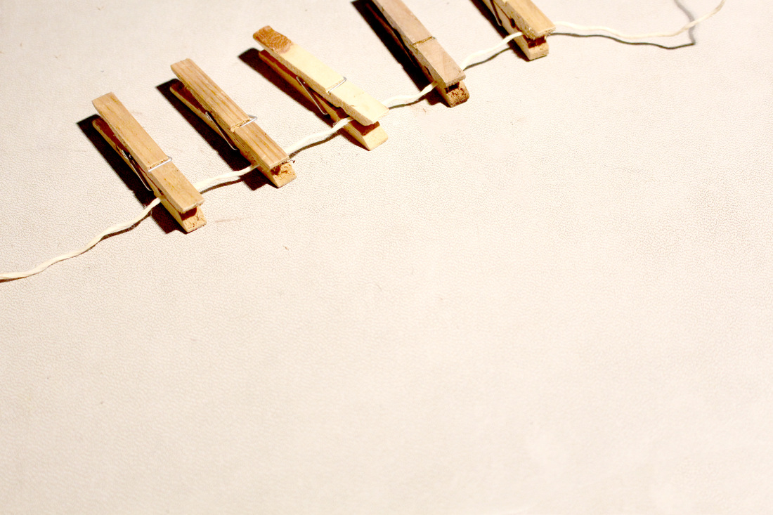
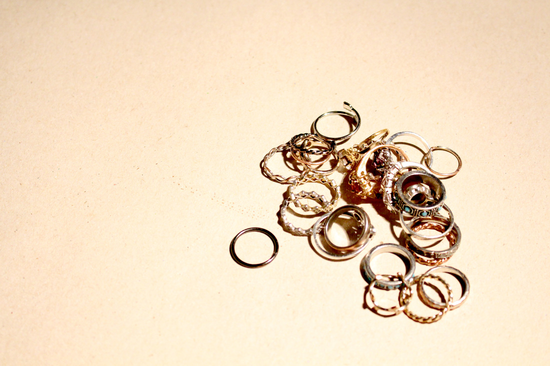
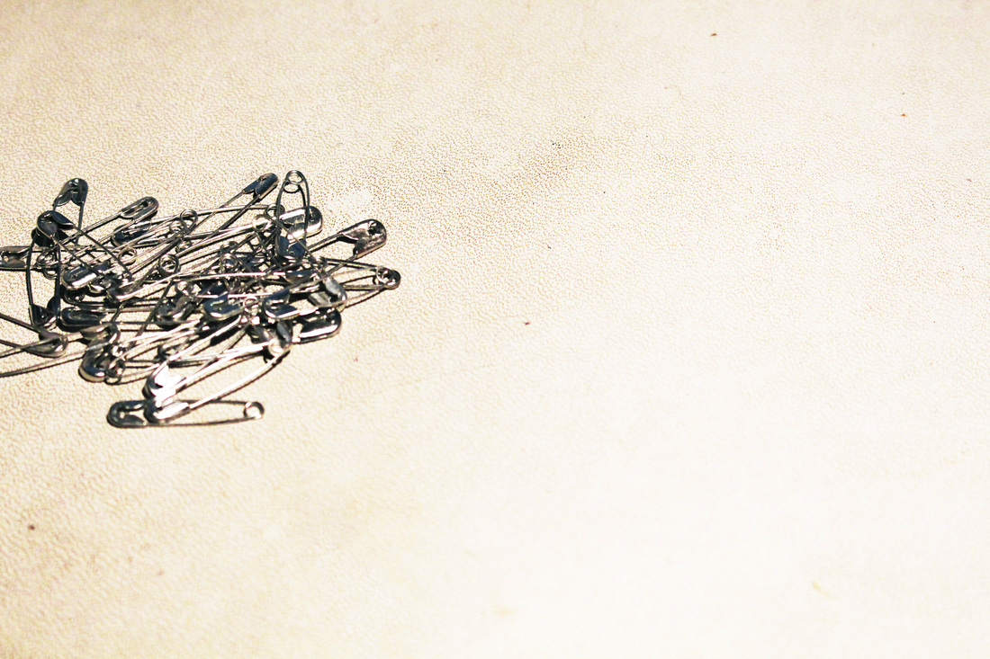
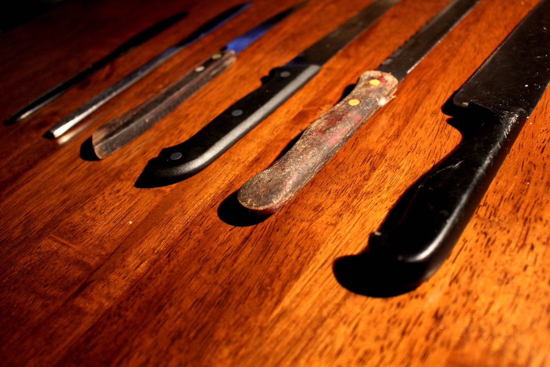
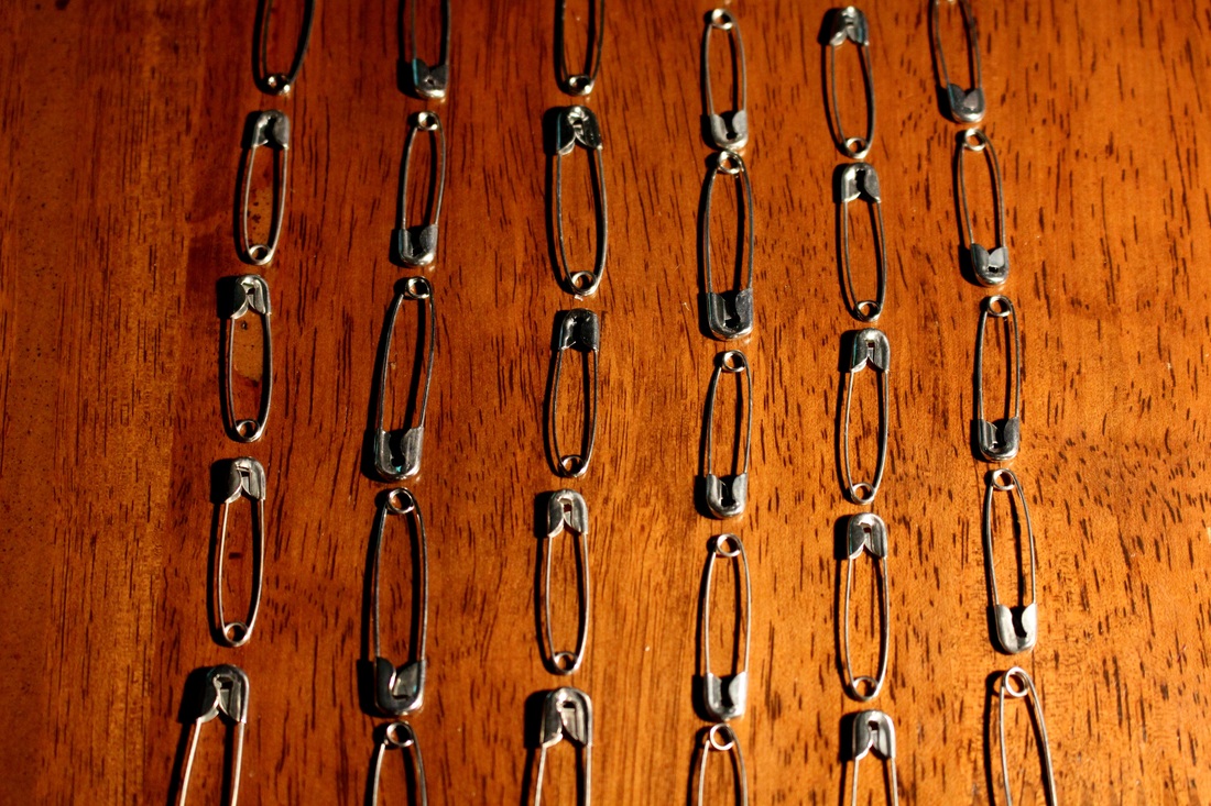
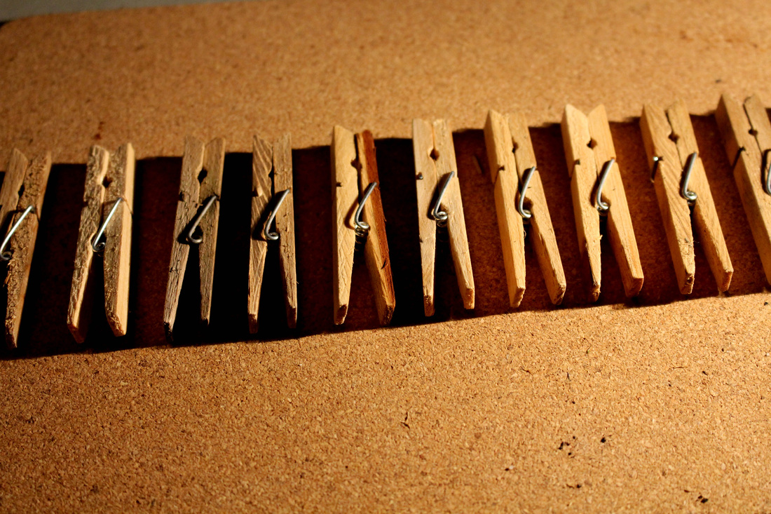


Strand: Submerged
In my second strand I experimented with photographing a sinking a fake flower. I was inspired when starting the strand by thinking of how water and earth, natural elements, interacted with each other. Initially I had tried to photographed floating, however looking at the sight of the flower sinking made me mesmerised. It was interesting to capture a snapshot of the motions of sinking. Some how drowning the flower enhanced its appearance, as any small imperfections were blurred.
When photographing the flower striking to look at the way the ripples in the water created shadow patterns on the flower beneath them. However, the shape of the flower was unaffected by the ripples. While looking at things through water can distort what we look at it was strange to see that the flower's form was still completely intact.
Moreover, when testing out the flash when photographing the light of the flask reflected of the air bubbles. This resulted in the bubbles forming small pockets of concentrated light. It looked as if small holes were being created, piercing the flower as it was submerged.
I noticed that the air formed bubbles trapped beneath the water's surface as the flower sunk made the image look whimsical. It almost looked as it the flower was trying to breathe as it sunk to the bottom of the bucket. As the flower sunk the bold red colour of the flower petals cut through the white background and the transparent water. If I were to develop the project further I would test using a variety of coloured backdrops. Furthermore, I would also use an array of objects, and attaching masses to objects that float, to see how photographing them through the filter of water would have on their appearance.
Strand : Dark & Light (Shadows)
Marek Chaloupka - Latency
In Marek Chaloupka's series, Latency, the Czech photographer photographs the silhouette of a model through milk glass. Chaloupka photographs the model from above, providing a vertical perspective, thus showing us silhouettes of mainly the subject's hands and feet. The outcome of the photographs provide an eerie and ghostly feel as the subject appears to be trapped behind a white barrier.
The image that particularly intrigued me when I looked at the series was the photograph that showed a pair of hands between a pair a feet. The image was striking a the rest of the subject's figure was barely visible. The image makes a viewer curious as to how the shot was achieved. The shape of the silhouette almost makes it look as if the subject if trying to escape from behind the glass, using both of their hands and feet. I think the image would look even more powerful as a large-scale image/
The series provides an audience with a new perspective of looking at the human figure. It is interesting to view a silhouette that is explored from rarely explored unusual angles.
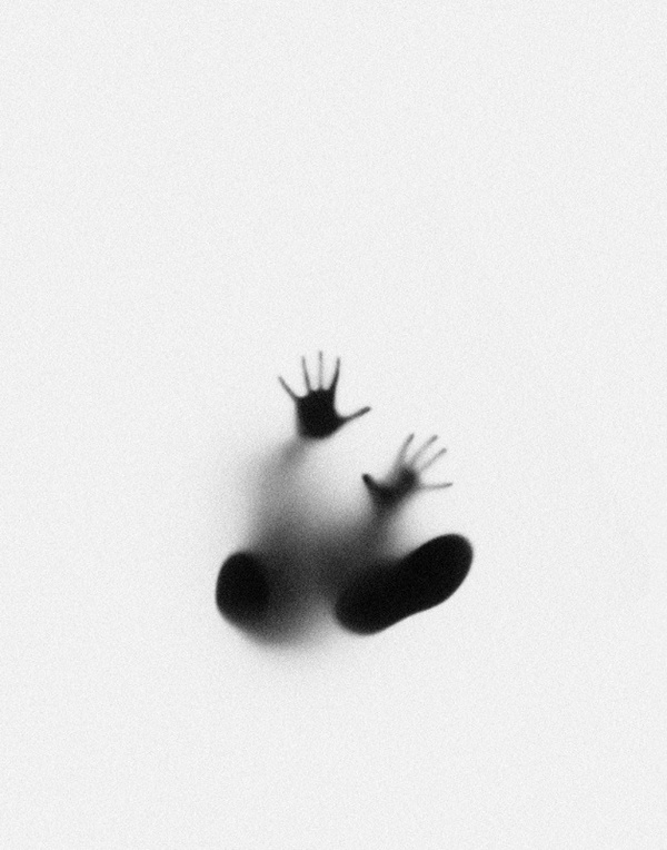
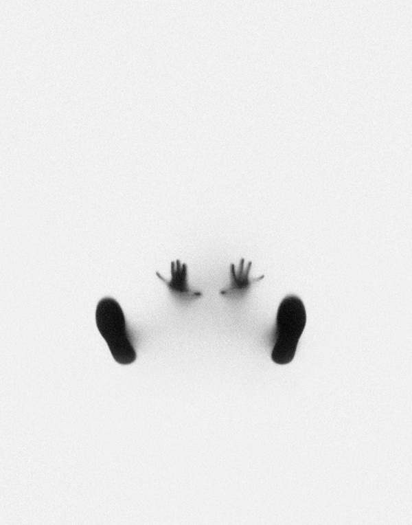
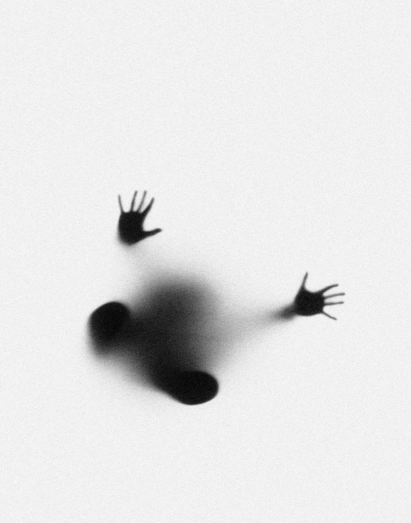
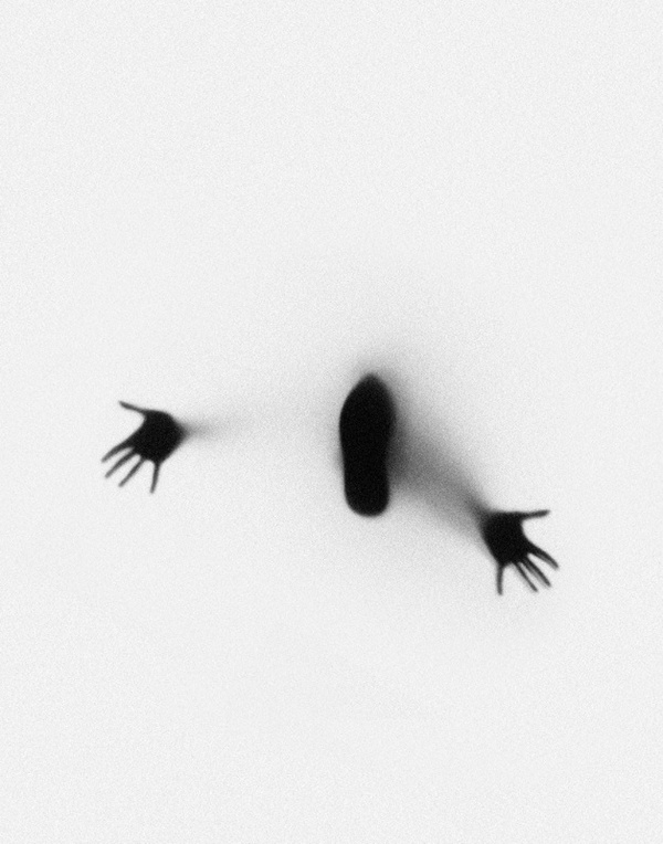
Response
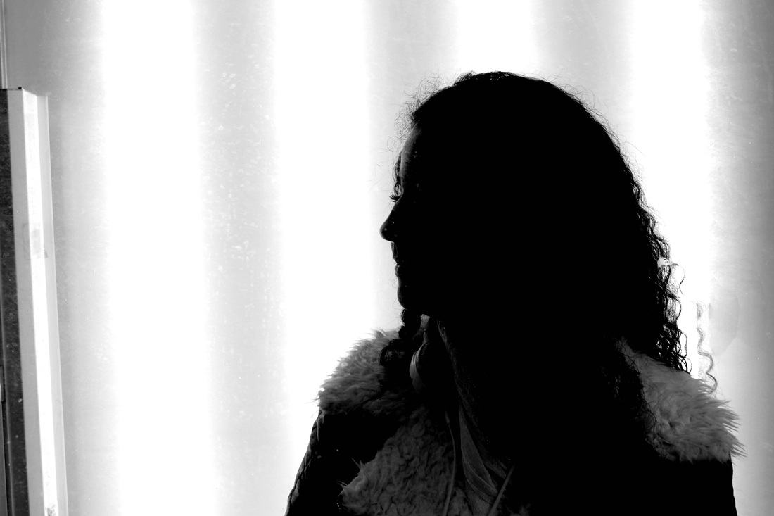
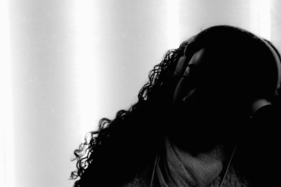
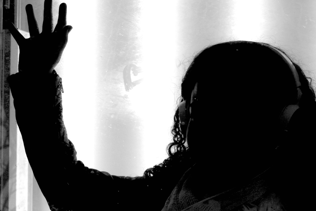
In response to Marek Chaloupka's series, Latency, I photographed a series of images that were inspired by Chaloupka's use of milk glass and his use of black-lighting to create abstract silhouettes.
When creating the detailed silhouettes I used a panel of fluorescent tubes, highlighting various details in the subject's profile. The use of florescent tubes was also inspired by Gilles Coloun's White Nights. Unlike Chaloupka's work the silhouettes I produced were less abstract and revealed more finer details. During the shoot I also experimented with using a pan of glass between the model and the camera, creating shapes on the glass.
When editing the images I increased the contrast of the image, by making the dark tones darker and the light tones lighter, exaggerating the difference between the light and darker section of the image. As a result of this the features of the model's face were emphasised and textures in the image were accentuated. To improve the set f images I would explore the outcome of of shooting the model from a variety of angles, allowing me to produce both wide and close up shot. If I were to develop the project further I would test different methods of lighting features of the face to produce abstract looking portraits.
Pol Úbeda Hervàs - I'm not there
In a series, I'm not there, Catalan photographer, Pol Úbeda Hervàs, explores who he is a he is in a state of constant development. The series arose due to changes in Úbeda Hervàs' life that left him questioning his identity. The images feature the photographer's shadow with his body erased.
Using editing software, like Photoshop, Úbeda Hervàs manipulated his images, leaving audiences puzzled. Úbeda Hervàs states that both his shoes and his shadow act as a reminder to him that he is still the same person. Even though Úbeda Hervàs may feel like he has changed the his pair of shoes that feature in all of his images gesture to the fact that there are fragments of his old personality that still remain. The addition of addition of the shoes to each image enhances the photographs by making the images more than just shadows. The fact that Úbeda Hervàs' shadow acts as a reminder of his old self suggest that the change was not physical but perhaps mental. As a person's personality transforms their physical appearances stays constant. Úbeda Hervàs' series acts as a reminder to viewers that as people we are constantly developing and growing, even though we may have physically stopped growing.
Úbeda Hervàs thought-provoking images captures the absence of a human figure in the images, allowing an audience to be accepting of their chance. As a product of age we start to react differently to situations we have encountered before.
"I don’t recognize myself any more. These photos express this feeling.
These pictures are the way I see myself now."
These pictures are the way I see myself now."
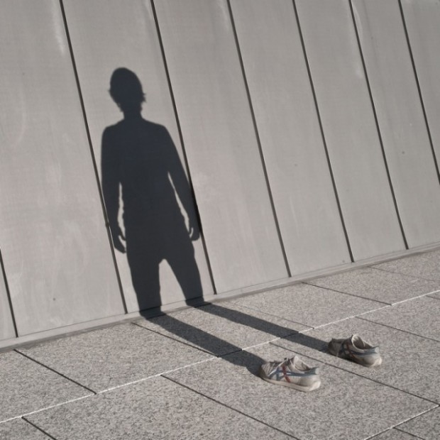
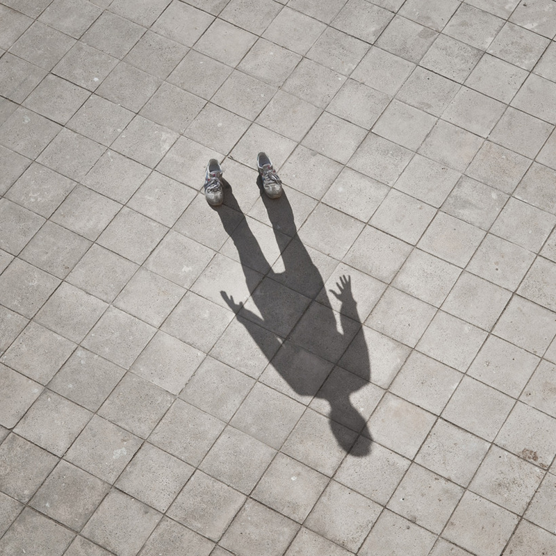
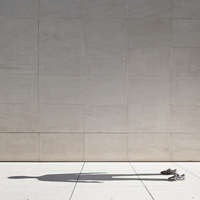
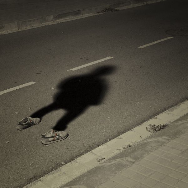
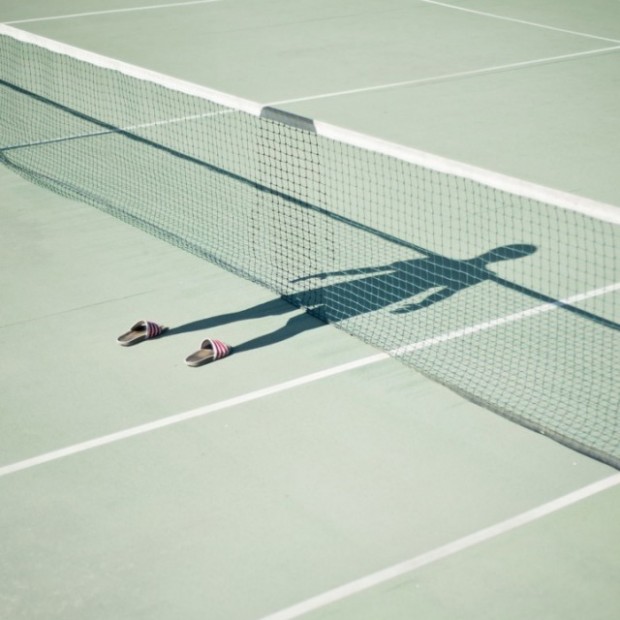
Response
Developing from my response to Marek Chaloupka's work I chose to experiment more with looking at silhouettes. In my previous response I found that the use of black and was effect in highlighting aspects of the subject so I chose to continue to use in in my next response. In response to Pol Úbeda Hervàs' I'm not here I photographed a series of images that were also heavily based on shadows. However, unlike Úbeda Hervàs I chose to explore the idea of movement by photographing the shadows of a wooden drawing dummy. Buy changing the dummy's position I explored the shape of the human form, especially in term of dance. Through placing a spotlight behind the dummy, enabling it's silhouette to be projected on the wall opposite it I then photographed the shadow, with the absence of the figure itself. If I were to develop the the project further I would have photographed a real dancer in a non-studio environment. This would focused more on the shadow's interactions with the surrounding environment.
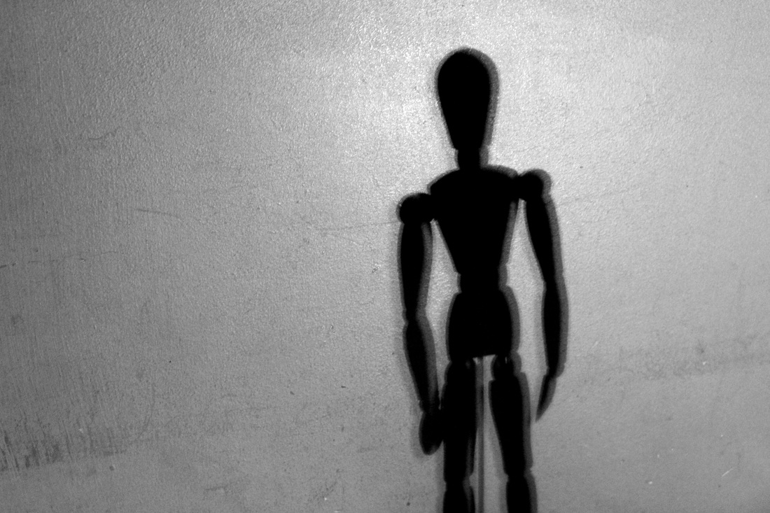
Strand: Lights
White Night - Gilles Coulon
Gilles Coulon's 'White Night' project began after he took a trip to Niger in 2000. The trip started a series where Coulon's obsession with the universal fluorescent lights began. While the subject of Coulon's photographs were banal the glowing nature of the lights makes for fascinating images. Viewers are drawn to look at the light, almost like a fly. The emptiness of the night was illuminate by random strips of fluorescent light, accentuating the vast emptiness of these places. When I created my response to Coloun's work I tried to also make the lights seem as if they were glowing, framing the figures in the images.
The images in the 'White Night' project were taken in cities across the world, including places such as Shanghai, Paris and Helsinki. Although the image of each city shares similarities through the use of fluorescent lights they also have a lot of differences. The lights in the images illuminate the unique scenes in each city, allowing an audience to imagine the personalities of each city.
The intensity of the lights in the images allows viewers to look at dark corners of the cities that would have been overlooked if they hadn't have been illuminated. The nature of the lights in each shot means that only its immediate surroundings are lit up, leaving the rest of the image in darkness. The high contrast between the two is interesting to look at.
One of the images that intrigues me the most is the image of the that are lit from above fans. Whilst majority of features no people in them it is an exception. However only the silhouette of the figure is seen in the image. I like the way the fans immediately below the fluorescent tube is lit adding detail to them, whilst the fans below are partially lit. The light bounces of the metal cage of the fan, reveal some of the details of the fan, such as the metal spokes. It is interesting to see how a illuminating a environment at night can reveal new sides to the place.
Development
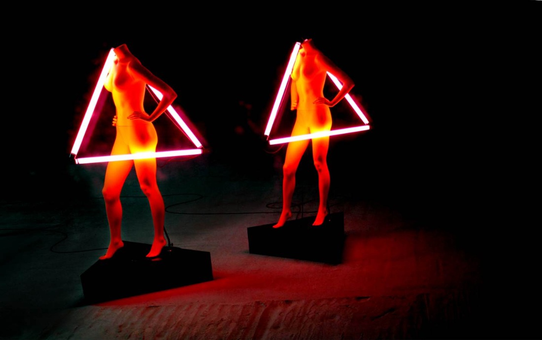
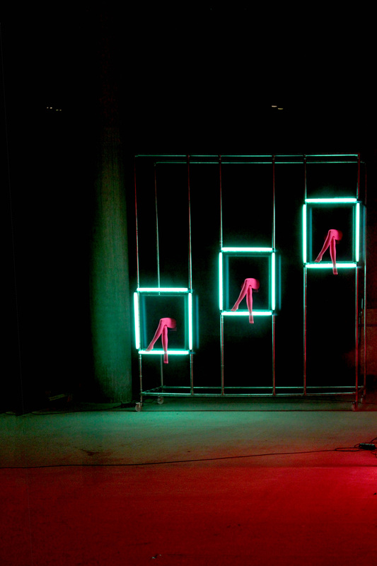
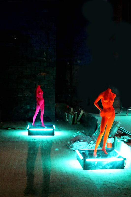
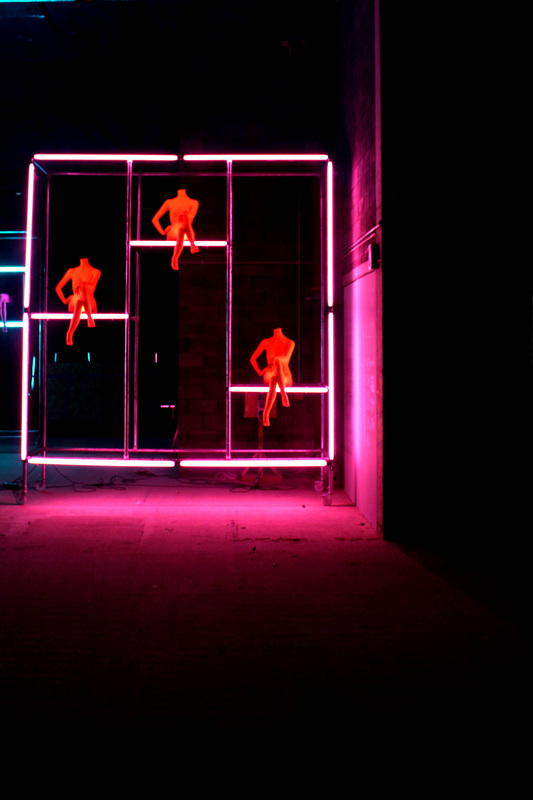
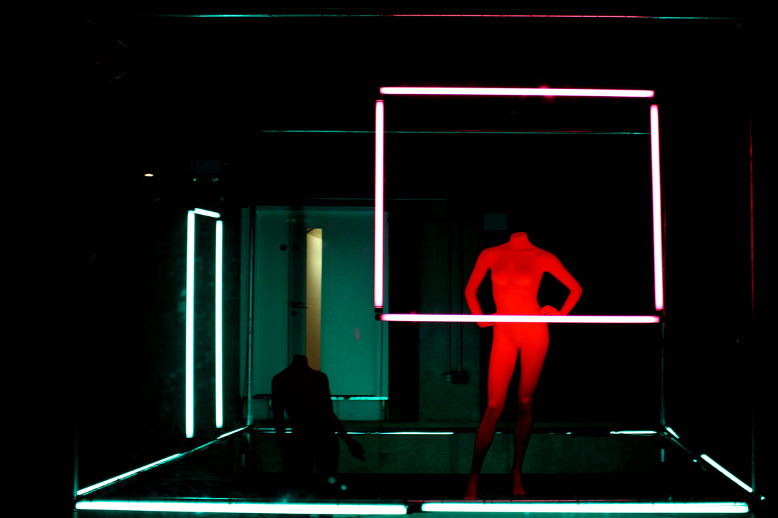
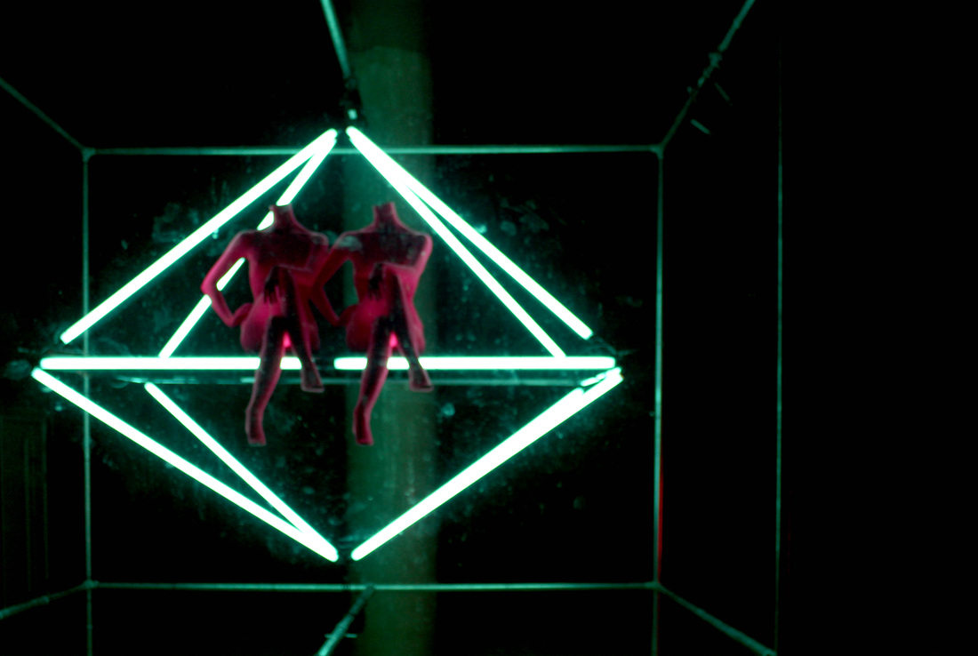
Influenced by Gilles Coulon's White Nights I photographed an art instillation in London's King's Cross. The installation consisted of neon coloured mannequins along with fluorescent lights that illuminates some of the area's vacant retail units. Using Photoshop I increased the contrast in the images emphasising the fluorescent lighting. The fluorescent tubes acted as frames in the images, drawing a viewer's eyes to the main point of focus. In order to add emphasis to the mannequins in the images I also adjusted the colouring and removed other sources of light, thus making the figures be solely lit by the fluorescent lights.
The installation shows that the addition of light and colour to a space can transform it from being dreary into being a pleasant and aesthetically pleasing place. Although the bright neon colours improved the appearance of the empty space I found that the lack of movement did not make up for the hollowness of the unit. To develop my idea further I plan to explore the impact of movement and light in a dark environment.
The installation shows that the addition of light and colour to a space can transform it from being dreary into being a pleasant and aesthetically pleasing place. Although the bright neon colours improved the appearance of the empty space I found that the lack of movement did not make up for the hollowness of the unit. To develop my idea further I plan to explore the impact of movement and light in a dark environment.
Light Painting - Michael Bosanko
Michael Bosanko's journey as a light artist began in 2004 after he was inspired to create lightwork after he accidentally knocked his camera when he was photographing the moon. Knocked over the tripod had cause the moon to to produce a streak of light through the night sky.
To produces his light work Bosanko uses long shutter speeds. Depending on the amount of detail in the images exposure time used can range from 10 minutes to an hour, the longer the exposure time the more detail in the image. Other than his camera the main tool used in his photograph is his torch. Like a painter may use a paintbrush Bosanko uses his futuristic tool to create masterpieces in a three-dimensional space, adding a fantastical dimension to the landscape. Other than his camera and a few props like torches Bosanko uses no form of editing software to create the images of his light drawings, making the images even more fascinating to look at.
Rather than just drawings Bosanko's pieces look like they are neon sculptures. In most instances it is obvious that the light drawings were added to the natural landscape, enhancing it. As a result of this they look alien like, because they glow making then stand out.
|
|
|
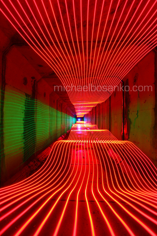
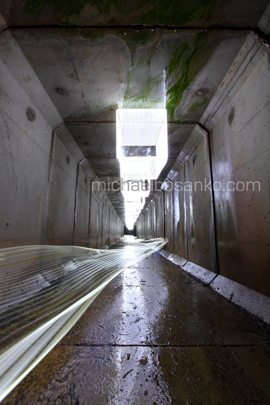
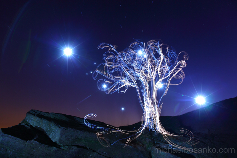
|
A series by Bosanko that intrigued me a lot was The Bottle. In a studio set up Bosanko develops his light graffiti techniques by using long exposure photography to capture the movement of smoke and flickers of light. The coloured light and smoke adds mystical elements by engulfing the bottle in smoke. Although the subject of each image remains constant the diversity created in each shot by the movement of the smoke and lights changes the atmosphere in each of the shots. Alteration of colour can have a large impact on the emotion that a viewer may feel. In one of the images, where red smoke surrounds the stationary silhouette of the bottle, the symbolic nature of the colour red is that of passion and intensity. Although the images feature a single wine bottle Michael Bosanko's images illustrate that colour is an important aspect in conveying emotions.
|
|
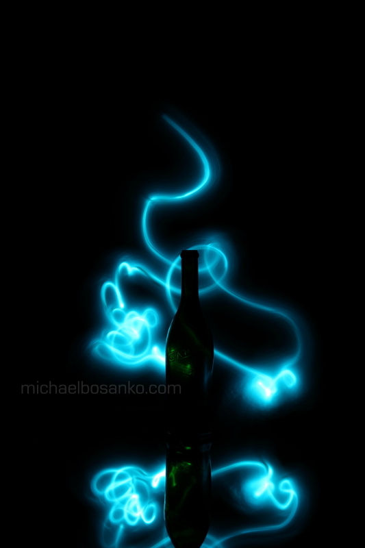
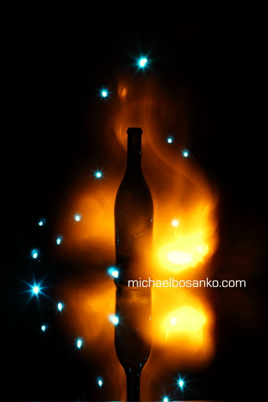
In another of Bosanko's long exposure series, Night Trails, the photographer photographs vehicles creating abstract lines, caused by the movement of the car. The trails show the journey of the car as it moves into and out of the frame. The progression show in the long exposure of the cars almost makes the coloured headlights look like reams of fabric blowing in the wind, creating waves. Although the mystical images were created through the use of artificial light the fluid motion of the trails has a natural element. The light trails created is reminiscent of the Northern Lights. Bosanko's use of long exposure to show how an object travels through the image inspires me to create long exposure shots where in a single shot viewer is able to witness an entire journey.
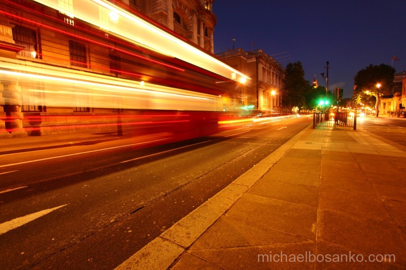
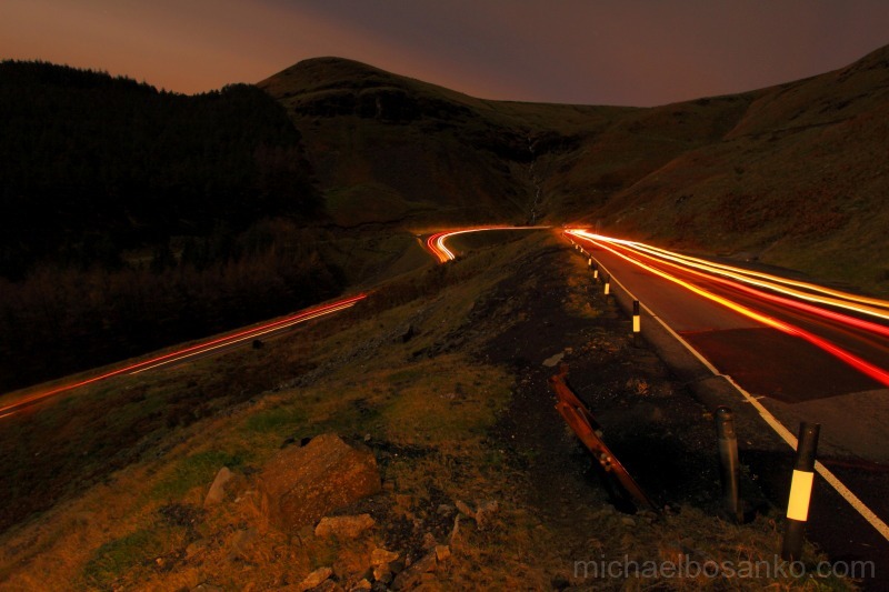
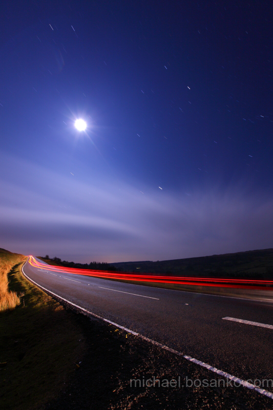
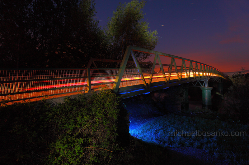
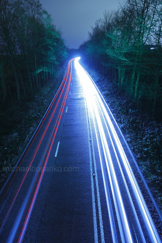
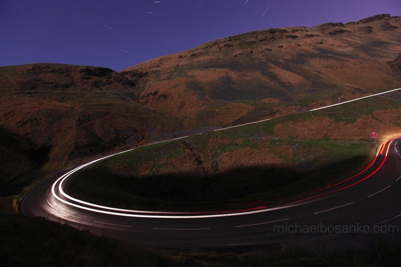
Development
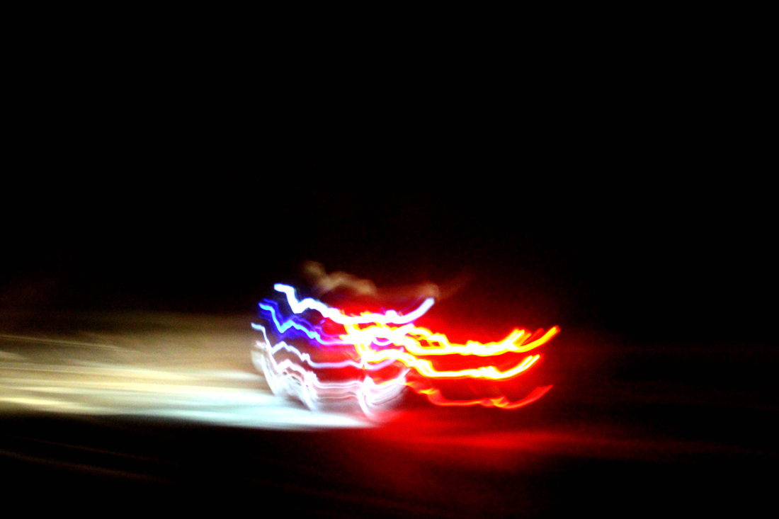
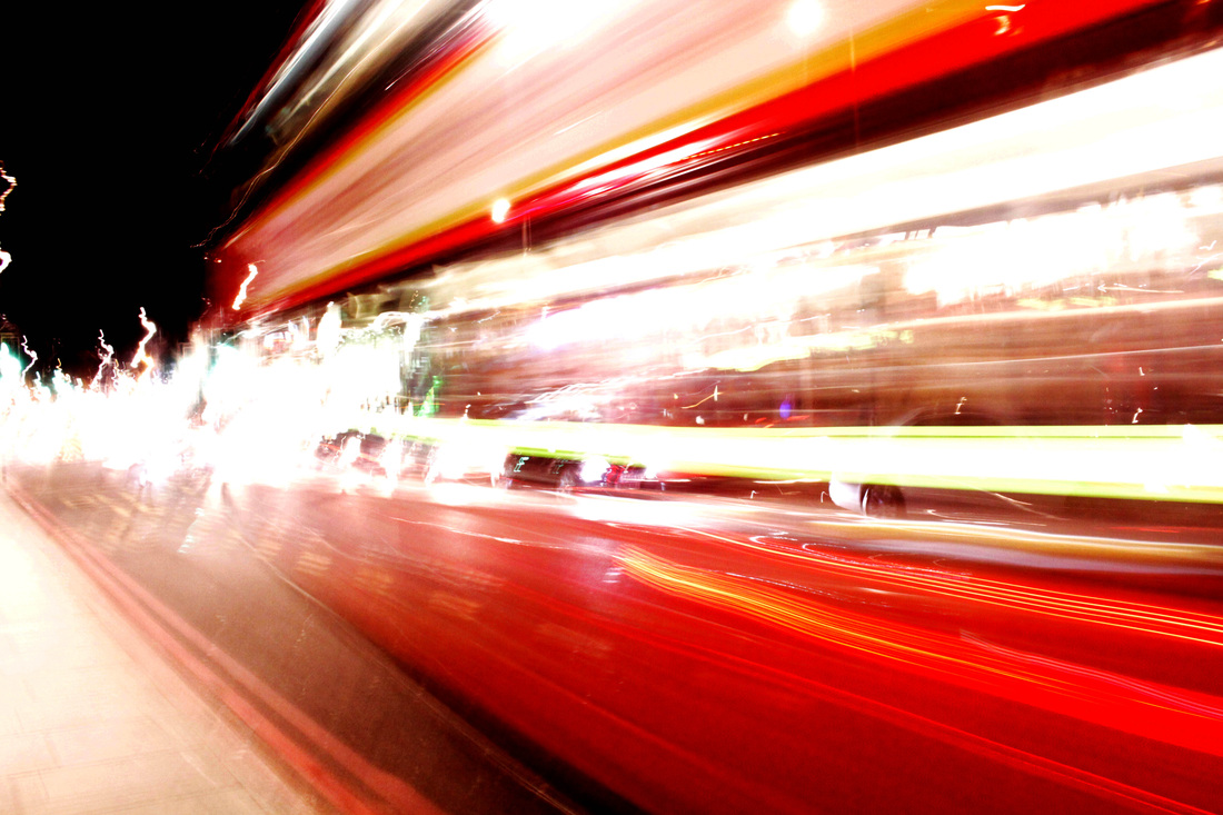
After completing my response to Gilles Coulon's White Nights I continued to explore photographing lights. However, with the influence of Michael Bosanko's Night Trails I explored how light to could be combined with movement to create long exposure shots. An idea that I also maintained when developing the project was the idea of contrasting the black background with the coloured lights. The images were shot in two contrasting locations, rural France and London's King's Cross.
When photographing I used slow shutter speeds, with low ISO to capture the movement of vehicles. The f-stop was kept high to allow for a lot of light to enter the lens. The long exposure shots create abstract shapes. Unlike Bosanko's images when photographing my images I did not use a tripod, consequently the images featured camera shake, which caused the light trails to be wobbly. However, I think that the undulating lines produced by the light provide an artistic touch to the image by creating unique shapes. To further improve the quality of my images I plan to use a tripod.
I found it fascinating to see that even though an audience would not be provided with the intact form of the car, the way in which the lights trails are formed still the fact that images are not suggestive as to what the shape or type of car that is presented. For examples in an images that shows a stream of red going across the frame indicates that the vehicle is a bus. Using light as a representation of the progression object makes as it move through the shot is a concept that I hope to develop.
Development
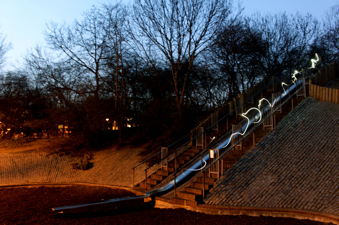
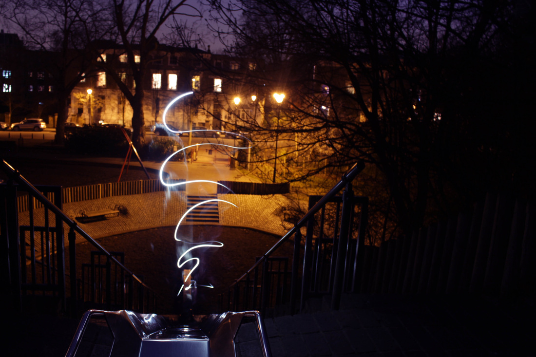
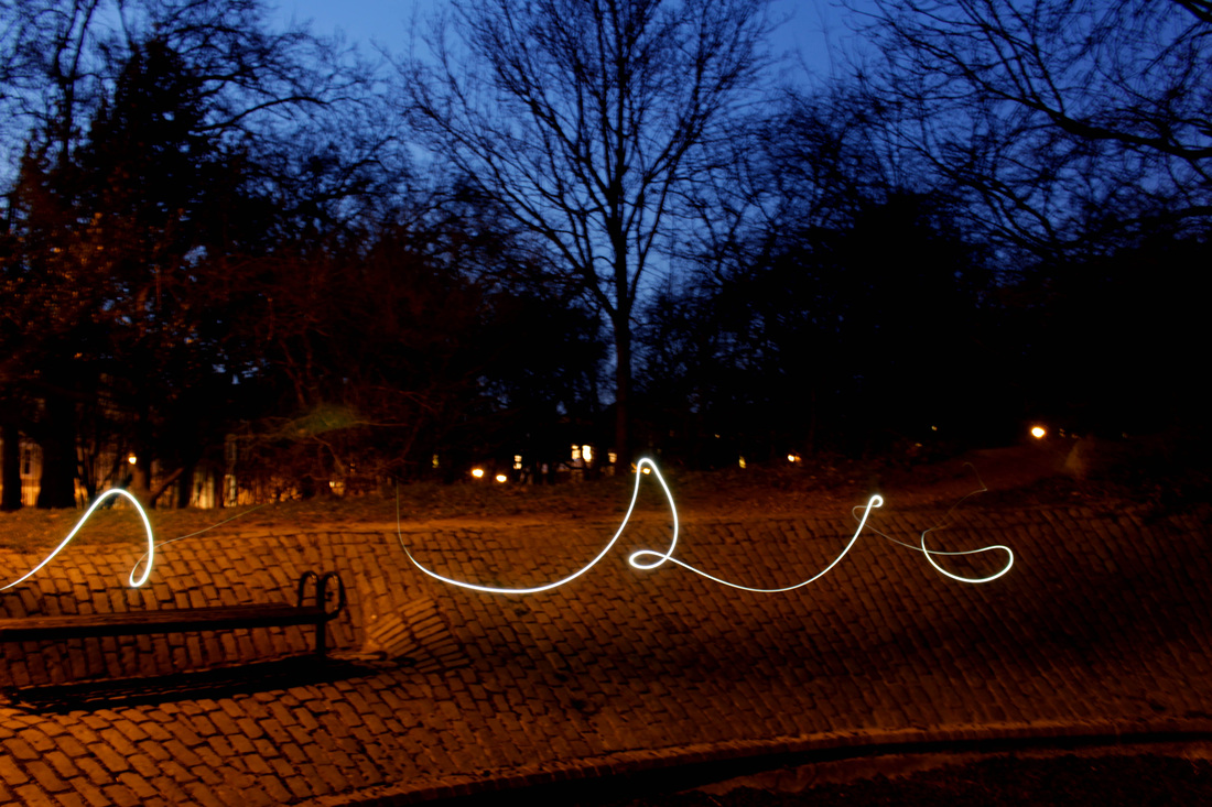
Developing from my first response I visited a local park, Highbury Fields Playgroung. Using a torch and the bulb mode on the camera to produce another set of long exposure images. Once the camera started the long exposure process the model then move the lit torch through the shot. Inspired by Michael Bosanko's White Nights I used the form of long exposure images to capture the journey of the subject as they wandered through the park. The fact that viewers are unable to see the identity of the person who created the light trails allows them to make a personal connection with the images.
The light trials created interesting waves in the images, replicating the elegant motion of the dancer. The whispers of light trails are fairy like. Using the long exposure process allowed me to allow an audience to rediscover forgotten childhood memories.
I chose to use the bulb mode on my camera instead of just using a slow shutter speed, this is because it enabled me to capture longer light trails. In addition the fact that the exposure times could be adjust for each individual shoot mean that I was able to limit the exposure time. This was key as unnecessarily long exposure times allowed more ambient light to have an impact on the images.
When editing the images using Photoshop I adjusted the levels, making the light trails stand out more.
In one particular image where light trail is seen travelling down the slide with houses in the background, the ambient light from the houses and the street lights. Photographing in an urban environment meant that the interference of ambient light in the long exposures was a constant issue. Moreover, I would also add weight to stabilise the tripod, this is because although I used a tripod may of the images I took were still slightly blurry due to camera shake.
Development
Developing from my previous response I continued with the theme of using long exposure shots to shot how light can interact with particular environments. Using a tripod along with a remote I ensured that there was camera shake visible in the shots. Although for the previous response I noticed that using a tripod alone reduced some of camera shake in the images it was not completely gone. This was due to the fact that each time I pressed the shutter it moved the camera slightly. This problem was combated through the use of an infra-red camera remote, which enabled to take pictures without having to physically touch the camera.
Developing from my fourth response I introduced the use of coloured light trails. This was achieved by placing coloured gels over the torch. The use of coloured light added a playful and mischievous vibe to the image. In this series I experiment with making the light trails end abruptly in the middle of frames, making it look like the trail had stopped suddenly to look at the viewer.
The location I chose or this shoot was the area surrounding my house. Rather than exploring generic childhood memories I chose to look deeper into my own childhood memories. My current house is a lace that I have grown up in and hold a lot of memories. Photographing in the area outside my house was refreshing, as going back to places that hold particularly fond memories was interesting to explore as an older person. Being taller also meant that I had entirely new perspectives on the world around me, a balcony that I though was kilometres high was not put into perspective. The bars of the balcony also enabled me to show how light can interact with different surface, as it was reflected of the metal, spreading its green glow
In this set of images ambient light was an issue again. To tackle this issue I would need to choose more rural locations, however this would be difficult as the purpose of this project is to explore my own memories. Having grown up in an urban environment meant that going to rural locations would not be an option.
Development
For this response I continued with the main theme that was now established in my project, long exposure. I progressed with the idea of using the long exposure process to explore childhood memories by examining a lonesome slide. For this development I decided to revert back to using white rather than coloured light. The colour white often symbolises innocence and purity. I though that this was suitable as it has a connection with the innocence of a child.
The light trails in the series of images represent a the wandering soul of a child as the play. The motion of the light is simulate to movement of a playing child. The fact that the series was shot at night gives an sombre atmosphere, the empty and dark backdrop is not necessarily a place that many of us associate with happier memories. In addition, the fact that there is only a single trail in each of the image emphasises the idea of loneliness.
When creating these images I developed my long exposure technique by adding a two second delay before the long exposure began. This allowed the torch to in the appropriate position before starting. Although I like the use of placing emphasis at the starting points of the trail the image was too dark overall, in some instances the slide was unseen. Environment that are too dark would not be suitable for my next development
Ben Matthews
Ben Matthews is an experimental photographer from Guildford, who also happens to be a dentist. Matthews produces often eerie long exposure photographs. Majority of Matthews' photographs have references to skater culture and the afterlife. In some of Matthews' images he also uses light graffiti to provide emphasis to the subjects. In the images he creates Matthews uses no form of editing software to retouch the images.
Matthews uses long exposure as a form of visual story telling. Many of Matthews' images feature ghosts, graves and fire. Some of Matthews' images uses biblical imagery. Along with basic light graffiti processes Matthews also incorporates the use of smoke and flask lights into his work. The long exposure images of smoke as a visual representation of spirits and ghosts. Two of my favourite images that were were produced by Matthews were both of the images that showed a half pipe. Matthews' use of lights and long exposure in the dark landscape highlighted the ramp, making it look like it were the haunting spirit of a ghost rider. The blue light creates a chilling atmosphere.
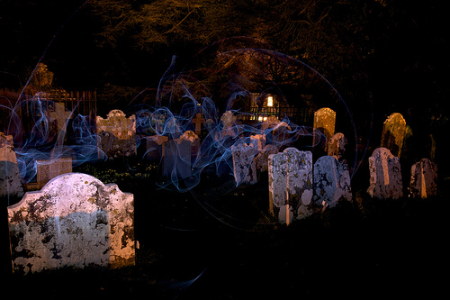
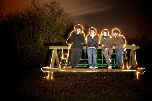
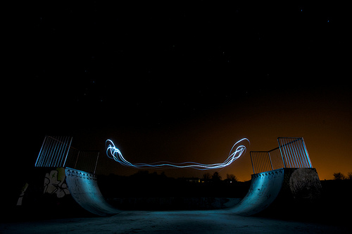
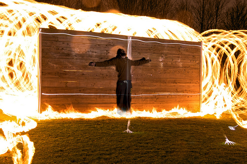
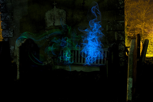
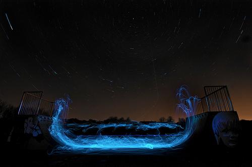
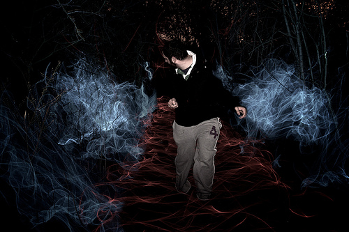
Development
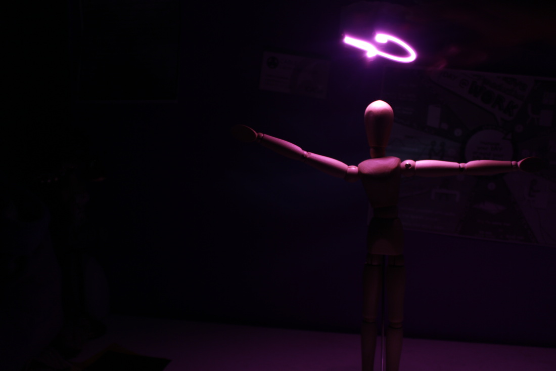
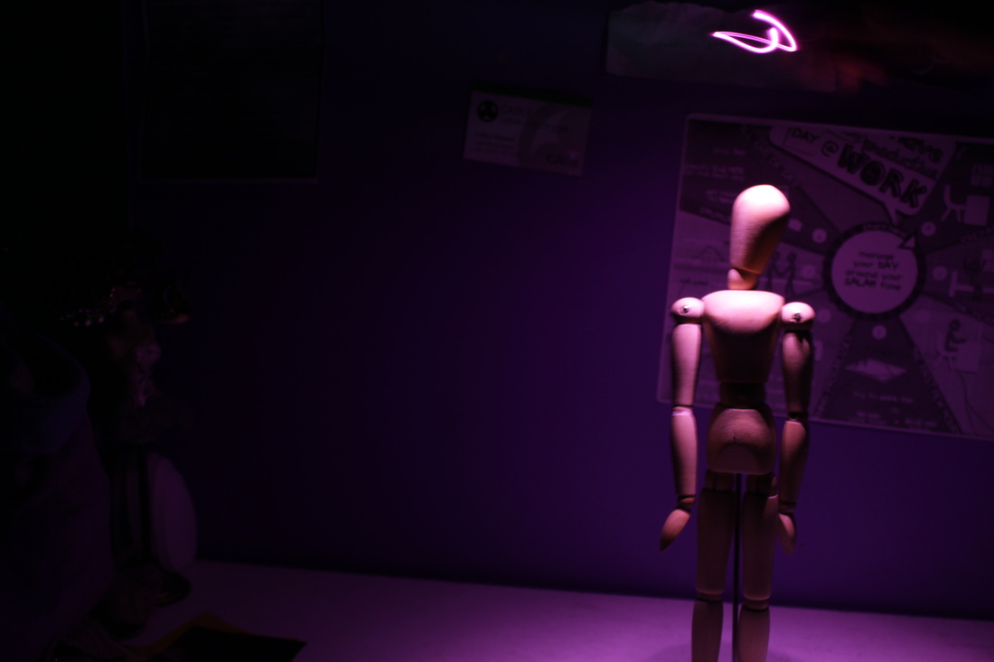
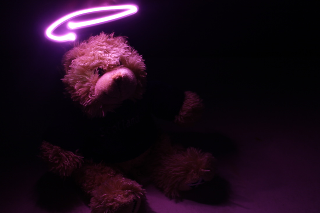
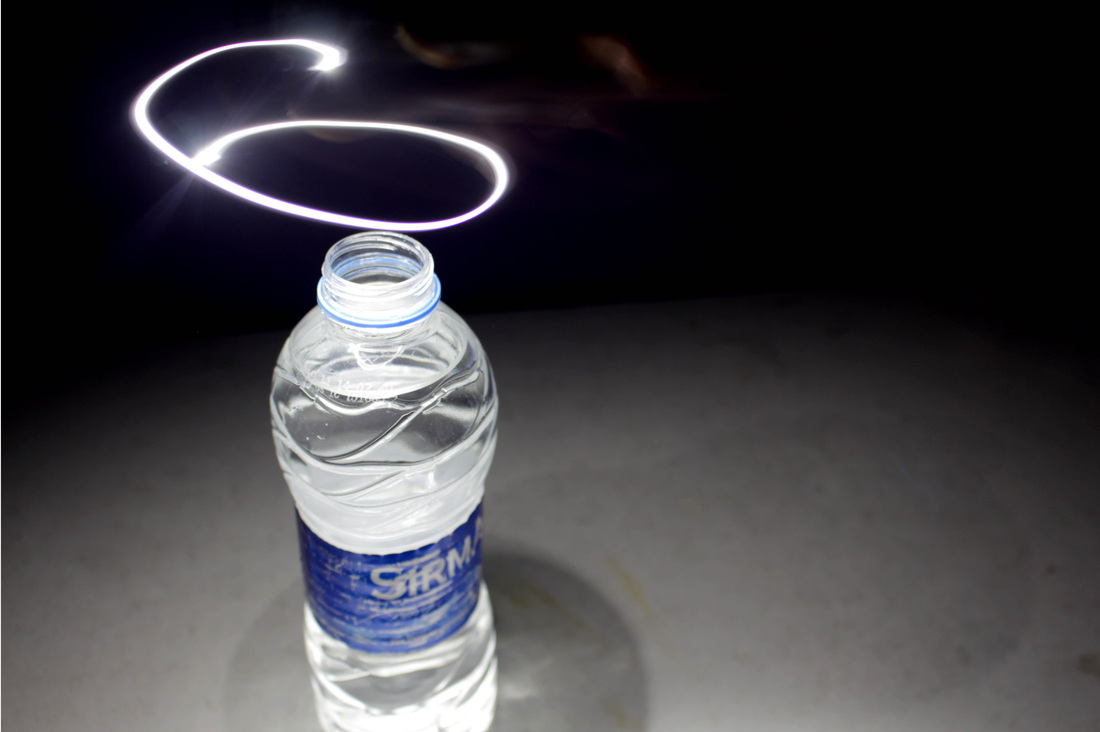
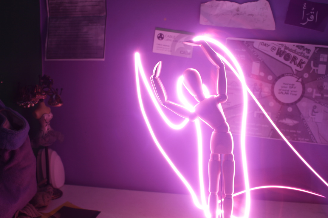
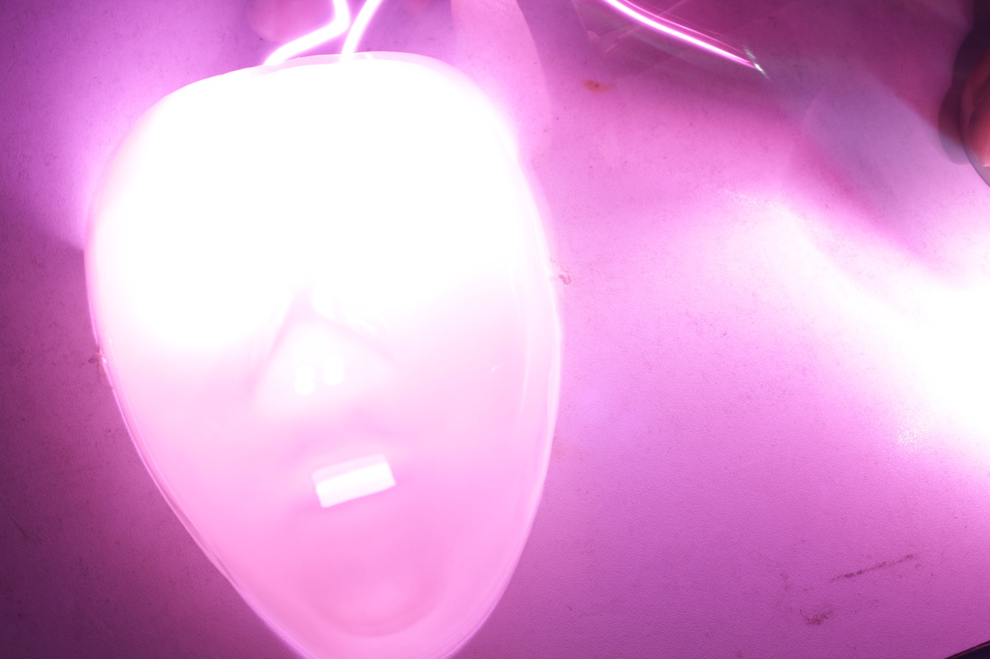
Developing form the idea of using long exposures to explore external environment I then developed the idea further and explored specific objects found inside in depth. I was inspired by an image by Ben Matthews that showed a beer bottle illuminated through the use of long exposure. In some of the images I draw halos above the objects, providing them with spotlights. This was done as an attempt to add souls to the inanimate objects, captivating an audience. Matthew's them of death and the afterlife also inspired the concept. The idea of transforming a simple object into something more was also inspired by Fischli and Weiß's The Everyday.
From the six selected images I think that the image that shows the wooden dummy with it arms spread out and a halo above its head is one that I think would be most memorable to an audience as the pink light contrasts with the darker background to create a romantic mood. On the other hand, I think that an aspect that detract from the image was the distracting backdrop. In future development the scenes behind the light drawings will to looked at so they do not draw attention away from the subject.
From the six selected images I think that the image that shows the wooden dummy with it arms spread out and a halo above its head is one that I think would be most memorable to an audience as the pink light contrasts with the darker background to create a romantic mood. On the other hand, I think that an aspect that detract from the image was the distracting backdrop. In future development the scenes behind the light drawings will to looked at so they do not draw attention away from the subject.
Development
Developing from my previous response I decided to carry on having objects as the subject of my light drawings. Using an outdoor location when it was pitch-black I opted to use an alternative light source in the form of a lantern and a candle. The candle provided a softer glow in comparison to the torch I had previously used, while the texture of the glass panes added a variation of tones within the light streaks. As well as using a swooping motion to create wave I also rotated the lantern, combining a spinning and swooping motion. After having photographed the different types of motion separately I then used Photoshop to merge the two into one, adjusting the positioning beforehand. The negative space, in the form of blackness, that surrounds the lantern represent the other possible journeys the light to take, drawing in the viewers. I think that to improve the image an increased amount of interaction with the environment would need to be seen.
Tokihiro Sato
Tokihiro Sato is a Japanese contemporary artist and photographer. Sato mainly produces black and white photographs, using a large format camera, the long exposures produced normally last between one to two hours. His photographs are familiar for their unusual expression of light and space. Using mirror to reflect he sun's rays and sources of light Sato marks the landscape, adding 2D streaks and spots to a 3D world. In two of his projects, Gleaning Light 1 and Gleaning Lights 2 Sato presents his work in the form of large installations that are comprised of discrete images, smaller composite photos and mural-sized digital panoramas.
As a Japanese artist Sato uses other form of Japanese visual art traditions such as the precision and athleticism that s expressed in work to influence his own work. Sato was also inspired by types performance art and dance when creating his work. Using the body as a tool, body language is translated in the to into light marks on the canvas, providing a playful interpretation of of light. In an Sato stated that the process in which he creates his work “a direct connection between my breath and the act of tracing out the light.” The motion created by the Sato i his light drawings are reminiscent of the movement of a dance, allowing viewers to cast their eyes on the elegance beyond just the simple movements of the dancers. The messages left in Sato's images are symbolic, and left to be interpreted by an audience.
Sato's use of a penlight to explore Tokyo's landscape creating organic shapes, inspired me too also explore my own environment. The way in which the light illuminates the black and white images is an idea that I will implement in my own work. I enjoy looking at Sato's work because the haunting stillness Sato captures in images create a dreamy and magical atmosphere, which is a concept I want to illustrate in my own work.
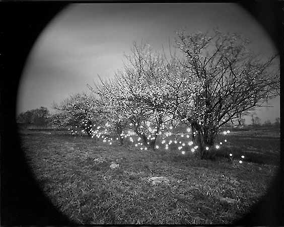
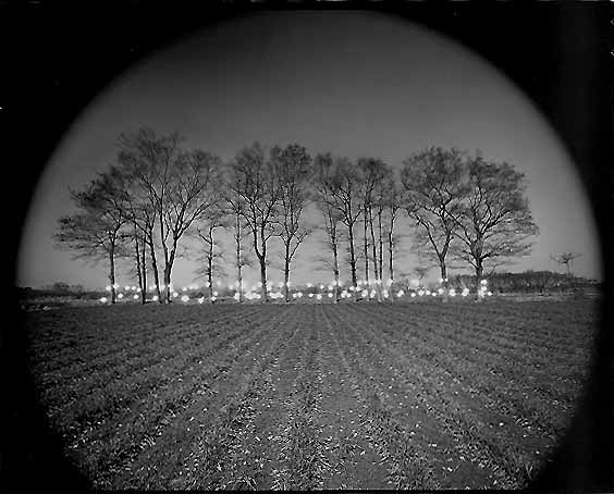
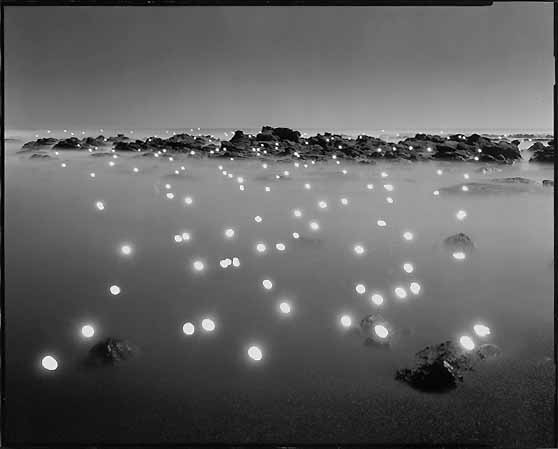
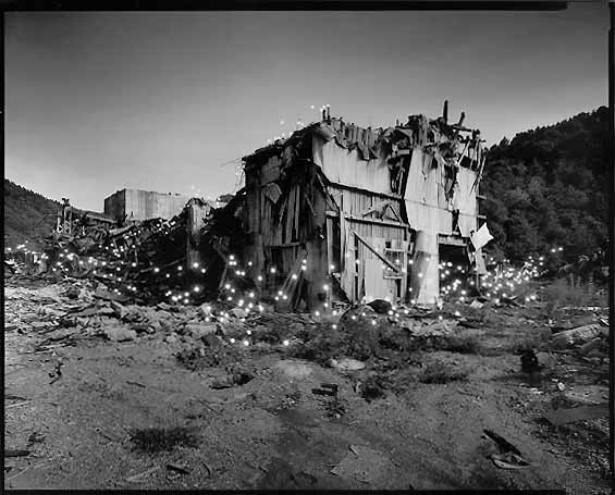
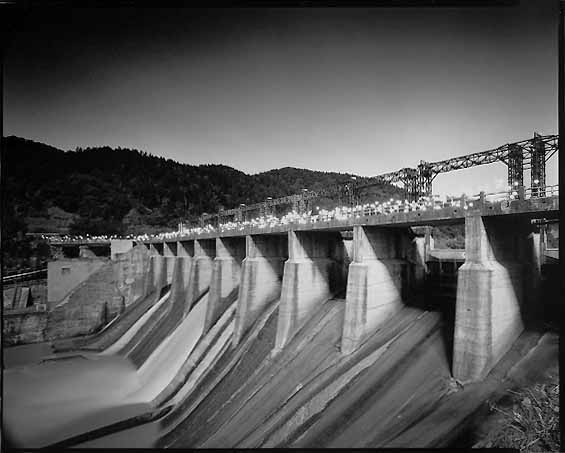
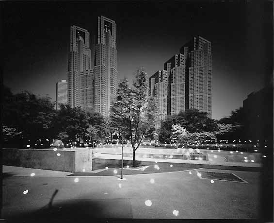
Development
Having looked at Tokihiro Sato's black and white photographs along with the contrast that was created by the coloured light and the black background in my past response I was inspired to intensify the vibrancy of the light trails by making the rest of the image duller. Having experimented with the combination of using both light trails and still images of sources of light developed images that I had taken before and edited them. By bringing together the vibrancy of neon light trails along with the more subdued tones of the background I attracted the eyes of a viewer. To achieve this I created created a mask layer - with the adjustments made so that the background colour was different, and then I erased the mask where the light trail was present. I tested out using a sepia and black and white effect on the background.
Exhibition: Revelations: Experiments in Photography
An exhibition that inspired me when creating my project was Revelations: Experiments in Photography. The exhibition was put on at Knightsbridge's Science Museum and showed the union that was formed involving science and art, focussing mainly on photography. The photographer we are able to see thing that is not possible to see with the naked eye. Photography today allows us to capture scenes of things that are astronomically distant, in swift motion and microscopically small. Moreover, the exhibition brought together a range of work, both old and new, unifying historical inventors such as William Henry Fox Talbot with contemporary photographers with the likes of Sharon Harper and Idris Khan
Two images that I found to be particularly relevant to my project was The Flight of a Baton by Harold Edgerton, 1953 and Chronograph of a Man Clearing a Hurdle by Etienne Jules Marey, 1892. Both images capture the journey of the subject as they move from one point to another, via photographing multiple frames as the subject is in motion. The process of showing the entire journey of these subjects, for instance the hurdler as he jumps over the hurdle allows a viewer to look at each detail as he moves from one end of the to the other, leaping over the obstacle that was in front of him. The concept of depicting the journey the subject takes is one that I hope to capture in my own project, through shooting long exposure shots of light trails.
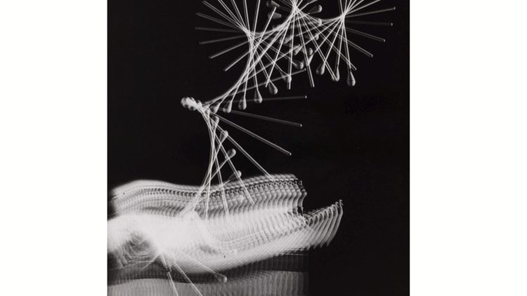
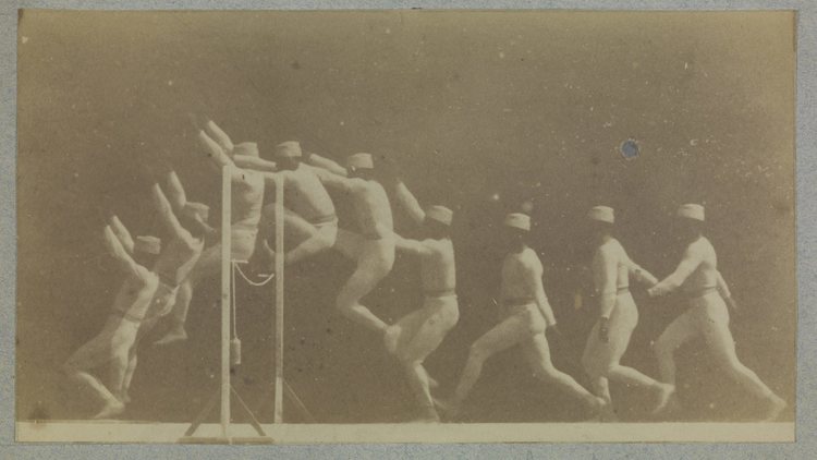
In contrast to the two the two images I just previously spoke of Blow Up by Ori Gersht, a London-based Israeli artist, using cameras with fast shutter speeds to capture a snapshot of the moment in which a flower arrangement is exploded, presenting them as large-scale photographs measuring at 96" x 72". Inspired by the painting of floral arrangements by 19th century still-life painter Henri Fantin-Latour. Through the use of photographing traditional flower arrangements with high-speed cameras Gersht bands together traditional art along with contemporary photographic processes.
To create his images Gersht freezes the flower arrangements with liquid nitrogen before using gun powder to blow up the arrangement. In the scenes of dramatic destruction the once delicate and soft flowers are now hurtles across the frame in the form of shattered glass like fragments. Freezing the flowers also signifies the ability of photographers to freeze time with their cameras. It is as if the freezing process weaponises the flowers. The images depict an uneasy beauty as the carnage illustrates the strain on the relationship between brutality and beauty.
To create his images Gersht freezes the flower arrangements with liquid nitrogen before using gun powder to blow up the arrangement. In the scenes of dramatic destruction the once delicate and soft flowers are now hurtles across the frame in the form of shattered glass like fragments. Freezing the flowers also signifies the ability of photographers to freeze time with their cameras. It is as if the freezing process weaponises the flowers. The images depict an uneasy beauty as the carnage illustrates the strain on the relationship between brutality and beauty.
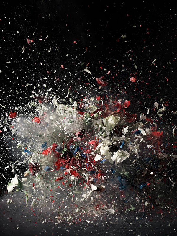
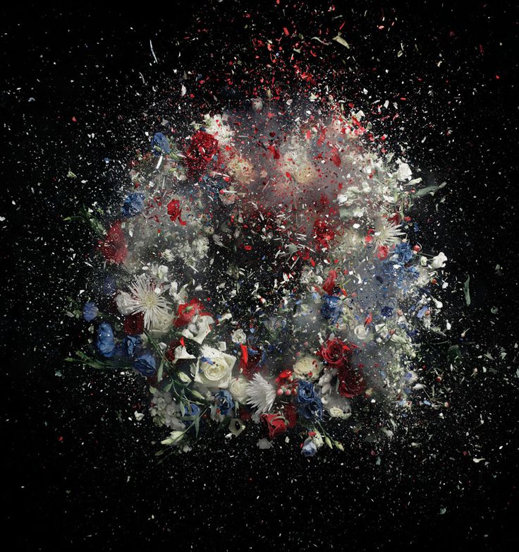
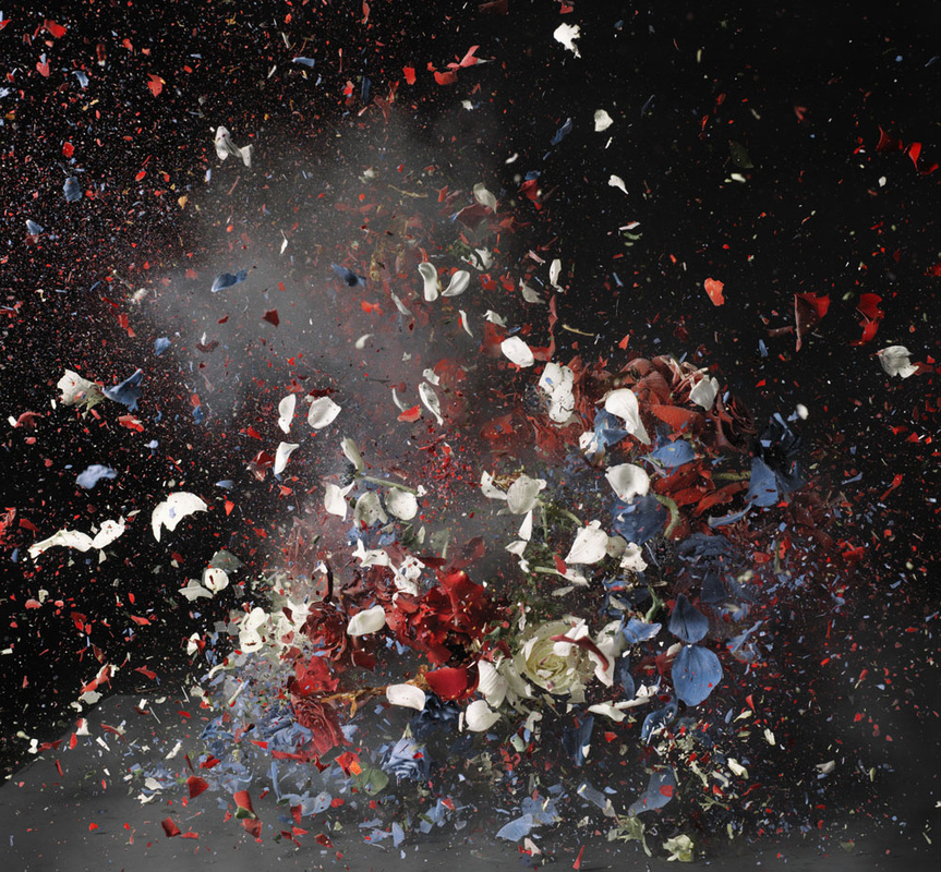
Final Idea
For my final idea I developed the idea of using black and white backgrounds with coloured light trails travelling across them. The chosen location for the backdrops of each of my light drawings had a personal connection to my childhood. I used my developed technique of long exposure light drawing to explore a park (both old and new) and the Emirates stadium. The light trails travel through each image connecting the different locations together, along with my own childhood memoires.
The sharp burst of light that whiz through the images, appearing from different entry points were planned before the images was taken. This enabled me to think of each images as part of a series of an interconnecting rather than just an individual shot. To present the photographs are printed onto gloss ink paper and then mounted onto foam board, elevating the piece from the wall. The images, ranging in size, are organised into an irregular arrangement that allows the light trails to continue from one image to another. The layout features gaps in between to allow viewer to imagine how the light would travel, changing in colour in some instances. Some layout options I have considered can be seen bellow.
Furthermore, the use of coloured light trails adds a playful note to a dull black and white environment. The black and white background emulates the monotonous nature of an adult life while the light is representative of the exciting journey children go through as they discover the world around them. The purpose of the project for me was remember my own childhood along with trying to help people have a fresh outlook on the world around them. The exploring a number of different relationships; including the relationship between and how light can have an impact on an environment, I illustrated how both places and memories are intertwined and connected.