What is a portrait?
|
A portrait can mean different things, the dictionary definition for is a painting, drawing, photograph or engraving of a person, usually depicting the face or head and shoulders.
To me a portrait is a visual representation of an individual, which captures an essence of who they are, without necessarily looking like the subject. It acts as a form of remembrance for the individual's unique characteristics. Portraits can be presented on an assortment of mediums, including paintings, photographs and even sculptural carvings. Portraits are produced as a result of combining elements of the subject and the artist. |
|
To me portraiture is like literature, although an artist creates the portrait, the meaning is there to be by a viewer.
Checking Out Me History - John Agard
|
Checking Out Me History
Dem tell me Dem tell me Wha dem want to tell me Bandage up me eye with me own history Blind me to me own identity Dem tell me bout 1066 and all dat dem tell me bout Dick Whittington and he cat But Toussaint L’Ouverture no dem never tell me bout dat Toussaint a slave with vision lick back Napoleon battalion and first Black Republic born Toussaint de thorn to de French Toussaint de beacon of de Haitian Revolution Dem tell me bout de man who discover de balloon and de cow who jump over de moon Dem tell me bout de dish ran away with de spoon but dem never tell me bout Nanny de maroon |
Nanny
seefar woman of mountain dream firewoman struggle hopeful stream to freedom river Dem tell me bout Lord Nelson and Waterloo but dem never tell me bout Shaka de great Zulu Dem tell me bout Columbus and 1492 but what happen to de Caribs and de Arawaks too Dem tell me bout Florence Nightingale and she lamp and how Robin Hood used to camp Dem tell me bout ole King Cole was a merry ole soul but dem never tell me bout Mary Seacole From Jamaica she travel far to the Crimean War she volunteer to go and even when de British said no she still brave the Russian snow a healing star among the wounded a yellow sunrise to the dying Dem tell me Dem tell me wha dem want to tell me But now I checking out me own history I carving out me identity |
John Agard was Afro-Guyanese. As a playwright, poet and children's moved to Britain in 1977. The poem 'Checking out my history' shows Agard's journey of discovery as he find out more about his history. As a result of only being taught British history in school Agard knew little about his own Afro-Guyanese history.
Representation of me
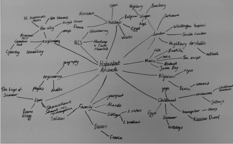
The spider diagram acts as a summary of who I am, by presenting the different points that make me who I am in the form of an interlocking web. The places I've visited, the people I’ve met and the experiences I’ve had have shaped my life. In this unit I hope to capture elements of each of my subjects that makes them who they are.
THE TOWEL SERIES - MARIO TESTINO
Mario Testino, a portrait and fashion photographer is one of the world's most influential photographers of today. Testino has shot numerous covers for the biggest magazines such as Vogue and Harper's Bazaar, making him sought after in both the fashion and beauty industries.
Through utilises the advances in today's technology, such as the mushrooming development of social media Testino has embraced Instagram to produce The Towel Series. The series features a set of behind-the-scenes portraits. The intimate shots show each models in a towel. Testino himself said “The Towel Series is a private club.” The personal project has a more relaxed environment, rather than set-up environment of an editorial shoot produces photographs with a rawer feel. An aspect of the images I really enjoy is Testino’s use of towels as a prop enables an audience to relate to the model. Most editorial shots involve extravagant outfit with an overwhelming amount of make-up. The series of images strips each model of the costumes the may normally wear and thus allowing their natural beauty to radiate. Like David Bailey's portraits Testino's portraits allows an audience to focus more on the subject rather than their surroundings.
Through utilises the advances in today's technology, such as the mushrooming development of social media Testino has embraced Instagram to produce The Towel Series. The series features a set of behind-the-scenes portraits. The intimate shots show each models in a towel. Testino himself said “The Towel Series is a private club.” The personal project has a more relaxed environment, rather than set-up environment of an editorial shoot produces photographs with a rawer feel. An aspect of the images I really enjoy is Testino’s use of towels as a prop enables an audience to relate to the model. Most editorial shots involve extravagant outfit with an overwhelming amount of make-up. The series of images strips each model of the costumes the may normally wear and thus allowing their natural beauty to radiate. Like David Bailey's portraits Testino's portraits allows an audience to focus more on the subject rather than their surroundings.


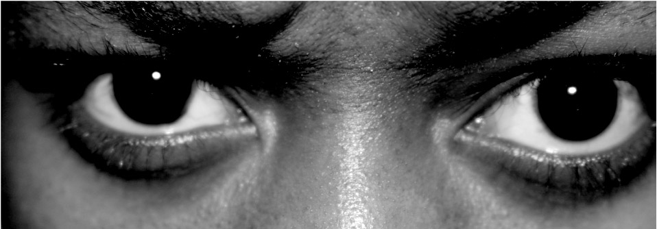
Character Recognition - Myra Greene
“Do we recognise character just by looking at the shape of a nose or the colour of skin?”
Myra Greene used traditional photographic to produce her collection of self-portraits, entitled Character Recognition. The photographs explored parts of Green's face, moving from the eyes to the ears in the form of extreme close ups. The close-up shot almost detach the particular feature from the rest of the face, thus allowing a viewer to delve deeper into the analysis of the portrait. I found it captivating to look at the image of the eyes as they tell an untold story through the intense emotion shown. The fact that the series of portraits never in fact show the photographer’s entire face, thus adding to the mystery of the photographs and increasing a viewer’s curiosity.
Greene tries to answer the question of “What do people see when they look at me?” From examining ’the physical features of face alone it is impossible for it to provide description of a person’s nature. The series is specific to Myra Greene, tells us of her journey as she explores who she and what that means to her. The journey of exploring Greene's face is a sensory experience where we are able to try and look past the physical features that are placed in front of us, but instead try to see if we can understand the character of the photographer.
To produce the pieces Greene used the collodion process with glass plate as the canvas. The chemical run down the glass, the grips can still be seen in the photographs and adds texture to them. When creating her self-portrait Greene used black glass rather than transparent glass, thus creating stunning positive images. The high contrast in the image also allows a viewer to see small details in the face such as the tiny pores on the surface of the skin.


Character Recognition


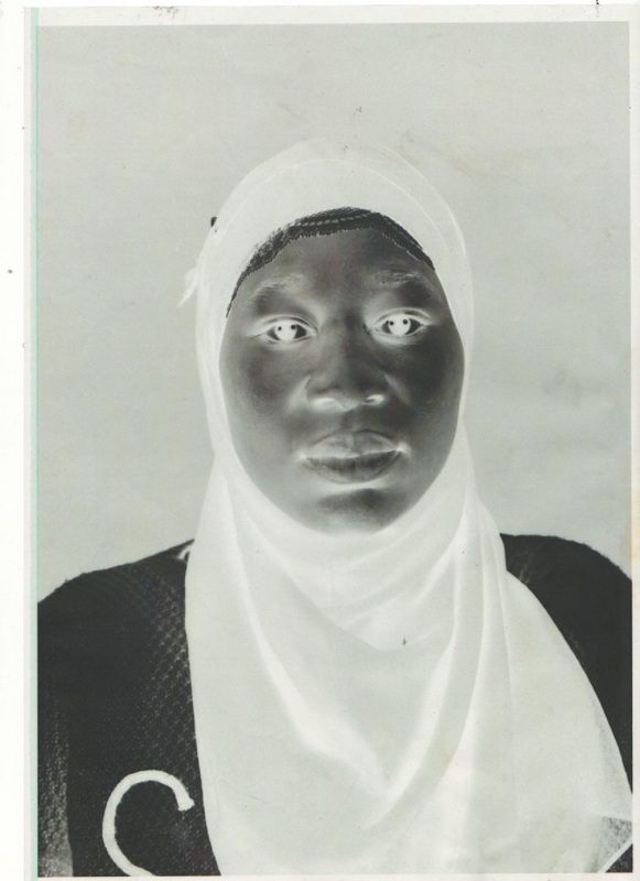
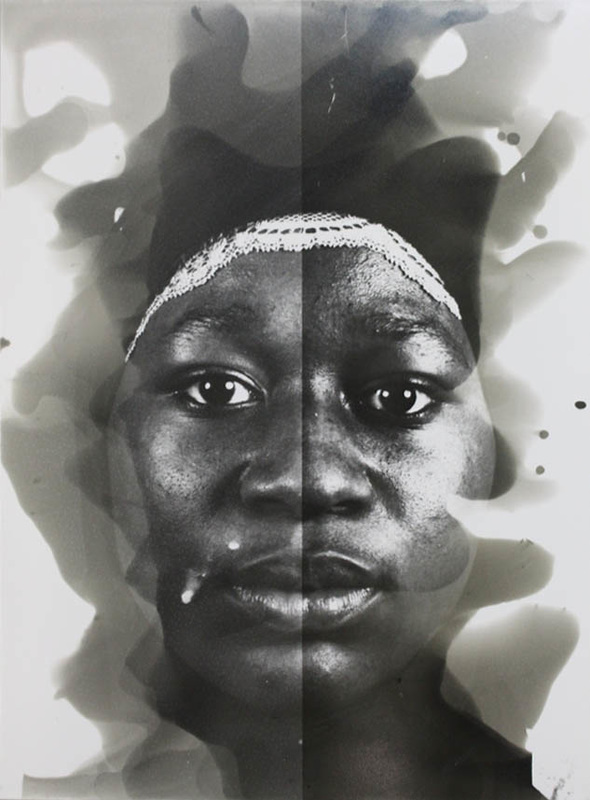
Inspired by Greene’s self-portraits Character Recognition’ I tried to make my portraits act as a jigsaw puzzle that represented me. Initially I found it difficult to take the extremely close up self-portraits, as a photographers I am more accustomed to being behind rather than in front of the camera. Exploring the features of my face in depth through the lens of a camera was a journey of self-discovery, creating the series helped me to feel more comfortable about how I perceived myself as my confidence increased. I hope that the as a series the images allow viewers to join me on my own journey whilst also encouraging them to embark on their own journey. I found it interesting to look at my face with such scrutiny, it made me realise that I was not truly aware of the details of my own face. Using a range of facial expressions, for example an intense stare, I tried to exaggerate the creases and pores in my face. Whilst in Greene’s series she focuses more on how her facial features and the colour of her skin I chose to use the close-up portraits to explore how my physical features are in fact a part of who I am.
Whist Greene used the more traditional method of the collodion process I opted to use more modern methods, by using a digital camera. Although my images did not have the same textures produced by the collodion process I found that increasing the contrast enhanced the image, the textures created increased the realism of the images. Moreover, the increased contrast allow more the details to shows up in the image. If I were to develop the response further I’d photograph the features of my face again, but with a micro lens to produce abstract images. I would also explore a variety of other people’s facial characteristics to display the similarities that we all share, along with highlighting the differences that make us unique individuals.
Whist Greene used the more traditional method of the collodion process I opted to use more modern methods, by using a digital camera. Although my images did not have the same textures produced by the collodion process I found that increasing the contrast enhanced the image, the textures created increased the realism of the images. Moreover, the increased contrast allow more the details to shows up in the image. If I were to develop the response further I’d photograph the features of my face again, but with a micro lens to produce abstract images. I would also explore a variety of other people’s facial characteristics to display the similarities that we all share, along with highlighting the differences that make us unique individuals.
My family
Developing from my previous response to Myra Greene’s Character Recognition I photographed my family, convey both the similarities and differences between each person. The fact that each of the models were part of the same family also allowed viewers to see the role of genetics in assisting the makeup of our physical appearance. The image I feel was the most successful was the portrait of my father. Using Photoshop I made the images black and white. After that I increased the contrast of the tones. The highly contrasting tones bring out the pores and define the creases and details in the skin of the models. The arrangement of the image shows also shows the generation gap. Placing the parents at the top followed by their two children at the bottom enables a viewer to have an insight into how genetic works through looking at shared or similar features. The arrangement of the images also allows a viewer to look at the similarities between siblings. When capturing the images I tried to make the framing constant, in order to maintain a sense of unity within the series.


Father
Click image to enlarge


Contact Sheet


Lewis Khan
The series Georgetown focuses on Pat Bennett, a neighbour and friend of Lewis Khan, the photographer. This the series of images along with a short clip of moving images Khan takes us behind closed doors and into the life of Pat Bennett, also known as George Samuda. In the images we see the surfaces of George’s apartment is shown to be littered names and places, all them connected parts of his memories.
An image that fascinated me was the still of the coffee table, was amazing to see how a person’s character could be summaries by a few mundane objects. Although alone each object may not necessarily have any significance, when collated together they symbolise parts of the owner. Each object can be seen to have some sort of significance, the pen in the image connects to the idea of George’s need to repeatedly write down words and phrases in order to try and hold on to fading memories. Another image I also liked was the shot where the George is captured peering out of the window from behind a net curtain. The way in which light that shines through the window suggest that a sort there is a longing to have a deeper connected with the wider world outside. The sun’s rays partially light George’s face, whilst shadows and the netting conceal the rest. The darkness is symbolise the feelings of solitude and being alone. Although Khan tries to show viewers who George Samuda viewers will never really be able to fully comprehend who he is.
Overall Lewis Khan's Georgetown emotive collection provides viewers with an insight into the life of George Samuda. Through photographing George a viewer is able to see into a hidden world.
Work Space
In my response to Lewis Khan's Georgetown photographed four contrasting work environment within Fortsimere. It was interesting to look at how different each environment was even though they were all within the same vicinity. Each area had the personalities of the people stamped on them. The collection of portraits give viewers an insight into the subject's’ line of work, by capturing mundane environments.
The Gate
James is a security guard. For many who walk into the school he is the first face they see. In the images I photographed the minimalistic box. A lonesome calendar decorated one of the empty walls. Although the security box appears to be isolated from the rest of the school the role of James is an important one.
The Reception
I found it strange to be on the other side of sliding of glass screen Once inside the reception I was surprised to find that it was much larger than I had expected, like a Tardis (bigger on the inside than on the outside). The reception was a warm and inviting space. The room is flooded in natural light, giving it a relaxed atmosphere. Looking at the stationary cupboard I noticed the high levels of organisation, displaying a sense of structure. Whilst, office has professional aura the personal possessions of the staff adds a humorous atmosphere to the room.
The Canteen
For me photographing the canteen staff was the most difficult out of the four, having a deadline to finish their meant that they were all constantly rushing around, from the sink to the chopping board, making it harder for me to take a good shot. However, I feel that the blurred subjects in the images signifies the active nature of their job.
The D&T Workshop
Having studied design and technology before I found that being back in a workshop was comforting. Located in North Wing and tucked in between two classrooms, the D and T workshop felt as if it were miles away from
Walking it the workshop I was confronted by a vast array of materials, nut and bolts, neatly organised into labelled trays and stacked on a number of shelves. The colour from the paint and the plastics that adorn the walls and the floor created a magical feel, with things catching my eye in all corners of the room.
Walking it the workshop I was confronted by a vast array of materials, nut and bolts, neatly organised into labelled trays and stacked on a number of shelves. The colour from the paint and the plastics that adorn the walls and the floor created a magical feel, with things catching my eye in all corners of the room.


ESSENTIALS - HYPEBEAST


Essential is a collection of images created by the blog Hypebeast. Like in Lewis Khan’s portraits in Georgetown the purpose of the set of images are to tell an audience a bit about the subject. The image feature objects that provide viewers clues the subject’s line of work along with parts of personality, the objects photographed vary from pairs of trainers to a pair of Pugs. The blog also presents each image with a brief biography of the subject. A viewer is able to infer what a person is like without actually seeing them. The concept of character recognition was referred to in Myra Green’s project and also has a significance in the Essentials collection.
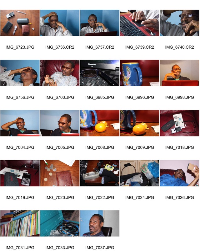
mY fATHER
I am lucky enough to be surrounded by a multitude of inspirational people. When deciding who to shadow for my second response to Lewis Khan's Georgetown my father immediately came to mind. My father has a large impact on my life as I’ve grown up. It made sense to photograph my father as he is inspires me. It was eye-opening to shadow my father as it made me realise how much he does. The series of images show objects associated to him. As a technician and an active member of the community my father is constantly doing something. In the brief period that I photographed him I found it strange that although he was always working on something he still looked relaxed. I think that even though I set out to try to show what my father does I realised that it actually illustrated who he is and showed his relaxed approach to life. Through focusing mainly on tangible objects I was able to visually describe my father.
Contact Sheet
Genetic Portraits - Ulric Collette
In the project Collette uses Photoshop to combine the faces of two relatives, reveal both the similarities and differences in their physical appearance.
|
Once merged it is difficult to realise that the portraits are comprised of two faces. When the two portraits are merged into one it is mesmerising to see how similar the two people look. Through blending the faces into one the finer details in each of the subject’s faces are brought to light. The photographic research of genetics in the project is even more interesting as it illustrates how genetic similarities defy barriers such as age, gender and environmental factors that cause a lot differences in people's appearances. As well as accentuating the differences and similarities in the subject’s faces in some cases the portraits also provide a window into the future, suggesting what a person may look like when they are older.
|
|


Genetic Portrait
In response to Ulric Collette's Genetic Portraits project I used Photoshop to merge portraits of my mother and me, to illustrate the role of genetic in creating the similarities in our appearances. To create the portraits I used Photoshop.
The process:
The process:
- Copy each of the portraits onto two layer (on top of each other)
- Change the opacity to 60% (on the top layers)
- Line up eyes of both portraits
- Scale the images, so that the faces are the same size
- Crop the portraits in alternating horizontal halves
- Blend the two halves together, using auto-blend in panorama mode
- Use the clone tool so smoothen out imperfections in the blending process
The process was technically demanding and difficult, however it successfully produced an almost seamless, through matching up the tones and colours in both portraits image. An aspect of the final portrait that was really successful was my ability to merge the front-lines of the headscarves, thus making it look as if it were one piece of fabric. Overall I think that the image I produced was successful.
To develop the project I would use the portraits of people who were not related to each other. Enabling a viewers to see the how people who have no genetic relation can still have physical appearances. As a race there is a lot of variation amongst us, however we are all united in parts of our physical appearances.
To develop the project I would use the portraits of people who were not related to each other. Enabling a viewers to see the how people who have no genetic relation can still have physical appearances. As a race there is a lot of variation amongst us, however we are all united in parts of our physical appearances.
Cyanotypes - Sayako Sugawara
In her collection of cyanotypes Sugamoto uses the portraits of her son and his friend to create and printed them onto textured surfaces, like fabric. After move to Japan at the age of 12 Sugamoto found that memories of her childhood were blurred. Through taking portraits of son and his friend, who were both 12 at the time of the shoot, Sugawara tried to retrace her own. The different surfaces used are representative of the different pathways she took to try and recover her memories. On the other hand, the blurred images represent the obscurity of the memories that are yet to be found.
The contrasting printing surfaces add a new dimension to the portraits. It is refreshing as unlike the conventional flat portraits. The printing process brings a new meaning to the images.
The contrasting printing surfaces add a new dimension to the portraits. It is refreshing as unlike the conventional flat portraits. The printing process brings a new meaning to the images.


Cyanotype Portraits
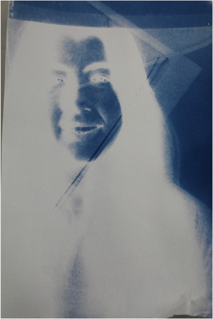
When creating my own cyanotype and acetate negative was placed over a sheet that was coated with ammonium iron (III) citrate and potassium ferricyanide securely. The sheet was then exposed to white-light for a period of 10 minutes time, resulting in a cyan positive being transferred on to sheet. I found that in comparison to most other photographic process the exposure time need to create a cyanotype was quite lengthy as the chemical process is slow.
Dark room processes
I experimented with darkroom processes, using an acetate negative self-portrait.
The first technique I used was overlaying, which consisted placing translucent materials over or under the negative before exposure. I explored with using a range of materials, including a plastic bag and a pieces of muslin to add texture to the photogram portraits. In one of the portraits I scrunched up a plastic bag and used it to mask the eyes. I found that addition of materials to the photograms creates an emphasis on particular parts of the portrait. When placing the muslin under the enlarger woven pattern of the fabric was accentuated and became a part of the portrait.
The second darkroom technique I explored was with the developer. After exposing the photograph I applied the developer to the portrait with a paint brush, allowing specific parts of the image to be revealed. I found this technique interesting as it made the portrait look as if it were emerging from a puddle.
If I were to continue to experiment with the darkroom processes I would refine the way in which developers are applied. It would be intriguing to see how applying the developer through flicking it and applying it through sturdy brush strokes would enhance the final outcome of the portrait, creating a new meaning. In addition, I would also explore with folding the photographic paper before administering the developer, which would cause the developed gather in the folds and thus creating darker lines.
|
|
|
The Photographic Object
To some people photography is not considered as an art form as the process is said to be too literal. In this project I combined images with artistic techniques to blur boundary between photography and art. The techniques I used was also to enhance the image or convey a particular message and create one-off unique pieces. The foundations for all of my pieces were an A3 colour self-portrait. Overall the workshop enabled me to experiment with different manipulation processes to enhance the images.
Joseph Parra
"There is an innate desire to replicate an individual through artistic production."
In his portraits Joseph Parra challenges the conventional form of portraiture. Using exposure and concealment as his tools Parra produces distorted portraits, giving the subjects an eerie look. Parra uses an assortment of methods to distort his photographs, such as braiding, scratching and line drawings on the photograph. The ambiguity of the individual’s faces, as a result of Parra's methods. Parra uses extreme and usually irreversible methods through cutting, bending or folding producing three-dimensional structures. The sterile backgrounds that envelopes the subject, giving viewers very little insight into the subjects. In some instances Parra preserves aspects of the face with bees wax, leaving it unmarked. The exposed portions of the portrait reel in an audience.


MY RESPONSE
The first piece of work I created was installation based, I used horizontal folds to accentuate some facial features by bringing them closer to viewers and creating a connection. The main features I focused on were the nose and the eyes. The eyes display a deeper and more intense emotion, thus allowing viewer to be engaged. The sculpture also allows an audience to view the portrait from different angles as well as forming interesting shadows. Rather than changing the meaning of the portrait the outcome of this technique was to enhance the meaning by exaggerating the portrait’s connection with a viewer.
Click on images to enlarge


Dryden Goodwin
“Drawing is about how the mind processes what the eye sees.”
Dryden Goodwin uses a combination of photography and drawing to convey the complexities of the mind. In the collection, Cradle, Goodwin uses a series of spiralling lines the process of drawing the lines was try to understand the minds and thoughts that occur in strangers’ heads. The patterns represent a spiritual rather than scientific approach to the brain.
Goodwin presents his work in large life-size screen-based installations, allowing the audience to analyse the finer details. In his installation Goodwin also includes soundtracks to accompany his work, creating an interesting viewing experience, engage not only the sense of sight but also sound.
Goodwin presents his work in large life-size screen-based installations, allowing the audience to analyse the finer details. In his installation Goodwin also includes soundtracks to accompany his work, creating an interesting viewing experience, engage not only the sense of sight but also sound.
Cradle
The 2008 collection, Cradle, Goodwin etched spiralling line into the surfaces of black and white portraits with a compass, embodying the subjects’ train of thought. Through Goodwin unseen aspects are made visible. In the portraits all of the subjects appear to be unaware of the camera, thus allowing for their unguarded emotions to be captured. The intricately placed patterns elevate the individuals above the mundane urban environment.
On the other hand, the process of scratching lines into strangers’ faces is almost like a violation of their privacy. Whilst the fact that viewers are able to share an intimate moment with a person both they and the photographer have no connection to is humbling as the lines tenderly cradle the subject’s facial features and expressions.
The texture created by etching the compass into the photographs inspires me as the circular patterns add an extra dimension, brings the subject out of the confines of two-dimensional photographs and into the audience's three-dimensional reality. However this effortless process desensitises how we respond to the world around us. In Goodwin's work merges the traditional process of drawing with modern digital photography, injecting some of that sensitivity that was removed due to the digital process back into the photographs.


May Xiong
"I think that I take little bit of everything that I enjoy and take snippets of it and piece them together as I go. Most of the time my work is just for the aesthetic appeal."
May Xiong is a conceptual photographer, her images are generally related to portraiture. Xiong’s photography captivates and provokes audiences, by focusing on the concept of the human mind. Xiong finds her source of inspiration from music, art, people and places.
Geometric Maps
In another of Xiong’s series, Geometric Maps, she continues to explore the theme of examining the human condition and thoughts and feelings. The portraits try to give viewers a perspective on the complexities of the human mind. The series visually navigates the mind.
The geometric forms that are added to each image act as a roadmap for the mind. The interlocking shapes show how a thought leads onto another thought, creating chain which in essence is the foundations that form the mind. The mind is a structure that consists of intangible maps that cause us to continuously wander. As a series it is fascinating to look at how the mind can be perceived.
The black and white paint Xiong also uses when photographing to alter the faces of the subjects in her portraits embodies both the light and dark sides their character.


In the series Strokes the Xiong applies a single broad strokes across to faces of her subject, drawing attention to the subject’s face. The eyes are especially emphasised and bring out the emotions in them. The colours of the paint complement the images. The unique brush strokes also act like a signature across the images. Overall the strokes create a whimsical effect.
In the image of the woman the thin layer of paint frames the models eyes. The portraits themselves also feature quirky set ups, such as adorning the subjects with orange peel, flour and fish. On the other hand, it is ironic as the serious facial expressions of the subjects contradicts their humorous environments. The props perhaps act a references to the subject's personality, or just merely placed there to evoke a response from the audience.
In the image of the woman the thin layer of paint frames the models eyes. The portraits themselves also feature quirky set ups, such as adorning the subjects with orange peel, flour and fish. On the other hand, it is ironic as the serious facial expressions of the subjects contradicts their humorous environments. The props perhaps act a references to the subject's personality, or just merely placed there to evoke a response from the audience.


MY RESPONSE
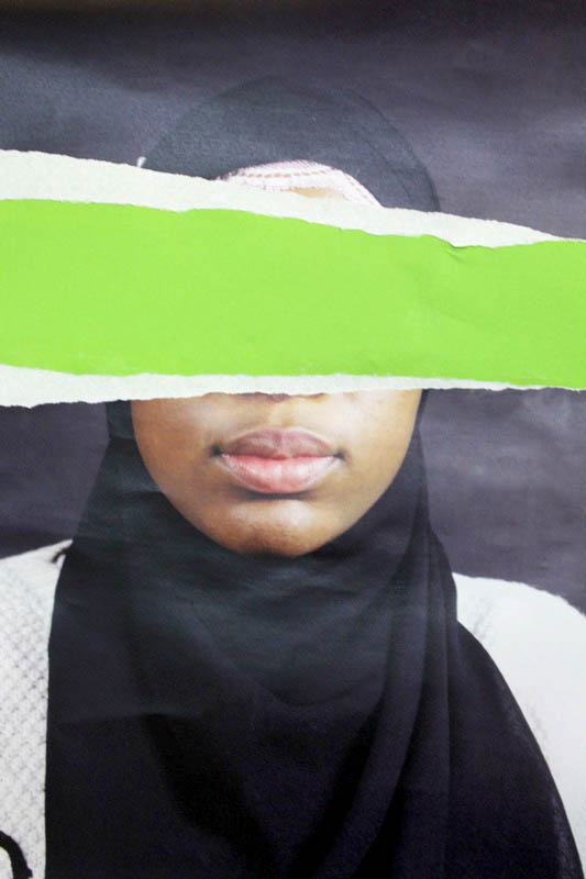
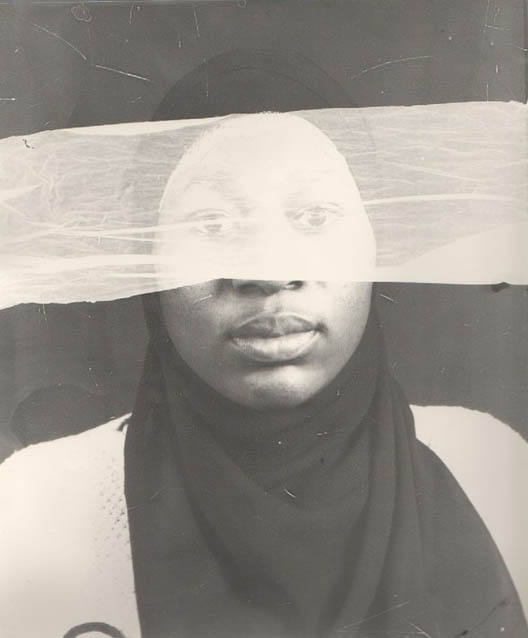
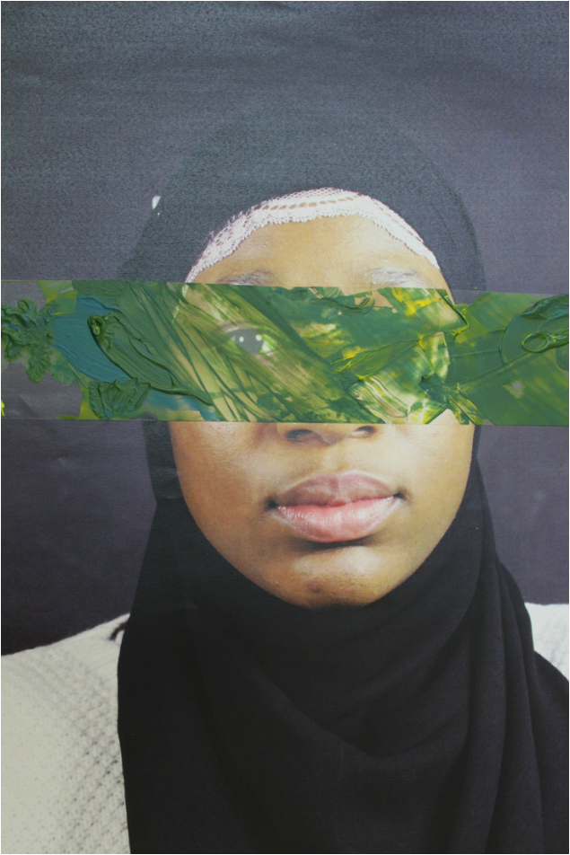
For my next piece I was inspired by Joseph Parra’s use of only editing parts of the face, leaving specific sections untouched as well as the way in which May Xiong added to her images with a swooping motion of a paintbrush. To create the collage I glued a sheet of bright green paper behind my portrait and tore off eye off of the portrait. This had a large impact on the portrait as the eyes provide an emotional connection between viewers and the portrait. The use of the green behind the eyes was to convey the natural process of interpreting what we see. It can also act as a reflection of the natural world that is hidden in the world around us. The overall process bring an entirely new meaning the the portrait.
Gerhard Richter
In Ritcher's series Overpainted Photographs the photographs are produced rapidly with irreversible effects by applying leftover paint to the photographs with a palette knife. The final pieces are created as a result of spontaneity, with each one being unique.
The administration of paint add a sense of completeness to the images, whilst also adding texture to an otherwise flat surface. The colours of the paint interacts the tones in the photograph, either complementing or contrasting with it. In some of the images the paint creates a sense of clarity. Additionally, the abstract nature of the images give an audience freedom to interpret the images. The paint disrupts the window in which viewers uses to look into the scene captured.
The administration of paint add a sense of completeness to the images, whilst also adding texture to an otherwise flat surface. The colours of the paint interacts the tones in the photograph, either complementing or contrasting with it. In some of the images the paint creates a sense of clarity. Additionally, the abstract nature of the images give an audience freedom to interpret the images. The paint disrupts the window in which viewers uses to look into the scene captured.


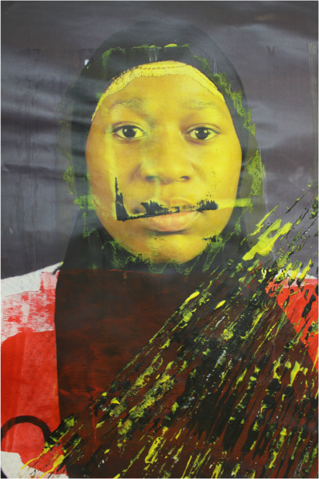
My response
After looking at Gerhard Richter’s Overpainted Photographs series I was inspired to also incorporate the medium of paint with photography. Instead of using left over paint I decided to infuse emotion into the portrait by drawing a portrait. I then scraped the paint off with a pallet knife leaving remnants of the smiley face that was there. To present the portrait I would document the creating process, allowing viewers to understand the how and why the image was produced. More paint was then added spontaneously to create more texture and patterns. The technique enhances the meaning of the portrait and is therefore appropriate to the theme of portraiture.
|
|
IRÉEL - Flora Borsi
Photographer, Flora Borsi uses a glass panel to combine painting techniques with photography in her series IRÉEL. Borsi's manipulation of photography makes the images whimsical as the subject appears to be in another dimension within the photograph. The harsh brush strokes contrast to the elegant of the subject. The orange paint compliments the red hues in the model's hair. The fiery red hair of the model along with the soft blue tone of the background.
When I first looked at the image I was captivated by how the images were photographed. Initially I thought the paint was applied to the images via the use of editing software. This theory was then ruled out by the last image in the series, in which Borsi reveals to the audience how the images were truly created. This revelation by the photographer detracts from some of the mystic of the images whilst also allowing viewers to understand the construction of the image.
When I first looked at the image I was captivated by how the images were photographed. Initially I thought the paint was applied to the images via the use of editing software. This theory was then ruled out by the last image in the series, in which Borsi reveals to the audience how the images were truly created. This revelation by the photographer detracts from some of the mystic of the images whilst also allowing viewers to understand the construction of the image.
“At first sight, what do you think?”


Foliage
FIRST RESPONSE
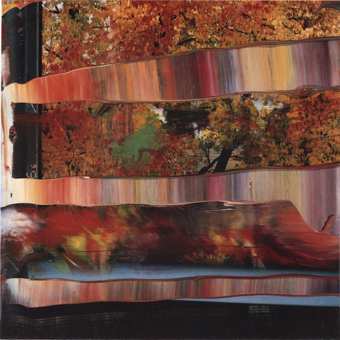
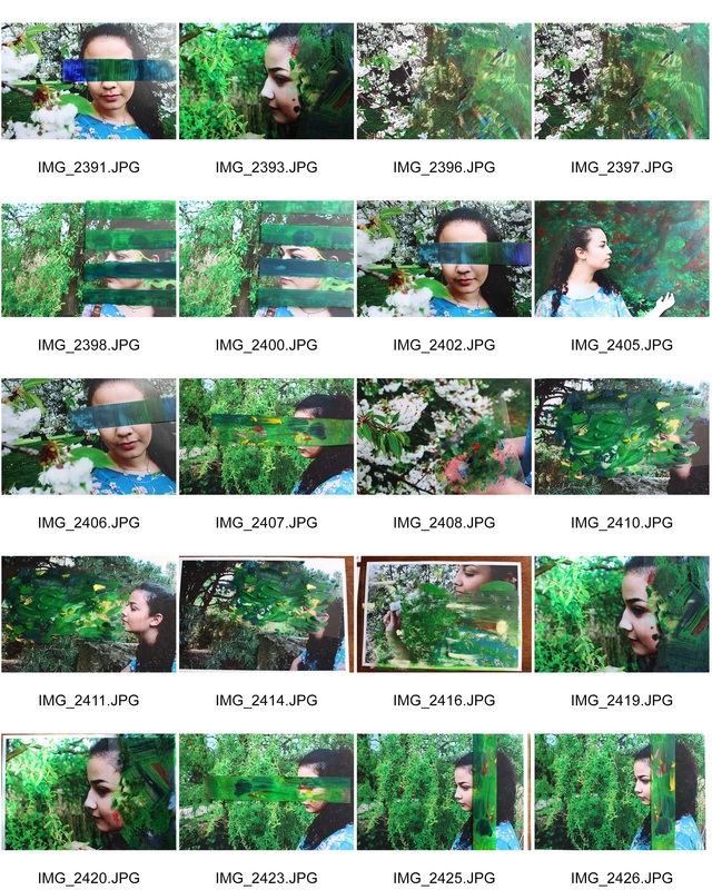
I was inspired by Flora Borsi's series IRÉEL to create pictorial photographs, which are photographs that resemble paintings. Gerhard Richter’s Overpainted Photographs also provided a source of inspiration as I like the way the paint interacted with the photographs. I opted to use an acetate sheet, rather than the glass panel used in Borsi’s images, which made the images modifiable. The theme of my images was nature, I found the juxtaposition between the man-made plastic and the earthy colours interesting. The initial shot was taken in Highgate Woods in the summer. The purpose of the acetate panels were to stimulate the rigid structure of plant cells and the roughness of tree bark. The panels enabled me to build up texture by using a variety of paint strokes. When painting the panels I used organic colours to reflected the forest.


SECOND RESPONSE
When walking into the woods I was inspired by the feeling of being consumed by my surroundings with rays of light creeping through the canopy above. This was a feeling that I wanted to convey in my images. In order to enhance the audience’s viewing experience and make them feel as if they were in the same place as the camera I placed the images on a light-box. This resulted in an ethereal scene as the light looked as if it were oozing out of the images. However, I found that this reduced the quality of the image.


THIRD RESPONSE
Due to the artificial light of light-box washing out some of the colour of the image I placed coloured sheets of blue and green paper to acts correcting filter. I also re-photographed the images under soft natural lighting to make them more vibrant. This improved the image quality substantially.


FOURTH RESPONSE
To display the images I returned to Highgate Woods and pegged the images throughout the woods to try to infuse more nature into the viewing experience. After looking at Gerry Badger’s work I was also inspired by how showing two seasons at once illustrated how world around us changes, providing us with contrasting environments in the same place to enjoy. In addition, the way photograph interacted with the wind added structure and a calmness to the images.
Click on images to view


FIFTH RESPONSE
Developing my idea further I took a new set of observation at Regent’s park. However I decided to explore using Photoshop to apply virtual layers of paint. I used images of paint that I found online An image that was particularly successful was the portrait with the paint dripped as the electrifying colours contrasted with the leafy background. However, I found that this method lacked the sincere emotion that I was able to communicate by physically painting panels.
Click to enlarge


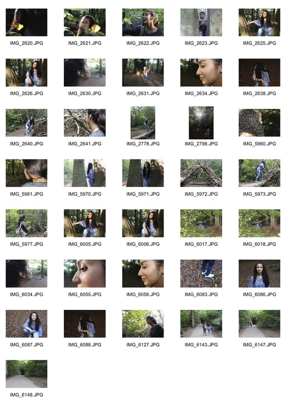
Contact Sheets


SIXTH RESPONSE
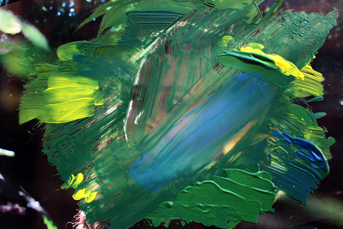
I then chose to revert back to using painted acetate panels, as it also gave me the freedom to paint after being inspired by the images. I think that it is significant that as the photographer I am able to paint the panels as well as it allows me to reveal intangible aspects of the environment. The way in which May Xiong’s used her paint in Stroke and her exploration of the mind in Geometric Maps inspired me to use a paint as an additional medium to re-explore the emotions. I used a variety of method to apply the paint to produce a range of textures to reflect the tranquility of the forest.
The theme of portraiture by using another person, a camera and paint to represent emotional characteristics of the photographer. Whilst a lot of tradition portraiture focuses on the person in from of the lens I chose to focus on the person behind it. In the series an audience is able to briefly see the natural world through the photographer’s eyes, interpreting emotions rather than a clear message.
The theme of portraiture by using another person, a camera and paint to represent emotional characteristics of the photographer. Whilst a lot of tradition portraiture focuses on the person in from of the lens I chose to focus on the person behind it. In the series an audience is able to briefly see the natural world through the photographer’s eyes, interpreting emotions rather than a clear message.


Contact Sheet
DEVELOPMENT
To further develop the project I would continue to experiment using paint with urban portraits. I think using darker tones to reflect the dull tones of an urban area could be used to emulate the . Using harsher lines and geometric shapes would compliment the sharp and crisp lines in a city's architecture.
To further develop the project I would continue to experiment using paint with urban portraits. I think using darker tones to reflect the dull tones of an urban area could be used to emulate the . Using harsher lines and geometric shapes would compliment the sharp and crisp lines in a city's architecture.
