Please click all images to enlarge
Pintrest Board
To find inspiration for the project I created a Pintrest board to help me progress in the project. I looked at photographers work that look at the themes of truth, fantasy and fiction. I was intrigued by the processes post-photographing that an image can go through. For instance, manipulating the image using Photoshop or adding texture with thread. The additional processes distort the original image transforming it to one of fiction.

Click to set custom HTML
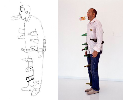
Erwin Wurm
Erwin Wurm is an Austrian artist and photographer who currently lives and works in Vienna. In an interview Wurm states that he is interested in everyday life. Wurm's work makes use of everyday objects and topics involved in contemporary society. In his work Wurm addresses the whole entity of a human being, by looking at the physical, spiritual, psychological and political aspects of humans.
|
|
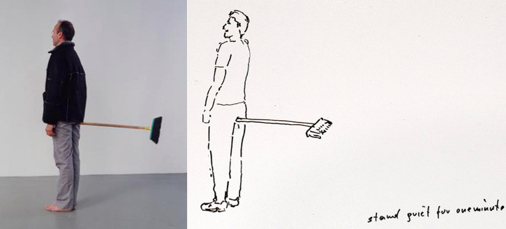
Wurm is known for his sculptures and photography. In the late 1980s Wurm began his ongoing series One Minute Sculptures. The sculptures, as seen in the video below, involve people posing in unexpected ways with the ordinary everyday objects. The series of sculptures were first exhibited in Künstlerhaus Bremen, Germany. In his exhibitions Wurm accompanies the objects with drawn instructions to allow for the audience to become the sculptures. The sculptures are often humours due to the odd nature in which the models interact with the objects in positions that can only be sustained for one minute. The use of humour and sarcasm in Wurm's work enable an audience to approach things in a lighter way in order to find the truths about society and human existence.
Still from the Red Hot Chilli Peppers music video 'Can'y Stop'
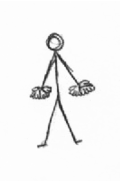
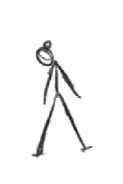
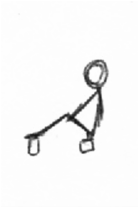
Absurd
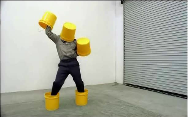
Inspired by Wurm's work I created a response to the artist's One minute sculptures. Like Wurm I used everyday objects in odd ways, for instance balancing a bauble on the hollow of the subject's ear. The positions in which the subjects posed in were hard to sustain and could therefore only be held for one minute, hence the title of the series. When holding a single position for one minute the short time often feels like an eternity due to the uncomfortable nature of the pose. The fact that these seemingly impossible fleeting moments are immortalised and become reality through the process of being captured on camera. The peculiar nature in which these everyday objects are used in what makes the absurd, and gives them a fictional characteristic. The drawn pictures presented alongside the images enable audiences to become involved in the sculpture by performing the pieces.

|

|
|

|
|

|

|
|

|
|

|
|
Developing from my first response to Wurm's work I decided to take the sculptures out of the studio. Presenting the sculptures enabled me to see the live responses of passers-by who we perplexed as to why a person was perched on four cans of beans. I think the act of sitting precariously on a few cans of beans on a bench was ironic as the subject chose to sit uncomfortably on the beans rather than the more practical option of the picnic bench. This unusual use of the cans is what makes the image almost fictional.
Isabelle Wenzel

Building Images
Isabelle Wenzel is a Dutch photographer who lives and works in Amsterdam. Wenzel studied photography and fine arts at the Fachhochschule Bielefeld in Germany. In 2007 she was awarded the Lecia Prize. Three years later she went on to graduate from Gerrit Rietveld Academie in Amsterdam. That year she also received a grant from the Virtual Zoom.
Wenzel's portraits feature deliberately faceless subjects where their bodies and most significantly their legs take centre stage. As a child Wenzel had been obsessed with the act of trying to overcome gravity. Wenzel’s strange portraits came about through her experimentation of photographing herself in her studio in Amsterdam, the results of which can be seen in the 2009 series Self. In her portraits the subjects are seen in strange positions. The legs Wenzel says are connected to movement and power. In a single moment Wenzel's subjects are able to defy gravity and illustrate the strength of their legs. The images are often a result of a combination of the subject’s strength and quick thinking. Wenzel’s images are deliberately faceless due to the fact that “they irritate me since they stand imminently for a specific personality,” in its headless state the body itself becomes its own working organism.
The images shown were taken from Wenzel’s 2010 series Building Images, where she was invited by the Virtueel Museum Zuidas, Holland, to produce a body of work that was centred around the business area of South Amsterdam. Majority of the images were shot in the headquarters of Amsterdam’s business district with a studio set up. The playful chaos Wenzel created by rearranging furniture and throwing papers juxtaposed the highly professional and functional environments in which they were located. Wenzel’s manipulation of the human body transformed her subjects into almost alien-like figures creates fantastical characters in her images. Wenzel states that it was her aim to “turn the logic of an office upside down,” highlight the fact that people are more than their everyday routines.
Paul Russell

The City of London, 2008
Paul Russell is a photographer based in Weymmouth, England. In university Russell studied animal behaviour and evolution. Through photography, which Russell has been interstellar since his teens, he examines how human behaviour is affected by their environments by thinking of his images as pictorial natural history and the ecology of humans. The images seen in series such as Bristol: The Tourists Guide are generally taken on Russell’s day trips out of Weymouth.
In the series London: The Tourist’s Guide Russell Provides viewers with a tourist’s viewpoint of the city, focuses on London’s tourist hotspots such as Picadilly Circus capturing the tourist behaviour and ironic illustrations of clichéd aspects of London life. The work is influenced by Miroslav Sasek’s This is London.
In the series London: The Tourist’s Guide Russell Provides viewers with a tourist’s viewpoint of the city, focuses on London’s tourist hotspots such as Picadilly Circus capturing the tourist behaviour and ironic illustrations of clichéd aspects of London life. The work is influenced by Miroslav Sasek’s This is London.

Hide

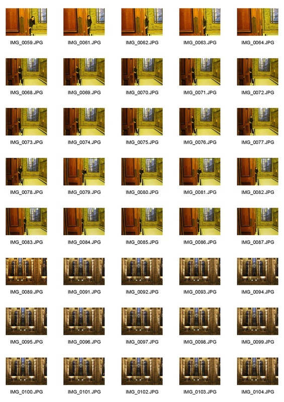
n response to both Isabelle Wenzel and Paul Russell’s work I visited the Victoria and Albert Museum and took photographs of my subject hiding inside the museum. This response continued with the idea of strange circumstances as well as non-traditional portraiture that I explored in my Absurd response. When taking the images I was influenced by the need of Isabelle Wenzel to make the subject’s in her portraits faceless. Having come across Paul Russell’s The City of London image I was inspired to use buildings to preserve the anonymity of subject. Russell and my image differ on the fact that Russell’s image was a humour coincidence whereas mine was staged.
When composing my images I stuck heavily to the rule of thirds. Through utilising the naturally vertically lines from the museum’s interior I split the image into thirds. On of the thirds was full of negative space where the object concealed majority of the subject. Overall I think the response was successful in enabling the audience to get to know the subject without revealing their identity, by presenting only small sections of the subject’s body.
I think that although the scenarios pictured in the image were odd I think that to improve the portraits I could have further explored photographing the body in more peculiar and bizarre position, like that of Wenzel’s Building Images.


|

|
Romain Laurent

Romain Laurent is a French photographer who grew up in the French Alps but currently resides in New York City. Laurent is influenced by a range of artist, some of which are Don Rosa, Philip-Lorca diCorcia and Charles Kuffman. Some of his favourite photographers include Sally Mann, Robert Mapplethorpe and Edward Weston. Whist Mann and Mapplethorpe produce black and white portraits Weston also creates abstract in ages that often resemble the human for by photographing fruit.
In his series of cinemagraph portraits, One Loop Portrait, Laurent uses the cinemagraph technique to create simple moving portraits that continuously repeat the same motion. Laurent takes inspiration from a variety of sources including comic books, movies and other pieces of art.
In his series of cinemagraph portraits, One Loop Portrait, Laurent uses the cinemagraph technique to create simple moving portraits that continuously repeat the same motion. Laurent takes inspiration from a variety of sources including comic books, movies and other pieces of art.
One Loop Portait
- Import images: File>Scripts>Load File into Stacks / File>Import>Video Frames from layers
- Duplicate still image and rename as Baselayer
- Move Baselayer to the bottom of the palette
- Create a new group and rename Animated Layers
- Move all layers to the Animated Layers folder
- Select base layer and isolate the area that will move, using the mask tool
- Move the layer to the Animated Layers
- Adjust the image positions, colour balance and contrast
- Window > Animation > Make frames from layers
- Duplicate the base layer so that it is visible in each frame

Taking inspiration from Roman Laurent’s One Loop portraits and Paul Russell’s image The City of London I combined the theme of hide with the cinemagraph technique. I found that my chosen location of the Natural History Museum was a suitable location as there were a number of places for my subject to hide.
In each frame I told my subject to move few inches. However, starting out I found that the camera moved, changing the background of the shot. As a result of this the first cinemagraph that tried to create had to be scrapped, due to the low quality of the images. To combat this issue I used a remote. Another issue I found was that the cinemagraph was not as smooth as I would have liked due to the fact that the each frame was taken individually. In addition as a result of the busy location passers-by were often in the background of the shots and were difficult to remove.
In each frame I told my subject to move few inches. However, starting out I found that the camera moved, changing the background of the shot. As a result of this the first cinemagraph that tried to create had to be scrapped, due to the low quality of the images. To combat this issue I used a remote. Another issue I found was that the cinemagraph was not as smooth as I would have liked due to the fact that the each frame was taken individually. In addition as a result of the busy location passers-by were often in the background of the shots and were difficult to remove.
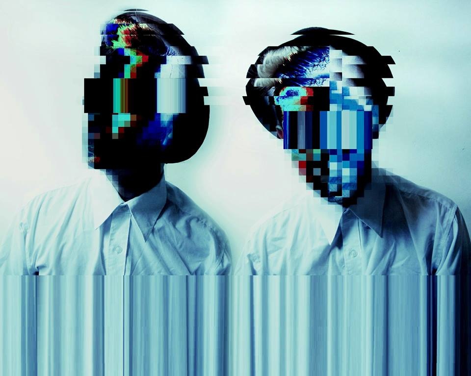
Heitor Magno
Heitor Magno is a Brazilian artist whose work mainly consists of glitch photography portraits. Magno seamlessly incorporating the glitches into his subject’s faces to make identities invisible and leaving the backgrounds unblemished. Whilst the artist uses subdued colour in his portraits they are contrasted by the glitched sections of the image add vibrant bursts of colour to the final portraits. The fact that Magno combines the human form with glitches is as if his is combining the virtual and physical worlds. It is reflective of the anonymous and unstable internet cultural identity.
In one of Magno’s images he merges several portraits of the same subject into one image. Through this Magno is able to convey more than one emotion from the same person in a single image. It is surprising that although viewers are unable to see the subject’s expression they are still able to interpret the emotion conveyed in the image by looking at the subject’s body language as well as using Magno’s use of colour and therapy in which the glitch was applied to the image. Magno’s photographic manipulation of his portraits cause them to transcend the world’s reality
In one of Magno’s images he merges several portraits of the same subject into one image. Through this Magno is able to convey more than one emotion from the same person in a single image. It is surprising that although viewers are unable to see the subject’s expression they are still able to interpret the emotion conveyed in the image by looking at the subject’s body language as well as using Magno’s use of colour and therapy in which the glitch was applied to the image. Magno’s photographic manipulation of his portraits cause them to transcend the world’s reality
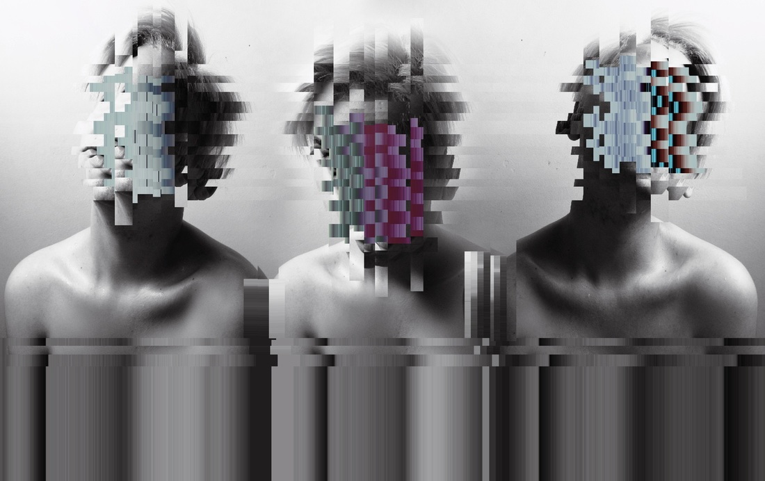
GLITCHED
In order to create my glitches portraits in response to Heitor Magno’s work I experimented with two different processes.
The first methods involved using textedit to corrupt the image file. The portrait was opened in textedit where section of the text were altered by cutting, copying and pasting different pieces of text to change the original image. The outcome of the process was random as there was no way of knowing how each section of text I edited affected the image. Inspired by Magno’s work I found that the hues of the image were reflective of the subject’s emotions. For instance, in the pink glitched image the fact that the subject was smiling along with the pink and yellow tones suggest a relaxed and happy emotion
The first methods involved using textedit to corrupt the image file. The portrait was opened in textedit where section of the text were altered by cutting, copying and pasting different pieces of text to change the original image. The outcome of the process was random as there was no way of knowing how each section of text I edited affected the image. Inspired by Magno’s work I found that the hues of the image were reflective of the subject’s emotions. For instance, in the pink glitched image the fact that the subject was smiling along with the pink and yellow tones suggest a relaxed and happy emotion

|

|
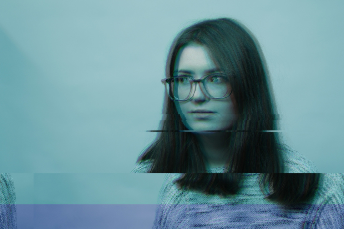
For the second method I used Photoshop.
- I began by duplicating two layers of the background.
- To the first layer I adjusted the hue until it had a blue tint.
- I then moved layer one along the horizontal plane slightly and lowered the opacity to 30%.
- The hue on the second layer was then adjusted so that it was green. Both layer were adjusted until the overall tint of the image was desirable.
- Layer one and two were then merged.
- Using the box selection tool section of the image were then moved along the horizontal plane and the hues changed again.
Exhibition: Champagne Life
To celebrate their 30th anniversary the Saatchi gallery held its first all-female exhibition in the gallery’s history act as a reminder to the fact that “art made by women” isn’t “women’s art.” The exhibition featured 14 emerging artists, with prices ranging from clay sculptures to photographs to charcoal drawings. The exhibition, Champagne Life, which takes its name from Julia Wachtel’s series of the same name, has a sense of cultural relevance that is key to the exhibition. The work within the exhibition provokes a dialogue with the audience in which the question the times we live in.
Julia Wachtel
Julia Wachtel is a neo-pop artist, she studied at the School of Visual Arts in New York in 1978 and the following year at the Whitney Museum of American Art, New York. Wachtel began working in the mid-70s and early 80s, her first exhibition was in the Institute of Contemporary Art in 1979. Watchel’s work is influenced by artist Andy Warhol. Watchel’s work is reflective of her fascination with the visual language of mass and celebrity culture. Her paintings visually interpret mass culture by documenting the contemporary socio-political landscape through looking at mainstream media. In every piece of her work features a focal panel that analyses the idea of the ‘everyman’. Company logos, sale advertisements and celebrity figures act as recognisable elements that enable Wachtel’s work to be relatable
Julia Wachtel is a neo-pop artist, she studied at the School of Visual Arts in New York in 1978 and the following year at the Whitney Museum of American Art, New York. Wachtel began working in the mid-70s and early 80s, her first exhibition was in the Institute of Contemporary Art in 1979. Watchel’s work is influenced by artist Andy Warhol. Watchel’s work is reflective of her fascination with the visual language of mass and celebrity culture. Her paintings visually interpret mass culture by documenting the contemporary socio-political landscape through looking at mainstream media. In every piece of her work features a focal panel that analyses the idea of the ‘everyman’. Company logos, sale advertisements and celebrity figures act as recognisable elements that enable Wachtel’s work to be relatable

Champagne Life
In Wachtel’s five panelled piece, Champagne Life, the image depicts celebrity couple Kim Kardashian and Kanye West alongside an image of a Minnie Mouse figure. The title of the piece was drawn from a song from the R&B artist Ne-Yo. The song goes on to talk about a glitzy lifestyle were “trouble is just a bubble in a champagne glass.” Champagne has become a common indicators of success in hip-hop culture. High living prestige and affluence are all qualities that have led to the champagne’s cultural appropriation. Although champagne is relatively affordable, to those who cannot afford a plethora of luxuries the drink act as an appetiser for their higher aspirations, Nigel Hurst, Saatchi gallery CEO, said with her work Wachtel makes “a mockery of the perception that champagne can be an easily obtained aspiration,” says Nigel Hurst, Saatchi’s CEO. The inverted image of the Kardashian-West power couple is representative of how reversed the lifestyles of celebrities are too many of our own. The attempt of trying to converge fantasy with reality is essence of modern society, where people are driven by the lust for celebrity status.
Slinkachu
Put Slinkachu after you have introduced the task.


For this project I looked a the idea making small things appear to be big. Through manipulating perspective the camera is able to present object as being much larger than they are in real life. Slinkachu is a photographer that uses everyday objects as prop, bringing them to life by creating the illusion that they are much larger than they actually are.
Slinkachu started his Little People Project in 2006. Whilst working at an advertising agency the artist started the project as an outlet for his creativity. Using remodelled and pained railway model figures Slinkachu created his street installations through telling stories, using everyday objects as prop. The act of photographing and titling the scenes make them more evident. The aim of the artist was to encourage city dwellers to be more aware of their surroundings. From Berlin to Paris to Doha to Cape Town and Beijing Slinkachu’s street installations allow its inhabitant to engage with the cities. Living a large city can often be lonely and overwhelming, in the scenes he leaves on streets for people to discover Slinkachu plays with the notion of surprise. The humour often seen beneath the images enable his audience to emphasis with the tiny characters put before them.
Slinkachu started his Little People Project in 2006. Whilst working at an advertising agency the artist started the project as an outlet for his creativity. Using remodelled and pained railway model figures Slinkachu created his street installations through telling stories, using everyday objects as prop. The act of photographing and titling the scenes make them more evident. The aim of the artist was to encourage city dwellers to be more aware of their surroundings. From Berlin to Paris to Doha to Cape Town and Beijing Slinkachu’s street installations allow its inhabitant to engage with the cities. Living a large city can often be lonely and overwhelming, in the scenes he leaves on streets for people to discover Slinkachu plays with the notion of surprise. The humour often seen beneath the images enable his audience to emphasis with the tiny characters put before them.
Small becomes big
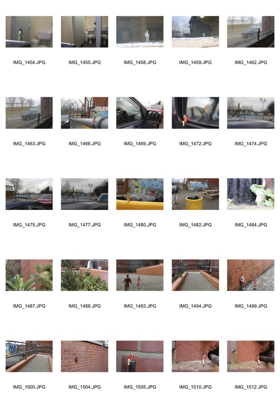
Due to the fact the figures of moved and used several times the blue instead of superglue, like Slinkachu and used, was used secure the miniature figures when photographing. However, the blue tack was visible in the images and as a result it had to be edited out.


In response to Slinkachu's work ventured out of the studio and photographed tiny railway figures in the school grounds. Like Slinkachu I chose to present each close up image with a zoomed out version of the same scene, this enabled viewers to get understanding of the perspectives. The images with large force the viewer to look deeper into the images as they try to locate the figures in the frame.
When photographing in public locations I found it interesting to see the reaction of passers by who intrigued as to what I was photographing. Upon closer inspection and seeing the tiny plastic figures they would often chuckle. I found that act of placing toy figures in odd locations insert humour into the images. I particularly liked the image of the two women perched on the bin. The posed put-togetherness of the figures is juxtaposed with the fact that they are sitting on a bin.
Overall I think the idea of using colliding the miniature world the that of the real, along with using a bit of humour, was a technique that allows fiction and fantasy to converge.
Vincent Laforet

|
|
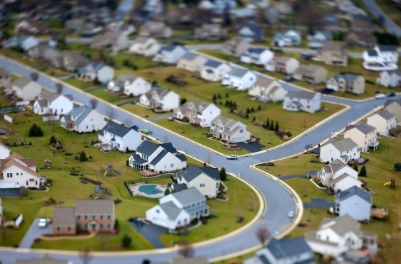
Tilt shift, sometimes known as miniature faking, is photography technique that enables life-size images of objects or scenes to hate the appearance of having a miniature scale. French American photographer Vincent Laforet is a French American photographer and director. He has won the Pulitzer Prize for his coverage of post 9/11 event in the Middle East in the New York Times. Laforet’s is considered be one of the pioneers of tilt shift. In Laforet’s images his use of tilt shift makes the modern world seem as if I were a fantasy through miniaturising objects such as planes. Laforet uses a tilt shift lens to move the plane of focus through shooting wide and tilting the lens up and down in the vertical plane. As a result a very shallow depth of field is created, this shallow depth of field is normally encountered when using a macro lens.
The tilt shift can also achieved through manipulating an image in Photoshop. In addition, the colour saturation and the contrast of the image are often increased to simulate the bright paint often found in scale models.
The tilt shift can also achieved through manipulating an image in Photoshop. In addition, the colour saturation and the contrast of the image are often increased to simulate the bright paint often found in scale models.
Big become small
- Image is taken from above of a scene. The image is then opened in Photoshop.
- The background layer was duplicated and a mask is created on the top layer.
- The reflected gradient was selected on the gradient tool. The … black to transparent
- The reflected gradient was then applied horizontally across the focal point of the image on the mask.
- The lens blur filter was then applied on the mask
- The radius of the blur is then adjusted until the image is appropriately blurred.
- Using the paintbrush tool I edited the mask so that the whole of all objects in the same planes as the gradient were clear.
- The levels of the bottom layer were then adjusted to increase the contrast.
- The saturation of the background was also increased.
- The background was then sharpened.
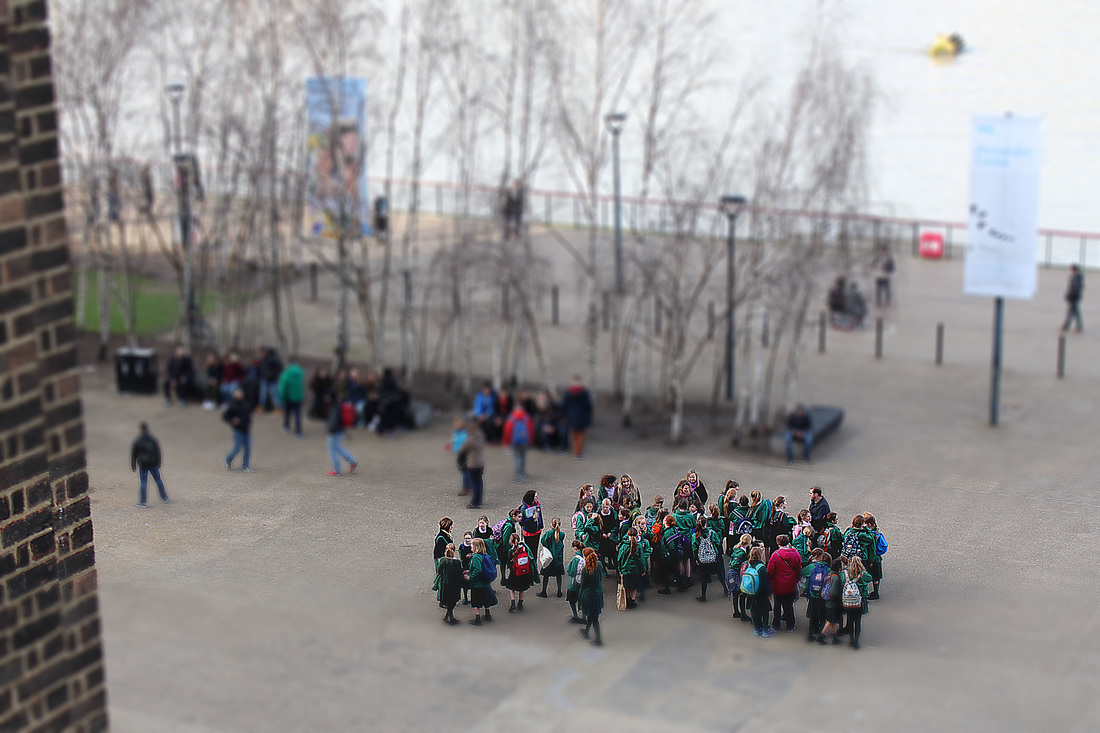
For my initial attempts at using tilt shift were unsuccessful as when applying the lens blur filter the radius of the blur was increased too much. Additionally, when using the paintbrush tool I edited out too much of the gradient, which isolated the subject and blurred the entire background. This did not make the bridge look miniature.
Through using tilt shift I was able to transform the real in a fictional play world. People are presented as figures through what initially seemed to be as a result of a shrinking process.
Through using tilt shift I was able to transform the real in a fictional play world. People are presented as figures through what initially seemed to be as a result of a shrinking process.
Paul Graham


Paul Graham is an English fine-art and documentary photographer, Graham is self-taught. In an article for the BBC Phil Coomes stated that “some photographs change the way we look at the world, some change the way we look at photography, and some do both,” and Paul Graham is one of them. As a pioneer of colour photography Graham used the medium to provide viewers with a new way of understanding recorded reality.
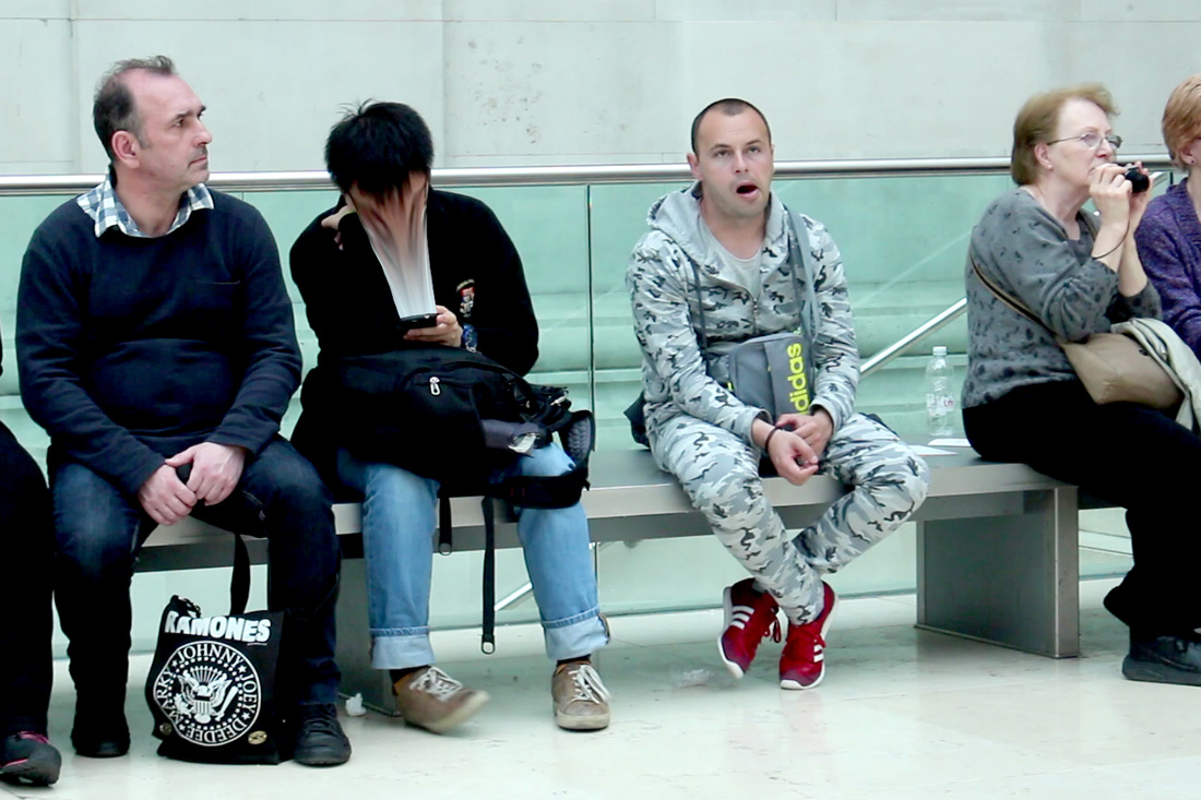
In the series Beyond Caring Graham was commissioned to present his view of Britain in 1984. In the 1982 Britain’s unemployment rate was high, one in every eight people at the time were unemployed. Moods in society shifted from anger to bitterness and finally to acceptance. Taking the photojournalistic approach Graham depicts packed jobcentre waiting rooms, as a result of the closure of numerous factories with former traditional industry workers as the main victims of this bout of redundancies. To reflect the bleakness of many people’s circumstances Graham uses blunt and factual titles for each image.
Graham’s images show an increase in the sense of isolation and internalisation. Without official permission Graham used innovative techniques such as holding his camera at hip level or placing it on his hip to shot discretely, the odd angles of many of the images illustrate this. In the image of the woman in the unemployment office the subject’s vibrant red coat contrast with the grey-wash background of the office.
Unposed Truth
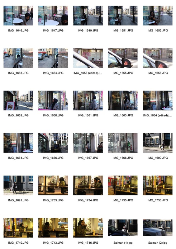
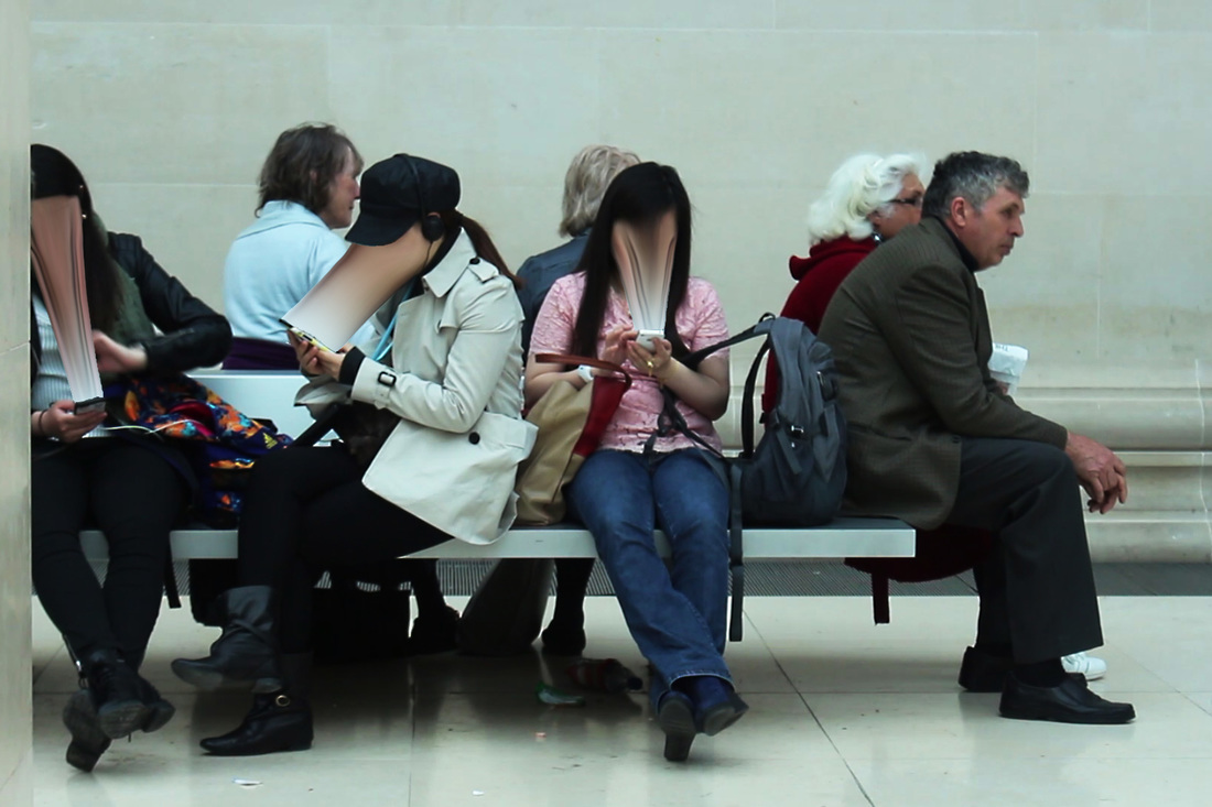
The Unposed Truth was created in response to Paul Graham’s Beyond Caring I visited some of London’s major landmarks such as Leicester Square. I chose the location of central London as it usually full of people which would make it more likely for me to find an interesting subject. Like Graham I used a variety of tactics to photograph my subject's discretely, thus allowing me to capture moments of truth. Often when a person thinks that no one is observing them the guards are let down. Due to the fast pace of street photography I found that I often had only one chance to get the perfect shot.
Initially I found that when I shot without being able to look into the viewfinder the composition and focus of the images were often poor. Adapting from Graham’s technique of holding the camera next to my hip I pulled out the articulating screen so I could adjust both the focus and composition of the image from above. I also used my friend as a distraction to enable my camera and I to be overlooked. As a result the quality of my images drastically improved.
To refine the series I think I would need to get closer to my subject's, making the images more intimate. Shortening the distance between the camp and the subject would create a stronger connection to the subjects.

|

|

|

Exhibition: Wolf Suschitzky's London
The Photographer's Gallery presented Wolf Suschitzky’s London a small exhibition dedicated to the Austrian photojournalist and cinematographer. Suschitzky’s images act as a historical depiction of London in the 40s and 30s. After fleeting Austria due to the rise in fascism in 1933 with his socialist family Suschitzky arrived in London at the age of 24. Influenced by his sister who was a press photographer, Suschitzky photographed his newly adopted city, as a recent migrant he was marvelled by the city. Through his work for politically influential magazine companies he refined his humanist approach to photography.
Suschitzky’s candid images show moments of spontaneity. Using his keen eye for composition Suschitzky has a story-telling ability that makes it appear as if his image were still from a film, for example in his image of the man walking along the Thames embankment. Suschitzky’s manipulation of light and shadows is reminiscent of the Film Noire genre. Suschitzky’s notably best piece of work was his Charing Cross series, with work being compared to the likes of Brassaï and Henri Cartier Bresson.
Suschitzky’s candid images show moments of spontaneity. Using his keen eye for composition Suschitzky has a story-telling ability that makes it appear as if his image were still from a film, for example in his image of the man walking along the Thames embankment. Suschitzky’s manipulation of light and shadows is reminiscent of the Film Noire genre. Suschitzky’s notably best piece of work was his Charing Cross series, with work being compared to the likes of Brassaï and Henri Cartier Bresson.


|


|
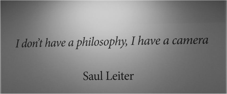
Exhibition: Saul Leiter: Retrospective

|

|
Another exhibition I visited in The Photographer’s Gallery was Saul Leiter: Retrospective. The exhibition featured work solely from the American photographer Saul Leiter. Although Leiter considers himself as primarily a painter he is well known for his portrayal of New York through street photography, although Leiter’s painterly instincts often influenced his work. The wall of the exhibition were plastered with quotes from Leiter, one of which was “it is not where it is or what it is that matters, but how you see it.” When shooting Leiter was never interested in “spectacular moments” but was interested in seemingly insignificant and fleeting moments, his approach to street photography ignored the usual rules of documentary photography.
During 1950s and 1960s when Leiter what mainly photographing colour photography had previously been used almost exclusively for advertising and fashion magazines. The medium had previously be dubbed as being unsuitable for artistic expressions. It was only in 1976 when the New York’s Museum of Modern art held its first exhibition devoted to the medium of colour photography. At the time colour photography was an expensive process and as a result it was only embraced by a few, Leiter would save money by buying film (35mm Kodachrome colour slide) past their sell-by date. This would often result in delicate muted tones.
During 1950s and 1960s when Leiter what mainly photographing colour photography had previously been used almost exclusively for advertising and fashion magazines. The medium had previously be dubbed as being unsuitable for artistic expressions. It was only in 1976 when the New York’s Museum of Modern art held its first exhibition devoted to the medium of colour photography. At the time colour photography was an expensive process and as a result it was only embraced by a few, Leiter would save money by buying film (35mm Kodachrome colour slide) past their sell-by date. This would often result in delicate muted tones.
Exhibition: Performing for the Camera
Tate Modern
- continuation of candid images
3 strands
For my three strands I decided focus on the words truth and fiction from the exam title. I began by looking at how difficult it can be to distinguish between the reality (truth) and the virtual world (fiction) in the 21st century. In modern society the concept of what is real and what is fake are ones that have been blurred as a result of technological advances.
Strand 1:
The first strand focuses on the idea of the rise in fake personas as a result of people’s increased use of social media. Social media platforms such as Instagram and Facebook have made it easier for people to present fake personalities to the online world through enabling people to be selective about what the show, thus manipulating the truth. Recently there has even been the creation of a new word, catfish, which tackles the idea of people pretending to be something they are not, using social media as their shield. The strand I will look at how easy it can be to create an alter ego.
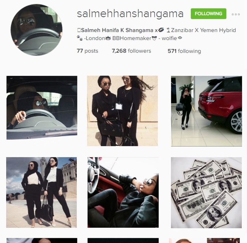
Zilla Van Der Born
For her university project, Dutch student, Zilla Van Den Born convinced her family and friends that she was would be travelling around Asia for the next five weeks. Through social media Zilla was able to update them about her experiences on her travels, little did they know she was in fact still at home in Amsterdam. The aim of her project was to show how social media does not always reflect reality. Using her Photoshop skills and utilising her photographer boyfriend’s skills Zilla posted images that showed her apparently in tuctuc in Indonesia when she was in fact in a studio in Amsterdam. The series of images Van Den Born posted along the Facebook updates illustrated how people create an online ideal world which reality can no longer meet to. It also shows how common and easy it is for people to distort reality. Although most people are aware of the fact that majority of the images put before us either by the media have been manipulated in some way we often overlook the fact that we often manipulate reality in our own lives.
Upon revealing that the trip and all of her social media updates was a ruse Van Den Born released a behind the scenes video showing her family and friends what she had really been up to. She also filmed their reactions. The before and after images she posted of the images she posted showed how each image was edited to distort the truth.
Upon revealing that the trip and all of her social media updates was a ruse Van Den Born released a behind the scenes video showing her family and friends what she had really been up to. She also filmed their reactions. The before and after images she posted of the images she posted showed how each image was edited to distort the truth.

|

|
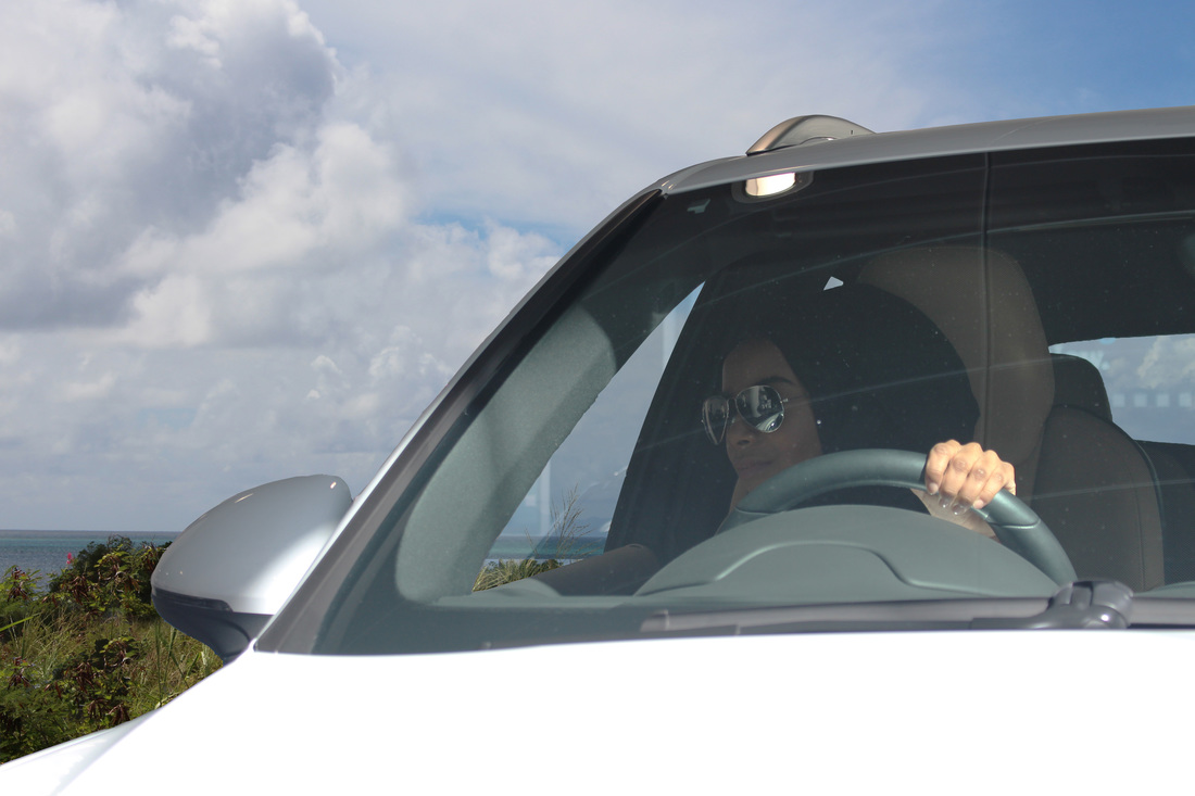
Photoshoped Reality
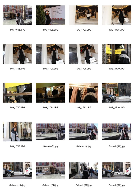
For my first response for this strand I was influenced by the work of Zilla Van Den Born. In Van Den Born’s university project she used digital manipulation techniques along with social media to convince her family and friend that she was travelling around South East Asia for five weeks when she actually never left the city. Van Den Born’s project inspired me to transport my subject from a showroom in Central London to a dusty road next to tropical beach in the Caribbean.
I began by opening the images I had photographed of my subject inside the Porsche showroom along with image I had taken on a holiday. Through a process to layering the two images, removing the negative space within the car image and then merging the two layers together I was able create evidence that did not occur in reality.
I think that the overall idea of using Photoshop to present a fictional scene to audience is one that I enjoyed. In my next response I shall explore using social media as a way of presenting these falsified realities to a wider audience.
Amalia Ulman
|
Argentine born Spanish artist Amalia Ulman graduated from one of London’s most prestigious art school, Central Saint Martins, in 2011. During her time at the university Ulman also work part-time as an escort. Ulman’s work often tackles issues linked with class, gender and sexuality often using a middlebrow aesthetic.
In April 2014 Ulman began her Excellence and Perfection project, which was was a four month performance that took place directly on Ulman Instagram page. Ulman uses the social media app to enact the story of an innocent blonde who moves to Los Angeles. Through Ulman dairistic posts we follow the main character, Ulman, as she develops a drug addiction and then returns back home to perhaps attend rehab. The project is separated into three episodes; cute girl, a sugar babe and life goddess. The series was recently presented at the Tate Modern’s Performing for the Camera. The exhibition present the project to the audience with a wall of three enlarged images taken from Ulman’s Instagram accompanied by three iPads. The iPads enabled the audience to scroll through the Instagram feed. |

|
Samuel Fosso
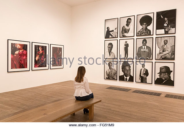
Samuel Fosso is a Cameroonian photographer who fled from Nigeria to Bangui in the Central African Republic as a result of the Nigerian civil war. For most of his career Fosso has worked in the Central African Republic. Fosso’s career as a photographer began at the age of 12 when he worked as an assistant photographer, the following year he set up his own studio, Studio Photo Nationale, in Bangui as a portrait photographer. After photographing customers Fosso used up the leftover parts of film to take self-portraits to send to his mother, who had stayed in Nigeria. Fosso would often dress-up in various costumes. In 1994 Fosso became the first winner of African Photography Encounters and went on to win the Prince Claus Award in 2001.
Fosso’s series African Spirit series was presented as part of the Tate Modern’s Performing for the Camera exhibition. In the gallery several portraits from the series were presented in a regular arrangement across a wall of the room. The large scale images made the the portraits seem regal. In the series Fosso used costumes to recreate elaborate personas of African politicians and cultural figures. Through borrowing various identities Fosso shows viewers that a person’s identity is partially determined by materialistic objects. Fosso’s self-portraits provide a glimpse of our humanity through disclosing how humans actually create their own identities.
Fosso’s series African Spirit series was presented as part of the Tate Modern’s Performing for the Camera exhibition. In the gallery several portraits from the series were presented in a regular arrangement across a wall of the room. The large scale images made the the portraits seem regal. In the series Fosso used costumes to recreate elaborate personas of African politicians and cultural figures. Through borrowing various identities Fosso shows viewers that a person’s identity is partially determined by materialistic objects. Fosso’s self-portraits provide a glimpse of our humanity through disclosing how humans actually create their own identities.
Response

|
Moving on from my first response I continued with the concept of utilizing photography to illustrate how much of what we see online, on a lot of celebrity social media pages have been edited As spectator we often are not given the full story. I used props, like Samuel Fosso, and key locations in the response to create an alter ego for my subject that leads a life of luxury. I photographed my subject in front of brands known luxury such as Selfridges. In the image taken in front of the Selfridges revolving door the phase ‘the gift of self-indulgence’ emphasises how images can be used to present a life of luxury simply by being seen somewhere, not necessarily doing something.
To present my project I chose the same format of Amalia Ulman, and used the social media app Instagram. My use of the app was show viewers that although these apps were created to capture moments of reality, reality is a thing that has now become difficult to find on these apps. To improve the response further I think the use of more props would be beneficial, along with replicate celebrity Instagram pages to show how easy it can be to upload something onto a social media page without giving the audience the full context of which the image was taken. |
|
Alison Jackson
Alison Jackson is a British artist. After graduating from the Chelsea College of Art and Design with a BA (Hons) in Fine Art Sculpture as an adult student, she became established as an abstract painter. Jackson’s work often explores the cult celebrity culture that has been created by the media. Jackson began to make work about Princess Diana at the time of her death. In 1999 Jackson became notorious for her controversial black-and-white portrait of Princess Diana and Dodie Fayed with showed the couple holding their supposed love child. Millions mourned her, even though the majority did not know her personally but thought they knew her through her projected image within the media. Jackson has made images of Diana using lookalikes “to explore our perception of her and our fantasies about her love life.”
Jackson’s realistic long-lens paparazzi style images use lookalikes present public figures, such as the royal family, politicians and celebrities, in compromising circumstance to create the impression that the audience is getting an insight into their lives. The images were often humorous and thought provoking. The grainy quality of the images along with the fact that they are often taken from behind bushes or through windows makes them seem more realistic. Jackson’s concept of using lookalikes to portray celebrities in compromising situations was rolled out onto the 2003 BBC satirical comedy Double Take created by Jackson. Like her portraits the comedy series commented on the the public’s need to believe, even when they know it is far-fetched.
Jackson’s realistic long-lens paparazzi style images use lookalikes present public figures, such as the royal family, politicians and celebrities, in compromising circumstance to create the impression that the audience is getting an insight into their lives. The images were often humorous and thought provoking. The grainy quality of the images along with the fact that they are often taken from behind bushes or through windows makes them seem more realistic. Jackson’s concept of using lookalikes to portray celebrities in compromising situations was rolled out onto the 2003 BBC satirical comedy Double Take created by Jackson. Like her portraits the comedy series commented on the the public’s need to believe, even when they know it is far-fetched.
Response
For this response I decide to experiment deeper on the idea that the no everything in photography in necessarily as it seems. The rise in celebrity culture in today’s society has seen an increase in people following celebrity life. Often scenes presented to the public by the media are often taken to be the absolute truth. However, as seen in the work of Alison Jackson who uses look-a-likes to create her paparazzi style images that show celebrities in compromising circumstances.
For this response I chose to also use paparazzi style images of my subject doing everyday tasks to make a point on how menial these elevated images of celebrities are. To improve my response I could have used a longer lens to achieve a more paparazzi style image and perhaps using more props to create a narrative about the subject, like that of the one created through using Instagram in my previous response.
For this response I chose to also use paparazzi style images of my subject doing everyday tasks to make a point on how menial these elevated images of celebrities are. To improve my response I could have used a longer lens to achieve a more paparazzi style image and perhaps using more props to create a narrative about the subject, like that of the one created through using Instagram in my previous response.
Samuel Fosso

Samuel Fosso is a Cameroonian photographer who fled from Nigeria to Bangui in the Central African Republic as a result of the Nigerian civil war. For most of his career Fosso has worked in the Central African Republic. Fosso’s career as a photographer began at the age of 12 when he worked as an assistant photographer, the following year he set up his own studio, Studio Photo Nationale, in Bangui as a portrait photographer. After photographing customers Fosso used up the leftover parts of film to take self-portraits to send to his mother, who had stayed in Nigeria. Fosso would often dress-up in various costumes. In 1994 Fosso became the first winner of African Photography Encounters and went on to win the Prince Claus Award in 2001.
Fosso’s series African Spirit series was presented as part of the Tate Modern’s Performing for the Camera exhibition. In the gallery several portraits from the series were presented in a regular arrangement across a wall of the room. The large scale images made the the portraits seem regal. In the series Fosso used costumes to recreate elaborate personas of African politicians and cultural figures. Through borrowing various identities Fosso shows viewers that a person’s identity is partially determined by materialistic objects. Fosso’s self-portraits provide a glimpse of our humanity through disclosing how humans actually create their own identities.
Fosso’s series African Spirit series was presented as part of the Tate Modern’s Performing for the Camera exhibition. In the gallery several portraits from the series were presented in a regular arrangement across a wall of the room. The large scale images made the the portraits seem regal. In the series Fosso used costumes to recreate elaborate personas of African politicians and cultural figures. Through borrowing various identities Fosso shows viewers that a person’s identity is partially determined by materialistic objects. Fosso’s self-portraits provide a glimpse of our humanity through disclosing how humans actually create their own identities.
Alison Jackson
Alison Jackson is a British artist. After graduating from the Chelsea College of Art and Design with a BA (Hons) in Fine Art Sculpture as an adult student she became established as an abstract painter. Jackson’s work often explores the cult celebrity culture that has been created by the media. It wasn’t until 1999 when Jackson became notorious for her controversial black-and-white portrait of Princess Diana and Dodie Fayed with what was apparently their love child. Jackson began to make work about Princess Diana at the time of her death. Millions mourned her, even though majority did not know her personally but knew her through the media. Jackson’s made images of Diana using lookalikes “to explore our perception of her and our fantasies about her love life.” I think that Jackson’s images of Princess Diana illustrates how deceiving camera can be.
Jackson’s realistic long-lens paparazzi style images use lookalikes to make public figures, such as the royal family, politicians and celebrities, to create the impression that the audience is getting an insight into their lives. The images were often humorous and thought provoking. The grainy quality of the images along with the fact that they are often taken from behind bushes or through windows makes them seem more realistic. Jackson’s concept of using lookalikes to portray celebrities in compromising situations was rolled out onto the 2003 BBC satirical comedy Double Take created by Jackson. Like her portraits the comedy series commented on the the public’s need to believe, even when they know it is far-fetched.
Jackson’s realistic long-lens paparazzi style images use lookalikes to make public figures, such as the royal family, politicians and celebrities, to create the impression that the audience is getting an insight into their lives. The images were often humorous and thought provoking. The grainy quality of the images along with the fact that they are often taken from behind bushes or through windows makes them seem more realistic. Jackson’s concept of using lookalikes to portray celebrities in compromising situations was rolled out onto the 2003 BBC satirical comedy Double Take created by Jackson. Like her portraits the comedy series commented on the the public’s need to believe, even when they know it is far-fetched.

|

|

Response
For this response I decide to experiment deeper on the idea that the no everything in photography in necessarily as it seems. The rise in celebrity culture in today’s society has seen an increase in people following celebrity life. Often scenes presented to the public by the media are often taken to be the absolute truth. However, as seen in the work of Alison Jackson who uses look-a-likes to create her paparazzi style images that show celebrities in compromising circumstances.
For this response I chose to also use paparazzi style images of my subject doing everyday tasks to make a point on how menial these elevated images of celebrities are. To improve my response I could have used a longer lens to achieve a more paparazzi style image and perhaps using more props to create a narrative about the subject, like that of the one created through using Instagram in my previous response.
For this response I chose to also use paparazzi style images of my subject doing everyday tasks to make a point on how menial these elevated images of celebrities are. To improve my response I could have used a longer lens to achieve a more paparazzi style image and perhaps using more props to create a narrative about the subject, like that of the one created through using Instagram in my previous response.
Strand 2: An Impossible History
For my second strand I shall be using my Photoshop image manipulation skills to create an impossible history through juxta-positioning fixtures of modern life with historical images. The use of Photoshop enables the truth of the original image to be distorted which also looks at the idea fiction. The strand looks at the phrase ‘the camera never lies’ through presenting the audience with scenes that would have been impossible to occur
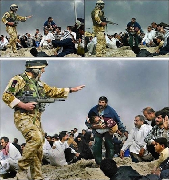
Brian Walski
|
Brian Walski is a professional photographer and photojournalist who in 2003 was accused of altering a newspaper image. The image mentioned was take in Iraq, near Basra, and depicts the scene of a man carrying the body of a child across a crowd whilst a soldier, standing in the foreground, raise his hand to him, a gun in hand. Originally the man standing and the soldier raising his hand had been taken separately. Combining the two images paint a very different and biased message through dramatising reality. When the image was published in the LA Times the was an uproar due to the fact that it had been ok for a photographer to manipulate an image and present it as reality.
|
Flora Borsi

|
|
Flora Borsi has been interested in photo-manipulation since 2004, with Photoshop Borsi is able to do anything. Borsi is a fine art photographer who has been using her Photoshop skills to to create her surreal images since 2007. Much of Borsi’s work have the recurring themes of identity, relationships, emotions and dreams through capturing the complex strength and fragility of the human psyche.
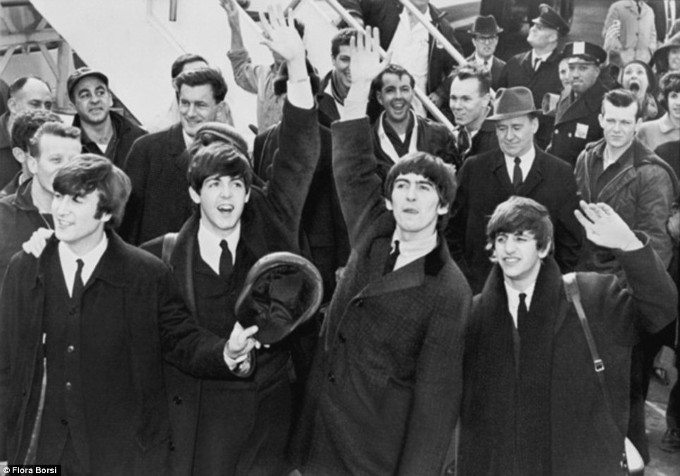
In Borsi’s Time Travel Project the artist edits herself along with her digital camera into iconic images from the past. With her series Borsi asks “if time travel did indeed become a reality, how would it affect our world as we currently experience it?” Many have dreamed of being able to witness another era through photograph, by meeting icons such as the Beatles and Marilyn Monroe Borsi fulfils her dreams.. To seamlessly edit in the the images Borsi pays attention to the details through matching her clothes to that of the era whilst also ensuring the lighting and the film grain matches the original. The black and white images take inspiration from Charlie Chaplin’s silent film The Circus. Borsi’s work comments on the fact that much of society today spend a lot of their time trying to capture life instead of actually experiencing it. If time travel was a reality would people still be hung up capturing the most important events in history.
In Borsi’s Time Travel Project the artist edits herself along with her digital camera into iconic images from the past. With her series Borsi asks “if time travel did indeed become a reality, how would it affect our world as we currently experience it?” Many have dreamed of being able to witness another era through photograph, by meeting icons such as the Beatles and Marilyn Monroe Borsi fulfils her dreams.. To seamlessly edit in the the images Borsi pays attention to the details through matching her clothes to that of the era whilst also ensuring the lighting and the film grain matches the original. The black and white images take inspiration from Charlie Chaplin’s silent film The Circus. Borsi’s work comments on the fact that much of society today spend a lot of their time trying to capture life instead of actually experiencing it. If time travel was a reality would people still be hung up capturing the most important events in history.
A Day in the 60s
- Transform > Flip horizontally (fit into context of scene
- Magic Wand - select background & delete
- Use quick select to remove smaller section of background
- Duplicate subject Layer on to file containing base image (I decided to use a different image to the one I initially started with as the new one was more suitable for the scene & exhibited the Apple logo
- Changed opacity of layer to 24% & positioned and scaled image so that it was where I wanted it to be
- Adjustment > Black & White & contrast, adjusted to match that of the image
- Used the quick select tool to select the part of the image that I wanted to be in front of the subject & duplicated onto a new layer
- Moved new layer in front of layer of the subject
- Filter > Texture > Grain, adjusted radius so that is matched that of the original
In response to Borsi’s Time Travel Project I created my own response, manipulating images from the past. The set of images act as ‘evidence’ of the subject’s day in the 60’s. The realistic looking images contradicts the common phrase ‘the camera never lies.’ The fact the subject had been photographed in the same clothes suggested that the she had visited a number of event that took place over a time period of a decade in one day. In the images the subject is seen with her phone, the logo on the back provides the audience with a clue that she was foreign to the era.
When editing the image I took note Borsi’s techniques and I tried to match both the contrast and the film grain of the image to make the subject seamlessly fit into the images. An issue I found with the first image I created, The King of Rock ‘N’ Roll, was that the lighting of the image I took of my subject was not consistent with the original image. Learning from that mistake for the following images I made sure that I paid attention to the lighting to insure that the shadows on the subject matched that of the original images.
When editing the image I took note Borsi’s techniques and I tried to match both the contrast and the film grain of the image to make the subject seamlessly fit into the images. An issue I found with the first image I created, The King of Rock ‘N’ Roll, was that the lighting of the image I took of my subject was not consistent with the original image. Learning from that mistake for the following images I made sure that I paid attention to the lighting to insure that the shadows on the subject matched that of the original images.

Beatlemania

The King of Rock 'N' Roll

Photo-bombing Marilyn Monroe
Yinka Shonibare
In Yinka Shonibare’s Diary of a Victorian Dandy Shonibare digitally inserts himself into a series of satirical art from the 18th century paintings where he plays the protagonist in each image. The recreates paintings that resonate with Hogarth’s 1735 A Rake’s Progress. At a first glance to a viewer it would seem as if the scenes were in fact an 18th century painting. Collectively scenes shown the typical day of Shonibare’s fictional Victorian Dandy, who often strode to imitate an aristocratic lifestyle, where Shonibare himself plays the protagonist. Shonibare uses his series to celebrate excess and decadence, throughout images themes such as leisure, frivolity, self-invention and self-indulgence are seen. The gilded frames in which Shonibare's exhibits his work is representative of opulence.
Each image is captioned with the time of day in which the scene depicts. Beginning with an orgy at 0300 and ending with a ball at in a large ballroom at 1900.
Each image is captioned with the time of day in which the scene depicts. Beginning with an orgy at 0300 and ending with a ball at in a large ballroom at 1900.

Diary of a Victorian Dandy: 3.00 hours
|

Diary of a Victorian Dandy: 19.00 hours
|
The Last Supper
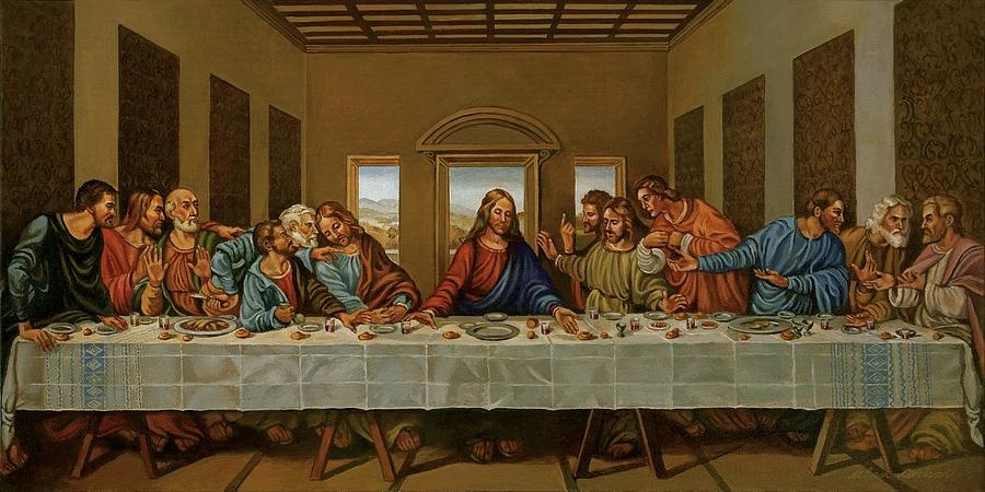
The Original

The edited version
In response to Shonibare's Diary of a Dandy I chose to also take inspiration from painting from the past as an influence for my work. However, instead of recreate the scenes from a painting I combined the Photoshop skills I had learnt from my previous response to Flora Boris’s work and used photo manipulation.
To add humour to Leonardo Da Vinci’s The Last Supper mural I inserted items from the modern day, like Suzanne Jongmans. The painting now depicts Jesus and his apostles drinking cans of coca-cola along with the traditional wine. In addition an apostle can also been seen to have the latest iPhone in his hand. The insertion of small items into the painting forces the audience to look closely at the image in order to find the quirks. To prevent the modern objects from being too prominent in their setting the colouring of the image was adjusted along with a brush filter, as a result they presence was subtle in the painting.
The final image starts a discussion on how through mediums such as painting and photography artists are able to create their own reality, it the audience’s choice to decide what they want to believe. Da Vinci began work on The Last Supper mural in 1495 when Jesus had died approximately 1500 years prior. Therefore there was noway Da Vinci could have painted the scene of the last supper exactly, yet when many today think of Jesus’ last supper images similar to Da Vinci’s The Last Supper arise. Much of what society thinks of the past we ideas put forward by artist and writers.
Strand 3:
In the 21st century a growing number of society live in virtual worlds, perpetuated by social media apps. Today everyday moments, entertainment and even the task of finding future partners are activities are commonly done with the aid of the virtual realm that is the internet. This series follows on loosely from the Unposed Truth response by using street photography to look at society at a period of time.
Antoine Gieger

Antoine Geiger, a Parisian photographer, created his Sur-Fake series to depict the attention sucking power of modern technology. Geiger took inspiration from the Sur-Fake project.
In both French and English sur is the a prefix that means above or beyond. Geiger’s face sucking surreal images take his subjects beyond the realms of reality. Geiger’s use of photography enables his subjects to be frozen in a semi-trance like state, demonstrating how much people are engrossed by digital objects rather than the tangible the tangible world.
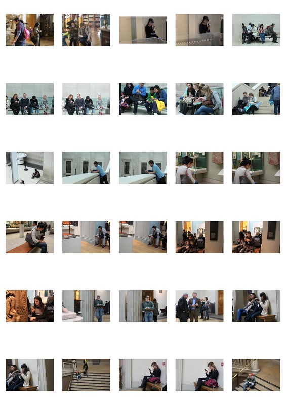
The series highlights people’s obsessive relationship with their smartphones, through visually embodying their attention-sucking power. Geiger edits his portraits in a way that masks the identities of his subjects, stating that “I’ve always been attracted by images of anonymity, hidden faces and expressions. It is something that touches me aesthetically.” The somewhat sinister images were not staged, in the images Geiger captures reality. In Geiger’s image of the group of people sitting in museum surrounded by art was shocking, as it showed the extent to which people are engrossed by technology. Even inside a museum surround art and multiple things of interest a large group of people can still be seen to be disengaged with their surroundings. The idea of being sucking out of reality as a result of constantly using technology is one I would like to convey in my response.
In both French and English sur is the a prefix that means above or beyond. Geiger’s face sucking surreal images take his subjects beyond the realms of reality. Geiger’s use of photography enables his subjects to be frozen in a semi-trance like state, demonstrating how much people are engrossed by digital objects rather than the tangible the tangible world.
The series highlights people’s obsessive relationship with their smartphones, through visually embodying their attention-sucking power. Geiger edits his portraits in a way that masks the identities of his subjects, stating that “I’ve always been attracted by images of anonymity, hidden faces and expressions. It is something that touches me aesthetically.” The somewhat sinister images were not staged, in the images Geiger captures reality. In Geiger’s image of the group of people sitting in museum surrounded by art was shocking, as it showed the extent to which people are engrossed by technology. Even inside a museum surround art and multiple things of interest a large group of people can still be seen to be disengaged with their surroundings. The idea of being sucking out of reality as a result of constantly using technology is one I would like to convey in my response.
Soul-sucking
|
|
|
|
Process:
|
In response to the Sur-Fake series I recreate images in the style of Geiger’s face sucking portraits. For this response I chose to focus on people travelling on London’s Underground. Living in London and travelling on its underground, I have found when travelling carriages are almost exclusively full with people preoccupied with their phone or some sort of technological device. These devices are often used as a way of blocking out the world around the user by creating an invisible barrier between people and the physical world around them, allowing commuters to busy themselves and avoid any awkward interactions with other commuters.
I found it interesting to capture scenes where some many people are confined in a small space yet none of them seem to interact with each other. It seemed strange that even when whizzing under a city as rich and vibrant as London people still seemed to be stuck somewhere else online.
I think the actual editing process of the images was successful. I think that it was a good idea to show how look at how focusing on a single individual can represent societal attitudes. However I think to improve my response I could have photographed multiple on their phones in the same shot rather than focusing on a single person by taking shots with a wider perspective
Eric Pickersgill

|

|

Eric Pickersgill graduated from Columbia College in 2011 with a Bachelor of Fine Arts degree, concentrated in photography. He later went on to receive a Master of Fine Arts degree from the University of North Carolina in 2015. Pickersgill’s work often explores the psychological and social effects that cameras have on individuals and societies as a whole.
In his series Removed, Pickersgill explore the issue people and their personal devices, such as mobile phones and tablets. The development of mobile phone was to make faraway places and people feel closer, yet the addictive force caused by these devices often cause the user’s attention to be split their attention between those who are with them physically and those that are not. Consequently, scenes where two people can be sat at a table together yet both be consumed by their devices and its ability to enable them to talk to someone else are ones that are common today. The inspiration for the series came from a scene not too dissimilar. Whilst in a cafe Pickersgill notices a family at a table who seem disconnected from one another as a result of being preoccupied with the their devices. The only person, who had appeared to put her phone away, was the mother who had tried to negate conversion amounts to the group but that retired to star in out off the window, looking sad and alone in the company offer own family. Pickersgill says that he was “saddened by the use of technology for interaction in exchange for not interacting.”
In Removed Pickersgill presents his large format black-and-white portraits show everyday scenes that show individuals that appear to be holding mobile phones which have physically been removed from their hands. The images represent re-enactments of daily experiences, the artist himself admits to being guilty frequently turning his back on his wife to look at his ‘cold, illuminated’ phone. Pickersgill acts his subjects to hold their posture as if they were still holding their devices. It is interesting to see how much the devices can be seen to take a physical form without actually being present in the frame. As a society we have become accustomed to reading the body language of a person on their device. The series acts as a mirror, enabling the public to see how addictive these digital devices are through documenting how societal behaviour have changed as a result of the ther growing presence in daily life. In addition, Pickersgill’s use of a varied demographic along with an assortment of common circumstances illustrates how far-reaching people’s dependence on their technological devices are.
Phantom Limb

Continuing from my previous Sur-fake response where I looked at how people can become consumed by their devices I decided to with the concept of smartphones consuming their users. In this response, influenced by the Removed series by Eric Pickersgill, I concentrated on how devices can be seen to physically impact their users. Phones have almost become phantom limbs, the act of using a device can still be seen even without it actually being present.
For my response I used Pickersgill’s method of asking the subject to pose with their comfortably phones before removing it from their hands, and then asking them to hold their stance. It was strange to see that even without seeing what is in their hands it is immediately apparent as what they are doing.
Initially I viewed the images in colour but later on decided that black and white was more suitable as it brought a more earnest note to the images. When editing the images I also increased their contrast slightly to enhance the aesthetics.
I found it was interesting to see the subject in a variety of scenario, such as sitting down at to standing up on an escalator, to show that the physical embodiment of the phone with a person’s body language is irrelevant of where they are. To improve my response I think I could have also taken images in group settings as well, for example at a party.


|

|
Nicholas Sack
Nicholas Sack is a British photographer, his Lost in the City series features a number of black-and-white images of office workers in and around the City of London. Sacks takes inspiration from other street photographers including the likes of Garry Winogrand and Lee Friedlander. In the images Sack sets his subjects against the imposing architecture that makes up the city. The geometric shapes in the background create a heightened sense of isolation within the city. It is almost unnerving as it reminds viewers of the alienation that can still be felt in the heart of a city as large and populous as London. In an interview Sack comments on his series saying, “they might have been perfectly happy but by setting them against this rather anonymous architecture it lifts the everyday to a state of dislocation and otherworldliness."

|

|
Back to Black and White
|
|

|
- Use magnetic Lasso tool to select subject
- Apply black and white mask to the selected section
- Duplicate mask to create and use it to create a levels mask, adjust the image levels
- Use the brush tool to neaten the edges of the the mask, for example the tassels of the scarf
- Edit the mask by adjusting the feathering of the mask
- Increase the saturation of the background image to increase the contrast

|

|

I found that in my previous response the use of black and white had a power effect on the overall image. I chose to explore looking at using black and white filters in my images. Looking at the work of Nicolas Sack I found the use of black and white also assisted in contrasting the subject with their surroundings. Also inspired by other street photographer I had looked at such as Paul Graham, I chose to covertly photograph my subject in order to capture people going about their everyday business unaware in their natural states.
For this response I used a black and white filter on only the subject of the image to create a distinction between them and their surroundings. Through a combination of Photoshop’s lasso and magic wand tools I was able to isolate the the black and white mask. Idea behind this was to look at how people put up barriers when they are on their phones, cutting themselves off from the rest of their surroundings. The coloured background that surrounds the subject suggests that they are missing out. As colour images were as a result of technological advances it is ironic that using these devices detract colour from the images.
Upon evaluating the final image I found that using a black and white filter did not have the desired effect. Instead of making the subject stand out from their surrounding they appeared to look washed out as a result of the lack of colour.
I developing from my use of a black and white filter I decided to experimenting with heightening the intensity of the colour in the images rather than reducing it. For this I used the same method of selecting the subject using the magic wand tool on Photoshop, but I applied a gradient map mask to the images instead of using a black and white filter. I then decided to invert the mask, thus giving the background rather the subject a kaleidoscope effect. This was more successful as still enable me to put across the concept of the subject missing out on a colourful world. I also decrease that saturation of the subject to increase the contrast. The image conveys the idea that vibrancy and colourfulness of reality is only appreciated when people stop and look up from their devices.
To improve the response I think that looking different locations, such as a fun fair may be more appropriate for the message I am trying to convey as the surrounding would be more vibrant. This is because the image of sleeping women in the background does not suggest the world worth taking a break from your devices.
To improve the response I think that looking different locations, such as a fun fair may be more appropriate for the message I am trying to convey as the surrounding would be more vibrant. This is because the image of sleeping women in the background does not suggest the world worth taking a break from your devices.

Hayley Warnham
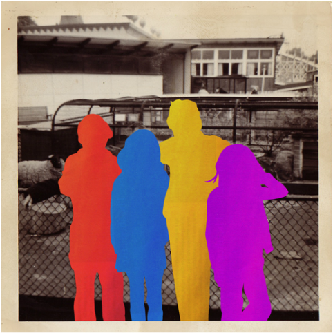
|

|
In Hayley Warnham’s ‘Everything is Beautiful’ series Warnham transforms old family photos taken by her Grandfather, of their family seaside holidays. The traditional British family seaside holiday scenes provide the images with a nostalgic feel. The fact that artist’s mother appears in some of the images as a child makes the series even more personal to Warnham. Warnham injects the grey scale images with burst of bright colours, bringing a new-found life to the old images.
Combining the flat colour the low quality grain of the originals allows them to contrast with one another. The use of colour in the otherwise black and white images provides viewers with a new perspective on the great British seaside holiday. Through highlighting different aspects in each frame seaside holidays that were previously viewed as being drab and dreary are compared to the likes of exotic holidays abroad due to the bright colours and silhouettes.
Through editing her images digital rather than manually, Warnham is given the freedom of exploring the composition of the images enabling her to both build up and strip down with her collages. As a result of the photographs holding a lot of sentimental value an added benefit of editing the images digitally is that each image remains undamaged and is still reusable.
Colour Blocked
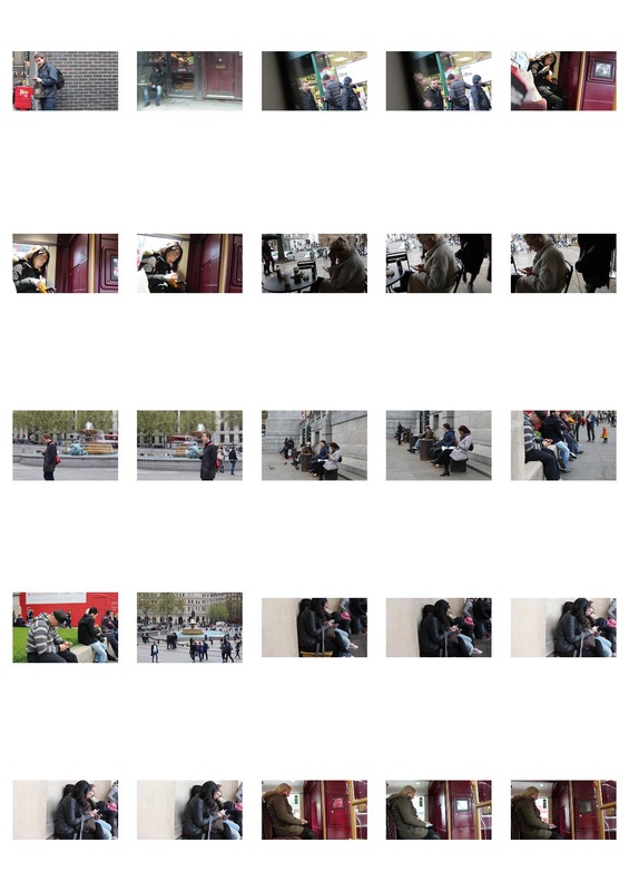
Inspired by the idea of using bright colours to bring attention to the subject I looked at the work of Hayley Warham, creates digital collages of colour blocked images. This response continues with the idea of the subject being segregated from their surroundings. The colour blocking technique creates a vagueness behind the subject’s identity. I found that this effect was one I liked as I found that the identity of the subject was irrelevant to concept. Eliminating the identity of the subjects enables viewers to put themselves in the image by recall similar situation where they were occupied with their devices, unaware of what was going on around them.
To edit the image I started by adjusting the brightness and level of the image before moving on to the quick select tool to select the subject’s body. I then created a new layer using the bucket tool to fill in the selected area in fuchsia. To neaten the edges of the block of colour I refines the edges and feathered them. For the final step, to add a bit of depth to the colour I applied a gradient of a tone that was lighter than the base to.
I found that the use of colour blocking brought to much attention to the subject rather than focusing on the activity of using phones. To develop from this Idea I will still conceal the identities of through using blocks of colour, however I shall you colours with more subdued tones instead of fuchsia.


Amirali Ghasemi
Amirali Ghasemi began his series, The Party Scenes - Tehran Remixed, in 2005. The title of the series acts as a literal representation of the scenes of the social and private lives of young urban Iranians. The series consists of collection of images, short clips and music.
Growing up in a middle class family in Tehran Ghasemi is able to give viewers a behind the scenes access to Tehran’s mysterious youth culture. The images of intimate private parties provide a look into aspects of Iranian life that are rarely televised. The images act as a form of photojournalism that shows the ordinary activities in the thesis of Tehran. Ghasemi’s images contrast to the prejudicial images presented by the media.
In order to protect his subject’s identities Ghasemi conceals their faces and flesh by over-exposing them. The blanked out. Faces and bodies act as a pre-emptive cursor due to the difficult circumstances of living in Iran. Although audiences are unable to see the subject’s faces they are still able to relate to the subjects through making connections with the everyday scenes. Just like many around the the world Iran’s young population are not excluded from enjoying their youth like the rest of the world’s youthful population. The series highlights to audience what the realities are for some people in other parts of the world.

Individual
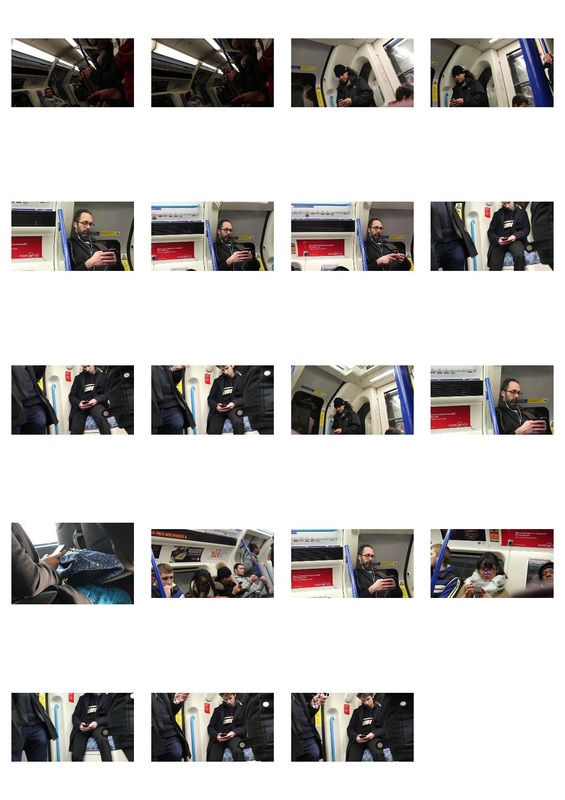
In response I chose to colour block the images by using white. I think the use of white, the absence of colour, better represented the fact the identity of the subject was not need in this image. The use of white almost made it seem as if the subject had been physically cut out of the image.
When editing the image I used a very similar method to the one I had previous used. However, this time I purposely did not select the clothes the subject was wear as well as other miscellaneous objects such as glasses. In order to do this I reduced the opacity of top layer, then I used the erase tool to remove the white paint from the details. After That I went back in with small paint brush to neaten the edges. I think that this attention to detail created more space for the viewers to empathise with the piece without revealing their identity.
When editing the image I used a very similar method to the one I had previous used. However, this time I purposely did not select the clothes the subject was wear as well as other miscellaneous objects such as glasses. In order to do this I reduced the opacity of top layer, then I used the erase tool to remove the white paint from the details. After That I went back in with small paint brush to neaten the edges. I think that this attention to detail created more space for the viewers to empathise with the piece without revealing their identity.
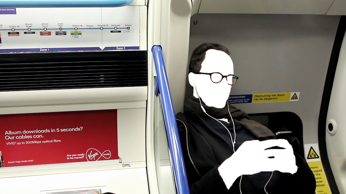
Jamie Beck and Kevin Burg
|
Jamie Beck and Kevin Burg are a husband and wife team that consist of a fashion photographer, Beck, and visual designer and digital artist, Burg, who have been collaborating as artist since 2009.
The duo created their first cinemagraph in 20011. The creation of the cinemagraph came about when the artists wanted create a piece of work that was “more than a photo, but not quite a video.” The cinemagraph, where individual instances of motion where isolated against static images rose the GIF animation to a new level, Burg describes them as “a living photograph. It’s a photograph that has a living moment inside of it.” |

|

Paris 2011
The process of creating the cinemagraph consisted of shooting short video clips with high quality cinema cameras. Using digital editing techniques the living moments were then ‘hand-stitched’ together. The process was time consumer and took an average of two days to create each cinemagraph.

|
When they are not travelling world creating work the husband and wife team reside in New York City. Their video and cinemagraphs of commercial and fashion campaigns are pushed on the artist duo’s website, Ann Street Studio. Some of their notable clients include the likes of Marchesa, Google and Volvo. Beck and Burg created a series of cinemagraph for Amazon Fashion’s with the CFDA Vogue Fashion Fund designers. A cinemagraph was created for each finalist that was tailored to specific details of the designers personalities, information was gathered from interviews that took place before the hoots.
|
Cinemagraphs
|
|
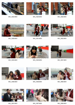
|
Using Burg and Beck’s cinemagraphs I went back to looking at the idea of having people being isolated by their phones are a result of constantly using their phones. The idea of using cinemagraphs was one I had previously experimented with when creating my One Loop portraits. I employed the same techniques I used when created my previous cinemagraph. Learning from my previous attempts I filmed short clips and used a tripod to ensure the cinemagraphs were smooth and to remove the camera shake.

In the first cinemagraph I created kept the foreground still whilst the subjects kept in motion. Limiting the motion in the cinemagraph to the subtle movement of the subject’s hands and faces presents the idea of a the subjects being trapped in their own world as a result of being fixated on their devices.
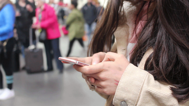
For the second cinemagraph change the area that was frozen. Rather than freezing the background I froze the subject whilst the background continued to move. I like the idea of making the subject frozen in their own virtual world while the world around them continued to move. However, I found that when editing the images I found that the subject moved beyond the mask. Additionally, as the movement of the people in the were not slight the idea of a continuous movement that is integral to a cinemagraph was not achieved. I think the previous cinemagraph I created was more successful.
Jean Faucheur

|

|
 Jean Faucheur – Untitled, Le M.U.R. 2000, photo credits – Art Actuel
Jean Faucheur is a French artist who was born in Versailles, Paris, in 1956. In 1979 Faucheur received a BA from the National School of Decorative Art, Paris, graduating first in his class. In 1982 Faucheur held his first solo exhibition at the Phillipe Frégnac gallery in Paris, that year he was also won the Pierre David Weil’s drawing price.
In Faucheur’s work he connects urban and traditional art. He was one of the pioneers of the Reclaiming the streets movement, which consisted of artists bringing bring art outside the confines of museum walls. Since 1983, Faucheur has covered commercial buildings with his 4m x 3m handpainted posters. Due to the success of his work Faucheur, along with a number of other artists, was invited to exhibit their work on the streets of New York by the Tony Shafrazy Gallery. Faucheur founded Frères Ripoulin (Brother Ripoulin) an artist collaborative group that worked together from from 1984 to 1988. Frères Ripoulin was also associated with the Figuration Libre, a French art movement that presented figurative and colorful paintings. Some of earlier work such as the billboard shown below was evidence of this. Faucheur was influenced by cubism.
For Faucheur photography is said to have always been the starting point of his work, although he also uses a variety of of mediums including sculpture. In his smaller scale photographic pieces Faucheur deconstructs and manipulates his portraits. Through his weaving and cut-out techniques Faucheur creates surreal portraits. In these portraits the artist hides as much as he reveals, creating a haziness over the subject’s identity.
Collage GIF

After looking at Faucheur’s collage portraits I created a layered GIF. Faucheur’s use of combining two images on the same person into one piece inspired me to try to combine the activities of what a person looks like when they are and are not on there phones. Developing from my previous response where I create a cinemagraph I continued to use the GIF form to create collage. The GIF I created was reminiscent of surrealist portraiture.
To create the GIF I began by filming my subject with sitting in a studio environment. The reason for moving away from shooting in a natural environment was to explore the idea of drawing more focus onto subjects. In the two videos I filmed I told the subject to initially be on her phone, in the second video I told the subject to stare deeply into the camera to a length of time. I found that constant eye contact with the camera was intense, as the eyes seemed to penetrate through the portrait. On the other hand, in the video where the subject was on her phone she seemed so distant and removed. Increasing the contrast of the section of the portrait with the eyes and applying a black and white filter to the rest of the portrait increased the contrast between the two.
I found that the harsh horizontal lines that cut across the portrait created an apparent difference between the two stances of the subject. The idea behind the portrait was to highlight the deeper and more meaningful interaction that is missing interaction we spend our time occupied by our phones.
In the initial GIF I created the two videos were combined into a GIF where there was only one boundary between them. However, I found that the coloured portion of GIF was overpowering and took attention away from the black and white part of the GIF. This was issue as the main purpose of the portrait was to bring attention to the activity of being on a device. Consequently, I reduced the part of the coloured portrait to a slice of the eyes. To improve it further I would have increased the contrast to the black and white filter to bring that section of the GIF into the foreground.
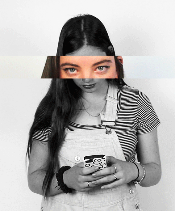
|

|
Nerhol
Nerhol is a Japanese artist unit formed in 2007 by Yoshihisa Tanaka and Ryuta Iida. The name Nerhol is made up of the Japanese words nerhu (to plan ideas) and holu (to sculpt and carve), the two words combined perfectly describes the collaborative duo. Tanaka plans the ideas whilst Iida acts as the sculptor. The pair have backgrounds in graphic design and fine art. Using paper as their main medium Nerhol’s aim is to try to open up a new possibilities for artistic expression. In their exhibitions Nerhol encourages their audiences to explore the pieces through touching them and physically engaging with them.
In their series Misunderstanding Focus the artists uses a series of time-lapse portrait of 27 subjects. In the three minutes they are asked sit still the camera captures the small minute movements in each frame of the of time-lapse. Whilst in a single frame a camera provides the illusion that the subject is perfectly still the time-lapse unmasks this illusion, illustrating that it is near impossible to sit truly still for longer than a few seconds. The portraits also also ask viewers to question their traditional understanding of portraiture and the idea that a person can be condensed into a single image through enabling viewers to see humans as they are, perpetually in motion.
The thousands of individual portraits from the time-lapsed frames were condensed in book like dense portrait. The two-dimensional time-lapse portraits were reconstructed and transformed into three-dimensional sculptures. Surgically carved through the stacks of the images, Iida reveals the slightest movements on the image below. The time-based typography shows how the image is distorted and shifts as each second passes by.

|


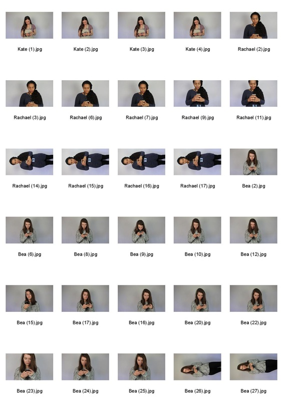

|
Alexey Titarenko
Alexey Titarenko is a Russian photographer who was born in Leningrad (known as St. Petersberg). At the age of year 15 Titarenko became the youngest member of the independent club Zerkalo [Mirror]. Titarenko later went on to graduate from the Department of Cinematic and Photographic Art at Leningrad’s Institute of Culture. His work is influenced by Russian avant-garde, such as the work of Kazmir Malevich, Alexander Rodchenko and the Dada art movement of the early 20th century. Using his long standing passion for making art with his camera Titarenko uses photography to depict the atmosphere and lives of inhabitants of St. Petersburg. HIs work reflects Russian history.
In Titarenko’s series City of Shadows he uses long exposure photography techniques to capture suffering in Russian after the collapse of the Soviet Union. The series acts a commentary on the oppressiveness Communist regime, Titarenko states that he began to take images as he felt it was his mission.
The somber compositions of his favourite composer, Dmitri Shostakovich, influences Titarenko work. “The beginning of the Second Cello Concerto is like a long-exposure image by itself,” he says, “and the melody of the cello is so long and so tired.” Walking the streets of St. Petersburg Titarenko was absorbed by what he saw, using his Hasselblad camera to capture the rush of bodies all trying to get into the station. In his photographs of a surge of people entering the Vasilievostrovskaia subway station Titarenko introduces long exposure into street photography, creating a haunting blur. As the sea of people are blurred in ghostly mist a sense of heaviness and darkness are brought to the image, creating a powerful emotional intensity. Each print is a unique interpretation of his experiences in the city, infusing his work with a personal and emotive visual character.
Using darkroom techniques such as bleaching and toning Titarenko adds depth to the grey tones. The Mack lines created in his images, as a result of solarisation, creates a silverish veil that adds to the uncomfortable atmosphere.


Still Ghost

In my previous response I use time lapse photography to illustrate how captivated people can be b their. For this response I decided to go back to the idea of highlighting the fact that subjects can often seemed isolated as a result of being on their phones. However, I chose use the concept of capturing multiple moments in a single image. In order to do this I took inspiration from Alexey Titarenko’s City of Shadows series and also used long exposure techniques to capture the hustle and bustle of people within a city. Like Titarenko I chose a station, London King’s Cross, as my location. The fact that I chose to shot the day before a bank holiday meant that there was a rush of people funneling through the station entrance.
Due to the long shutter speed a low ISO of 100 and small aperture of f/32.0 were required to ensure that the image was not overexposed. When I initially began to shoot the aperture was too high, resulting in overexposed images, however this was quickly rectified. In the two images shown I used to different shutter speeds. Consequently, the use of a shorter shutter speed in the second image meant that the features of the people in motion were much more distinguishable in comparison to that of the first, although the first image resembled Titarenko’s images more. To eliminate any camera shake that may have been seen in the image I used a tripod.
Like in Titarenko’s Begging Woman image from his Time Standing Still series as a result of being so still the subjects stand out from the blur of a crowd in front of them. Whilst it is the crowd that give an aesthetically ghostly atmosphere to the image it is in fact the stillness of the subjects that is eerie.
If I were to pursue using long exposure techniques further I would develop my idea though using much longer shutter speeds. The shutter maximum speed I used for this response was only 3s, as a result the motion of only a few people walking passed the camera was captured.


Nobuhiro Nakanishi
Nobuhiro Nakanishi is a Japanese artist who was born in Fukuoka, Japan, in 1976. In 1999 Nakanishi completed a postgraduate course receiving a B.A. in Fine Art Sculpture, three years later Nakanishi completed went back to university and went on to receive a M.A. in Fine Art Sculptures again. Nakanishi currently lives and works in Osaka, Japan, producing mixed-media sculptures and installations. The aim of Nakanishi’s work is to bridge the gap between art and life through providing audiences with an immersive experience. The theme of “the physical that permeates into the art piece,” is one that runs through his work.
In the series Layer drawings Nakanishi presents a collection of acrylic sheets, each with laser prints mounted onto them. The installations in the series consists of chronologically ordered acrylic sheets that have either been hung from the ceiling or mounted into pieces of wood. Through photographing the a single scene over a period of time viewers are able to see the subtle changes within each frame, experiencing the progression of time as they walk amongst the installations. Hanging the work from the ceiling blurs the boundaries between the internal and external worlds, giving them the ability to see nature as a whole. Through re-creating the scene in this way, Nakanishi enables viewers to empathise with him and enriches the experience, presenting them with an unusual landscape. saw when photographing enriched experience. The large and more physical dimensional aspects of Nakanishi’s landscapes contain infinitely more detail than a standard photograph. Nakanishi’s work allows the audience to analyse the way the world is perceived, Nakanishi strives “to produce art that creates movement between the artwork itself and the viewer’s experience of the artwork.”
In the series Layer drawings Nakanishi presents a collection of acrylic sheets, each with laser prints mounted onto them. The installations in the series consists of chronologically ordered acrylic sheets that have either been hung from the ceiling or mounted into pieces of wood. Through photographing the a single scene over a period of time viewers are able to see the subtle changes within each frame, experiencing the progression of time as they walk amongst the installations. Hanging the work from the ceiling blurs the boundaries between the internal and external worlds, giving them the ability to see nature as a whole. Through re-creating the scene in this way, Nakanishi enables viewers to empathise with him and enriches the experience, presenting them with an unusual landscape. saw when photographing enriched experience. The large and more physical dimensional aspects of Nakanishi’s landscapes contain infinitely more detail than a standard photograph. Nakanishi’s work allows the audience to analyse the way the world is perceived, Nakanishi strives “to produce art that creates movement between the artwork itself and the viewer’s experience of the artwork.”
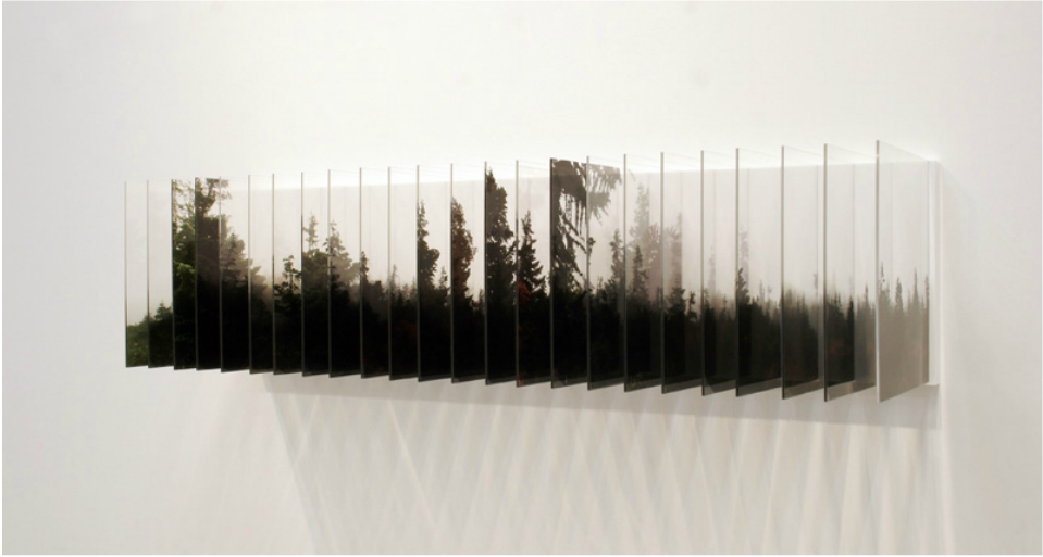


Layered Blur
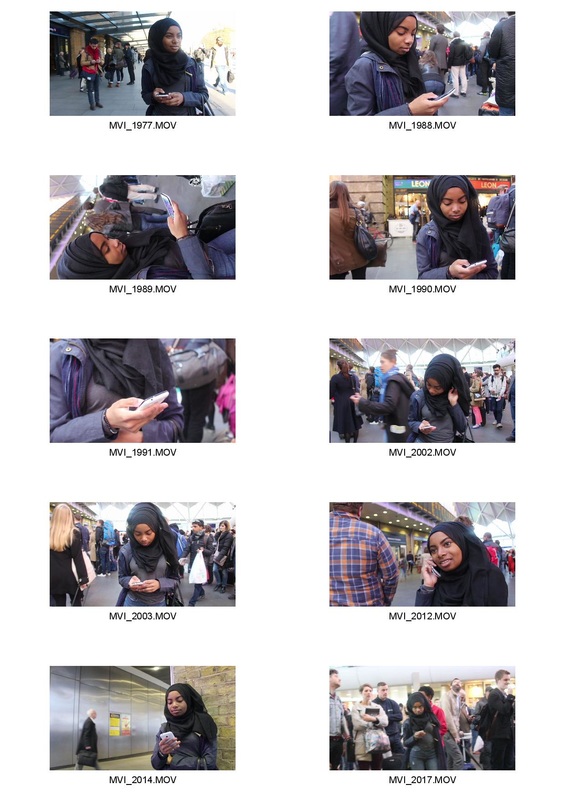
Process:
- Import the videos from video frames to layers
- Select the range of the clip and limit each layer imported to every two frames
- Select all of the layers and change the opacity to 4%, but leave the opacity of the base layer as 100%
- Merge all of the layers and apply a black and white filter
- Increase the contrast of the image
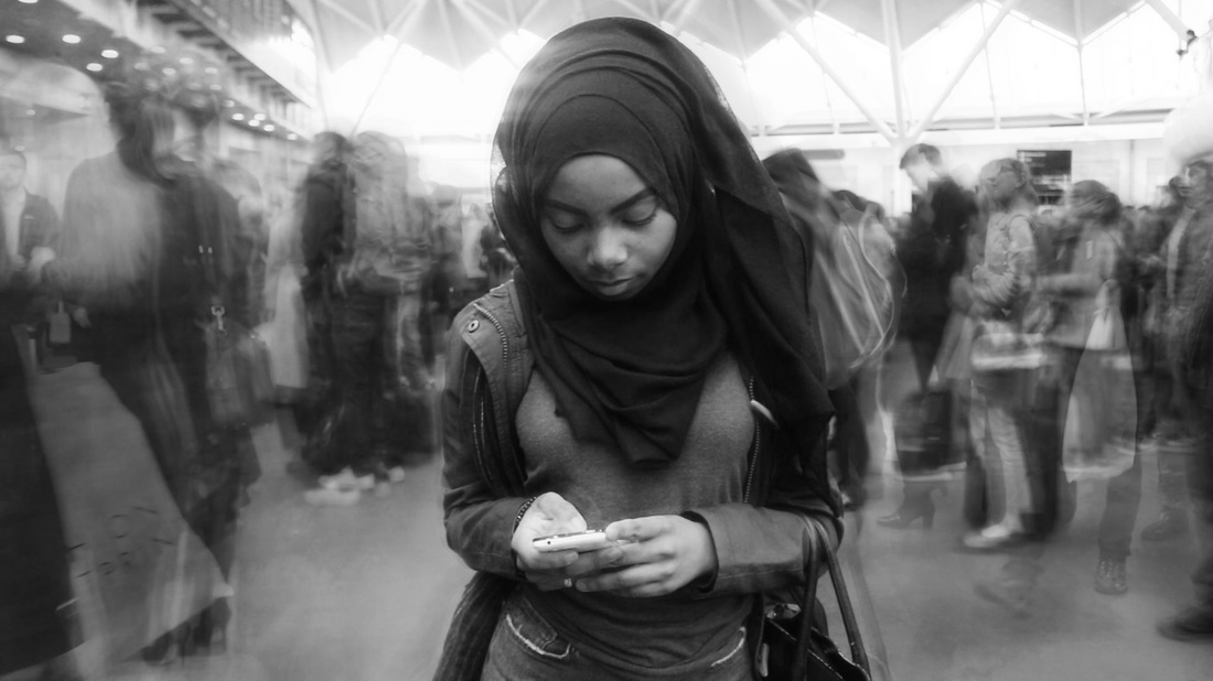
After looking at the work of artist, Nobuhiro Nakanishi, I decided to experiment with a different process that enabled me to capture the progression of time within a single frame. However, instead of doing this creating them inside my camera I experimented with manually creating these images in Photoshop. Using layers from a time lapse video I reduced the opacity of each frame. This produced a blur effect, whilst the image f the background remained relatively shape. The outcome of the images were reminiscent of Titarenko’s work. Like my previous response presents to viewers the concept of people being frozen in a virtual realm.
Compressing all of the layers gave me an idea of how an acetate installation like Nakanishi’s would look if viewed from the front. Although I liked the idea of layer images I found that layering the images in Photoshop did not give the audience the ability to look at each layer individually as well as all of them combined. To develop my idea further I will explore using a physical layering process through the use of using perspex sheets.
For the image I took inside the station I was unable to use a tripod due to health and safety issues. I think the use of a tripod would have drastically improved the quality of the image.
Dustin Yellin
|
Dustin Yellin is an American contemporary artist who currently resides in Brooklyn New York. Yellin chose on to complete his high school education, leaving his Colorado school before graduation as he felt he was unable to learn what he wanted. Through extensive travelling to remote location Yellin was able form his own well rounded education outside the traditional educational system, through experiencing the bizarre and eccentric everyday occurrences. In 2010 the artist purchase a large building in Red Hook, Brooklyn, and founded the Pioneer Works, a nonprofit institute for art and innovation.
Each glass panel is intricately painted, creating a dystopian scene. The work often focuses on mutations of living organisms, such as plants |
 Illustration by Ernst Haeckel
and insects. The year Yellin spent studying with a physics instructor gave him much of the scientific knowledge that has now become a pivotal theme in his art. Additionally, Yellin’s sculptures are reminiscent of taxonomic art of the 19th century, especially the work of Ernest Haekel.
With his work Yellin continues to push the boundaries of how artist work with different materials. Initially Yellin began creating his sculptures using layers of transparent resin, rather than glass, create the effect of “holograms trapped in amber. However, working resin required Yellin to wear a hazmat suit due to the dangerous vapours produced by the resin. Consequently Yellin realised that the flatness of the glass changed the work, resulting in the incorporation of collage of paper clippings from mid-century reference texts and other scientific materials.
With his work Yellin continues to push the boundaries of how artist work with different materials. Initially Yellin began creating his sculptures using layers of transparent resin, rather than glass, create the effect of “holograms trapped in amber. However, working resin required Yellin to wear a hazmat suit due to the dangerous vapours produced by the resin. Consequently Yellin realised that the flatness of the glass changed the work, resulting in the incorporation of collage of paper clippings from mid-century reference texts and other scientific materials.
Saatchi Gallery


When I visited the Saatchi gallery I saw an installation that combined the idea of using transparent panels mounted into a stand like that of the ones that feature in Nobuhiro Nakanishi’s work. In contrast to Nakanishi’s work the artist painted each subject onto separate panels. In addition through placing gaps in between the panels depth was still created within the work without using many panels.
Layered Perspex


